

WeekStrip
One row of days to pick from, with marks for what is on each.
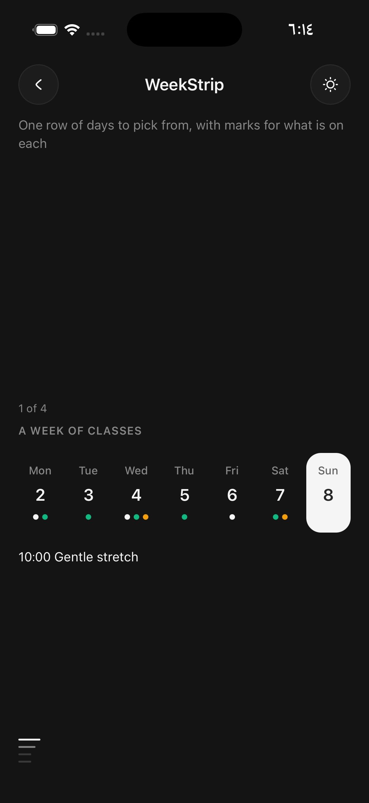
Use it at the top of a schedule, where a reader picks a day and the screen below shows what is on it. It is one row, so it leaves the screen to the day's content rather than spending it on a month.
By default it shows the seven days of one week, filling the row. Pass scroll for a run of days in fixed-width cells that scroll sideways, for a picker that reaches a few weeks ahead.
For picking a date far from today, or a range, use Calendar.
Installation
WeekStrip ships with the library — no separate install.
import { WeekStrip, Text } from 'panelui-native';Or copy the source into your project, to own and edit it:
npx panelui-cli@latest add week-stripUsage
const [day, setDay] = useState(() => new Date());

<WeekStrip value={day} onValueChange={setDay} weekStartsOn="auto" />
Examples
Marks
marks returns what each day shows: up to three dots in theme tones, a short label in their place, or a corner dot for a day that needs attention.
<WeekStrip
  value={day}
  onValueChange={setDay}
  marks={(date) => (date.getDay() === 3 ? { dots: ['primary', 'success'] } : undefined)}
/>
Labels instead of dots
A label replaces the dots, for a figure that reads better as words, such as the places left in a class.
<WeekStrip
  value={day}
  onValueChange={setDay}
  marks={(date) => ({ label: `${freeOn(date)} free` })}
/>
Disabled and faded days
disabled days are faded and cannot be pressed, such as a day the studio is closed. faded days are faded but stay pressable, such as past days a reader may still want to look back at.
<WeekStrip
  value={day}
  onValueChange={setDay}
  disabled={(date) => date.getDay() === 0}
  faded={(date) => date < startOfToday}
/>
Scrolling
scroll lays out length days from start, in fixed-width cells that scroll sideways. The strip opens with the selected day in view.
<WeekStrip scroll size="sm" length={21} value={day} onValueChange={setDay} />Variants
size
smmd(default)
<WeekStrip size="sm">…</WeekStrip>
<WeekStrip size="md">…</WeekStrip>
today
true
<WeekStrip today>…</WeekStrip>dim
true
<WeekStrip dim>…</WeekStrip>API Reference
WeekStrip
| Prop | Type | Default | Description |
|---|---|---|---|
className | string | — | |
value | Date | null | — | The selected day. |
onValueChange | (day: Date) => void | — | Called with the day that was pressed. |
week | Date | — | Which week to show, as any day inside it. Defaults to the week of value, or this week. Ignored when scroll is set. |
scroll | boolean | false | Lay out length days from start in fixed-width cells that scroll sideways, instead of the seven days of one week filling the row. |
start | Date | — | The first day of a scrolling strip. Defaults to today. |
length | number | 14 | How many days a scrolling strip holds. Default 14. |
weekStartsOn | number | 'auto' | 0 | The first day of the week, 0 for Sunday to 6 for Saturday, or auto to ask the locale. Default 0. |
locale | DateLocale | — | The locale for weekday names and spoken dates. Defaults to the device's. |
size | WeekStripSize | md | How big the days are. sm suits a header; md is the default. |
disabled | (day: Date) => boolean | — | Days that cannot be picked. They are faded and do not respond. |
faded | (day: Date) => boolean | — | Days that are faded but can still be picked, such as days in the past. |
marks | (day: Date) => WeekStripMarks | undefined | — | What each day shows beneath its number and in its corner. |
today | Date | — | The day counted as today. Defaults to the current date. |
Every part also accepts the underlying React Native props (ViewProps or TextProps) and a className for Tailwind utilities.
Notes
The week
weekStartsOn is the first day of the week, 0 for Sunday to 6 for Saturday. auto asks locale, the same way Calendar does, so en-GB starts on Monday. week picks which week is shown; it defaults to the week of value, or this week.
Today
Today has a ring, and the selected day is filled. Pass today to set the day counted as today, for a screen that is showing a different time zone.
Accessibility
Each day is a button. A screen reader hears the whole date in locale, followed by its label when it has one, and the selected day is announced as selected. Disabled days are announced as disabled.
Public exports
Values: WeekStrip
Types: WeekStripProps, WeekStripMarks, WeekStripTone, WeekStripSize