

Chip
Interactive pill — a filter, a tag, or a removable token.
A compact, interactive pill: a filter, a tag, or a removable token in a "To:" field.
Set selected to make it a filter and onClose to make it removable.
Where Badge only shows, a chip is the one you press. For a field whose whole value is a list of these, use TagInput.
Installation
Chip ships with the library — no separate install.
import { Chip, CheckIcon } from 'panelui-native';Or copy the source into your project, to own and edit it:
npx panelui-cli@latest add chipUsage
<Chip>Design</Chip>

<Chip variant="info" onClose={() => remove('design')}>Design</Chip>

<Chip selected={on} onPress={() => setOn(!on)}>Available</Chip>
Composition
<Chip start={<Icon />} onClose={() => {}}>
  <Chip.Label>…</Chip.Label>
</Chip>Chip.Label— The label, when the chip holds more than a string. Reads the chip's variant and selected state itself, so an icon-plus-text chip does not thread the colour through by hand.
Examples
Tags
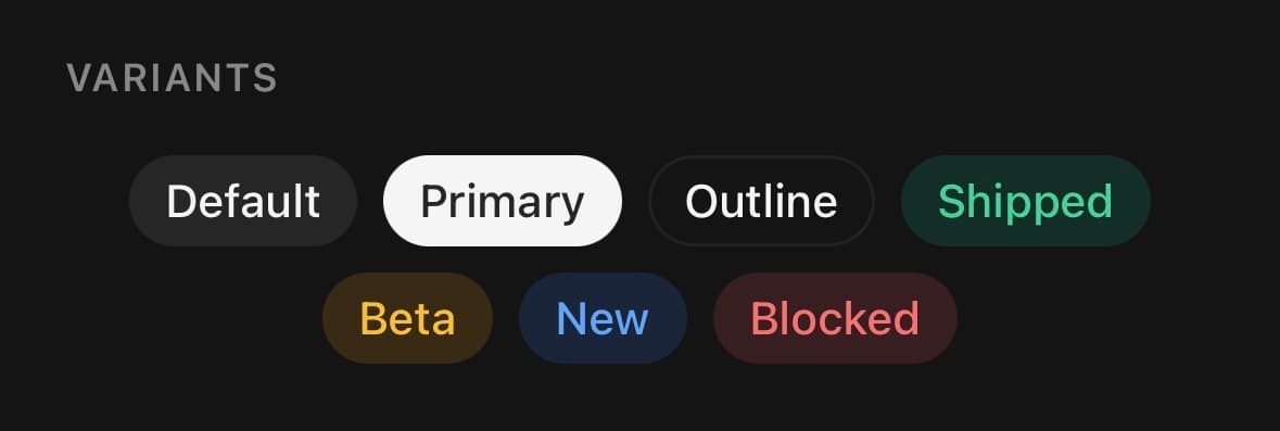
A static token, in any of the tones. With no onPress it is a plain View — it does not invite a tap it will not answer.
<Chip>Default</Chip>
<Chip variant="primary">Primary</Chip>
<Chip variant="success">Shipped</Chip>
<Chip variant="warning">Beta</Chip>
<Chip variant="info">New</Chip>
<Chip variant="outline">Draft</Chip>
A filter bar
selected promotes any chip to a loud accent surface, so a row of filters toggles on and off without a second colour. Pair it with onPress — setting selected makes the chip announce as a toggle.
const [tags, setTags] = useState<string[]>(['design']);

const toggle = (id: string) =>
  setTags((prev) =>
    prev.includes(id) ? prev.filter((t) => t !== id) : [...prev, id]
  );

<View className="flex-row flex-wrap gap-2">
  {['design', 'code', 'research'].map((id) => (
    <Chip
      key={id}
      selected={tags.includes(id)}
      onPress={() => toggle(id)}
    >
      {id}
    </Chip>
  ))}
</View>
Removable tokens
onClose adds a trailing ✕ that is its own hit target — removing a chip never also fires its onPress. Perfect for the recipients in a “To:” field or the applied filters above a list.
const [people, setPeople] = useState(['Ada', 'Grace', 'Alan']);

<View className="flex-row flex-wrap gap-2">
  {people.map((name) => (
    <Chip
      key={name}
      variant="outline"
      onClose={() => setPeople((p) => p.filter((n) => n !== name))}
    >
      {name}
    </Chip>
  ))}
</View>
With a leading icon
start takes an icon or an avatar before the label. Compose with Chip.Label and the icon inherits the chip's colour on its own.

<Chip variant="success" start={<CheckIcon size={13} />}>
  <Chip.Label>Available</Chip.Label>
</Chip>
Variants
variant
default(default)primaryoutlinesuccesswarninginfodestructive
<Chip variant="default">Default</Chip>
<Chip variant="primary">Primary</Chip>
<Chip variant="outline">Outline</Chip>
<Chip variant="success">Success</Chip>
<Chip variant="warning">Warning</Chip>
<Chip variant="info">Info</Chip>
<Chip variant="destructive">Destructive</Chip>
size
xssmmd(default)lgxl

<Chip size="xs">Extra small</Chip>
<Chip size="sm">Small</Chip>
<Chip size="md">Medium</Chip>
<Chip size="lg">Large</Chip>
<Chip size="xl">Extra large</Chip>
closable
true
<Chip closable>…</Chip>API Reference
Chip
| Prop | Type | Default | Description |
|---|---|---|---|
className | string | — | |
labelClassName | string | — | Extra classes for the label when children is a string. |
selected | boolean | — | The filter "on" state. Setting it (even to false) makes the chip a toggle, announced as such — pair it with onPress to flip it. |
disabled | boolean | false | |
start | ReactNode | — | A leading icon or avatar, before the label. |
onClose | () => void | — | Shows a trailing ✕ and calls this when it is pressed. The ✕ is its own hit target, so removing a chip never also fires its onPress. |
closeLabel | string | 'Remove' | Accessibility label for the ✕. Defaults to "Remove". |
haptics | boolean | false | A tick under the finger when the chip is pressed or removed. Off by default — needs the optional expo-haptics, and is silent without it. |
Chip.Label
| Prop | Type | Default | Description |
|---|---|---|---|
className | string | — |
Every part also accepts the underlying React Native props (ViewProps or TextProps) and a className for Tailwind utilities.
Notes
A chip is only pressable when you give it an onPress or a selected state — otherwise it is a plain tag and is not announced as a control. A selected chip is read out as checked or unchecked; a plain pressable one as a button.
The close button carries its own accessibilityLabel (“Remove” by default — override with closeLabel) and a generous hit slop, since a small pill leaves little room for the finger.
Set haptics for a tick under the finger on press or removal. It needs the optional expo-haptics and is silent without it.
A pressable chip forwards ordinary Pressable props, but keeps ownership of its role, selected/disabled semantics, classes, and haptic-aware onPress composition. The consumer callback receives the native event after the optional haptic tick.
Public exports
Values: Chip, useChip
Types: ChipProps, ChipLabelProps, ChipVariant, ChipSize