

Slider
Pick a value, or a span, by dragging a thumb along a track.
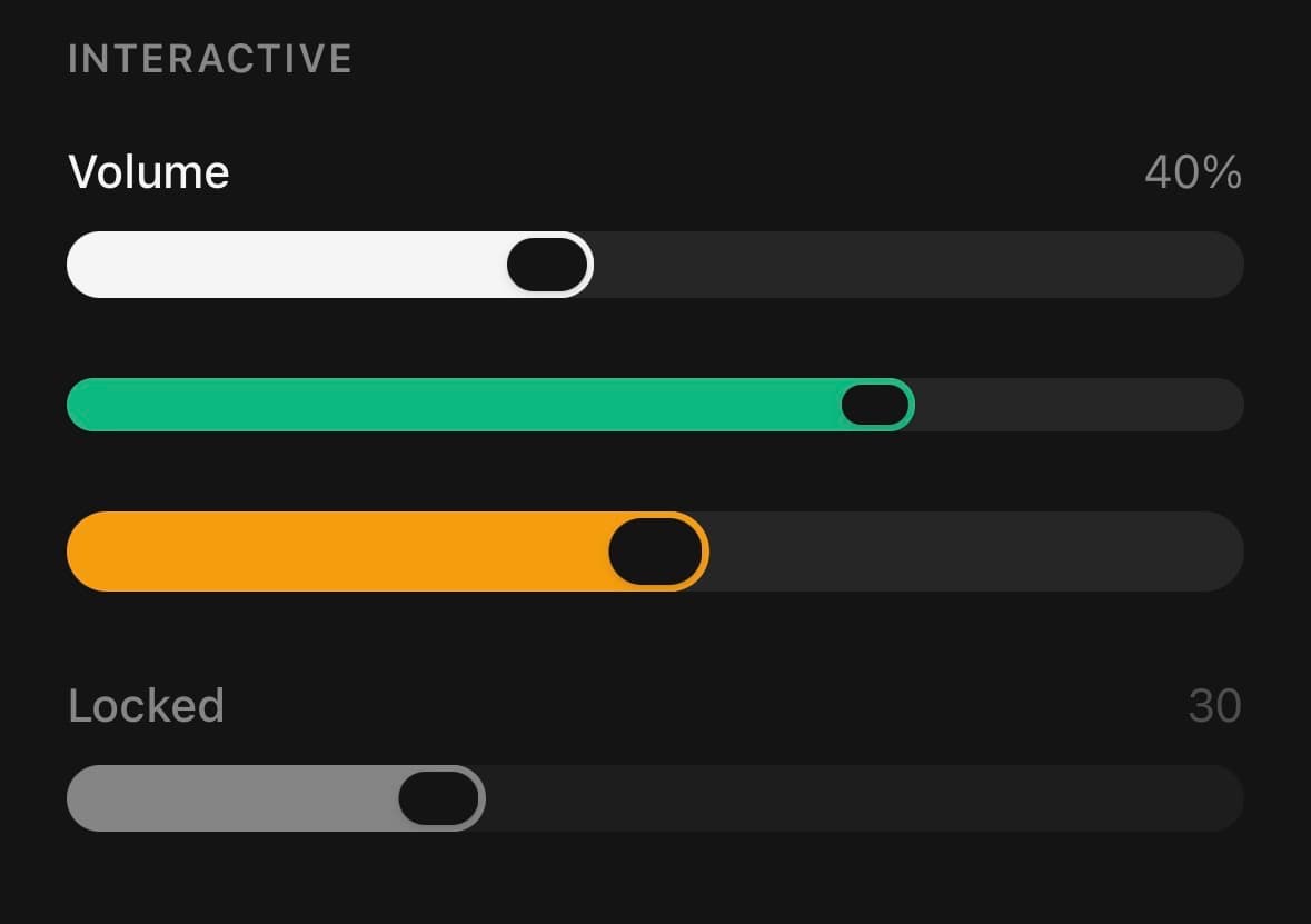
A value picked by dragging a thumb along a track, or a span picked by two.
The thumb is a pill exactly as tall as the track, so nothing has to escape the track to be drawn whole, with a knob inside it that shrinks while you drag.
Position and fill are animated on the UI thread, so dragging never round-trips through React; the value bridges back on change and again on release.
For an exact number, use NumberInput — past a handful of steps, typing beats dragging.
Installation
Slider ships with the library — no separate install.
import { Slider } from 'panelui-native';Or copy the source into your project, to own and edit it:
npx panelui-cli@latest add sliderUsage
<Slider defaultValue={40} />
<Slider label="Volume" showValue defaultValue={40} />
<Slider value={volume} onValueChange={setVolume} />
<Slider defaultRange={[20, 80]} onRangeCommit={save} />
Examples
Controlled
Hold the value in state and read it back for a live label.
const [volume, setVolume] = useState(40);

<Slider value={volume} onValueChange={setVolume} />
With a caption row
label and showValue draw a row above the track. formatValue owns the units, so the caption reads the way the value is spoken rather than as a bare number. The label doubles as the accessibility label.
<Slider label="Brightness" showValue defaultValue={62} />

<Slider
  label="Budget"
  showValue
  formatValue={(v) => `$${Math.round(v)}`}
  min={0}
  max={1000}
  step={20}
  defaultValue={340}
  color="success"
/>
A range
defaultRange — or range for a controlled one — gives the slider two thumbs and fills between them instead of from the start. Whichever thumb your finger lands nearest is the one that moves, and the two bound each other rather than the track, so they can meet but never cross.
const [price, setPrice] = useState([220, 680]);

<Slider
  label="Price"
  showValue
  formatValue={(v) => `$${Math.round(v)}`}
  range={price}
  onRangeChange={setPrice}
  min={0}
  max={1000}
  step={20}
  color="success"
/>
Keeping the thumbs apart
minStepsBetweenThumbs is the gap the span can never close. A filter wants at least one: an empty range matches nothing, and a control that can be dragged into matching nothing reads as a bug rather than a choice.
<Slider
  label="Nights"
  showValue
  defaultRange={[2, 6]}
  min={1}
  max={14}
  step={1}
  minStepsBetweenThumbs={1}
/>
Restyling the thumb
The thumb is two elements — the coloured pill and the knob inside it — and each takes its own classes, so a custom slider does not have to give up the press animation to get a different look.
<Slider
  defaultValue={65}
  trackClassName="bg-success/15"
  fillClassName="bg-success"
  thumbClassName="bg-success"
  knobClassName="bg-white"
/>
Range and step
min, max and step bound the value and snap it to fixed increments.
<Slider min={0} max={10} step={1} defaultValue={5} />Commit on release
onValueChange tracks the drag; onValueCommit fires once at the end — the place for a network write.
<Slider
  defaultValue={50}
  onValueChange={setPreview}
  onValueCommit={save}
/>
Haptic detents
haptics ticks under the finger each time the drag crosses onto a new step, and once more on release — the value feels like it clicks into place. It needs the optional expo-haptics, and is silent without it.
<Slider label="Zoom" showValue min={0} max={10} step={1} defaultValue={4} haptics />Disabled
<Slider defaultValue={30} disabled />The platform's own slider
Passing native hands the track and thumb to SwiftUI or Jetpack Compose. The caption row stays ours, so a native control still gets the label and value above it. Needs the optional @expo/ui package; without it the prop is a silent no-op.
<Slider
  native
  label="Brightness"
  showValue
  formatValue={(v) => `${Math.round(v)}%`}
  value={level}
  onValueChange={setLevel}
/>
Variants
color
primary(default)successwarningdestructiveinfo
<Slider color="primary" defaultValue={40} />
<Slider color="success" defaultValue={40} />
<Slider color="warning" defaultValue={40} />
<Slider color="destructive" defaultValue={40} />
<Slider color="info" defaultValue={40} />
size
smmd(default)lg
<Slider size="sm" defaultValue={40} />
<Slider size="md" defaultValue={40} />
<Slider size="lg" defaultValue={40} />
API Reference
Slider
| Prop | Type | Default | Description |
|---|---|---|---|
className | string | — | |
value | number | — | Controlled value. Leave unset and pass defaultValue to run uncontrolled. |
defaultValue | number | 0 | Starting value when uncontrolled. |
range | [number, number] | — | Controlled span, as [low, high]. Passing this — or defaultRange — gives the slider two thumbs and fills between them instead of from the start. |
defaultRange | [number, number] | — | Starting span when uncontrolled, as [low, high]. |
min | number | 0 | Lower bound. |
max | number | 100 | Upper bound. |
step | number | 1 | Snap granularity. The value is always a multiple of step from min. |
minStepsBetweenThumbs | number | 0 | How many steps the two thumbs must stay apart on a range slider. 0 lets them meet; 1 keeps a step between them, so the span is never empty. |
onValueChange | (value: number) => void | — | Fires on every change while dragging — cheap updates only. |
onValueCommit | (value: number) => void | — | Fires once when the gesture ends — the place for expensive side effects. |
onRangeChange | (range: [number, number]) => void | — | The range equivalent of onValueChange. Only fires on a range slider. |
onRangeCommit | (range: [number, number]) => void | — | The range equivalent of onValueCommit. Only fires on a range slider. |
disabled | boolean | false | |
native | boolean | — | Render the platform's own slider instead of this one. Requires the optional @expo/ui package; without it this prop does nothing. Theme tokens do not apply — the platform draws the control, so color, size and the slot classNames are ignored. label and showValue still render the caption row above it, since that is ours. Ignored on a range slider. Neither platform ships a two-thumb slider, so a range draws ours rather than quietly losing a thumb. |
label | string | — | Caption above the track. Also becomes the accessibility label. |
showValue | boolean | false | Show the current value on the caption row, opposite the label. |
formatValue | (value: number) => string | — | Format the shown value. Defaults to the rounded number. |
haptics | boolean | false | A tick under the finger each time a drag crosses onto a new step, and once more when the drag ends. Off by default — needs the optional expo-haptics, and is silent without it. |
headerClassName | string | — | Extra classes for the caption row. |
trackClassName | string | — | Extra classes for the unfilled track. |
fillClassName | string | — | Extra classes for the filled portion. |
thumbClassName | string | — | Extra classes for the draggable thumb. |
knobClassName | string | — | Extra classes for the knob inside the thumb. |
Every part also accepts the underlying React Native props (ViewProps or TextProps) and a className for Tailwind utilities.
Notes
Runs controlled (value + onValueChange) or uncontrolled (defaultValue). onValueChange fires on every frame of a drag; onValueCommit fires once on release — reach for it when the change is expensive. The value is always snapped to a multiple of step from min.
A range is a second pair of props, not a tuple in the first. Passing range or defaultRange gives the slider two thumbs and reports through onRangeChange / onRangeCommit. Keeping them apart is what lets a one-thumb slider's handler stay (value: number) => void — a single set of props covering both would hand every existing caller a union to narrow before they could read a number out of it.
The knob is painted with the page background rather than a per-colour on-token, because the status foregrounds are the darker text hues meant for soft fills — a green-700 knob on a green-500 pill would barely show. Override knobClassName if a theme needs something else.
See Native rendering for what native keeps and what it gives up — notably onValueCommit, which the platform control does not report. native is ignored on a range slider: neither platform ships a two-thumb control, so a range draws ours rather than quietly losing a thumb.
Public exports
Values: Slider
Types: SliderProps