

LineChart
Animated time series, drawn on the UI thread.
A time series, drawn and animated on the UI thread.
The chart is composed rather than configured: the grid, each series, the axis and the crosshair are separate children, so a chart that wants no grid simply does not have one. A single component with twenty booleans is how charts become unreadable at the call site.
Colours come from the --color-chart-1 … --color-chart-5 tokens, so a chart follows the active theme and is put on brand by overriding those five. Nothing in it hardcodes a colour.
For what a series is made of rather than its shape, use an AreaChart.
If the chart you need is not one of these, Plot is the same drawing machinery with nothing decided: you compose the marks — columns, lines, fills, dots, and marks you write yourself — over one measured box and one shared scale.
Installation
LineChart ships with the library — no separate install.
import { LineChart, Frame, Text, Button } from 'panelui-native';Or copy the source into your project, to own and edit it:
npx panelui-cli@latest add line-chartUsage
<LineChart data={visits} xDataKey="month">
  <LineChart.Grid />
  <LineChart.Area dataKey="visits" />
  <LineChart.Line dataKey="visits" />
  <LineChart.XAxis />
  <LineChart.YAxis />
  <LineChart.Tooltip />
</LineChart>
Composition
<LineChart>
  <LineChart.Header>…</LineChart.Header>
  <LineChart.Grid>…</LineChart.Grid>
  <LineChart.Area>…</LineChart.Area>
  <LineChart.Line>…</LineChart.Line>
  <LineChart.Skeleton>…</LineChart.Skeleton>
  <LineChart.XAxis>…</LineChart.XAxis>
  <LineChart.YAxis>…</LineChart.YAxis>
  <LineChart.Tooltip>…</LineChart.Tooltip>
  <LineChart.Legend>…</LineChart.Legend>
</LineChart>LineChart.Header— See props below.LineChart.Grid— Horizontal reference lines, under everything and outside the reveal.LineChart.Area— The gradient fill under a series. Separate from the line, because a two-series chart usually wants it on only one of them.LineChart.Line— One series. Takes its colour from a--color-chart-*token unless given one.LineChart.Skeleton— The flat rule with a sweep along it, shown whilestatus="loading".LineChart.XAxis— The x labels, as real text under the plot.LineChart.YAxis— The value labels down the side, one per grid line. Reserves its own gutter.LineChart.Tooltip— The crosshair and the drag that drives it.LineChart.Legend— A swatch and a name per registered series.
Examples
A chart card with a crosshair
Pair it with Frame, and add LineChart.Tooltip. Dragging across the chart moves a crosshair and floats a small label at the point with the value — the minimal readout a drag wants. The label tracks the finger on the UI thread; only its text crosses back into JS, and only when the active index changes. A stat band above the chart, inside the panel. Frame.Header is a caption on the tray the card sits in — one muted line — so a title, a legend, a headline number and a subtitle all crammed into it is four levels of hierarchy in a space with room for one, and the number the card is actually about ends up the hardest part to find.
<Frame>
  <Frame.Header>
    <Frame.Title>Monthly Revenue</Frame.Title>
    <Frame.Action>Drag to inspect</Frame.Action>
  </Frame.Header>

  <Frame.Panel>
    <View className="flex-row items-start justify-between px-4 pb-2 pt-3.5">
      <View className="gap-0.5">
        <Text size="2xl" weight="bold">$317,904</Text>
        <Text size="sm" muted>Last 12 months</Text>
      </View>
    </View>

    <LineChart data={revenue} xDataKey="month">
      <LineChart.Grid />
      <LineChart.Area dataKey="revenue" />
      <LineChart.Line dataKey="revenue" />
      <LineChart.XAxis ticks={5} />
      <LineChart.Tooltip formatValue={(v) => `$${v.toLocaleString()}`} />
    </LineChart>
  </Frame.Panel>
</Frame>
Replay the reveal
Take a ref and call replay() to run the entrance again — for a control that lets the reader watch the line draw itself once more.
const chart = useRef<LineChartHandle>(null);

<Button onPress={() => chart.current?.replay()}>Replay</Button>

<LineChart ref={chart} data={revenue} xDataKey="month">
  <LineChart.Grid />
  <LineChart.Line dataKey="revenue" />
</LineChart>
A sparkline
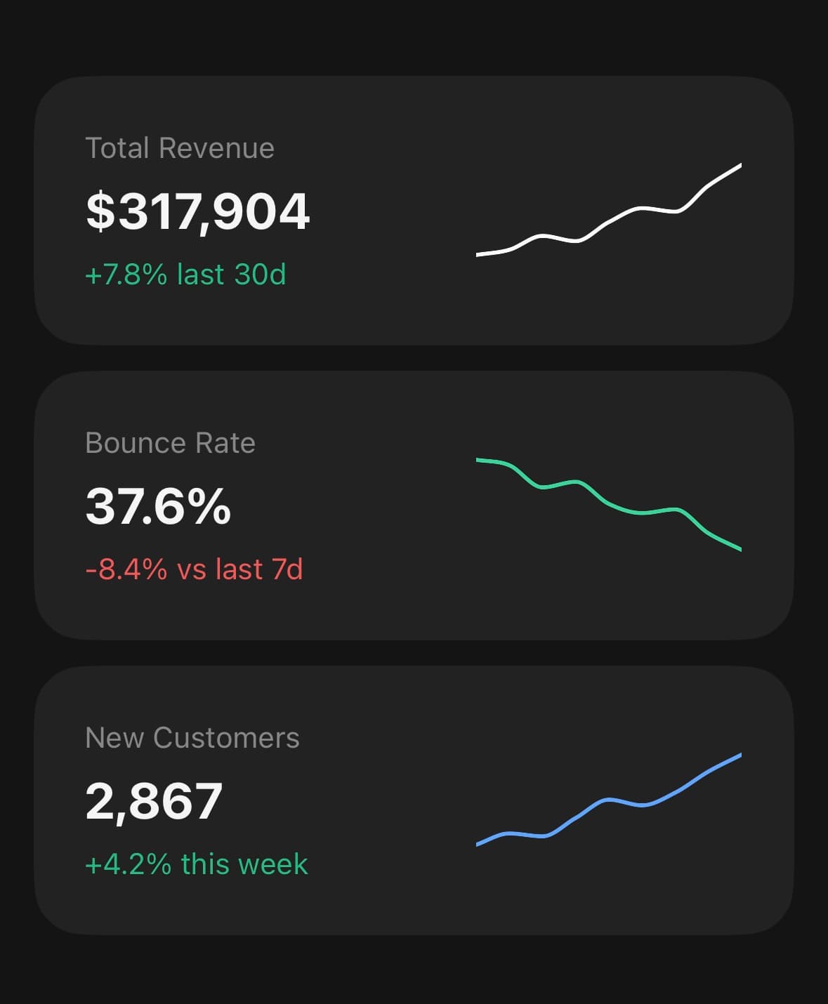
Set compact and drop the grid, axis and crosshair: the line reaches the edges and the shape is the whole point. For the whole card around one — a headline number, a trend badge and the sparkline under it — reach for Kpi rather than assembling it each time.
<View className="h-14 w-32">
  <LineChart data={points} xDataKey="t" compact aspectRatio={2.3}>
    <LineChart.Line dataKey="v" strokeWidth={2} />
  </LineChart>
</View>
Two series and a dashed comparison
Both series share one y-axis so they stay comparable. Give a target line the next colour token and a dash pattern, so actual and target are told apart by shape as well as by colour.
<LineChart data={revenue} xDataKey="month">
  <LineChart.Grid />
  <LineChart.Line dataKey="revenue" colorIndex={1} />
  <LineChart.Line dataKey="target" colorIndex={2} dashArray="6,5" />
  <LineChart.XAxis ticks={5} />
  <LineChart.Tooltip formatValue={(v) => `$${(v / 1000).toFixed(1)}k`} />
</LineChart>
Loading, and then data
Add LineChart.Skeleton and drive status. While loading, a flat rule sits where the series will be with a highlight travelling along it; on ready that same line grows into the data — one component the whole way through.
<LineChart data={data} status={status} xDataKey="month">
  <LineChart.Grid />
  <LineChart.Skeleton />
  <LineChart.Area dataKey="revenue" />
  <LineChart.Line dataKey="revenue" />
  <LineChart.XAxis />
  <LineChart.Tooltip />
</LineChart>
Versions
Basic
Two series sharing one axis, with the headline reading and the legend in a band above the chart rather than in the header. curve="linear" joins the points straight rather than easing between them, which is the honest choice when the readings are discrete.
<Frame>
  <Frame.Header>
    <Frame.Title>Traffic Source</Frame.Title>
    <Frame.Action>Last 12 months</Frame.Action>
  </Frame.Header>
  <Frame.Panel>
    <ChartStat value="292,000" caption="Sessions">
      <LegendDot colorIndex={1} label="Organic" />
      <LegendDot colorIndex={2} label="Paid Ads" />
    </ChartStat>
    <LineChart data={sessions} xDataKey="month" curve="linear" aspectRatio={1.7}>
      <LineChart.Grid />
      <LineChart.Line dataKey="organic" colorIndex={1} />
      <LineChart.Line dataKey="paid" colorIndex={2} />
      <LineChart.XAxis ticks={5} />
      <LineChart.Tooltip formatValue={(v) => v.toLocaleString()} />
    </LineChart>
  </Frame.Panel>
</Frame>
Both axes
Add LineChart.YAxis for value labels down the side. It reserves its own gutter before the plot is laid out, so the numbers sit beside the series rather than over it, and each label is centred on the grid line it names. Give it the same count as the grid — Grid’s rows and YAxis’s ticks both default to 4, and a chart where they disagree has numbers naming lines that are not there.
<LineChart data={revenue} xDataKey="month" aspectRatio={1.7}>
  <LineChart.Grid rows={4} />
  <LineChart.Area dataKey="revenue" />
  <LineChart.Line dataKey="revenue" />
  <LineChart.XAxis ticks={5} />
  <LineChart.YAxis ticks={4} format={(v) => `$${v / 1000}k`} />
  <LineChart.Tooltip formatValue={(v) => `$${(v / 1000).toFixed(1)}k`} />
</LineChart>
With dots
showMarkers puts a dot at every point. For a short series where each reading is a fact worth pointing at — on a hundred points it is noise.
<LineChart data={revenue} xDataKey="month" aspectRatio={1.7}>
  <LineChart.Grid />
  <LineChart.Line dataKey="revenue" showMarkers />
  <LineChart.XAxis ticks={5} />
  <LineChart.Tooltip formatValue={(v) => `$${(v / 1000).toFixed(1)}k`} />
</LineChart>
Crosshair
Drag across the chart and a label rides the crosshair. The nearest index is resolved on the UI thread and only crosses into JS when it changes, so a drag costs a handful of re-renders rather than one per frame. The hint that it is draggable lives in the header's action slot, where one short line fits.
<Frame>
  <Frame.Header>
    <Frame.Title>Monthly Revenue</Frame.Title>
    <Frame.Action>Drag to inspect</Frame.Action>
  </Frame.Header>
  <Frame.Panel>
    <ChartStat value="$317,904" caption="Last 12 months" />
    <LineChart data={revenue} xDataKey="month" aspectRatio={1.7}>
      <LineChart.Grid />
      <LineChart.Area dataKey="revenue" />
      <LineChart.Line dataKey="revenue" />
      <LineChart.XAxis ticks={5} />
    </LineChart>
  </Frame.Panel>
</Frame>
Animated line
The reveal plays once on mount; replay() on the chart ref runs it again. A data change redraws without replaying — repeating the reveal on every refresh turns an update into an animation.
const chart = useRef<LineChartHandle>(null);

<Button variant="ghost" size="sm" onPress={() => chart.current?.replay()}>
  Replay
</Button>

<LineChart ref={chart} data={revenue} xDataKey="month">
  <LineChart.Grid />
  <LineChart.Area dataKey="revenue" />
  <LineChart.Line dataKey="revenue" />
</LineChart>
Finance
A balance, a delta and a range selector. The delta rides beside the number rather than under it — three stacked lines is what made this header a wall of text. Switching the range tweens the y-domain rather than swapping the path, so a series that grows is redrawn against a moving axis instead of jumping to a new shape.
const [range, setRange] = useState("1M");

<Frame>
  <Frame.Header>
    <Frame.Title>Total balance</Frame.Title>
    <Frame.Action>{range}</Frame.Action>
  </Frame.Header>
  <Frame.Panel>
    <ChartStat value={`$${balance.toLocaleString()}`}>
      <Text size="sm" className="text-success">+{delta}% this period</Text>
    </ChartStat>
    <View className="gap-3 px-3 pb-3">
      <LineChart data={RANGES[range].data} xDataKey="t" aspectRatio={1.9}>
        <LineChart.Grid rows={3} dashArray="" opacity={0.4} />
        <LineChart.Area dataKey="v" />
        <LineChart.Line dataKey="v" />
      </LineChart>
      <Tabs value={range} onValueChange={setRange}>
        <Tabs.List>
          {Object.keys(RANGES).map((key) => (
            <Tabs.Trigger key={key} value={key}>{key}</Tabs.Trigger>
          ))}
        </Tabs.List>
      </Tabs>
    </View>
  </Frame.Panel>
</Frame>
Dashed comparison
An actual against a target. The two are told apart by shape as well as colour, so the chart still reads for a colour-blind reader and in a screenshot printed in grey. The key sits in the panel, above the chart.
<Frame>
  <Frame.Header>
    <Frame.Title>Actual vs Target</Frame.Title>
    <Frame.Action>2026</Frame.Action>
  </Frame.Header>
  <Frame.Panel>
    <ChartLegendRow>
      <LegendDot colorIndex={1} label="Actual" />
      <DashedKey label="Target" />
    </ChartLegendRow>
    <LineChart data={revenue} xDataKey="month" aspectRatio={1.7}>
      <LineChart.Grid />
      <LineChart.Line dataKey="revenue" colorIndex={1} />
      <LineChart.Line dataKey="target" colorIndex={2} dashArray="6,5" />
      <LineChart.XAxis ticks={5} />
    </LineChart>
  </Frame.Panel>
</Frame>
Multi-line
Four series across the chart token ramp. They share one y-domain, so they stay comparable — a per-series scale makes two lines look alike when they are orders of magnitude apart. Four keys wrap onto two rows on a narrow phone, which is another reason the legend belongs in the panel rather than in the header strip.
<Frame>
  <Frame.Header>
    <Frame.Title>Traffic Sources</Frame.Title>
    <Frame.Action>Last 12 months</Frame.Action>
  </Frame.Header>
  <Frame.Panel>
    <ChartLegendRow>
      <LegendDot colorIndex={1} label="Organic" />
      <LegendDot colorIndex={2} label="Paid Ads" />
      <LegendDot colorIndex={3} label="Referral" />
      <LegendDot colorIndex={4} label="Social" />
    </ChartLegendRow>
    <LineChart data={traffic} xDataKey="month" aspectRatio={1.7}>
      <LineChart.Grid />
      <LineChart.Line dataKey="organic" colorIndex={1} />
      <LineChart.Line dataKey="paid" colorIndex={2} />
      <LineChart.Line dataKey="referral" colorIndex={3} />
      <LineChart.Line dataKey="social" colorIndex={4} />
      <LineChart.XAxis ticks={5} />
    </LineChart>
  </Frame.Panel>
</Frame>
API Reference
LineChart
| Prop | Type | Default | Description |
|---|---|---|---|
className | string | — | |
data | LineChartDatum[] | — | The rows. Each one is a point along the x-axis. |
xDataKey | string | 'date' | Key holding the x label. Used by the axis and the crosshair readout. |
status | LineChartStatus | 'ready' | loading draws a flat skeleton with a sweep running along it, and morphs into the real series when it turns ready. One component throughout, rather than a spinner swapped for a chart — swapping loses the transition. |
aspectRatio | number | 2 | Width ÷ height. 2 is the wide card shape; 1.6 suits a narrow column. |
animationDuration | number | 700 | Milliseconds for the reveal on mount. |
domainDuration | number | 500 | Milliseconds for the y-axis to settle after the data changes. |
yDomain | [number, number] | — | Fix the y-axis instead of deriving it from the data. |
curve | LineChartCurve | 'monotone' | monotone never overshoots between points; linear joins them straight. |
onActiveIndexChange | (index: number, datum: LineChartDatum | null) => void | — | The point under the crosshair as it moves, and -1/null when the finger lifts. This is how a readout in the card's header gets its value — that header is outside the chart, so it cannot use useLineChart. Fires when the index changes, not per frame. |
compact | boolean | false | Drop the axis padding so the line reaches the edges — for a sparkline with no grid, axis or crosshair, where the shape is the whole point. |
LineChart.Grid
| Prop | Type | Default | Description |
|---|---|---|---|
rows | number | — | Horizontal rules across the plot. |
color | string | — | |
dashArray | string | — | Dash pattern, e.g. "4,6". Omit for a solid rule. |
opacity | number | — |
LineChart.Line
| Prop | Type | Default | Description |
|---|---|---|---|
dataKey | string | — | Key holding this series' y values. |
color | string | — | Stroke colour. Defaults to the --color-chart-* token at colorIndex, so a series follows the theme without the call site naming a colour. |
colorIndex | 1 | 2 | 3 | 4 | 5 | 1 | Which --color-chart-* token to take when color is not given. |
strokeWidth | number | 2.5 | |
dashArray | string | — | Dash pattern, e.g. "6,4" — for a projection or a secondary series. |
showMarkers | boolean | false | A dot at every point. Best kept for short series. |
LineChart.Area
| Prop | Type | Default | Description |
|---|---|---|---|
dataKey | string | — | |
color | string | — | |
colorIndex | 1 | 2 | 3 | 4 | 5 | 1 | |
opacity | number | — | Opacity at the line. Fades to nothing at the baseline. |
LineChart.Skeleton
| Prop | Type | Default | Description |
|---|---|---|---|
duration | number | — | Milliseconds for one pass of the sweep. |
color | string | — |
LineChart.XAxis
| Prop | Type | Default | Description |
|---|---|---|---|
ticks | number | — | How many labels to show. The rest are dropped, evenly. |
format | (datum: LineChartDatum, index: number) => string | — | Turn a row into its label. Defaults to the value at xDataKey. |
className | string | — |
LineChart.YAxis
| Prop | Type | Default | Description |
|---|---|---|---|
ticks | number | — | How many intervals to divide the axis into. Yields ticks + 1 labels. |
format | (value: number) => string | — | Turn a value into its label. Defaults to a compact number. |
className | string | — |
LineChart.Tooltip
| Prop | Type | Default | Description |
|---|---|---|---|
color | string | — | |
showLabel | boolean | — | Float a small label at the crosshair showing the x-value and each series' value at that point — the minimal readout a drag wants. On by default. |
formatValue | (value: number, key: string) => string | — | Format one series' value for the label. Defaults to a compact number. |
formatX | (datum: LineChartDatum) => string | — | Format the label's heading from the row. Defaults to the value at xDataKey. |
LineChart.Legend
| Prop | Type | Default | Description |
|---|---|---|---|
className | string | — | |
labels | Record<string, string> | — | Label per series key. A key with no label falls back to the key itself. |
LineChart.Header
| Prop | Type | Default | Description |
|---|---|---|---|
className | string | — | |
title | string | — | Small line above the value — what the chart is of. |
value | string | — | The readout. The largest thing on the card, and the first thing read. |
caption | string | — | One muted line under the value — a period, a comparison, a total. |
labels | Record<string, string> | — | Prettier names for the series keys, as the legend takes. |
legend | boolean | false | Draw a swatch and a name per series along the trailing edge. Prefer this to LineChart.Legend on a chart that has a header: the legend floats over the plot, where it competes with the lines for the same corner. |
Every part also accepts the underlying React Native props (ViewProps or TextProps) and a className for Tailwind utilities.
Notes
The two layers
The geometry is SVG and anything with text or a gesture on it is a React Native view laid over the top. The parts sort themselves into the right layer, so composition stays a flat list of children — but it is why LineChart.XAxis renders real text rather than SVG text. SVG text ignores the platform's text scaling and the theme's font, and a gesture handler cannot be attached to an SVG node at all.
Three animations, three reasons
The reveal uncovers the plot left to right on mount, with everything inside sharing one clip — so the line, its fill and its markers arrive together rather than as three separate effects.
The y-domain is tweened when the data changes, rather than the path being swapped. A series that grows is redrawn against a moving axis instead of jumping to a new shape. The reveal deliberately does not replay: it happened once, and repeating it on every refresh turns a data update into an animation.
The crosshair resolves the nearest index on the UI thread. Only that index crosses back into JS, and only when it changes, so a drag across a hundred points costs a hundred re-renders at most rather than one per frame.
All three respect the system's reduce-motion setting: the chart renders at its final state instead.
Reading out the active point
onActiveIndexChange fires as the crosshair moves between points, and with -1/null when the finger lifts. That is the one to use for a readout in the card header, because the header is outside the chart and a hook cannot reach up out of the subtree it is called in. useLineChart is for something rendered inside the chart, which is the rarer case.
The crosshair label
LineChart.Tooltip floats a small label at the crosshair by default, showing the x-value and each series' value at that point. Turn it off with showLabel={false}, or format its numbers with formatValue. For a readout in the card header instead — outside the plot, where it does not cover the line — use onActiveIndexChange on the root.
The curve
monotone is the default and is the right one for a time series. A plain cubic spline overshoots between points, so a series that never goes below zero draws a dip under the axis between two low values — a shape that is not in the data. Use curve="linear" when the points are exact readings and the eye should not be given anything between them.
Sizing
The chart fills its parent's width and takes its height from aspectRatio. Give it a wider ratio for a card and a squarer one for a narrow column; do not set a height directly, as the aspect ratio is what keeps the plot geometry stable while the layout settles.
Laying out a chart card
Frame.Header is a caption on the tray the card sits in — one muted line, a title on the left and a short note or control on the right. The headline reading, the legend and any subtitle belong in the panel, in a band above the chart.
Putting all of them in the header is the usual way a chart card goes wrong: four levels of hierarchy in a strip with room for one, and the number the card is actually about ends up the hardest thing on it to find. A legend of four keys makes it worse, because it wraps onto a second row on a narrow phone and pushes the chart down the card.
aspectRatio measures the plot, not the whole chart. The header sits above the drawing area rather than inside it, so a chart with a readout is taller than its ratio alone suggests — measure the box and the header would eat into the plot while still claiming the shape you asked for.
Labels sit on what they name. Each x label is placed on its own point, and each y label is centred on the grid line it belongs to. Grid's rows and YAxis's ticks have to match for the numbers to line up; both default to 4.
Accessible data
The chart exposes one screen-reader summary and one semantic entry per data row; its SVG paths, axes and markers stay decorative. Set accessibilityLabel for a domain-specific summary, accessibilityLabelForDatum to format each row, and onAccessibilityDatumPress when selecting a row should perform an action. Pass accessible={false} only when the same data is already available nearby in an accessible table.
Public exports
Values: LineChart, useLineChart
Types: LineChartProps, LineChartHandle, LineChartHeaderProps, LineChartGridProps, LineChartLineProps, LineChartAreaProps, LineChartSkeletonProps, LineChartXAxisProps, LineChartYAxisProps, LineChartTooltipProps, LineChartLegendProps, LineChartDatum, LineChartStatus, LineChartCurve