

Input
Text field with label, description and error message.
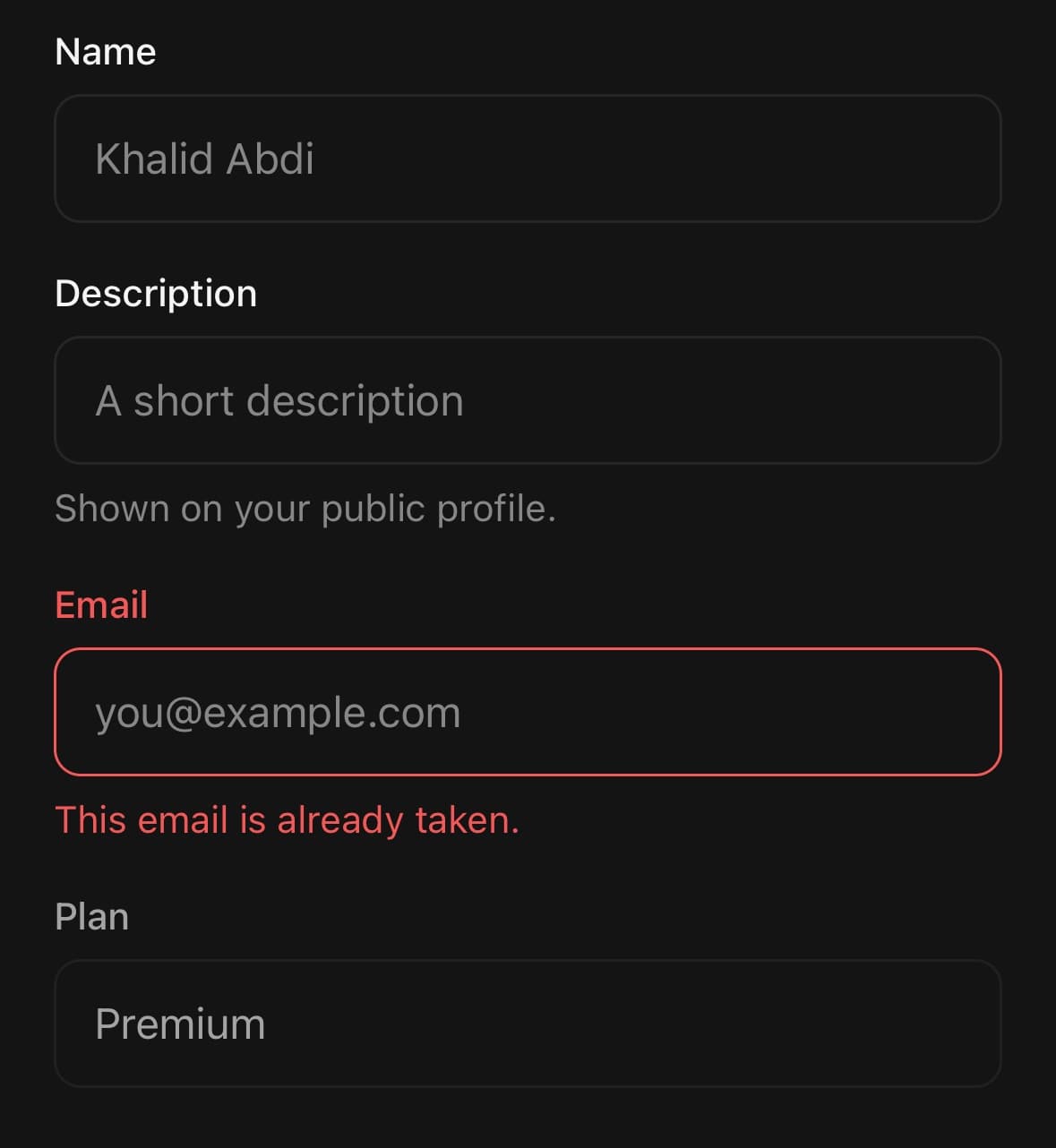
A text field with an optional label, description and error message.
Its focus border crosses between colours on the UI thread rather than snapping, and it comes in two backgrounds and three heights.
Passing errorMessage puts the field in its invalid state and replaces the description — so the two never appear together and the error is not competing with help text.
For several lines, use Textarea; for a field with something attached to either end, use InputGroup.
Installation
Input ships with the library — no separate install.
import { Input, Card, Button, PencilIcon, SearchIcon, Chip } from 'panelui-native';Or copy the source into your project, to own and edit it:
npx panelui-cli@latest add inputUsage
<Input label="Email" placeholder="you@example.com" />

<Input variant="filled" size="lg" label="Workspace" isRequired />

<Input
  label="Description"
  placeholder="A short description"
  description="Shown on your public profile."
/>

<Input
  label="Email"
  value={email}
  onChangeText={setEmail}
  errorMessage={error}
/>

// Lifts clear of the software keyboard when it would be covered.
<Input avoidKeyboard label="Comment" placeholder="Say something…" />
Examples
Label, description and error
Setting errorMessage also puts the field into its invalid state — you do not need a separate flag. The description is replaced by the error while one is present.
<Input label="Name" placeholder="Khalid Abdi" />

<Input
  label="Description"
  placeholder="A short description"
  description="Shown on your public profile."
/>

<Input
  label="Email"
  value={email}
  onChangeText={setEmail}
  errorMessage={emailError}
/>
An icon inside the field
startContent and endContent sit inside the field box and are measured, so the text is padded clear of them however wide they turn out to be. They are positioned against the field rather than against the component, which is what keeps them put when a label is added above it.
<Input
  label="Description"
  description="Shown on your public profile."
  placeholder="A short description"
  startContent={<PencilIcon size={18} />}
/>

<Input
  label="Search"
  placeholder="Find a project"
  startContent={<SearchIcon size={18} />}
  endContent={<Chip size="sm">⌘K</Chip>}
/>
Choosing a background
Use outline on the page, where the field draws its own edge. Use filled inside a card or a sheet, where a second border beside the container’s own reads as a seam.
<Input label="Email" placeholder="you@example.com" />

<Card>
  <Card.Content className="gap-4 p-4">
    <Input variant="filled" label="Workspace" placeholder="Acme" />
    <Input variant="filled" label="Notes" multiline />
  </Card.Content>
</Card>
Required fields and multiline
isRequired marks the label with an asterisk and sets the accessibility state with it, so the two cannot drift apart. multiline drops the fixed height for a minimum one and starts the text at the top.
<Input label="Full name" isRequired placeholder="Khalid Abdi" />

<Input
  label="Message"
  multiline
  numberOfLines={4}
  placeholder="Anything we should know?"
/>
Avoiding the keyboard
lift (the default) moves the field by exactly the amount the keyboard covers it, and not at all when it is already clear. The overlap is re-read every frame while the field is focused, so the field keeps its place in the page as it scrolls under and back out of the keyboard.
dock is for a field that is already pinned near the bottom edge — a composer or a search bar. It travels with the keyboard instead of measuring anything; pass the inset it already sits above as keyboardBottomInset.
<Input
  avoidKeyboard
  keyboardOffset={24}
  label="Comment"
  placeholder="Say something…"
/>

// A composer pinned above the home indicator, riding the keyboard.
<Input
  avoidKeyboard
  keyboardMode="dock"
  keyboardBottomInset={insets.bottom}
  placeholder="Message"
  containerClassName="absolute bottom-8 left-5 right-5"
/>
Passing through TextInput props
Anything TextInput accepts works here.
<Input
  label="Password"
  secureTextEntry
  autoCapitalize="none"
  autoComplete="current-password"
  returnKeyType="go"
  onSubmitEditing={signIn}
/>

<Input
  label="Amount"
  keyboardType="decimal-pad"
  inputMode="decimal"
/>
Styling the field and the container separately
className goes on the text field; containerClassName goes on the wrapper that holds the label, field and message.
<Input
  containerClassName="flex-1"
  className="h-12 rounded-full px-4"
  placeholder="Search components"
/>
In a form
Nothing special is needed to put fields in a card — label and isRequired carry the whole field, so the form is the fields and the button under them.
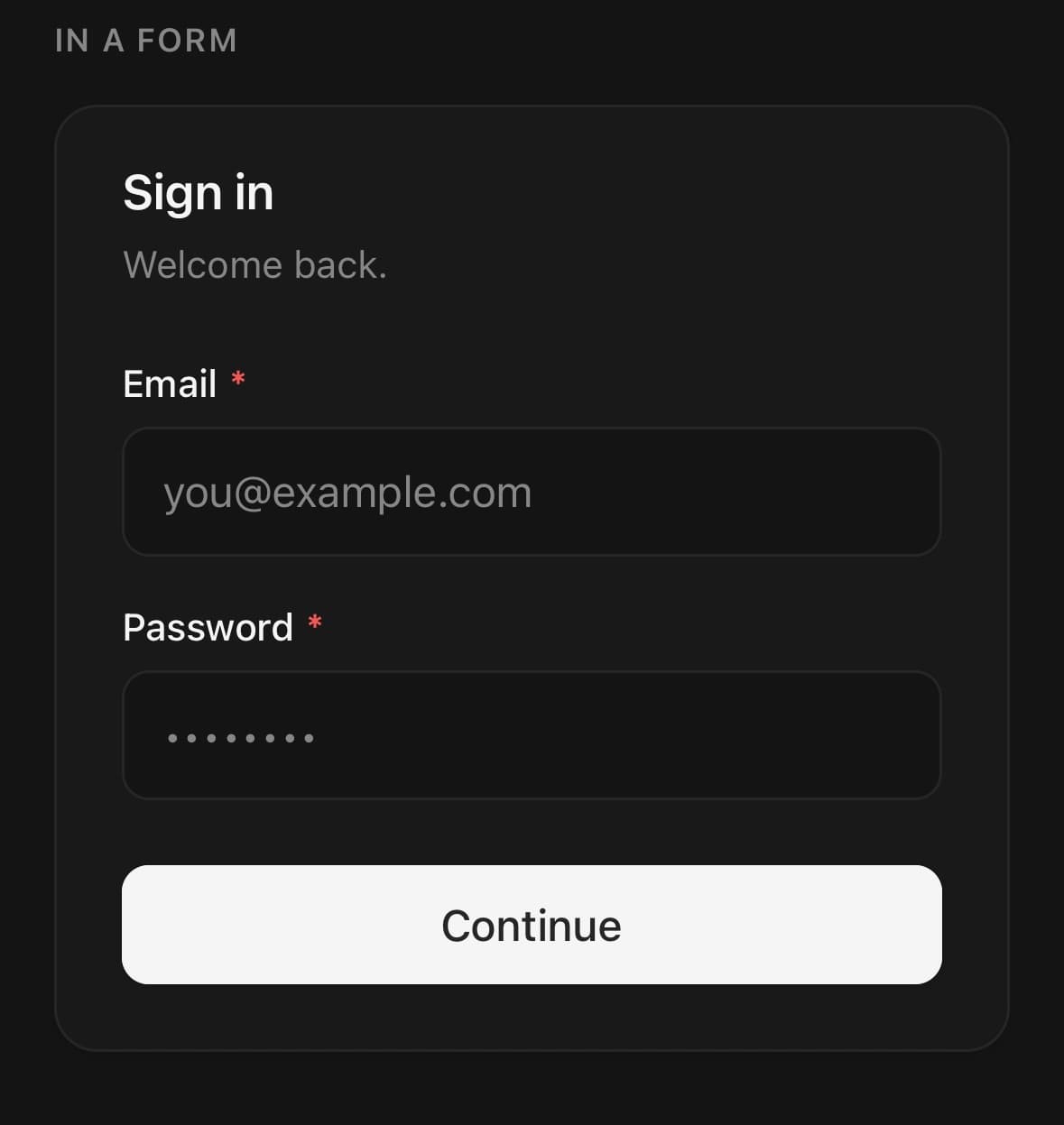
<Card className="w-full">
  <Card.Header>
    <Card.Title>Sign in</Card.Title>
    <Card.Description>Welcome back.</Card.Description>
  </Card.Header>
  <Card.Content className="gap-4">
    <Input label="Email" placeholder="you@example.com" isRequired />
    <Input label="Password" secureTextEntry placeholder="••••••••" isRequired />
  </Card.Content>
  <Card.Footer>
    <Button fullWidth>Continue</Button>
  </Card.Footer>
</Card>
Versions
Lifting in a scroll view
A field partway down a long form. Focus it and it lifts by exactly its overlap with the keyboard; scroll and it holds its place between the fields around it, because the overlap is re-read every frame rather than captured once at focus.
<ScrollView keyboardShouldPersistTaps="handled">
  <Input label="From" placeholder="you@example.com" />
  <Input label="Subject" placeholder="An ordinary field" />
  <Input
    avoidKeyboard
    label="Comment"
    placeholder="Say something…"
    multiline
  />
  <Input label="Signature" placeholder="Sent from my phone" />
</ScrollView>
Docked composer
A bar pinned above the home indicator that rides the keyboard up and back down. Nothing is measured — dock travels by the keyboard height less the inset the bar already sits above.
const insets = useSafeAreaInsets();

<KeyboardAvoider
  mode="dock"
  bottomInset={insets.bottom}
  className="absolute left-0 right-0 px-5"
  style={{ bottom: insets.bottom + 16 }}
>
  <View className="flex-row items-center gap-2 rounded-full border border-border bg-surface px-4">
    <Input
      placeholder="Message"
      className="flex-1 border-0 bg-transparent px-0"
      containerClassName="flex-1"
    />
    <SendIcon size={18} />
  </View>
</KeyboardAvoider>
Variants
variant
outline(default)filled
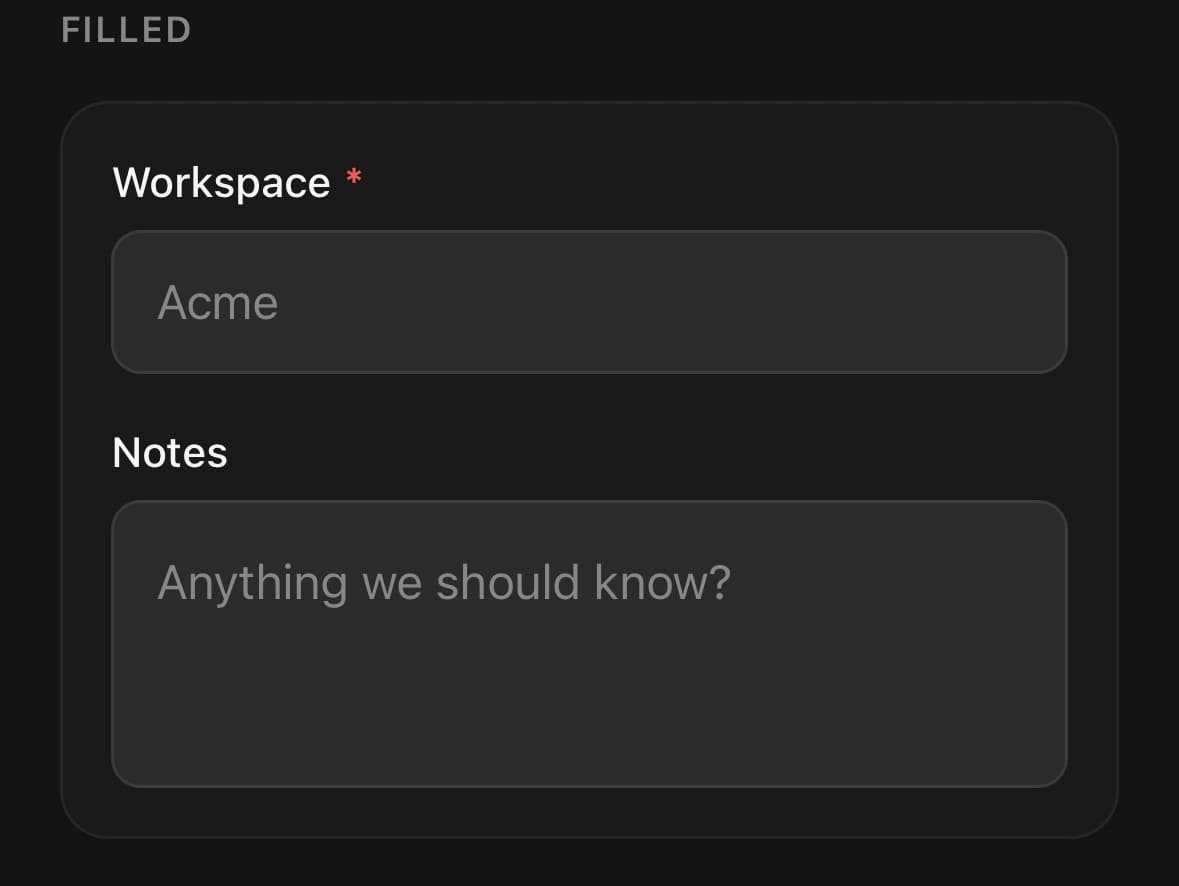
{/* On the page, where the field draws its own edge. */}
<Input variant="outline" label="Email" />

{/* Inside a card or a sheet, where a second border reads as a seam. */}
<Input variant="filled" label="Email" />
size
xssmmd(default)lgxl
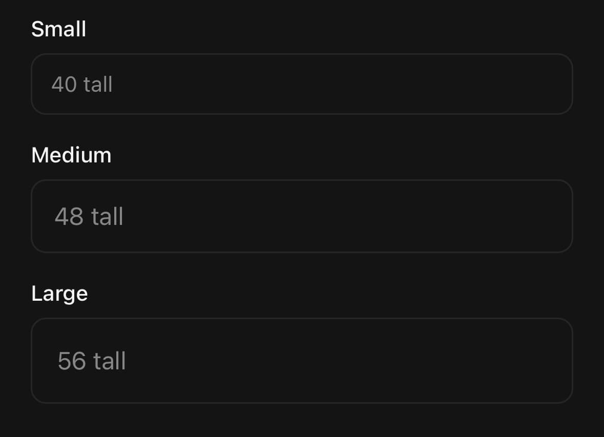
<Input size="xs" placeholder="32 tall" />
<Input size="sm" placeholder="40 tall" />
<Input size="md" placeholder="48 tall" />
<Input size="lg" placeholder="56 tall" />
<Input size="xl" placeholder="64 tall" />
API Reference
Input
| Prop | Type | Default | Description |
|---|---|---|---|
className | string | — | |
containerClassName | string | — | |
label | string | — | |
description | string | — | |
errorMessage | string | — | Error message. When set, the field renders in its invalid state. |
isRequired | boolean | — | Marks the field required — an asterisk on the label, and the a11y state. |
disabled | boolean | — | |
startContent | ReactNode | — | Content inside the field, before the text — usually an icon. Measured, so the text is padded clear of it however wide it is. start, not left: it follows the reading direction, and swaps sides under Direction dir="rtl" along with the text it introduces. |
endContent | ReactNode | — | Content inside the field, after the text — an icon, a unit, a count. |
interactiveContent | boolean | true | Whether touches reach the content. On by default, so a button placed in the field — a clear ✕, a show-password eye, a unit picker — is pressable without anything else being passed. Only the content itself takes those touches: the padding around it is transparent, so a tap that misses the button still lands on the field and puts the caret in it. Turn it off for pure decoration, where the icon should not be a target at all and every pixel of the field should focus it. That also drops the content from the accessibility tree, which is right for an icon that only restates the label. |
avoidKeyboard | boolean | false | Keep the field clear of the software keyboard. Moves by exactly the overlap, and not at all when the field is already clear — or when the keyboard belongs to a different field. The overlap is re-read every frame while the field is focused, so the field keeps its place in the page as it scrolls under and back out of the keyboard. Install react-native-keyboard-controller for this to behave on Android. Do not toggle this at runtime — it changes which component renders the container, which would remount the field and drop focus. |
keyboardMode | KeyboardAvoidanceMode | 'lift' | How the field gets clear. lift moves it up by its overlap and follows the scroll — right for a field in the flow of a page. dock makes it travel with the keyboard, for a composer already pinned near the bottom edge; pair it with keyboardBottomInset. |
keyboardOffset | number | 16 | Gap kept between the field and the keyboard. keyboardMode="lift" only. |
keyboardBottomInset | number | 0 | How far above the bottom edge the field already sits — usually the safe area inset. keyboardMode="dock" only. |
Every part also accepts the underlying React Native props (ViewProps or TextProps) and a className for Tailwind utilities.
Notes
Accepts every TextInputProps. The placeholder colour is resolved from the theme, so it follows light and dark automatically.
The focus border is animated with a shared value rather than switched with a class, because a class can only be swapped wholesale — which is the snap the animation exists to avoid. An invalid field is tinted at rest as well as on focus: the error is a fact about the value, not about whether the field happens to be focused.
Content inside the field
startContent and endContent are measured and turned into padding on the text, so a value never runs underneath them. Removing either one removes its measured padding in the same render, so a conditional clear button or spinner cannot leave an empty inset behind. They are positioned against the field box — not against the component — which is the whole reason they are props rather than something you compose around the outside: a label sits above the field and a description below it, so anything centred on the component as a whole drifts upward the moment a label is added.
They are start and end rather than left and right because they follow the reading direction, and swap sides under Direction dir="rtl" along with the text they introduce.
Content is pressable by default, so a button placed in the field — a clear ✕, a show-password eye, a unit picker — works without anything else being passed. Only the content itself takes those touches: the padding around it stays transparent, so a tap that misses the button still lands on the field and puts the caret in it.
Pass interactiveContent={false} for pure decoration. The icon stops being a target at all, every pixel of the field focuses it, and the content leaves the accessibility tree — which is what an icon that only restates the label should do.
The prop covers both ends at once, since it is one field. When one end is decoration and the other is a control, leave it on and wrap the decorative one in a <View pointerEvents="none">.
InputGroup is still the right answer for a decorator that is not part of the field: a button attached to its end, a select bolted to its start, an addon with a background of its own. It measures the same way; it just spans a different box.
Avoiding the keyboard
avoidKeyboard measures the field and translates it by exactly the overlap with the keyboard — and not at all when the field is already above it, or when the keyboard was opened by a different field. Only the field being typed into moves; without that rule every avoiding field on the screen would lift at once and land stacked on top of the others. That is the difference from KeyboardAvoidingView, which shifts an entire subtree by the full keyboard height wherever the field happens to sit.
The overlap is re-measured every frame for as long as the field is focused and the keyboard is up, which is what lets a field inside a ScrollView hold its place: scroll it clear of the keyboard and the lift decays to nothing, scroll it back under and the lift returns. Measuring once at the moment of focus is right for exactly one frame — after that the field is holding an offset that belongs to where it used to be.
keyboardMode="dock" is the other shape of the problem: a composer or a search bar that is already pinned near the bottom edge and should ride the keyboard rather than get out of its way. It measures nothing; it travels by the keyboard height less keyboardBottomInset, the inset it is already sitting above.
Install react-native-keyboard-controller for this to behave on Android:
npx expo install react-native-keyboard-controllerIt is an optional peer, and PanelUIProvider mounts its KeyboardProvider for you when it is present. Without it the hook falls back to Reanimated's useAnimatedKeyboard, which is deprecated in Reanimated 4 and — merely by being called — switches Android out of adjustResize for the whole app.
Use keyboardOffset to change the gap it keeps (16px by default). Do not toggle avoidKeyboard at runtime: it changes which component renders the container, which would remount the field and drop focus.
For anything that is not an Input — a toolbar, a composer, a whole card — use the KeyboardAvoider primitive or the useKeyboardAvoidance hook directly.
Public exports
Values: Input
Types: InputProps