

Table
Rows and columns that stay lined up, with sortable headers.
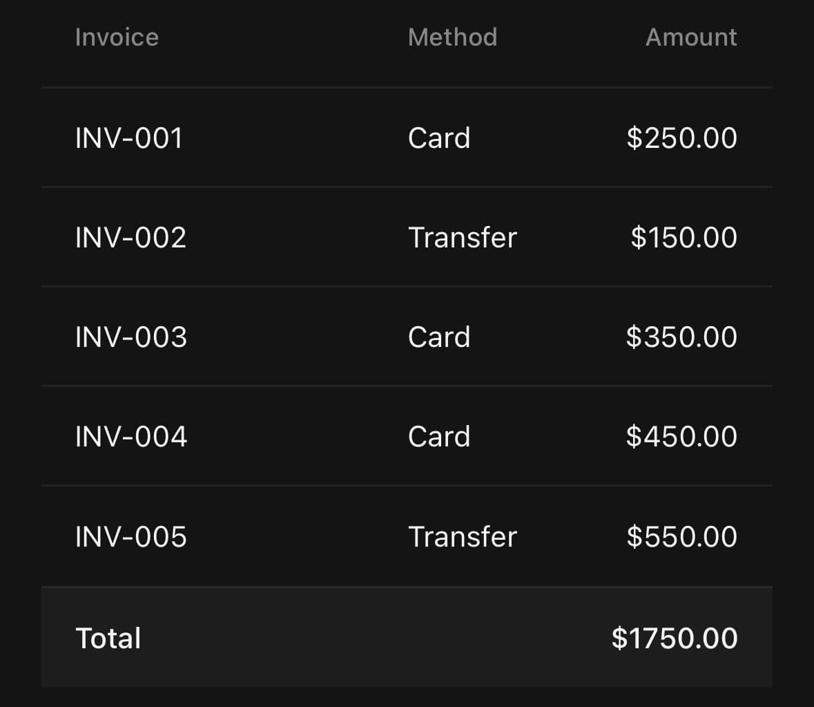
Rows and columns that stay lined up, with sortable headers.
React Native has no table layout, so a table here is a stack of flex rows whose cells divide the width the same way. The component owns everything that is not that: the hairlines, the muted header and footer bands, optional striping, per-column alignment, and a sort arrow that turns over rather than being swapped.
Tables are wide and phones are not. For a list of records on a phone, a column of Item rows usually reads better.
Installation
Table ships with the library — no separate install.
import { Table, Badge, ScrollFade, Pagination } from 'panelui-native';Or copy the source into your project, to own and edit it:
npx panelui-cli@latest add tableUsage
<Table variant="outline" columns={[{ flex: 2 }, {}, { align: 'end' }]}>
  <Table.Header>
    <Table.Row>
      <Table.Head>Invoice</Table.Head>
      <Table.Head>Method</Table.Head>
      <Table.Head>Amount</Table.Head>
    </Table.Row>
  </Table.Header>
  <Table.Body>
    <Table.Row>
      <Table.Cell>INV-001</Table.Cell>
      <Table.Cell>Card</Table.Cell>
      <Table.Cell>$250.00</Table.Cell>
    </Table.Row>
  </Table.Body>
</Table>
Composition
<Table.Frame>
  <Table.Header />
  <Table.Body />
</Table.Frame>

<Table>
  <Table.Header>
    <Table.Row>
      <Table.Head />
    </Table.Row>
  </Table.Header>
  <Table.Body>
    <Table.Row>
      <Table.Cell />
    </Table.Row>
  </Table.Body>
  <Table.Footer>
    <Table.Row>
      <Table.Cell />
    </Table.Row>
  </Table.Footer>
  <Table.Empty />
  <Table.Caption />
</Table>
Nothing in React Native connects the third cell of one row to the third cell of the next except both of them dividing the row the same way. columns on the root is what states that once: one entry per column, and every Table.Head and Table.Cell takes its flex, width and align from the entry at its own position in the row. Anything set on a head or a cell still wins, for the one row that has to differ.
Without it the sizing has to be repeated on every head and every cell, and the column drifts the moment two of them disagree — which on a five-row, three-column table is eighteen places to keep in agreement by hand.
Table.Frame is the other place that rule gets easier rather than harder. The headings end up outside the card, but they are still the same Table.Header you would have written inside it, and the lift keeps them measuring against the same padding as the rows.
Examples
Basic
Cells divide the row evenly unless told otherwise. flex={2} gives a column twice the share of the leftover width, and align="end" puts a money column’s digits against the same edge so they read as a column.
<Table variant="outline">
  <Table.Header>
    <Table.Row>
      <Table.Head flex={2}>Invoice</Table.Head>
      <Table.Head>Method</Table.Head>
      <Table.Head align="end">Amount</Table.Head>
    </Table.Row>
  </Table.Header>
  <Table.Body>
    {invoices.map((invoice) => (
      <Table.Row key={invoice.id}>
        <Table.Cell flex={2}>{invoice.id}</Table.Cell>
        <Table.Cell>{invoice.method}</Table.Cell>
        <Table.Cell align="end">{invoice.amount}</Table.Cell>
      </Table.Row>
    ))}
  </Table.Body>
  <Table.Footer>
    <Table.Row>
      <Table.Cell flex={2} labelClassName="font-medium">Total</Table.Cell>
      <Table.Cell />
      <Table.Cell align="end" labelClassName="font-medium">$1,750.00</Table.Cell>
    </Table.Row>
  </Table.Footer>
</Table>
Declared columns
The same table with its sizing moved to one array. A column is described once, at the top, and a row is just its contents — there is no longer a flex on a head that a cell underneath can contradict.
Declare it outside render. A fresh array every frame renumbers every cell in the table.
const columns = [{ flex: 2 }, {}, { align: 'end' as const }];

<Table variant="outline" columns={columns}>
  <Table.Header>
    <Table.Row>
      <Table.Head>Invoice</Table.Head>
      <Table.Head>Method</Table.Head>
      <Table.Head>Amount</Table.Head>
    </Table.Row>
  </Table.Header>
  <Table.Body>
    {invoices.map((invoice) => (
      <Table.Row key={invoice.id}>
        <Table.Cell>{invoice.id}</Table.Cell>
        <Table.Cell>{invoice.method}</Table.Cell>
        <Table.Cell>{invoice.amount}</Table.Cell>
      </Table.Row>
    ))}
  </Table.Body>
</Table>
Striped
Tints every other body row, which helps the eye track across a wide one. Leave it off for a short table, where the stripes are louder than the data.
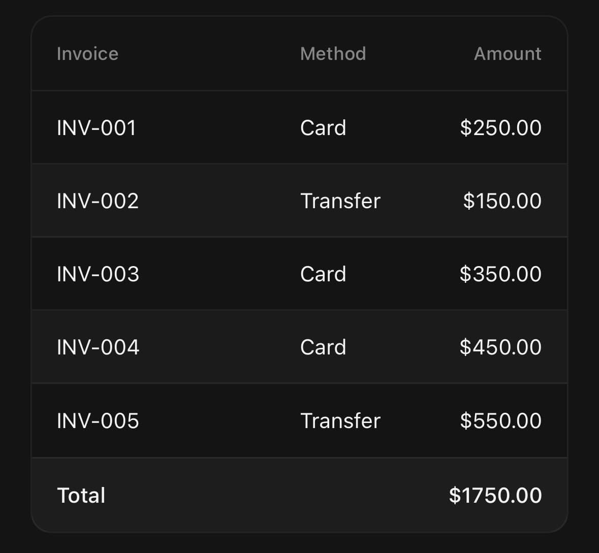
<Table variant="outline" striped>
  {/* …header and body… */}
</Table>
In a frame
Column headings are not data. Table.Frame puts them on the tray above the card, where they read as the label for the block, and leaves the card holding nothing but rows. Give it the whole table — it takes the Table.Header out itself, so the columns are still declared once. A title and a description are the same muted line on the tray, so a caption that fits on one line should be one — description is for a second thought, not the rest of the first.
<Table.Frame
  title="Five most recent invoices"
  action={<Badge variant="outline">Q3</Badge>}
>
  <Table.Header>
    <Table.Row>
      <Table.Head flex={2}>Invoice</Table.Head>
      <Table.Head>Method</Table.Head>
      <Table.Head align="end">Amount</Table.Head>
    </Table.Row>
  </Table.Header>
  <Table.Body>
    {invoices.map((invoice) => (
      <Table.Row key={invoice.id}>
        <Table.Cell flex={2}>{invoice.id}</Table.Cell>
        <Table.Cell>{invoice.method}</Table.Cell>
        <Table.Cell align="end">{invoice.amount}</Table.Cell>
      </Table.Row>
    ))}
  </Table.Body>
</Table.Frame>
Sortable columns
A header given onPress is the handle for sorting by its column. Pass sortDirection to the column being sorted by and leave it off the others: that column takes a full-strength arrow and a foreground label, while the rest keep a dimmed arrow saying they could be sorted too. The arrow rotates between the two directions rather than being replaced, so it stays the same arrow pointing the other way.
const [column, setColumn] = useState<'id' | 'amount'>('amount');
const [direction, setDirection] = useState<'asc' | 'desc'>('desc');

const sortBy = (next: 'id' | 'amount') => {
  if (next === column) {
    setDirection((d) => (d === 'asc' ? 'desc' : 'asc'));
    return;
  }
  setColumn(next);
  setDirection('asc');
};

<Table.Head
  flex={2}
  sortable
  sortDirection={column === 'id' ? direction : undefined}
  onPress={() => sortBy('id')}
>
  Invoice
</Table.Head>
Selectable rows
A row with an onPress announces itself as a button rather than as a row, since being tappable is the more useful fact. selected lights the chosen one.
const [picked, setPicked] = useState('INV-002');

<Table.Body>
  {invoices.map((invoice) => (
    <Table.Row
      key={invoice.id}
      selected={picked === invoice.id}
      onPress={() => setPicked(invoice.id)}
    >
      <Table.Cell flex={2}>{invoice.id}</Table.Cell>
      <Table.Cell>
        <Badge variant="success">{invoice.status}</Badge>
      </Table.Cell>
    </Table.Row>
  ))}
</Table.Body>
Wider than the screen
More columns than a phone is wide belong in a horizontal scroller, not squeezed until the columns are unreadable. Give the table a minWidth and a fixed width per column, and wrap it in ScrollFade so the fading edge says there is more to the right. The w-full on the wrapper is load-bearing — without a width of its own it shrink-wraps to the scroller’s content and the table runs off the screen instead of clipping.
<ScrollFade size={24} className="w-full self-start">
  <ScrollView horizontal showsHorizontalScrollIndicator={false}>
    <Table variant="outline" size="sm" striped style={{ minWidth: 440 }}>
      <Table.Header>
        <Table.Row>
          <Table.Head width={86}>Invoice</Table.Head>
          <Table.Head width={100}>Customer</Table.Head>
          <Table.Head width={82}>Status</Table.Head>
          <Table.Head width={92} align="end">Amount</Table.Head>
        </Table.Row>
      </Table.Header>
      {/* …body, with the same widths… */}
    </Table>
  </ScrollView>
</ScrollFade>
Nothing to show
A header with no rows under it looks broken rather than empty. Table.Empty replaces the body and keeps the header, which is worth keeping: it says what would be there.
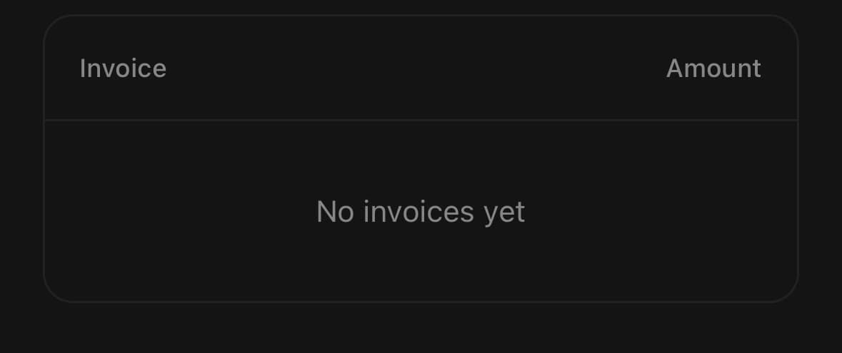
<Table variant="outline">
  <Table.Header>
    <Table.Row>
      <Table.Head flex={2}>Invoice</Table.Head>
      <Table.Head align="end">Amount</Table.Head>
    </Table.Row>
  </Table.Header>
  <Table.Empty>No invoices yet</Table.Empty>
</Table>
With a caption
A line about the table as a whole — what it counts, when it was last read. Place it after the body: a caption read before the columns is a heading, and a heading is not this component's job.
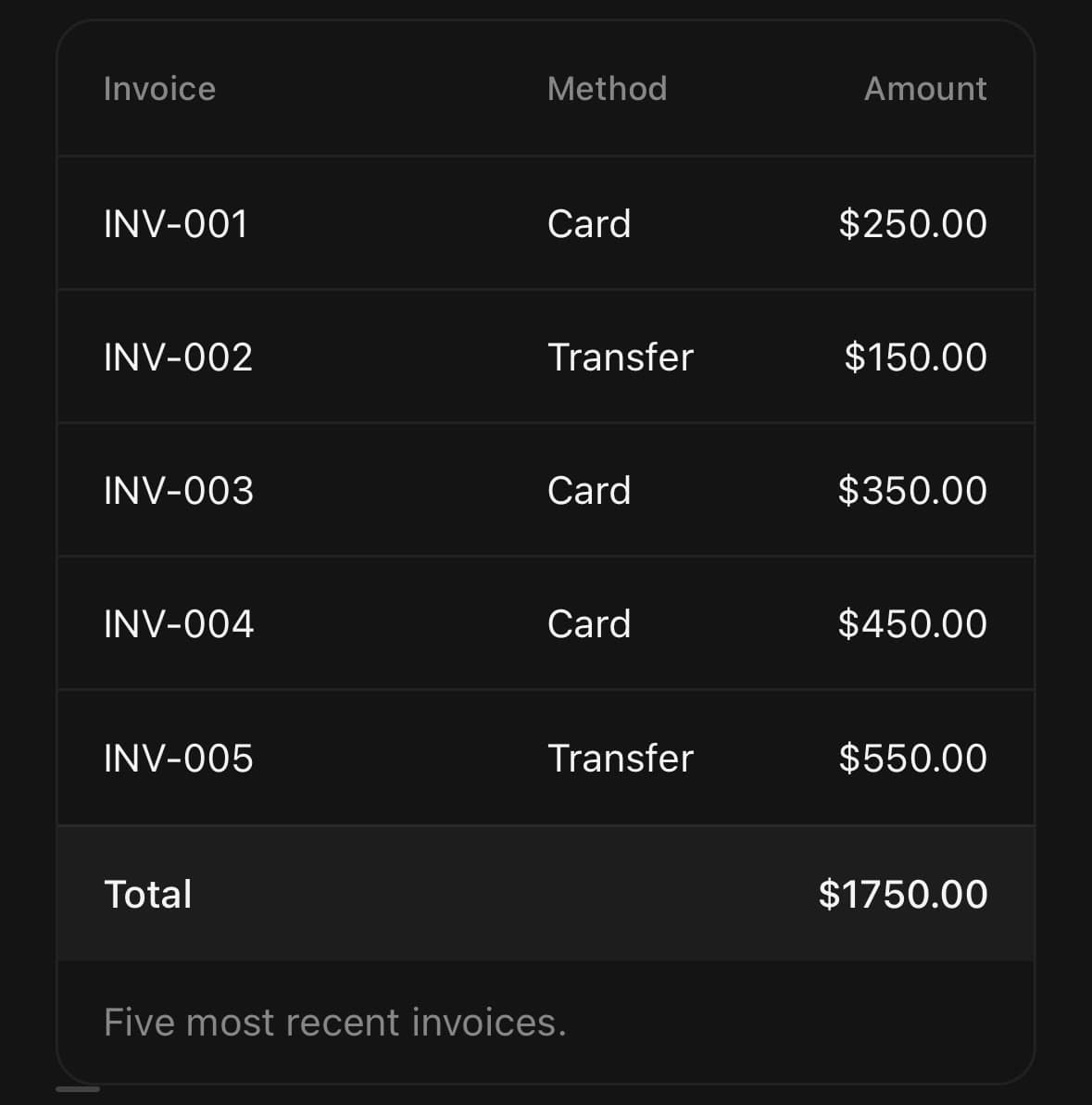
<Table variant="outline">
  <Table.Header>…</Table.Header>
  <Table.Body>…</Table.Body>
  <Table.Caption className="px-4 py-3">
    Five most recent invoices.
  </Table.Caption>
</Table>
Paged
Pagination reports the page; slicing the rows stays with you. Put it under the table with a Pagination.Status for the span, and the footer says both where you are and how much is left.
const [page, setPage] = useState(1);
const pageSize = 20;
const rows = invoices.slice((page - 1) * pageSize, page * pageSize);

<Pagination
  count={Math.ceil(invoices.length / pageSize)}
  page={page}
  onPageChange={setPage}
  variant="compact"
  size="sm"
>
  <Pagination.Status pageSize={pageSize} total={invoices.length} />
</Pagination>
Variants
variant
default(default)outline
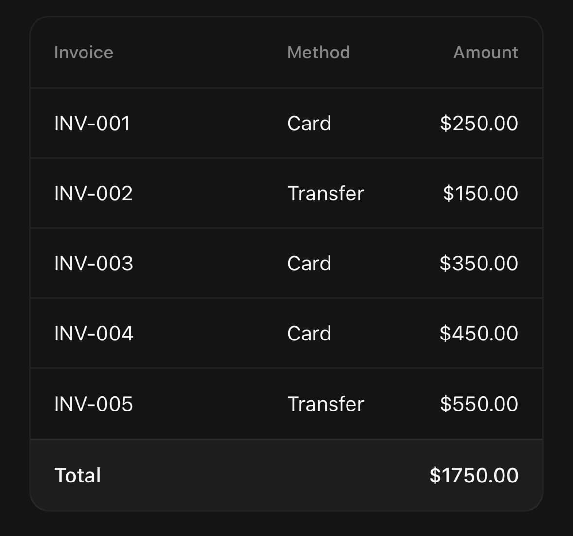
<Table variant="default">…</Table>
<Table variant="outline">…</Table>
size
default(default)sm
<Table size="default">…</Table>
<Table size="sm">…</Table>
API Reference
Table
| Prop | Type | Default | Description |
|---|---|---|---|
className | string | — | |
size | TableSize | default | Row density. Table.Row, Table.Head and Table.Cell follow it, so it only needs setting here. |
striped | boolean | false | Tint every other body row. Helps the eye track across a wide row; drop it for a short table, where the stripes are louder than the data. |
columns | TableColumn[] | — | The column model: one entry per column, in order. Every Table.Head and Table.Cell takes its flex, width and align from the entry at its own position in the row, so a column is described once instead of on every row. Anything set on a head or a cell still wins. Declare it outside render — a new array each frame renumbers every cell. |
Table.Header
| Prop | Type | Default | Description |
|---|---|---|---|
className | string | — |
Table.Body
| Prop | Type | Default | Description |
|---|---|---|---|
className | string | — |
Table.Footer
| Prop | Type | Default | Description |
|---|---|---|---|
className | string | — |
Table.Row
| Prop | Type | Default | Description |
|---|---|---|---|
className | string | — | |
selected | boolean | — | Marks the row as the chosen one — for a table you pick from. |
disabled | boolean | — | |
index | number | — | Position in the section, for a row rendered outside Table.Body — a FlatList item, say. Decides which rows a striped table tints. |
last | boolean | — | Whether this is the section's final row, for a row rendered outside Table.Body. The last row drops its hairline so it does not double up with the table's own bottom edge. |
Table.Head
| Prop | Type | Default | Description |
|---|---|---|---|
className | string | — | |
flex | number | — | Share of the leftover width, relative to the other cells in the row. Defaults to 1, so columns divide the row evenly. Without a columns model on the root it must match the flex on the cells beneath it. |
width | number | — | Fixed width in pixels, for a column that must not move — an icon, a state dot. Without a columns model on the root it must match the width on the cells beneath it. |
align | CellAlign | — | Which edge the column's content sits against. Use end for numbers: a money column reads as a column only when the digits line up. |
sortable | boolean | — | Show the sort arrow without committing to a direction — the column can be sorted, but is not the one being sorted by. Implied by sortDirection. |
sortDirection | TableSortDirection | — | The direction this column is currently sorted in. Turns the arrow over. |
onPress | AnimatedPressableProps['onPress'] | — | Called on a tap. Supplying it makes the header a button. |
labelClassName | string | — | Styles the header's text. |
Table.Cell
| Prop | Type | Default | Description |
|---|---|---|---|
className | string | — | |
flex | number | — | Share of the leftover width, relative to the other cells in the row. Defaults to 1. Without a columns model on the root it must match the flex on the head above it. |
width | number | — | Fixed width in pixels, for a column that must not move. Without a columns model on the root it must match the width on the head above it. |
align | CellAlign | — | Which edge the cell's content sits against. Without a columns model on the root, match the head above it. |
labelClassName | string | — | Styles the cell's text. |
Table.Caption
| Prop | Type | Default | Description |
|---|---|---|---|
className | string | — |
Table.Empty
| Prop | Type | Default | Description |
|---|---|---|---|
className | string | — |
Table.Frame
| Prop | Type | Default | Description |
|---|---|---|---|
className | string | — | |
title | ReactNode | — | Caption on the tray, above the column headings. |
action | ReactNode | — | Trailing slot on the title row — a button, a badge, a menu. |
description | ReactNode | — | A line under the title, for what the table is counting. |
size | TableSize | default | Row density, as on Table. |
striped | boolean | false | Tint every other body row, as on Table. |
columns | TableColumn[] | — | The column model, as on Table. |
Every part also accepts the underlying React Native props (ViewProps or TextProps) and a className for Tailwind utilities.
Notes
Columns are a convention, not a mechanism
There is no column model. A column exists because every row divides its width the same way, so flex and width on a Table.Head and on the Table.Cells beneath it have to agree. flex is a share of the leftover width — the default of 1 makes columns even — and width pins a column that must not move, such as an icon or a state dot.
Sorting is yours
The table renders a sort direction; it never sorts. sortDirection says which way the arrow points and onPress reports the tap — reordering the rows stays with you, because the data being reordered is yours and only you know whether that means a comparator, a refetch or a new query.
What the component does own is making the press land. The sorted column takes a full-strength arrow and a foreground label at a heavier weight, because one signal at the size of a sort arrow is too quiet: a press that only nudges a dim chevron reads as a press that did nothing, even when the rows behind it did move.
Long tables
Table.Body renders every row it is given, so a table of thousands belongs in a FlatList instead. Table.Row takes index and last directly for that case: a virtualised row has no Table.Body above it to read its position from, and without them a striped table would tint nothing and every row would keep its hairline.
<FlatList
  data={invoices}
  renderItem={({ item, index }) => (
    <Table.Row index={index} last={index === invoices.length - 1}>
      <Table.Cell flex={2}>{item.id}</Table.Cell>
      <Table.Cell align="end">{item.amount}</Table.Cell>
    </Table.Row>
  )}
/>
Wrap the list in a Table so the rows still read the density and striping, and put the header row above the list rather than inside it.
Accessibility
The root, the bands, the rows and the cells carry table, rowgroup, row, columnheader and cell roles, so a screen reader walks the table as a table. A row given onPress is the exception: it announces itself as a button, because being able to act on it is the more useful fact about it.
Table.Row forwards ordinary view or Pressable props for the branch it renders, while retaining ownership of its row/selected/disabled semantics, row classes, and—when interactive—its button role and primary press handler.
Public exports
Values: Table
Types: TableProps, TableFrameProps, TableHeaderProps, TableBodyProps, TableFooterProps, TableRowProps, TableHeadProps, TableCellProps, TableCaptionProps, TableEmptyProps, TableColumn, TableSortDirection