

AvatarCropper
Frame a photo under a circle, and get that circle back as an image.
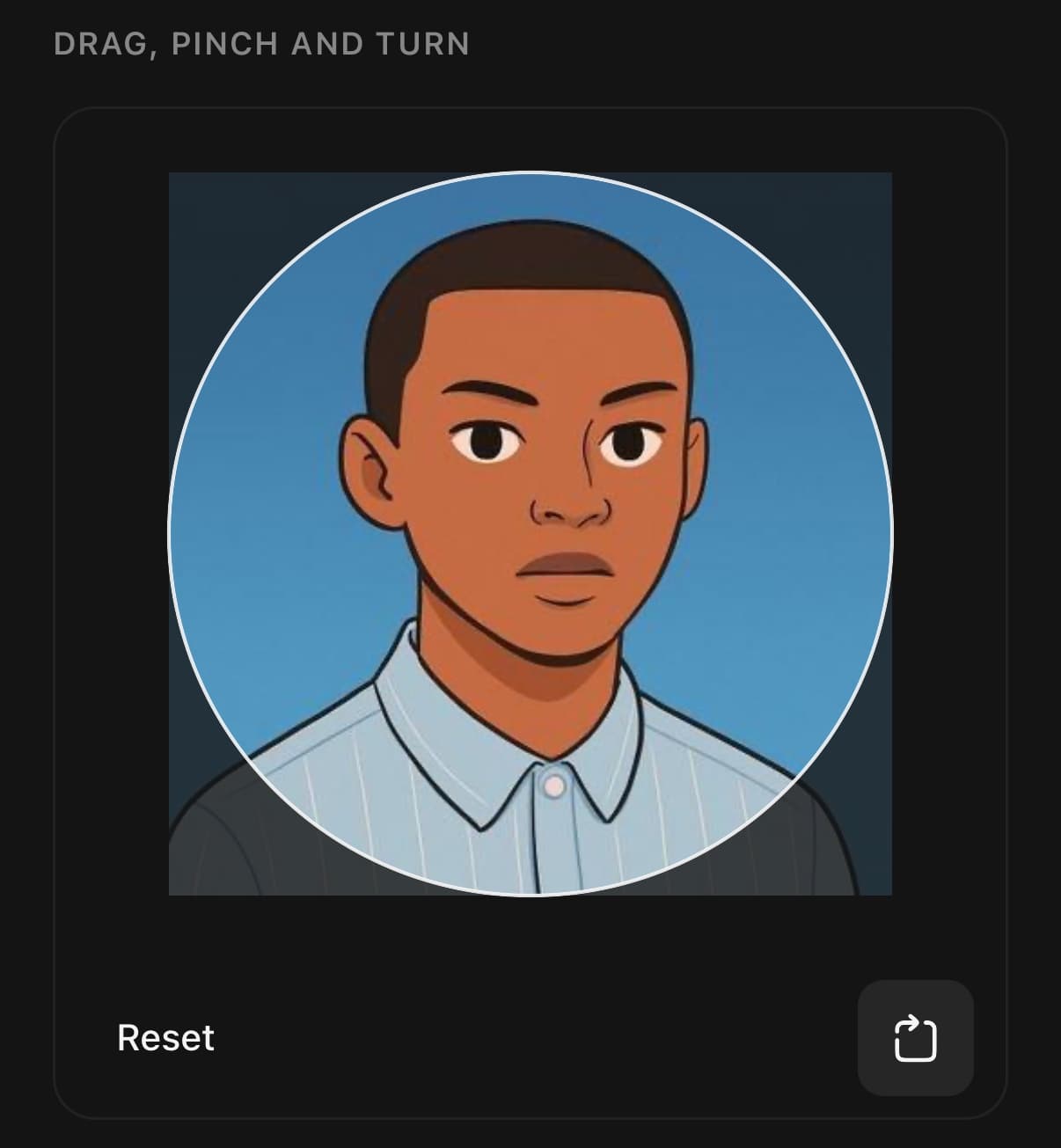
Use it for a profile photo: the user drags, pinches and turns a photo under a fixed outline, and crop() writes what is inside the outline to a new square image. pickAvatarImage() gets the photo from the library or the camera first.
By default the photo always covers the outline. Let go past an edge, or zoom out too far, and it springs back to the nearest position that fills it. Set cover={false} to let the photo be zoomed out smaller than the outline; background fills the space around it.
Writing the image needs the optional expo-image-manipulator, and picking a photo needs the optional expo-image-picker. A crop with background in it is drawn and captured instead, which needs the optional react-native-view-shot. All three run in Expo Go.
Without the manipulator, getCrop() still returns the rectangle the outline covers, in the photo's pixels, for an app that crops on its server. To show a photo without editing it, use Avatar. To let the user look at one full screen, use ImageViewer.
Installation
AvatarCropper ships with the library — no separate install.
import { AvatarCropper, Avatar, Button, pickAvatarImage, type AvatarCropperHandle, type AvatarCropperSource } from 'panelui-native';Or copy the source into your project, to own and edit it:
npx panelui-cli@latest add avatar-cropperUsage
const cropper = useRef<AvatarCropperHandle>(null);

<AvatarCropper ref={cropper} source={photo}>
  <AvatarCropper.Canvas />
  <View className="flex-row justify-between p-4">
    <AvatarCropper.Reset />
    <AvatarCropper.Rotate />
  </View>
</AvatarCropper>

const { uri } = await cropper.current!.crop({ size: 512 });
Composition
<AvatarCropper ref={cropper} source={photo}>
  <AvatarCropper.Canvas />
  <AvatarCropper.Reset />
  <AvatarCropper.Rotate />
</AvatarCropper>AvatarCropper.Canvas— The photo under its outline, and the surface the gestures land on. It fills the space it is given. Leave the root's children out and it is rendered on its own.AvatarCropper.Rotate— An icon button that turns the photo a quarter turn about the middle of the outline.direction="counterclockwise"turns it the other way.AvatarCropper.Reset— A text button that puts the photo back centred, unzoomed and upright.
Examples
Pick, crop, show
pickAvatarImage() resolves null when the user cancels. It throws when camera permission is refused, so the app can say why nothing happened.
const cropper = useRef<AvatarCropperHandle>(null);
const [photo, setPhoto] = useState<AvatarCropperSource | null>(null);
const [avatar, setAvatar] = useState<string | null>(null);

const choose = async () => setPhoto(await pickAvatarImage({ from: 'library' }));

const done = async () => {
  const result = await cropper.current?.crop({ size: 512 });
  if (result) setAvatar(result.uri);
  setPhoto(null);
};

{photo ? (
  <AvatarCropper ref={cropper} source={photo}>
    <AvatarCropper.Canvas />
    <Button onPress={done}>Done</Button>
  </AvatarCropper>
) : (
  <>
    <Avatar size="xl" source={avatar ? { uri: avatar } : undefined} fallback="KA" />
    <Button onPress={choose}>Choose photo</Button>
  </>
)}
Shapes
Match the outline to where the photo will be shown. The written image is square for every shape, so the screen that draws it decides its corners.
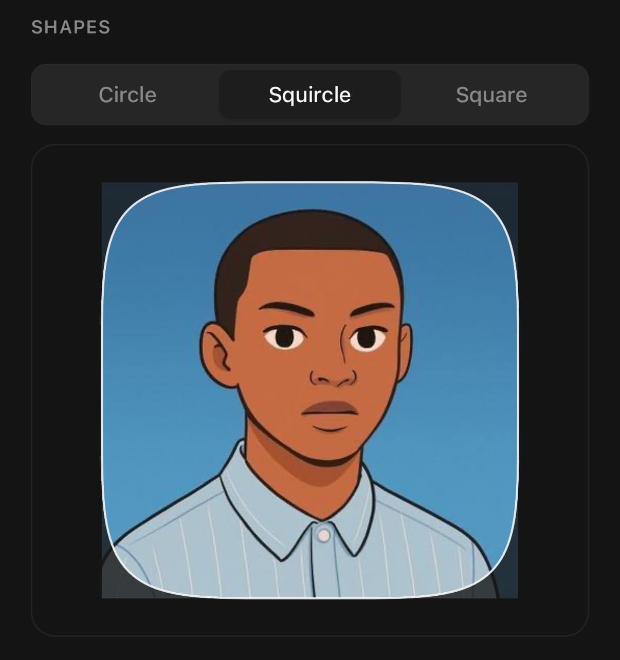
<AvatarCropper source={photo} shape="circle" />
<AvatarCropper source={photo} shape="squircle" />
<AvatarCropper source={photo} shape="square" />
Zooming out past the outline
With cover={false} the photo can shrink until its long side is minZoom of the outline's width. background fills the gap on screen and in the written image. Pass 'transparent' to keep it empty; the image is then written as PNG.
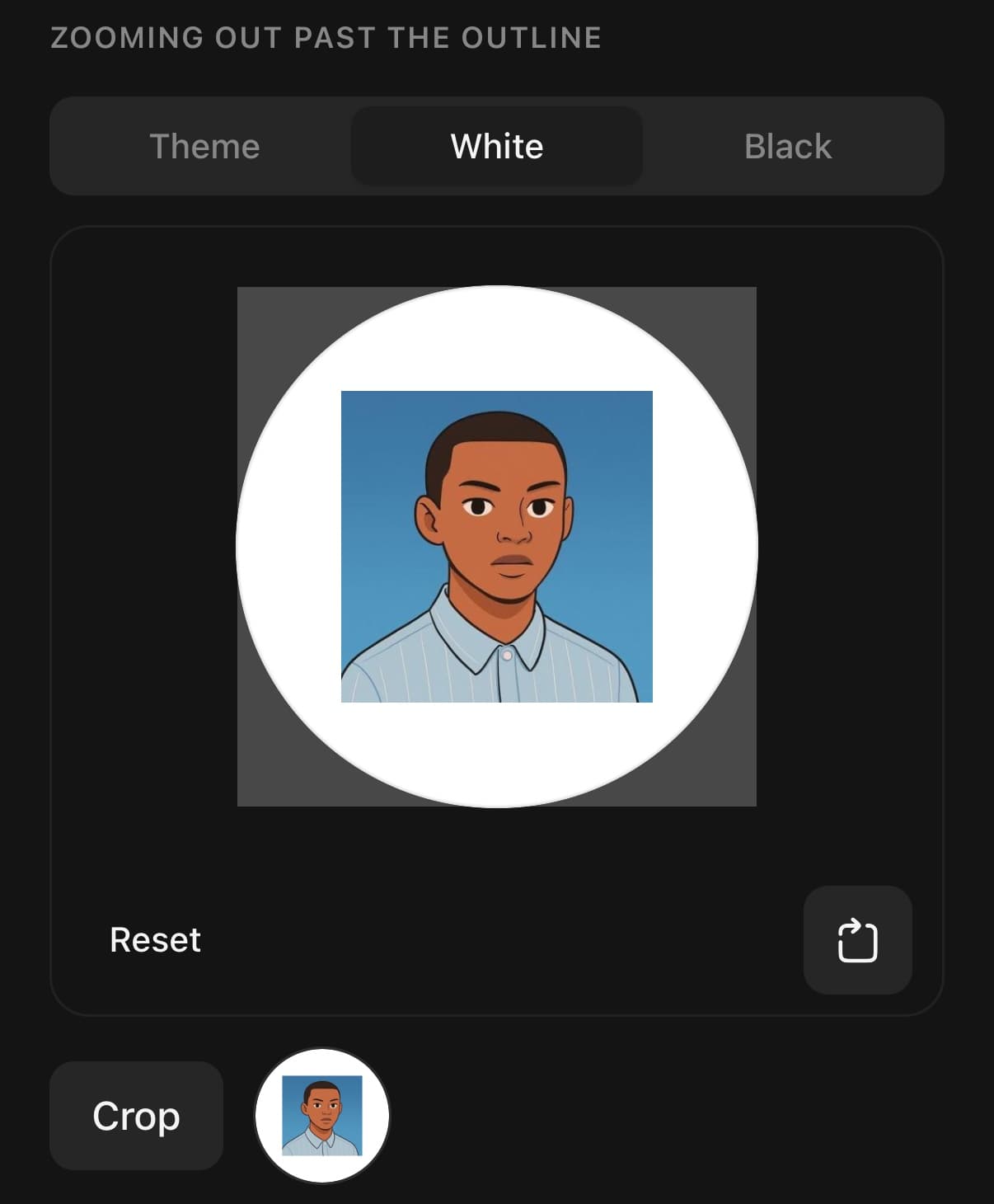
<AvatarCropper
  ref={cropper}
  source={photo}
  cover={false}
  background="#ffffff"
/>

<AvatarCropper source={photo} cover={false} minZoom={0.3} background="transparent" />
Cropping on a server
getCrop() needs no optional package. Turn the original by rotation degrees clockwise, then cut the rectangle out of the result.
const crop = cropper.current?.getCrop();
// { originX: 812, originY: 340, width: 1500, height: 1500,
//   rotation: 90, canvas: { width: 3000, height: 4000 } }

await upload(photo.uri, crop);
Size and format
size is the side of the written image, in pixels. A crop with fewer pixels than that is written at its own size rather than scaled up.
await cropper.current?.crop({ size: 256, format: 'png' });
await cropper.current?.crop({ size: 1024, format: 'jpeg', compress: 0.8 });
Versions
Change photo
A profile with the two ways to replace its photo. The cropper takes over the screen between choosing a photo and seeing it in the avatar.
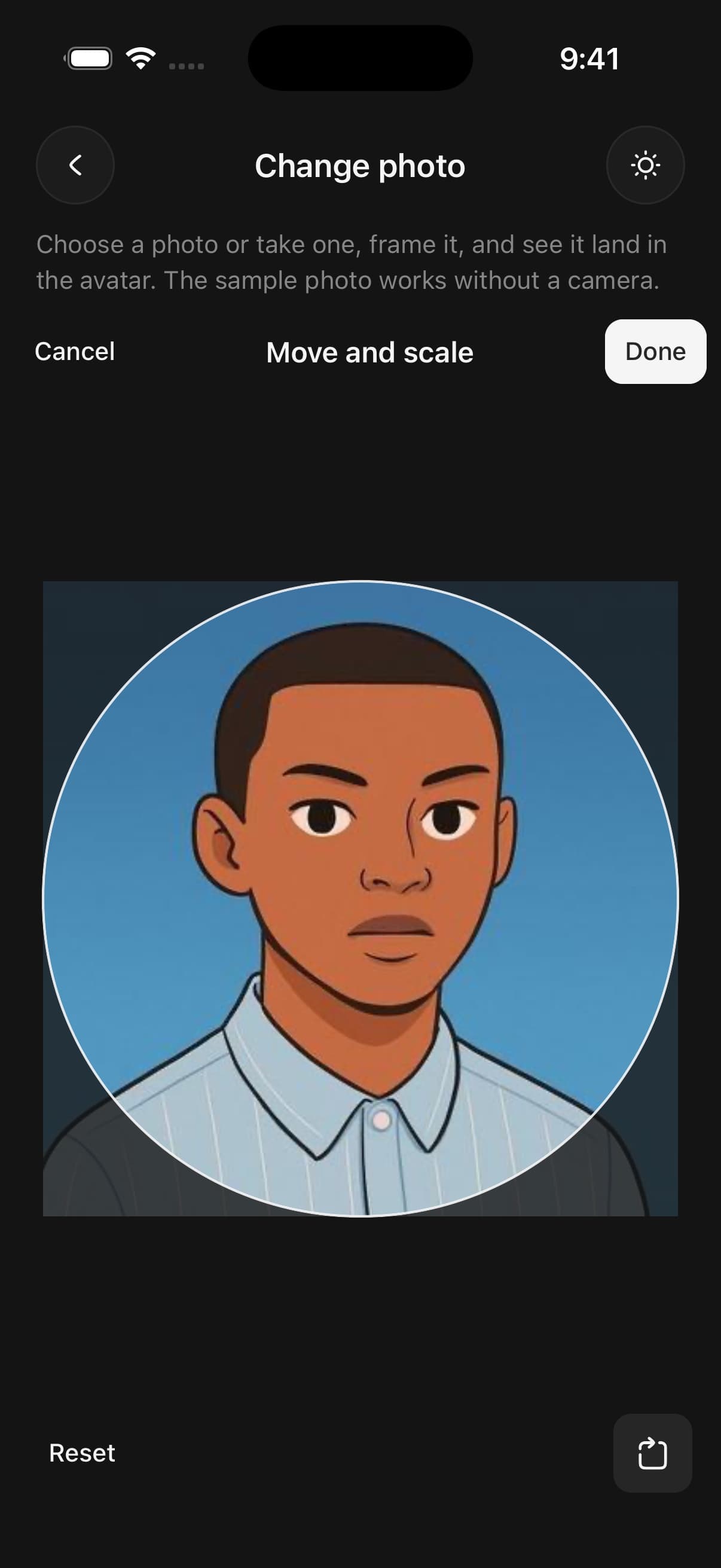
if (photo) {
  return (
    <AvatarCropper ref={cropper} source={photo}>
      <AvatarCropper.Canvas />
      <View className="flex-row justify-between px-4">
        <AvatarCropper.Reset />
        <AvatarCropper.Rotate />
      </View>
    </AvatarCropper>
  );
}
API Reference
AvatarCropper
| Prop | Type | Default | Description |
|---|---|---|---|
source | AvatarCropperSource | — | The photo. Changing it starts the crop again from the centre. |
shape | CropShape | 'circle' | The outline the photo is framed in. Default 'circle', which is how Avatar draws it. The image written out is square for every shape. |
maxZoom | number | 5 | How far the photo can be zoomed past filling the mask. Default 5. |
cover | boolean | true | Keep the photo covering the whole outline. Default true: let go past an edge, or zoom out too far, and it springs back to fill it. Set it to false to let the photo be zoomed out smaller than the outline, down to minZoom. The space around it is filled with background, on screen and in the image crop() writes. |
minZoom | number | 0.5 | With cover off, how small the photo can get: its long side as a fraction of the outline's width. Default 0.5. |
background | string | — | What fills the outline around a photo smaller than it, with cover off. Any colour React Native accepts, or 'transparent' — written out as PNG so it stays transparent. Default: the theme's background colour. |
inset | number | 24 | Space between the mask and the canvas's shorter side, in points. Default 24. |
className | string | — |
AvatarCropper.Canvas
| Prop | Type | Default | Description |
|---|---|---|---|
className | string | — | |
accessibilityLabel | string | 'Photo crop' | What a screen reader calls the canvas. Default "Photo crop". |
AvatarCropper.Rotate
| Prop | Type | Default | Description |
|---|---|---|---|
direction | 'clockwise' | 'counterclockwise' | 'clockwise' | Which way a press turns the photo. Default 'clockwise'. |
Every part also accepts the underlying React Native props (ViewProps or TextProps) and a className for Tailwind utilities.
Notes
Two fingers move, zoom and turn the photo at once. Zooming and turning happen about the point between the fingers.
A square or squircle outline needs more zoom at an angle than a circle does, because its corners reach further. The minimum zoom follows the angle.
Screen readers can zoom and rotate with the canvas's actions, and hear the current zoom and angle as its value.
The photo is redrawn upright before it is turned and cut, so a camera photo that stores its orientation as a flag comes out the right way up.
Taking a photo in a development build needs the camera permission strings from expo-image-picker's config plugin. Expo Go has them already.
With cover off, a photo larger than the outline still behaves as it does with cover on: the outline has to stay on the photo. Only a photo smaller than the outline is kept inside it instead, with background around it.
When the outline is fully on the photo, crop() cuts the photo's own pixels. When part of it is background, it draws the crop at the outline's on-screen size and captures that, scaled to size, so that image is limited to about the screen's resolution.
Public exports
Values: AvatarCropper, hasAvatarCropperExport, pickAvatarImage
Types: AvatarCrop, AvatarCropOptions, AvatarCropResult, AvatarCropperCanvasProps, AvatarCropperHandle, AvatarCropperProps, AvatarCropperResetProps, AvatarCropperRotateProps, AvatarCropperShape, AvatarCropperSource, PickAvatarImageOptions