

Fab
The floating action button — one action pinned over the content, with an optional dial of others behind it.
A single action, floating over the screen it belongs to.
It covers some of the content underneath it, and the bottom-right corner of a scrolling list is exactly where the last row ends up. Pad the bottom of the list so the last row can clear it — nothing here can work out how tall your list is.
That trade is worth making for one action. It stops being worth it at three: a corner with three buttons in it is a toolbar in the wrong place. When a screen has several actions, put a ButtonGroup in a bar instead, or — if one of them really does lead — keep this and put the rest behind a Fab.Group.
Installation
Fab ships with the library — no separate install.
import { Fab, PlusIcon, PencilIcon, ImageIcon, PaperclipIcon, MicIcon, TrashIcon, SendIcon } from 'panelui-native';Or copy the source into your project, to own and edit it:
npx panelui-cli@latest add fabUsage
<Fab
  placement="bottom-right"
  icon={<PlusIcon size={24} />}
  accessibilityLabel="New note"
  onPress={compose}
/>
Composition
{/* on its own */}
<Fab icon={…} accessibilityLabel="…" onPress={…} />

{/* or with a dial behind it */}
<Fab.Group icon={…} accessibilityLabel="…">
  <Fab.Action icon={…} label="…" onPress={…} />
  <Fab.Action icon={…} label="…" onPress={…} />
</Fab.Group>

{/* or a menu */}
<Fab.Group layout="menu" icon={…} accessibilityLabel="…">
  <Fab.Action icon={…} label="…" onPress={…} />
</Fab.Group>
Fab.Action only works inside a Fab.Group — it reads the dial's open progress to know when its own turn to unfold is, and throws outside one rather than rendering something that would never animate.
Examples
Over a list
The case it exists for. placement pins it to a corner against the nearest positioned ancestor, which on a screen means the screen — so give the content below it enough bottom padding to scroll clear. Nothing here can work out how tall your list is, and a button sitting on the last row forever is the failure people actually hit.
<View className="flex-1">
  <ScrollView contentContainerStyle={{ paddingBottom: 96 }}>
    {/* …rows… */}
  </ScrollView>

  <Fab
    placement="bottom-right"
    icon={<PlusIcon size={24} />}
    accessibilityLabel="New note"
    haptics
    onPress={compose}
  />
</View>
Spelling the action out
A lone glyph is a guess unless the glyph is a plus. extended turns the circle into a stadium and puts the label beside it — worth the width for anything a plus would not have said on its own.

<Fab extended placement="bottom-right" icon={<PencilIcon size={20} />}>
  Write
</Fab>
A speed dial
The actions unfold one after another rather than together — a few frames apart each, which is enough to read as a list opening instead of a menu appearing. Every one carries its label, because a column of unlabelled circles is a quiz.
Opening drops a scrim over the screen. Not for looks: an open dial is modal — the next tap either picks something or closes it — and the scrim is both what says so and what catches the tap.
<Fab.Group icon={<PlusIcon size={24} />} accessibilityLabel="Add something" blur>
  <Fab.Action icon={<ImageIcon size={18} />} label="Photo" onPress={addPhoto} />
  <Fab.Action icon={<PaperclipIcon size={18} />} label="Attachment" onPress={attach} />
  <Fab.Action icon={<MicIcon size={18} />} label="Voice note" onPress={record} />
  <Fab.Action icon={<TrashIcon size={18} />} label="Empty drafts" destructive onPress={empty} />
</Fab.Group>
A menu
layout="menu" unfolds one panel of rows out of the button instead of a column of buttons — the shape the platform's own menus take. Each row is its label with a glyph, and the panel springs out of the corner the trigger sits in, so it reads as the button opening rather than a sheet arriving.
appearance picks the drawing. platform, the default, is the system's: a hairline between rows and the glyph after the label. wells is tighter, with the glyph leading in a tinted well and each row its own pill — a menu the app designed rather than the system. iconPlacement, menuWidth, menuRadius, menuClassName and rowClassName adjust either.
With glass the panel is one piece of the material and the rows are content on it. Without it the panel is the same surface a popover is. Everything else is the dial's: the scrim, the close on press, the back button.
<Fab.Group layout="menu" glass icon={<PlusIcon size={24} />} accessibilityLabel="Add something" blur>
  <Fab.Action icon={<ImageIcon size={18} />} label="Photo" onPress={addPhoto} />
  <Fab.Action icon={<PaperclipIcon size={18} />} label="Attachment" onPress={attach} />
  <Fab.Action icon={<MicIcon size={18} />} label="Voice note" onPress={record} />
  <Fab.Action icon={<TrashIcon size={18} />} label="Empty drafts" destructive onPress={empty} />
</Fab.Group>

{/* the app's own shape */}
<Fab.Group layout="menu" appearance="wells" glass icon={<PlusIcon size={24} />} accessibilityLabel="Add">
  <Fab.Action icon={<ImageIcon size={18} />} label="Photo" onPress={addPhoto} />
  <Fab.Action icon={<TrashIcon size={18} />} label="Empty drafts" destructive onPress={empty} />
</Fab.Group>
A native menu
layout="native" hands the menu to the platform: a SwiftUI menu on iOS, a Compose dropdown on Android. The trigger stays a Fab — it is passed to the platform as the thing you press — so the button keeps its variant, its size and its glass, and only the menu is the system's.
The rows are drawn by the platform, so className and the theme tokens do not reach them. A row takes label and, on iOS, systemImage — an SF Symbol name, because SwiftUI names its symbols rather than taking a view for one. destructive and disabled cross over. On Android the icon element is used instead, hosted at a fixed size.
blur still applies. The scrim behind the menu is ours, so the page recedes the way it does behind the dial and the panel, and the menu reads as belonging to the screen it opened on.
Where the menu sits is the platform's decision and cannot be set: iOS lifts it clear of the button, Android draws its dropdown over the anchor. The open state is the platform's too, so open and onOpenChange do nothing on iOS; Android's menu is controlled and honours both.
It needs the optional @expo/ui. Without it, and on the web, this falls back to layout="menu" — so a working fallback and a missing package look the same, and the package is worth checking before the code is.
<Fab.Group layout="native" glass blur icon={<PlusIcon size={24} />} accessibilityLabel="Add something">
  <Fab.Action systemImage="photo" label="Photo" onPress={addPhoto} />
  <Fab.Action systemImage="paperclip" label="Attachment" onPress={attach} />
  <Fab.Action systemImage="mic" label="Voice note" onPress={record} />
  <Fab.Action systemImage="trash" label="Empty drafts" destructive onPress={empty} />
</Fab.Group>
Liquid Glass
glass draws the button in the material iOS 26 uses for its own floating controls, in place of the variant's fill. A button floating over a list is what the material is for: the rows refract through it as they scroll under, and it lifts its own edge, so the shadow goes with the fill.
Every variant takes the plain material, with its glyph in the foreground colour and in red on destructive. A tint would only dim the glass: a colour laid on it turns it back into a fill, and a monochrome one greys it, so the colour that carries meaning goes on the glyph instead. Pressed, the material swells and brightens under the finger the way the platform's own glass controls do, in place of the usual press scale. On a Fab.Group the flag covers the trigger and every action.
It needs iOS 26 and the optional expo-glass-effect. Below that, on Android, on web, or with Reduce Transparency on, the flag does nothing and the button keeps its ordinary fill — so it is safe to write once for every platform.
<Fab
  glass
  placement="bottom-right"
  icon={<PlusIcon size={24} />}
  accessibilityLabel="New note"
  onPress={compose}
/>

<Fab.Group glass icon={<PlusIcon size={24} />} accessibilityLabel="Add">
  <Fab.Action icon={<ImageIcon size={18} />} label="Photo" onPress={addPhoto} />
  <Fab.Action icon={<TrashIcon size={18} />} label="Empty drafts" destructive onPress={empty} />
</Fab.Group>
In the flow instead of over it
Leave placement out and it is an ordinary round button where you put it — for a screen that already has somewhere for it to sit, and for laying several out side by side.
<View className="flex-row items-center gap-4">
  <Fab icon={<PlusIcon size={20} />} accessibilityLabel="Add" />
  <Fab variant="surface" icon={<SearchIcon size={20} />} accessibilityLabel="Search" />
  <Fab variant="destructive" icon={<TrashIcon size={20} />} accessibilityLabel="Delete" />
</View>
Sizes and variants
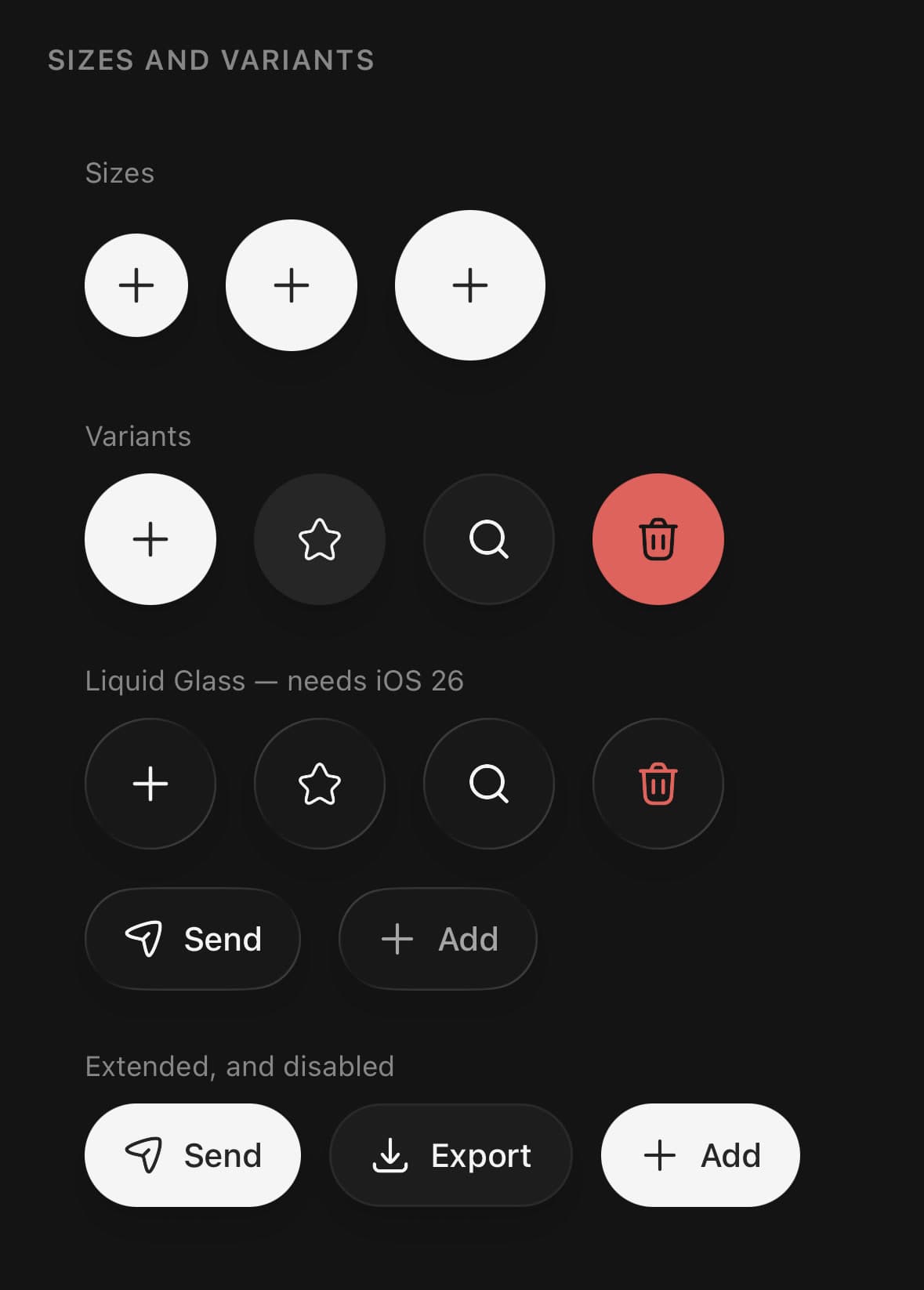
Every size and variant together, with the same set drawn in the material below them and the extended forms under that.
size is sm, md or lg — 44, 56 and 64 points. variant is primary, secondary, surface or destructive. Under glass each one drops its fill for the material and keeps its glyph colour, which is why the destructive one is a red glyph rather than a red button.
An extended button is as wide as its label, in the material as anywhere else.
<Fab size="sm" icon={<PlusIcon size={18} />} accessibilityLabel="Add" />
<Fab size="md" icon={<PlusIcon size={24} />} accessibilityLabel="Add" />
<Fab size="lg" icon={<PlusIcon size={28} />} accessibilityLabel="Add" />

<Fab variant="secondary" icon={<StarIcon size={20} />} accessibilityLabel="Favourite" />
<Fab variant="surface" icon={<SearchIcon size={20} />} accessibilityLabel="Search" />
<Fab variant="destructive" icon={<TrashIcon size={20} />} accessibilityLabel="Delete" />

<Fab glass icon={<PlusIcon size={20} />} accessibilityLabel="Add" />
<Fab glass variant="destructive" icon={<TrashIcon size={20} />} accessibilityLabel="Delete" />
<Fab glass extended size="sm" icon={<SendIcon size={18} />}>Send</Fab>
The three sizes
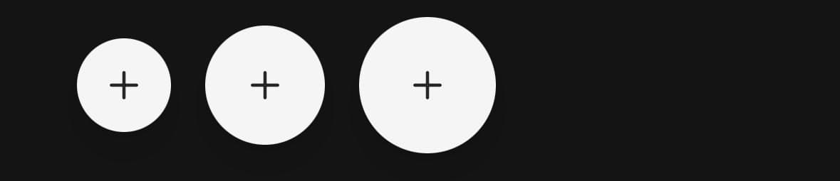
size is the diameter, and the glyph inside it is yours to scale — the button does not resize an icon it was handed, because an icon that is right at one size is rarely right at all three. md is the default and the one the platforms agree on.
{(['sm', 'md', 'lg'] as const).map((size) => (
  <Fab
    key={size}
    size={size}
    icon={<PlusIcon size={20} />}
    accessibilityLabel="New"
  />
))}
The variants
primary is the filled one and the reason the component exists — a screen with one action worth floating should not be quiet about it. secondary and surface are for a dial's members and for a second button that must not compete; destructive is for the rare corner action that deletes something.

<Fab icon={<PlusIcon size={20} />} accessibilityLabel="New" />
<Fab variant="secondary" icon={<PencilIcon size={20} />} accessibilityLabel="Edit" />
<Fab variant="surface" icon={<ImageIcon size={20} />} accessibilityLabel="Photos" />
<Fab variant="destructive" icon={<TrashIcon size={20} />} accessibilityLabel="Delete" />
Versions
Over a list
The case it exists for — one action pinned over content that scrolls under it.
<View className="flex-1">
  <ScrollView contentContainerStyle={{ paddingBottom: 96 }}>
    {/* …rows… */}
  </ScrollView>

  <Fab
    placement="bottom-right"
    icon={<PlusIcon size={24} />}
    accessibilityLabel="New note"
    haptics
    onPress={compose}
  />
</View>
A speed dial
Actions unfolding out of the button, over a screen that says the dial is modal.
<Fab.Group icon={<PlusIcon size={24} />} accessibilityLabel="Add something" blur>
  <Fab.Action icon={<ImageIcon size={18} />} label="Photo" onPress={addPhoto} />
  <Fab.Action icon={<PaperclipIcon size={18} />} label="Attachment" onPress={attach} />
  <Fab.Action icon={<MicIcon size={18} />} label="Voice note" onPress={record} />
  <Fab.Action icon={<TrashIcon size={18} />} label="Empty drafts" destructive onPress={empty} />
</Fab.Group>
Where it parks
The extended form, in each of the three corners it can take.
<Fab extended placement={placement} icon={<PencilIcon size={20} />}>
  Write
</Fab>

{/* placement is 'bottom-left' | 'bottom-center' | 'bottom-right' */}
Liquid Glass
A dial in the platform material over the list. Needs iOS 26 — anywhere else it is the filled one.
<Fab.Group glass icon={<PlusIcon size={24} />} accessibilityLabel="Add something" blur>
  <Fab.Action icon={<ImageIcon size={18} />} label="Photo" onPress={addPhoto} />
  <Fab.Action icon={<PaperclipIcon size={18} />} label="Attachment" onPress={attach} />
  <Fab.Action icon={<MicIcon size={18} />} label="Voice note" onPress={record} />
  <Fab.Action icon={<TrashIcon size={18} />} label="Empty drafts" destructive onPress={empty} />
</Fab.Group>
A menu
One panel of rows springing out of the button, in the material.
<Fab.Group layout="menu" glass icon={<PlusIcon size={24} />} accessibilityLabel="Add something" blur>
  <Fab.Action icon={<ImageIcon size={18} />} label="Photo" onPress={addPhoto} />
  <Fab.Action icon={<PaperclipIcon size={18} />} label="Attachment" onPress={attach} />
  <Fab.Action icon={<MicIcon size={18} />} label="Voice note" onPress={record} />
  <Fab.Action icon={<TrashIcon size={18} />} label="Empty drafts" destructive onPress={empty} />
</Fab.Group>
A menu, with wells
The same menu in the wells appearance: the glyph leads in a tinted well and each row is its own pill.
<Fab.Group layout="menu" appearance="wells" glass icon={<PlusIcon size={24} />} accessibilityLabel="Add something" blur>
  <Fab.Action icon={<ImageIcon size={18} />} label="Photo" onPress={addPhoto} />
  <Fab.Action icon={<PaperclipIcon size={18} />} label="Attachment" onPress={attach} />
  <Fab.Action icon={<MicIcon size={18} />} label="Voice note" onPress={record} />
  <Fab.Action icon={<TrashIcon size={18} />} label="Empty drafts" destructive onPress={empty} />
</Fab.Group>
A native menu
The platform's own menu, drawn by SwiftUI on iOS and Jetpack Compose on Android, over a page the scrim frosts. Without @expo/ui it is the panel instead.
<Fab.Group layout="native" glass blur icon={<PlusIcon size={24} />} accessibilityLabel="Add something">
  <Fab.Action systemImage="photo" label="Photo" onPress={addPhoto} />
  <Fab.Action systemImage="paperclip" label="Attachment" onPress={attach} />
  <Fab.Action systemImage="mic" label="Voice note" onPress={record} />
  <Fab.Action systemImage="trash" label="Empty drafts" destructive onPress={empty} />
</Fab.Group>
Variants
size
smmd(default)lg
<Fab size="sm">…</Fab>
<Fab size="md">…</Fab>
<Fab size="lg">…</Fab>
extended
truefalse(default)
<Fab extended>…</Fab>
<Fab extended={false}>…</Fab>
variant
primary(default)secondarysurfacedestructive
<Fab variant="primary">…</Fab>
<Fab variant="secondary">…</Fab>
<Fab variant="surface">…</Fab>
<Fab variant="destructive">…</Fab>
glass
true
<Fab glass>…</Fab>API Reference
Fab
| Prop | Type | Default | Description |
|---|---|---|---|
className | string | — | |
icon | ReactNode | — | The glyph. Sized by you — this is the one thing that should not guess. |
extended | boolean | false | Spell the action out beside the glyph. |
placement | FabPlacement | 'bottom-right' | Pin it over the content, in a corner. Left out, it is an ordinary button in the flow — which is what you want inside a Fab.Group, or when the screen already has somewhere for it to sit. |
offset | number | 16 | Distance from the edges when placement is set, in points. |
style | ViewProps['style'] | — | Placement-aware view style. Press-state styling belongs in className. |
disabled | boolean | false | |
haptics | boolean | false | A tick on press. Off by default — needs the optional expo-haptics, and is silent without it. |
glass | boolean | false | Draw it in Liquid Glass — the material iOS 26 uses for its own floating controls — instead of the variant's fill. Every variant takes the plain material, with its glyph in the foreground colour and in red on destructive. Pressed, the material swells and brightens the way the platform's own glass controls do. Needs iOS 26 and the optional expo-glass-effect. Below that, on Android, on web, or with Reduce Transparency on, it does nothing and the button keeps its ordinary fill. |
accessibilityLabel | string | — | Required for an icon-only button. A lone glyph reads out as nothing. |
Fab.Group
| Prop | Type | Default | Description |
|---|---|---|---|
className | string | — | |
icon | ReactNode | — | The glyph on the trigger. |
label | string | — | The trigger's label, if it should be extended while closed. |
open | boolean | — | Controlled open state. |
onOpenChange | (open: boolean) => void | — | |
placement | FabPlacement | 'bottom-right' | Which corner of the screen the whole dial parks in. |
offset | number | 16 | Distance from the screen's edges, in points. Add your safe-area inset. |
layout | FabGroupLayout | 'dial' | What opens out of the trigger. dial, the default, is a column of round buttons with their labels beside them. menu is one panel of rows — a label with its glyph, on the side the appearance puts it — that springs out of the trigger's corner, the way the platform's own menus do. native hands the menu to the platform: SwiftUI on iOS, Jetpack Compose on Android. A native menu is drawn by the platform, so className and the theme tokens do not reach it, and the rows take label and systemImage rather than an icon element. blur still applies: the scrim behind the menu is ours, so the page recedes the way it does behind the dial and the panel. On iOS the platform owns the menu's open state, so open and onOpenChange do nothing there. Android's menu is controlled and honours both. Where the platform menu cannot be drawn — on the web, or without @expo/ui installed — this falls back to menu. |
appearance | FabMenuAppearance | 'platform' | How a menu is drawn. platform, the default, is the shape the platform's own menus take: a hairline between rows and the glyph after the label. wells is tighter, with the glyph leading in a tinted well and each row its own pill — a menu the app designed rather than the system. Menu layout only. |
iconPlacement | FabMenuIconPlacement | — | Which side of a menu row the glyph sits on. Each appearance has its own default. |
menuWidth | number | — | The menu panel's width in points. Each appearance has its own default. |
menuRadius | number | — | The menu panel's corner radius in points. Each appearance has its own default. |
menuClassName | string | — | Extra classes for the menu panel. |
rowClassName | string | — | Extra classes for every menu row. A row's own className comes after. |
size | FabSize | md | |
variant | FabVariant | primary | |
disabled | boolean | false | |
haptics | boolean | false | |
glass | boolean | false | Draw the trigger and its actions in Liquid Glass. The same flag as on Fab, with the same floor: iOS 26 and expo-glass-effect, inert elsewhere. |
blur | boolean | false | Frost the screen behind the open dial instead of dimming it. |
accessibilityLabel | string | — | Required — the trigger is a lone glyph until it is opened. |
rotateOnOpen | boolean | true | Turn the trigger's glyph a quarter circle while the dial is open. On by default, and it is doing real work when the glyph is a plus: the same mark becomes a cross, which says "this closes now" without a second icon that has to be swapped in. Turn it off for a glyph that means something at one angle only. |
Fab.Action
| Prop | Type | Default | Description |
|---|---|---|---|
className | string | — | |
icon | ReactNode | — | The glyph. |
systemImage | string | — | The glyph for a native menu row, as an SF Symbol name. layout="native" only, and iOS only — SwiftUI names its symbols rather than taking a view for them, so icon cannot cross over. Ignored everywhere else, so a group can carry both and be right on either path. |
label | string | — | What it does, beside the glyph. A column of unlabelled circles is a quiz. |
onPress | () => void | — | |
disabled | boolean | false | |
destructive | boolean | false | Draws it in the destructive colour, for the one that removes something. |
labelClassName | string | — | Extra classes for the label — the chip in a dial, the row's text in a menu. |
Every part also accepts the underlying React Native props (ViewProps or TextProps) and a className for Tailwind utilities.
Notes
Give it a label
accessibilityLabel is not optional in practice. An icon-only button reads out as nothing, and the plus that is obvious to someone looking at it says nothing to someone who is not. Fab.Action takes its label from label, so it is already covered.
Dial or menu
layout on Fab.Group decides what opens. dial, the default, is the column of round buttons with labels beside them. menu is one panel of rows that grows out of the trigger's corner. A dial reads as a handful of buttons and suits three or four glyphs that stand on their own; a menu reads as a list and suits actions that need their words.
A menu has two appearances. platform is the system's own shape; wells leads with the glyph in a tinted well and makes each row a pill. Either takes iconPlacement, menuWidth, menuRadius, menuClassName and rowClassName, and a row's own className and labelClassName come after those.
The menu panel scales in rather than fading in. The material cannot be faded — at zero it stops drawing — and a panel growing out of the button is what says the button opened.
Write a group in the screen's root container
A Fab.Group draws its scrim and its buttons as two absolutely positioned siblings in whatever it is written inside. That parent is what offset is measured from and what the scrim covers, so it should be the container that fills the screen.
This is also what makes the dial belong to its screen. Pushing a new screen over this one hides the dial with everything else on it, because it is part of the screen's own view tree rather than lifted above the app.
Add your safe-area inset to offset to clear the home indicator.
Pressing an action closes the dial
Any child of a Fab.Group closes it when pressed, including a plain Fab used as an action. A menu that stays up after a choice reads as the choice not having registered — and an action that navigates would otherwise leave the dial standing over the screen it navigated to.
The Android back button closes an open dial too, rather than popping the screen behind it.
The actions are unmounted while the dial is closed
Not hidden. A column kept alive behind the trigger would still be in the accessibility tree, and a screen reader would walk into four buttons nobody can see.
One spring, not one per action
The whole dial runs off a single spring, and each action works out its own share of it on the UI thread from its index — the stagger is where each one reads the spring, not a delay. There is no chain of timeouts to fall out of step with itself when the dial is closed halfway through opening; closing runs the same value back down, and every action follows it. The spring overshoots a little and settles, so buttons arrive rather than stop.
A glass dial's actions rise out of the trigger, small, and grow into their slots, with each label growing out of its button once it is most of the way there. Inside the group the pieces of glass merge while they overlap, so the trigger reads as dividing into its actions rather than the actions arriving from elsewhere. Nothing fades: the material stops drawing at zero opacity and does not come back.
The trigger turns rather than swapping
rotateOnOpen gives the glyph a quarter circle while the dial is up. That is doing real work when the glyph is a plus: the same mark becomes a cross, so the button says this closes now without a second icon to swap in. Turn it off for a glyph that means something at one angle only.
Glass is a material, not a colour
glass is inert where the material cannot be drawn, and it cannot be drawn below iOS 26, on Android, on web, without expo-glass-effect, or with Reduce Transparency on. Nothing is faked there: a hand-drawn approximation of a system material is a near-miss on the one platform that has the real thing, and an iOS look pasted onto Android. The button keeps its variant's fill instead.
A disabled glass button dims its glyph and label rather than the material. A faded material stops being one.
Press behavior composes with the button
Fab forwards the ordinary animated Pressable controls such as hitSlop, onLongPress, pressOpacity, and the native press event passed to onPress. Its button role, disabled state, haptic tick, and primary press handler remain owned by the component. Use className for pressed-state styling; style remains a placement-aware view style so an absolutely positioned Fab keeps one deterministic anchor.
Public exports
Values: Fab
Types: FabProps, FabGroupProps, FabActionProps, FabPlacement, FabSize, FabVariant, FabGroupLayout, FabMenuAppearance, FabMenuIconPlacement