

CandlestickChart
Open, high, low and close for a period, drawn as one mark.
Open, high, low and close for a period, drawn as one mark.
The body spans open to close and is filled by direction — green when the period closed at or above where it opened, red when it closed below — and the wick behind it spans the low to the high.
Composed the way every chart here is: the grid, the candles, the axes and the readout are separate children.
If the chart you need is not one of these, Plot is the same drawing machinery with nothing decided: you compose the marks — columns, lines, fills, dots, and marks you write yourself — over one measured box and one shared scale.
Installation
CandlestickChart ships with the library — no separate install.
import { CandlestickChart, Frame, Text } from 'panelui-native';Or copy the source into your project, to own and edit it:
npx panelui-cli@latest add candlestick-chartUsage
<CandlestickChart data={sessions} xDataKey="day">
  <CandlestickChart.Grid />
  <CandlestickChart.Candles />
  <CandlestickChart.YAxis />
  <CandlestickChart.XAxis />
  <CandlestickChart.Tooltip />
</CandlestickChart>
Composition
<CandlestickChart>
  <CandlestickChart.Header />       {/* title, readout and key, above the plot */}
  <CandlestickChart.Grid />         {/* lines across the price axis */}
  <CandlestickChart.Candles />      {/* the marks */}
  <CandlestickChart.XAxis />        {/* period labels, under the candles */}
  <CandlestickChart.YAxis />        {/* price labels, down the side */}
  <CandlestickChart.Legend />
  <CandlestickChart.Tooltip />      {/* the drag, and the readout */}
</CandlestickChart>CandlestickChart.Header— The strip above the plot: what the chart is of, what it currently reads, and what the two colours mean. The value is passed in rather than derived, so one header can show the last close when nothing is pressed and a session's close when something is.CandlestickChart.Grid— Lines across the price axis, so a candle can be read against a number and not only against the candle beside it.CandlestickChart.Candles— The marks. Every rising body is a subpath of one path and every falling body of another, so the chart is four animated props a frame whether it holds twenty periods or two hundred.CandlestickChart.XAxis— Period labels under the candles. Real text, so they follow the theme's font and the platform's text scaling.CandlestickChart.YAxis— Price labels down the side. The chart reserves a gutter for them, rather than drawing them over the plot.CandlestickChart.Tooltip— The drag that selects a period, and the card that reports its four prices and its change.CandlestickChart.Legend— The two colours and what they mean, floated over the plot. PreferHeader'slegendon a chart that has a header.
Examples
A run of sessions
The whole component. Each row carries open, high, low and close; onActiveIndexChange reports the period under the finger, which is how a readout above the plot gets its value.
const sessions = [
  { day: '1 Sep', open: 182.4, high: 185.1, low: 181.2, close: 184.6 },
  { day: '2 Sep', open: 184.6, high: 186.0, low: 182.9, close: 183.1 },
  // …
];

<CandlestickChart
  data={sessions}
  xDataKey="day"
  aspectRatio={1.5}
  onActiveIndexChange={(_index, datum) => setActive(datum)}
>
  <CandlestickChart.Header
    title="NWM · Daily"
    value={price(active?.close ?? last.close)}
    legend
  />
  <CandlestickChart.Grid />
  <CandlestickChart.Candles />
  <CandlestickChart.YAxis />
  <CandlestickChart.XAxis />
  <CandlestickChart.Tooltip formatValue={price} />
</CandlestickChart>
Naming the four columns
The four prices are read from open, high, low and close by default. Point them at whatever the data already calls them rather than reshaping it on the way in.
<CandlestickChart
  data={bars}
  xDataKey="t"
  openDataKey="o"
  highDataKey="h"
  lowDataKey="l"
  closeDataKey="c"
>
  <CandlestickChart.Candles />
</CandlestickChart>
Colours of your own
Green and red are the defaults because up and down are not two series — they are two states of one, and the convention for them is older than any palette. Both are overridable for a chart that has to match something else.
<CandlestickChart.Candles
  risingColor="#2dd4bf"
  fallingColor="#fb7185"
  cornerRadius={2}
/>
Sized for a card
No axes and a wider gap between the candles, for a chart that is a glance rather than a screen. candleGap is a fraction of each period's slice, so the proportions hold at any width.
<CandlestickChart data={recent} xDataKey="day" aspectRatio={1.9} candleGap={0.42}>
  <CandlestickChart.Header value={price(last.close)} caption={change} />
  <CandlestickChart.Candles cornerRadius={2} />
  <CandlestickChart.XAxis />
</CandlestickChart>
Waiting for the series
status="loading" draws flat placeholder candles and grows them into the real ones when it turns ready. One component throughout, rather than a spinner swapped for a chart — swapping loses the transition.
<CandlestickChart data={sessions} xDataKey="day" status={status}>
  <CandlestickChart.Grid />
  <CandlestickChart.Candles />
  <CandlestickChart.XAxis />
</CandlestickChart>
Versions
Sessions
Thirty sessions, with a readout that follows the finger.
<CandlestickChart data={sessions} xDataKey="day" aspectRatio={1.5}>
  <CandlestickChart.Header title="NWM · Daily" value={price(shown.close)} legend />
  <CandlestickChart.Grid />
  <CandlestickChart.Candles />
  <CandlestickChart.YAxis />
  <CandlestickChart.XAxis />
  <CandlestickChart.Tooltip formatValue={price} />
</CandlestickChart>
No axes
The last ten, sized for a card rather than for a screen.
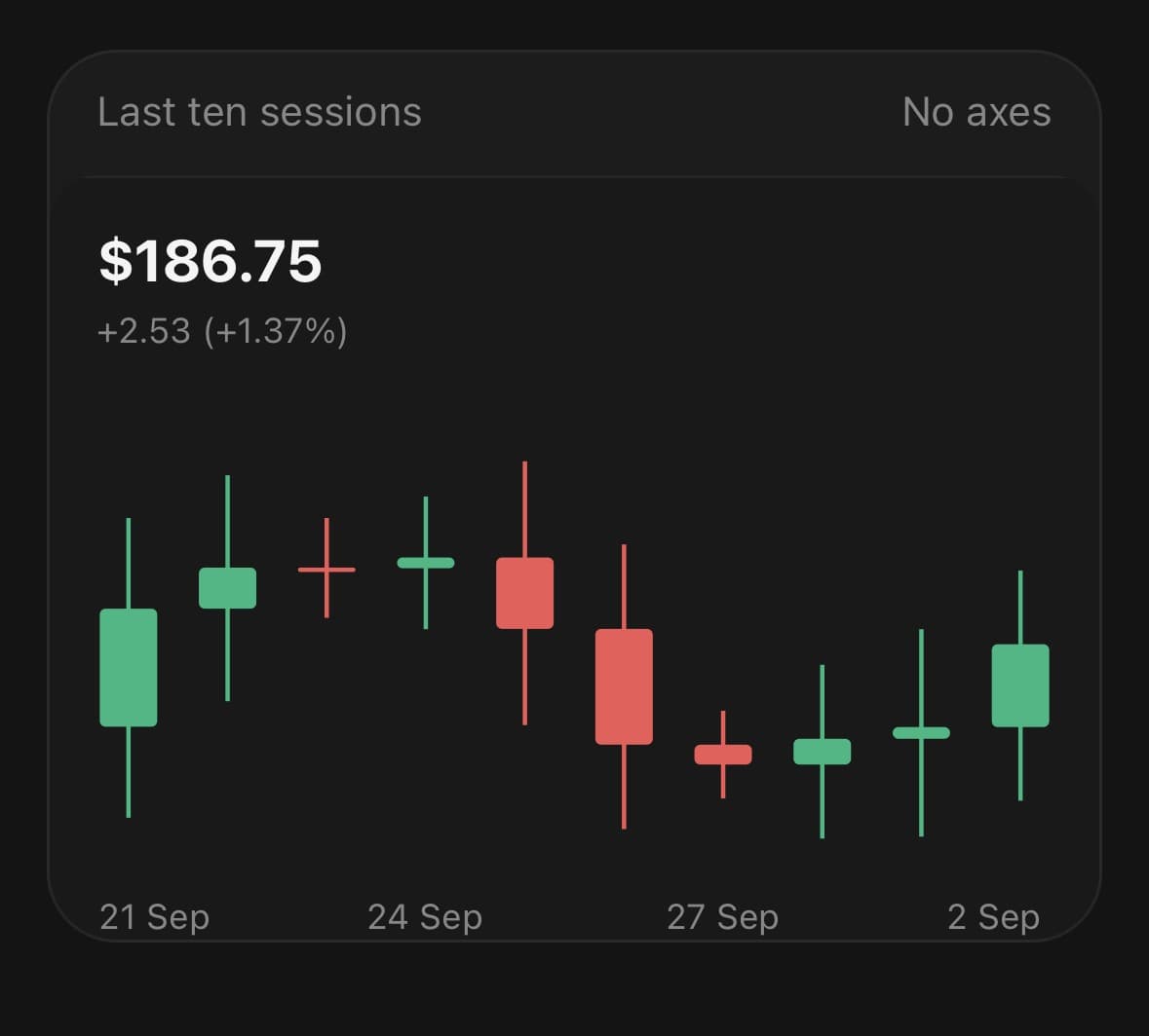
<CandlestickChart data={recent} xDataKey="day" aspectRatio={1.9} candleGap={0.42}>
  <CandlestickChart.Header value={price(last.close)} caption={change} />
  <CandlestickChart.Candles cornerRadius={2} />
  <CandlestickChart.XAxis />
</CandlestickChart>
Loading
Placeholder candles growing into the real ones.
<CandlestickChart data={recent} xDataKey="day" status={status}>
  <CandlestickChart.Header title="NWM · Daily" value={status === 'loading' ? '—' : price(last.close)} />
  <CandlestickChart.Grid />
  <CandlestickChart.Candles />
  <CandlestickChart.XAxis />
</CandlestickChart>
API Reference
CandlestickChart
| Prop | Type | Default | Description |
|---|---|---|---|
className | string | — | |
data | CandlestickChartDatum[] | — | The rows. Each one is a period along the x-axis. |
xDataKey | string | 'date' | Key holding the period label. Used by the axis and the readout. |
openDataKey | string | 'open' | Key holding the opening price. |
highDataKey | string | 'high' | Key holding the period's high. |
lowDataKey | string | 'low' | Key holding the period's low. |
closeDataKey | string | 'close' | Key holding the closing price. |
status | CandlestickChartStatus | 'ready' | loading leaves the plot empty — the frame, the grid and the header stay, and no candles are drawn. Turning ready grows them in left to right. Nothing stands in for the candles while they are missing. A placeholder candle is four made-up prices, and a reader has no way to tell an invented one from a real one until it changes under them. |
aspectRatio | number | 1.6 | Width ÷ height. 1.6 suits a chart this dense better than 2. |
animationDuration | number | 700 | Milliseconds for the candles to grow in on mount. |
domainDuration | number | 500 | Milliseconds for the price axis to settle after the data changes. |
yDomain | [number, number] | — | Fix the price axis instead of deriving it from the lows and highs. Note that the derived domain deliberately does not include zero — see the notes on why a candle's axis is not a bar's. |
candleGap | number | 0.3 | Fraction of each period's slice left empty, 0 to 1. A fraction rather than a pixel gap so the proportions hold at any width. |
candleWidth | number | — | Fixed body width in points. Derived from the slice when omitted. |
fadedOpacity | number | 0.3 | Opacity of the candles that are not under the finger. |
onActiveIndexChange | (index: number, datum: CandlestickChartDatum | null) => void | — | The candle under the finger as it moves, and -1/null when it lifts. This is how a readout in the card's header gets its value — that header is outside the chart, so it cannot use useCandlestickChart. Fires when the index changes, not per frame. |
compact | boolean | false | Drop the axis padding, for a dense strip with no axis or readout. |
CandlestickChart.Grid
| Prop | Type | Default | Description |
|---|---|---|---|
rows | number | 4 | How many lines to draw across the price axis. |
color | string | — | |
dashArray | string | — | |
opacity | number | 1 |
CandlestickChart.Candles
| Prop | Type | Default | Description |
|---|---|---|---|
risingColor | string | — | Colour of a period that closed at or above its open. Green by default. |
fallingColor | string | — | Colour of a period that closed below its open. Red by default. |
cornerRadius | number | 1.5 | Corner radius on a body. |
CandlestickChart.XAxis
| Prop | Type | Default | Description |
|---|---|---|---|
ticks | number | — | How many labels to show. Derived from the room available when omitted. |
format | (datum: CandlestickChartDatum, index: number) => string | — | Format a row's label. Defaults to the value at xDataKey. |
className | string | — |
CandlestickChart.YAxis
| Prop | Type | Default | Description |
|---|---|---|---|
ticks | number | 4 | How many labels to show along the price axis. |
format | (value: number) => string | — | Format a price for its label. Defaults to a compact number. |
className | string | — |
CandlestickChart.Tooltip
| Prop | Type | Default | Description |
|---|---|---|---|
formatValue | (value: number, field: 'open' | 'high' | 'low' | 'close') => string | — | Format one of the four prices. Defaults to a compact number. |
formatX | (datum: CandlestickChartDatum) => string | — | Format the readout's heading from the row. Defaults to the value at xDataKey. |
showChange | boolean | true | Show the period's change from open to close under the four prices. |
className | string | — |
CandlestickChart.Header
| Prop | Type | Default | Description |
|---|---|---|---|
className | string | — | |
title | string | — | Small line above the value — what the chart is of. |
value | string | — | The readout. The largest thing on the card, and the first thing read. |
caption | string | — | One muted line under the value — a period, a comparison, a change. |
legend | boolean | false | Name the two colours, for a reader who has not met the convention. |
risingLabel | string | 'Up' | What the rising colour is called. |
fallingLabel | string | 'Down' | What the falling colour is called. |
CandlestickChart.Legend
| Prop | Type | Default | Description |
|---|---|---|---|
className | string | — | |
risingLabel | string | 'Up' | What the rising colour is called. |
fallingLabel | string | 'Down' | What the falling colour is called. |
Every part also accepts the underlying React Native props (ViewProps or TextProps) and a className for Tailwind utilities.
Notes
Why the axis does not reach zero
A bar chart's axis has to, because a bar compares lengths and a bar cropped at the bottom is a length that lies. A candle compares nothing to zero. What is being read is the distance between four numbers that sit close together and usually far from the origin — a share at 180 that moved between 178 and 183 is a chart of that five-point span, and forcing zero onto the axis compresses the whole thing into a band at the top and every candle in it into a dash.
So the domain runs from the lowest low to the highest high, with a tenth of the span as margin at each end so the extremes are not drawn on the frame. yDomain fixes it outright.
Colour is direction, not identity
There is one thing plotted, so there is no series list and no colour per series. The two colours are the two states of that one thing, and they come from the theme's success and destructive tokens rather than from the chart palette — that palette is picked so several series can be told apart, which is not what green and red are doing here.
What it costs to draw
Every rising body is a subpath of one path and every falling body of another, and the wicks likewise. Four animated props a frame whether the chart holds twenty periods or two hundred. The candle under the finger is drawn once more over the top rather than splitting all four paths in two, and only the index crosses to JavaScript while a finger is moving.
Periods, not points
A candle owns a slice of the width rather than sitting on a point, so the finger is inside whichever slice it lands on. candleGap is the fraction of that slice left empty — a fraction rather than a pixel gap, so a chart of thirty periods and a chart of six look like the same chart.
Labels thin themselves
A chart of thirty sessions gives each about eleven points, which is not a date. The axis asks the plot how much room there is and keeps every nth label, spaced far enough apart that no two touch. ticks overrides the count where a particular one is wanted.
Reduced motion
The grow-in and the domain tween are both skipped, and the chart draws straight to its final shape.
aspectRatio measures the plot, not the whole chart. The header sits outside the measured box, so a chart with a readout above it keeps the shape it asked for instead of losing as much height as the readout took.
Accessible data
The chart exposes one screen-reader summary and one semantic entry per data row; its SVG paths, axes and markers stay decorative. Set accessibilityLabel for a domain-specific summary, accessibilityLabelForDatum to format each row, and onAccessibilityDatumPress when selecting a row should perform an action. Pass accessible={false} only when the same data is already available nearby in an accessible table.
Public exports
Values: CandlestickChart, useCandlestickChart
Types: CandlestickChartProps, CandlestickChartHandle, CandlestickChartHeaderProps, CandlestickChartGridProps, CandlestickChartCandlesProps, CandlestickChartXAxisProps, CandlestickChartYAxisProps, CandlestickChartTooltipProps, CandlestickChartLegendProps, CandlestickChartDatum, CandlestickChartStatus