

WeekHoursGrid
A week of hours, one row per day, with the taken parts filled in.
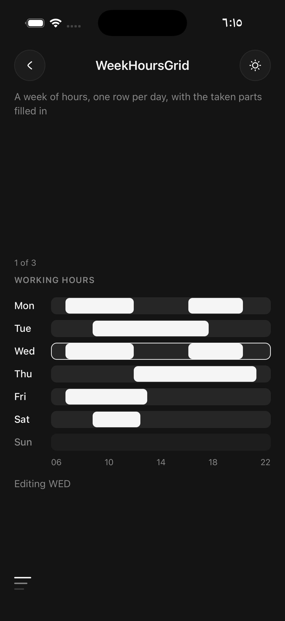
Use it to show which hours of each day are taken: a trainer's working hours, the sessions already booked in a room, a shift plan. Each row is a bar across the visible hours with the taken stretches filled in, so reading down compares the days and reading along shows the gaps.
Hours are numbers, so 9.5 is half past nine and no date library is needed. from and to set the visible range, and a block outside it is cut at the edge.
For a month of days, use Planner.
Installation
WeekHoursGrid ships with the library — no separate install.
import { WeekHoursGrid } from 'panelui-native';Or copy the source into your project, to own and edit it:
npx panelui-cli@latest add week-hours-gridUsage
<WeekHoursGrid
  from={6}
  to={22}
  ticks={[6, 10, 14, 18, 22]}
  rows={[
    { key: 'mon', label: 'Mon', blocks: [{ start: 9, end: 12 }, { start: 16, end: 20 }] },
    { key: 'sun', label: 'Sun', off: true, blocks: [] },
  ]}
/>
Examples
Pressing a row
With onSelect each row is a button, called with the row's key. Mark the row being edited selected to outline it.
<WeekHoursGrid
  from={6}
  to={22}
  rows={rows.map((row) => ({ ...row, selected: row.key === editing }))}
  onSelect={setEditing}
/>
A legend
A block's tone picks its colour from the theme. Use muted for time taken by someone else, and explain each tone with legend.
<WeekHoursGrid
  from={6}
  to={22}
  rows={bookings}
  legend={[{ label: 'Your sessions' }, { label: 'Booked by others', tone: 'muted' }]}
/>
Rows that are not days
A row is a key, a label and its blocks, so the same grid holds one row per person for a shift plan.
<WeekHoursGrid
  rows={[
    { key: 'jonas', label: 'Jonas', blocks: [{ start: 8, end: 16, tone: 'success' }] },
    { key: 'leila', label: 'Leila', blocks: [{ start: 14, end: 22, tone: 'warning' }] },
  ]}
  ticks={['00', '06', '12', '18', '24']}
/>
API Reference
WeekHoursGrid
| Prop | Type | Default | Description |
|---|---|---|---|
className | string | — | |
rows | WeekHoursRow[] | — | The rows, top to bottom. |
from | number | — | The first visible hour. Default 0. |
to | number | — | The last visible hour. Default 24. |
ticks | (number | string)[] | — | The labels under the bars, spread evenly from from to to. Numbers are written as two-digit hours; strings are shown as given. |
legend | WeekHoursLegendItem[] | — | The entries under the grid, explaining each tone. |
onSelect | (key: string) => void | — | Makes each row a button, called with the row's key. |
offLabel | string | — | What a screen reader says for a row marked off. Default "off". |
Every part also accepts the underlying React Native props (ViewProps or TextProps) and a className for Tailwind utilities.
Notes
Ticks
ticks are spread evenly from from to to, so pass evenly spaced hours. A number is written as a two-digit hour; a string is shown as given.
Rows that are off
A row marked off is drawn faded with no blocks. A screen reader hears its label followed by offLabel, which defaults to "off".
Accessibility
Each row is read as its label followed by every block as a range of times, such as "Mon, 09:00 to 12:00, 16:00 to 20:00". With onSelect the row is a button and a selected row is announced as selected. The ticks are hidden from assistive technology, since the times are already in each row's label.
Public exports
Values: WeekHoursGrid
Types: WeekHoursGridProps, WeekHoursRow, WeekHoursBlock, WeekHoursLegendItem, WeekHoursTone