

OtpInput
One-time-code field drawn as a row of separate cells.
A one-time-code field drawn as a row of separate cells, so the reader can see how many digits are left.
There is one text field underneath — a transparent input laid over the whole row — so the keyboard, SMS autofill and paste all behave; the cells are drawn from its value.
The active cell's border crosses to the focus colour on the UI thread, and a caret blinks in the cell awaiting input.
Installation
OtpInput ships with the library — no separate install.
import { useState } from 'react';
import { OtpInput } from 'panelui-native';
Or copy the source into your project, to own and edit it:
npx panelui-cli@latest add otp-inputUsage
const [code, setCode] = useState('');

<OtpInput value={code} onChangeText={setCode} onComplete={submit} />

// Four masked cells, grouped two and two, letters allowed.
<OtpInput length={4} mask groupEvery={2} type="text" />
Examples
Controlled
Hold the value yourself and act on it when the code completes.
const [code, setCode] = useState('');

<OtpInput
  value={code}
  onChangeText={setCode}
  onComplete={(value) => verify(value)}
/>
Masked, like a passcode
Each filled cell shows a dot rather than the character.
<OtpInput length={4} mask type="numeric" />Grouped with a separator
groupEvery draws a divider between runs of cells — 3 gives xxx — xxx.
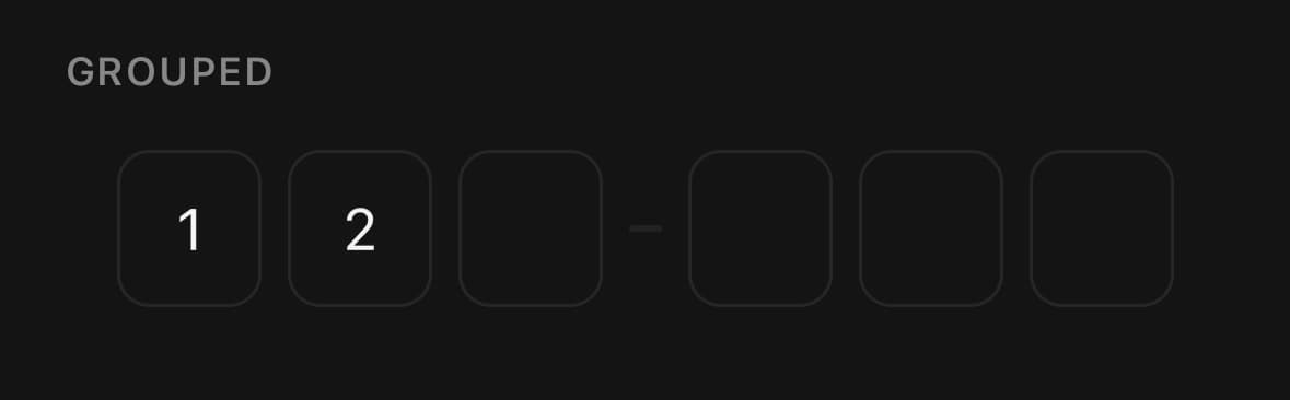
<OtpInput length={6} groupEvery={3} />Sizes
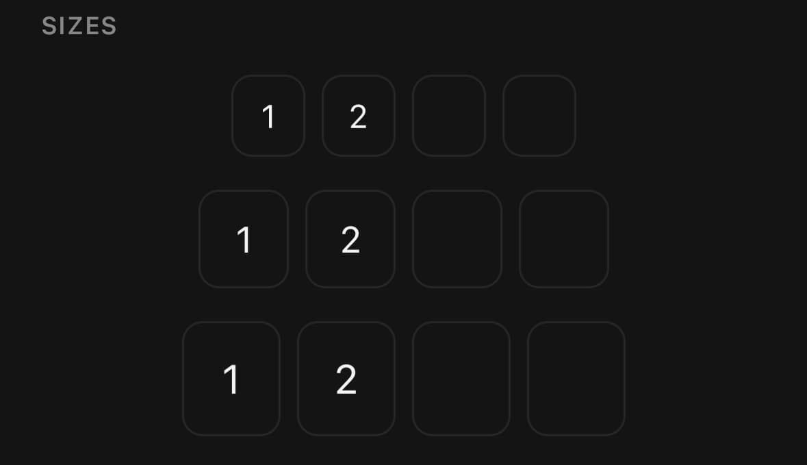
<OtpInput size="sm" length={4} />
<OtpInput size="md" length={4} />
<OtpInput size="lg" length={4} />
Invalid
errorMessage tints every cell and prints a line beneath the row.
<OtpInput
  length={6}
  value={code}
  onChangeText={setCode}
  errorMessage="That code didn’t match. Try again."
/>
Letters
type="text" accepts letters as well as digits.
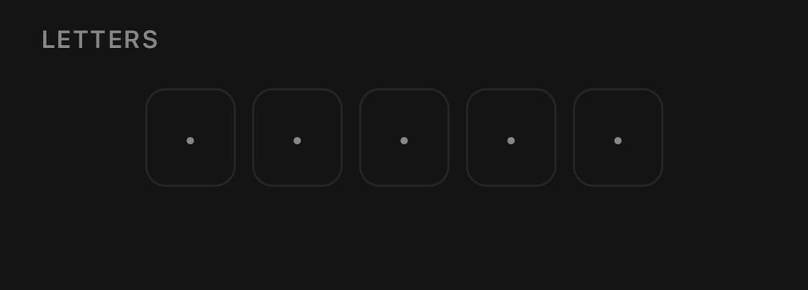
<OtpInput type="text" length={4} />Variants
size
smmd(default)lg
<OtpInput size="sm" length={4} />
<OtpInput size="md" length={4} />
<OtpInput size="lg" length={4} />
API Reference
OtpInput
| Prop | Type | Default | Description |
|---|---|---|---|
className | string | — | |
cellClassName | string | — | Class applied to every cell — for a taller box or a different radius. |
length | number | 6 | How many cells, i.e. the length of the code. |
value | string | — | Controlled value. Longer strings and stray characters are trimmed to fit. |
defaultValue | string | '' | Starting value when the field manages its own state. |
onChangeText | (value: string) => void | — | |
onComplete | (value: string) => void | — | Fires once, the moment the last cell is filled. |
type | 'numeric' | 'text' | 'numeric' | What the keyboard offers and what the field accepts. numeric keeps digits only and asks for the number pad; text accepts any character. |
mask | boolean | false | Hide each filled character behind a dot, the way a passcode field does. |
placeholder | string | — | A single character shown, dimmed, in every cell still waiting for input. |
groupEvery | number | 0 | Draw a separator between groups of this many cells — 3 gives xxx — xxx. |
disabled | boolean | — | |
isInvalid | boolean | — | Tint the field in its error colour and announce it as invalid. |
errorMessage | string | — | Error line under the field. Setting it also puts the field in its invalid state. |
accessibilityLabel | string | — | Announced by a screen reader as the field's name. |
Every part also accepts the underlying React Native props (ViewProps or TextProps) and a className for Tailwind utilities.
Notes
Accepts most TextInputProps — they land on the hidden field — except the ones OtpInput owns: value, defaultValue, onChangeText, maxLength and children. Setting editable={false} also makes the native field read-only, while disabled always takes precedence and keeps it non-editable.
The field is controlled when you pass value, and manages its own state otherwise (seed it with defaultValue). Either way the string is trimmed to length and, when type="numeric", filtered to digits, so an over-long paste or a stray character can never put the cells and the value out of step.
onComplete fires once, on the transition to a full code — not on every keystroke that leaves it full — which is the right moment to submit or verify. The hidden input carries textContentType="oneTimeCode" and the matching autoComplete, so iOS offers the SMS code above the keyboard and Android autofills it.
Public exports
Values: OtpInput
Types: OtpInputProps