

Card
Content surface with header, body and footer.
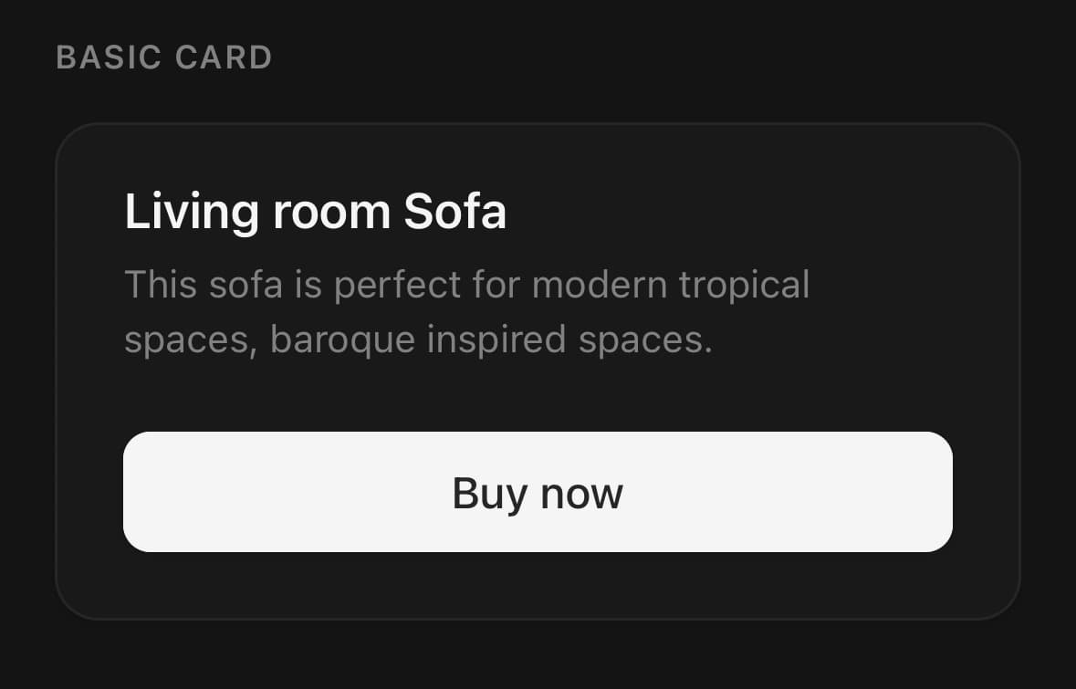
A content surface with a header, a body and a footer.
Use the parts rather than dropping everything into the content slot — the padding and the hairlines between them are what the composition is for.
For a surface without the header and footer structure, use Surface.
Installation
Card ships with the library — no separate install.
import { Card, Button, Text, Badge, Input, Chip } from 'panelui-native';Or copy the source into your project, to own and edit it:
npx panelui-cli@latest add cardUsage
<Card>
  <Card.Header>
    <Card.Title>Create project</Card.Title>
    <Card.Description>Deploy your new project in one click.</Card.Description>
  </Card.Header>
  <Card.Content className="gap-4">
    <Input label="Name" placeholder="My project" />
  </Card.Content>
  <Card.Footer>
    <Button size="sm">Deploy</Button>
  </Card.Footer>
</Card>
Composition
<Card>
  <Card.Header>
    <Card.Title>…</Card.Title>
    <Card.Description>…</Card.Description>
  </Card.Header>
  <Card.Content>…</Card.Content>
  <Card.Footer>…</Card.Footer>
</Card>Card.Header— Title and description block.Card.Title— Card heading.Card.Description— Muted supporting line.Card.Content— Main body.Card.Footer— Row of actions.variant="panel"draws it as a band set into the card instead — a rule across the top, a step darker, and the card's own bottom corners — for a footer that is what somebody does with the card rather than more of what it says.
Examples
Full anatomy
Header, content and footer carry the padding, so the card itself never needs a padding class.
<Card>
  <Card.Header>
    <Card.Title>Monthly report</Card.Title>
    <Card.Description>Revenue and retention for October.</Card.Description>
  </Card.Header>
  <Card.Content>
    <Text size="3xl" weight="bold">$48,120</Text>
    <Text size="sm" muted>+12% on September</Text>
  </Card.Content>
  <Card.Footer>
    <Button variant="outline" size="sm">Export</Button>
    <Button size="sm">Open</Button>
  </Card.Footer>
</Card>
Content only
Skip the parts you do not need — nothing is required.
<Card>
  <Card.Content className="p-4">
    <Text>A plain surface with a border and a shadow.</Text>
  </Card.Content>
</Card>
Media at the top
Clip the card so the image corners follow its radius, and put the image before the header.
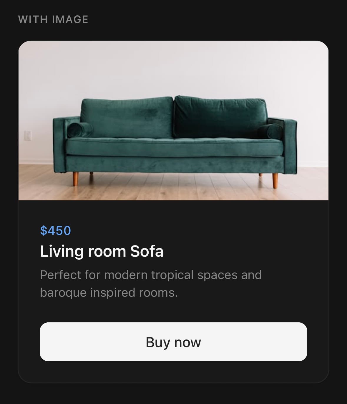
<Card className="overflow-hidden">
  <Image source={{ uri: post.cover }} className="h-40 w-full" />
  <Card.Header>
    <Card.Title>{post.title}</Card.Title>
    <Card.Description>{post.excerpt}</Card.Description>
  </Card.Header>
</Card>
Horizontal
A media tile beside the text instead of above it.
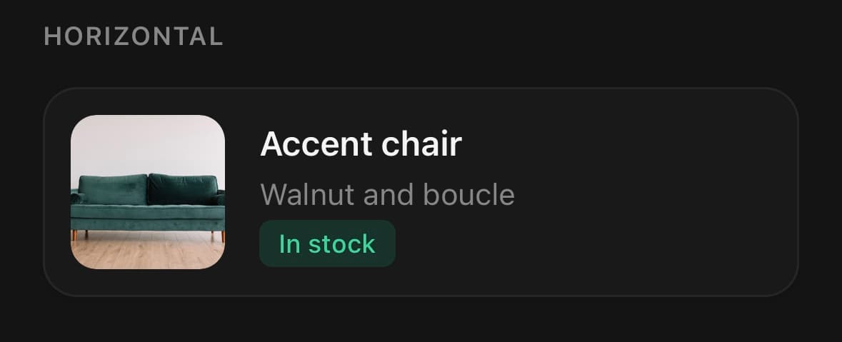
<Card className="overflow-hidden">
  <Card.Content className="flex-row items-center gap-4 p-3">
    <Image source={{ uri: product.image }} style={{ width: 72, height: 72, borderRadius: 12 }} />
    <View className="flex-1 gap-0.5">
      <Text weight="semibold">Accent chair</Text>
      <Text size="sm" muted>Walnut and boucle</Text>
      <Badge variant="success">In stock</Badge>
    </View>
  </Card.Content>
</Card>
With a form
Card as the shell around a short form.
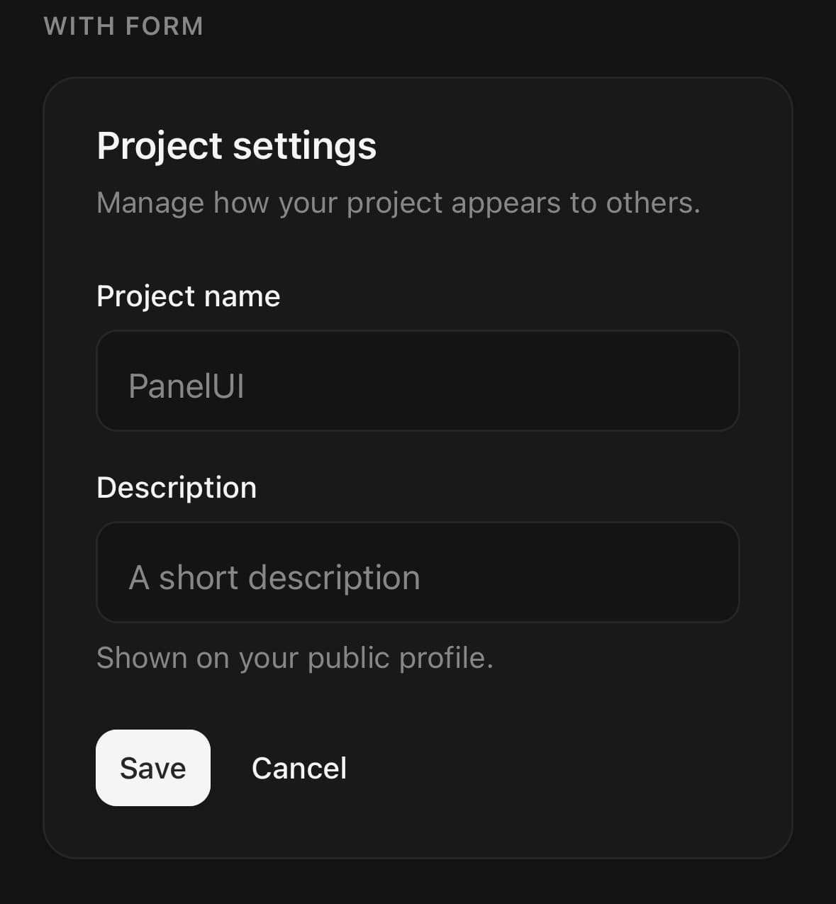
<Card>
  <Card.Header>
    <Card.Title>Project settings</Card.Title>
    <Card.Description>Manage how your project appears to others.</Card.Description>
  </Card.Header>
  <Card.Content className="gap-4">
    <Input label="Project name" placeholder="PanelUI" />
    <Input label="Description" placeholder="A short description" description="Shown on your public profile." />
  </Card.Content>
  <Card.Footer>
    <Button size="sm">Save</Button>
    <Button size="sm" variant="ghost">Cancel</Button>
  </Card.Footer>
</Card>
Actions on their own surface
variant="panel" puts the buttons on a band of their own, divided from the body by a rule and a step of shade.
The case it exists for is a card whose body is a form. Buttons on the same surface, directly under the last field, read as one more field — and submitting is not the same kind of thing as filling something in.
<Card>
  <Card.Header>
    <Card.Title>Login to your account</Card.Title>
    <Card.Description>Enter your email below to login to your account.</Card.Description>
  </Card.Header>
  <Card.Content className="gap-4">
    <Input label="Email" placeholder="m@example.com" />
    <Input label="Password" secureTextEntry />
  </Card.Content>
  <Card.Footer variant="panel" className="flex-col gap-2">
    <Button fullWidth>Login</Button>
    <Button fullWidth variant="outline">Login with Google</Button>
  </Card.Footer>
</Card>
Variants
variant
plain(default)panel
<Card variant="plain">…</Card>
<Card variant="panel">…</Card>
API Reference
Card
| Prop | Type | Default | Description |
|---|---|---|---|
className | string | — |
Card.Footer
| Prop | Type | Default | Description |
|---|---|---|---|
Header | CardHeader, | — | |
Title | CardTitle, | — | |
Description | CardDescription, | — | |
Content | CardContent, | — | |
Footer | CardFooter, | — |
Every part also accepts the underlying React Native props (ViewProps or TextProps) and a className for Tailwind utilities.
Notes
Padding lives on the slots
The root carries none, which is why a card whose media reaches its own corners needs nothing but overflow-hidden — no padding to undo first.
Every part is a plain view
A card draws a surface and stops there. Nothing in it subscribes to a theme value, drives an animation or reaches for a native module, so a screen may render as many as it likes and pay for the views alone. A decorative backing layer is composed as the first child of a card that clips, not built in.
Public exports
Values: Card
Types: CardProps