

ToggleButton
A button that stays down, on its own or in a group.
A button that stays down, on its own or in a group.
The difference from Button is the point: a button does something and springs back, a toggle button is something afterwards. So the selected state is the loud one and the resting state is quiet.
For buttons that act rather than latch, use ButtonGroup; for switching between panels of content, use Tabs.
Installation
ToggleButton ships with the library — no separate install.
import { ToggleButton, ToggleButtonGroup, useToggleButton, Text, PlusSquareIcon } from 'panelui-native';Or copy the source into your project, to own and edit it:
npx panelui-cli@latest add toggle-buttonUsage
<ToggleButton defaultSelected>Follow</ToggleButton>

<ToggleButton iconOnly accessibilityLabel="Save">
  <PlusSquareIcon size={18} />
</ToggleButton>

<ToggleButtonGroup selectionMode="multiple" value={marks} onValueChange={setMarks}>
  <ToggleButton id="bold">Bold</ToggleButton>
  <ToggleButton id="italic">Italic</ToggleButton>
</ToggleButtonGroup>
Composition
<ToggleButtonGroup>
  <ToggleButton id="…">
    <Icon />
    <ToggleButton.Label>…</ToggleButton.Label>
  </ToggleButton>
</ToggleButtonGroup>ToggleButton.Label— The label, when the button holds more than a string. Reads the selected state itself, so an icon-plus-text button does not thread the colour through by hand.
Examples
On its own
Uncontrolled with defaultSelected, or controlled with selected and onSelectedChange.
<ToggleButton defaultSelected>Follow</ToggleButton>

const [liked, setLiked] = useState(false);

<ToggleButton selected={liked} onSelectedChange={setLiked}>
  <HeartIcon size={16} />
  <ToggleButton.Label>{liked ? 'Liked' : 'Like'}</ToggleButton.Label>
</ToggleButton>
A toolbar of independent marks
selectionMode="multiple" lets any number be on at once. Inside a group each button needs an id — that is the value the group reports — and the group owns the state, so a selected prop on the button is ignored.
const [marks, setMarks] = useState<string[]>([]);

<ToggleButtonGroup
  selectionMode="multiple"
  variant="ghost"
  value={marks}
  onValueChange={setMarks}
>
  <ToggleButton id="bold" iconOnly accessibilityLabel="Bold">
    <BoldIcon size={18} />
  </ToggleButton>
  <ToggleButton id="italic" iconOnly accessibilityLabel="Italic">
    <ItalicIcon size={18} />
  </ToggleButton>
</ToggleButtonGroup>
An either-or choice
selectionMode="single" clears the last selection when a new one is made. Pressing the selected button again clears it — a filter you cannot turn off is a trap.
const [view, setView] = useState(['day']);

<ToggleButtonGroup selectionMode="single" value={view} onValueChange={setView}>
  <ToggleButton id="day">Day</ToggleButton>
  <ToggleButton id="week">Week</ToggleButton>
  <ToggleButton id="month">Month</ToggleButton>
</ToggleButtonGroup>
Reading the state further down
Anything inside the button can ask whether it is on, without the state being passed to it.
function Count() {
  const { selected } = useToggleButton();
  return selected ? <Text size="xs">1</Text> : null;
}

<ToggleButton>
  <ToggleButton.Label>Pinned</ToggleButton.Label>
  <Count />
</ToggleButton>
Variants
variant
default(default)ghost
{/* A soft fill at rest, so the control is visible before you touch it. */}
<ToggleButton variant="default">Follow</ToggleButton>

{/* Nothing at rest — for a dense toolbar where six fills would be noise. */}
<ToggleButton variant="ghost" iconOnly accessibilityLabel="Bold">
  <BoldIcon size={18} />
</ToggleButton>
size
xssmmd(default)lgxl
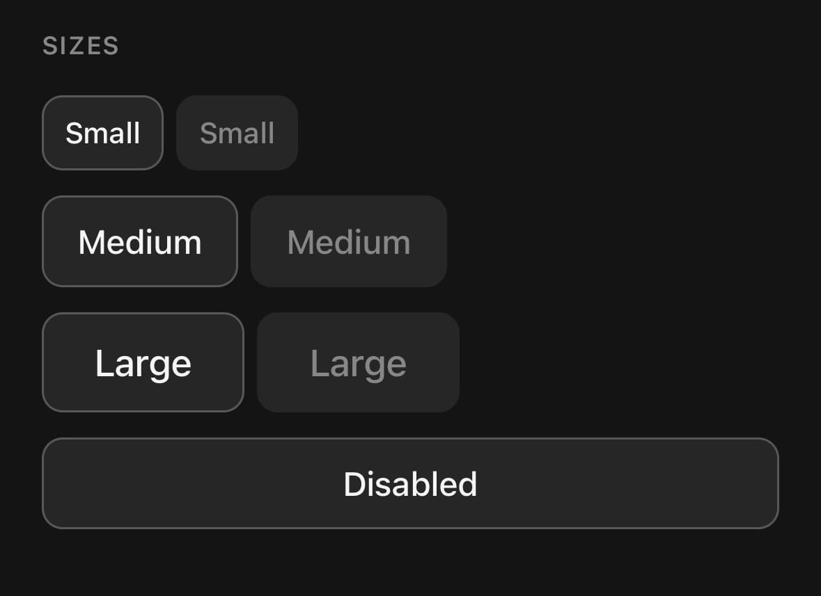
<ToggleButton size="xs">Extra small</ToggleButton>
<ToggleButton size="sm">Small</ToggleButton>
<ToggleButton size="md">Medium</ToggleButton>
<ToggleButton size="lg">Large</ToggleButton>
<ToggleButton size="xl">Extra large</ToggleButton>
API Reference
ToggleButtonGroup
| Prop | Type | Default | Description |
|---|---|---|---|
className | string | — | |
selectionMode | ToggleSelectionMode | 'multiple' | multiple is a set of independent marks — bold and italic. single is an either-or choice where picking one clears the last. |
value | string[] | — | Selected ids. Controlled — pair with onValueChange. |
defaultValue | string[] | [] | Starting selection when uncontrolled. |
onValueChange | (value: string[]) => void | — | |
disabled | boolean | false | Disables every button in the group. |
variant | ToggleButtonVariant | default | Applied to every button that does not set its own. |
size | ToggleButtonSize | md | |
haptics | boolean | — | A tick under the finger each time a button is pressed. Off by default — needs the optional expo-haptics, and is silent without it. Inherited by every button that does not set its own. |
ToggleButton
| Prop | Type | Default | Description |
|---|---|---|---|
className | string | — | |
labelClassName | string | — | Extra classes for the label when children is a string. |
id | string | — | Identifies this button within a ToggleButtonGroup. Required there. |
selected | boolean | — | Controlled selection. Ignored inside a group, which owns the state. |
defaultSelected | boolean | false | Starting state when uncontrolled and outside a group. |
onSelectedChange | (selected: boolean) => void | — | |
disabled | boolean | false | |
haptics | boolean | — | A tick under the finger each time the button is pressed. Off by default — needs the optional expo-haptics, and is silent without it. Inside a group, falls back to the group's haptics. |
iconOnly | boolean | false | Square, with no horizontal padding — for a single icon. |
selectedClassName | string | — | Extra classes applied only while selected. |
unselectedClassName | string | — | Extra classes applied only while unselected. |
ToggleButton.Label
| Prop | Type | Default | Description |
|---|---|---|---|
className | string | — |
Every part also accepts the underlying React Native props (ViewProps or TextProps) and a className for Tailwind utilities.
Notes
The selected state is announced, not just drawn: every button sets accessibilityState.checked, which is what a screen reader reads out as on or off. An iconOnly button has no label to read, so give it an accessibilityLabel.
A group takes variant and size and applies them to every button that does not set its own, so a toolbar is styled in one place.
Set haptics for a tick under the finger on each press — a toolbar of filters feels more like hardware for it. It needs the optional expo-haptics and is silent without it, so it is safe to leave on. A group's haptics is inherited by every button that does not set its own.
A supplied onPress runs before the selected-state transition. Other Pressable props are forwarded, but the component keeps ownership of its button role, checked/selected/disabled semantics, and primary press handler so those cannot drift away from the visible state.
Public exports
Values: ToggleButton, ToggleButtonGroup, useToggleButton
Types: ToggleButtonProps, ToggleButtonGroupProps, ToggleButtonLabelProps, ToggleButtonSize, ToggleButtonVariant, ToggleSelectionMode