

EmptyState
Placeholder for a list or screen with no content.
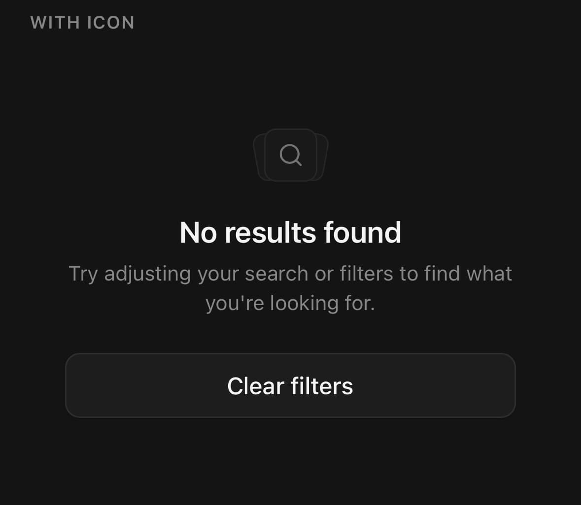
The placeholder for a list or screen with nothing in it.
Media variant="icon" frames the icon in a small card with two rotated ghost cards fanned behind it.
Say what would be here and how to get some. An empty list with no explanation reads as a list that failed to load.
Installation
EmptyState ships with the library — no separate install.
import { EmptyState, Button, SearchIcon, BellIcon } from 'panelui-native';Or copy the source into your project, to own and edit it:
npx panelui-cli@latest add empty-stateUsage
<EmptyState>
  <EmptyState.Header>
    <EmptyState.Media variant="icon">
      <SearchIcon size={18} />
    </EmptyState.Media>
    <EmptyState.Title>No results found</EmptyState.Title>
    <EmptyState.Description>
      Try adjusting your search or filters.
    </EmptyState.Description>
  </EmptyState.Header>
  <EmptyState.Content>
    <Button variant="outline" fullWidth>Clear filters</Button>
  </EmptyState.Content>
</EmptyState>
Composition
<EmptyState>
  <EmptyState.Header>
    <EmptyState.Media>…</EmptyState.Media>
    <EmptyState.Title>…</EmptyState.Title>
    <EmptyState.Description>…</EmptyState.Description>
  </EmptyState.Header>
  <EmptyState.Content>…</EmptyState.Content>
</EmptyState>EmptyState.Header— Groups media, title and description into one centred column.EmptyState.Media— Visual anchor above the title.EmptyState.Title— Heading.EmptyState.Description— Supporting text.EmptyState.Content— Slot below the header, for actions.
Examples
With an icon and an action
The icon media fans two ghost cards behind the icon; the content slot below the header holds a primary action.
<EmptyState>
  <EmptyState.Header>
    <EmptyState.Media variant="icon">
      <SearchIcon size={18} />
    </EmptyState.Media>
    <EmptyState.Title>No results found</EmptyState.Title>
    <EmptyState.Description>Try adjusting your search or filters.</EmptyState.Description>
  </EmptyState.Header>
  <EmptyState.Content>
    <Button variant="outline" fullWidth>Clear filters</Button>
  </EmptyState.Content>
</EmptyState>
Inside a card
The card variant is a self-contained bordered block sized to its contents — for an empty section inside a screen rather than a whole empty screen. Pair it with a smaller size.
<EmptyState variant="card" size="sm">
  <EmptyState.Header>
    <EmptyState.Media variant="icon">
      <BellIcon size={16} />
    </EmptyState.Media>
    <EmptyState.Title>No notifications</EmptyState.Title>
    <EmptyState.Description>You are all caught up.</EmptyState.Description>
  </EmptyState.Header>
</EmptyState>
Sizes
One size scales the padding, media, title and description together.
<EmptyState size="sm">…</EmptyState>
<EmptyState size="default">…</EmptyState>
<EmptyState size="lg">…</EmptyState>
Text only
A heading and a line, with no icon or action.
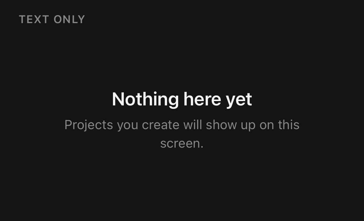
<EmptyState>
  <EmptyState.Title>No results</EmptyState.Title>
  <EmptyState.Description>Try a different search term.</EmptyState.Description>
</EmptyState>
Variants
variant
default(default)card
{/* Fills its parent — a whole screen or a flex slot. */}
<EmptyState variant="default">…</EmptyState>

{/* A bordered block that sits inside content. */}
<EmptyState variant="card">…</EmptyState>
size
smdefault(default)lg
<EmptyState size="sm">…</EmptyState>
<EmptyState size="default">…</EmptyState>
<EmptyState size="lg">…</EmptyState>
API Reference
EmptyState
| Prop | Type | Default | Description |
|---|---|---|---|
className | string | — | |
variant | 'default' | 'card' | default | default fills its parent — a whole screen, or a flex slot. card is a self-contained bordered block for an empty state that sits inside content rather than owning the screen. |
size | EmptyStateSize | default | Scales the padding, media, title and description together. |
EmptyState.Media
| Prop | Type | Default | Description |
|---|---|---|---|
className | string | — |
Every part also accepts the underlying React Native props (ViewProps or TextProps) and a className for Tailwind utilities.
Public exports
Values: EmptyState
Types: EmptyStateProps, EmptyStateMediaProps