

Label
Form field label with required, invalid and disabled states.
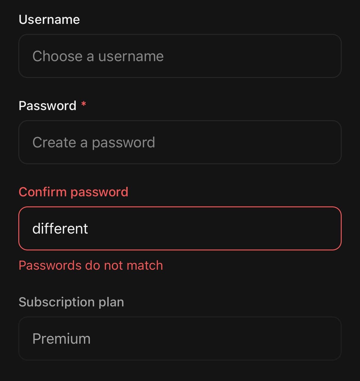
A form field label, with required, invalid and disabled states.
String children are wrapped in Label.Text for you.
Installation
Label ships with the library — no separate install.
import { Label, Input } from 'panelui-native';Or copy the source into your project, to own and edit it:
npx panelui-cli@latest add labelUsage
<Label isRequired>Password</Label>
<Input placeholder="Create a password" secureTextEntry />

<Label>
  <Label.Text className="text-base font-semibold">API key</Label.Text>
</Label>
Composition
<Label>
  <Label.Text>…</Label.Text>
</Label>Label.Text— The label text. Renders the required asterisk when the label is required.
Examples
Marking a field required
isRequired adds the asterisk and the accessibility state.
<View className="gap-1.5">
  <Label isRequired>Email</Label>
  <Input keyboardType="email-address" />
</View>
Invalid and disabled
Both are visual and semantic — pair them with the matching state on the field itself.
<Label isInvalid>Card number</Label>
<Input errorMessage="Check the number and try again." />

<Label isDisabled>Plan</Label>
<Input value="Premium" disabled />
Custom layout
Passing Label.Text instead of the children string is what lets the text be styled on its own — the required mark stays the label's, positioned the same way.
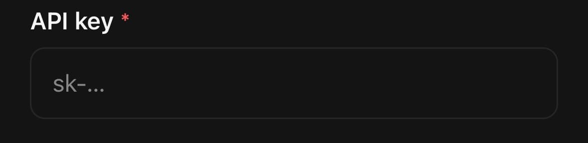
<View className="w-full gap-1.5">
  <Label isRequired>
    <Label.Text className="text-base font-semibold">API key</Label.Text>
  </Label>
  <Input placeholder="sk-…" />
</View>
API Reference
Label
| Prop | Type | Default | Description |
|---|---|---|---|
className | string | — | |
isRequired | boolean | false | Appends an asterisk marking the field as required. |
isInvalid | boolean | false | Recolours the label to signal a validation error. |
isDisabled | boolean | false |
Label.Text
| Prop | Type | Default | Description |
|---|---|---|---|
className | string | — | |
asteriskClassName | string | — | Classes for the required asterisk. |
Every part also accepts the underlying React Native props (ViewProps or TextProps) and a className for Tailwind utilities.
Public exports
Values: Label
Types: LabelProps, LabelTextProps