

BubbleChart
Named circles on two axes, with a third quantity on their area.
One circle per row, placed on two measured axes, with a third quantity on each circle's area and its name written inside it.
It is for a handful of named things — eight teams, twelve products, six regions — where the reader wants to find one of them and see where it sits. For a series of observations, where the shape of the cloud is the finding and no single point needs a name, ScatterChart does the same area mapping through sizeKey.
Colours come from the --color-chart-1 … --color-chart-5 tokens, cycling by row.
Installation
BubbleChart ships with the library — no separate install.
import { BubbleChart, Frame, Text } from 'panelui-native';Or copy the source into your project, to own and edit it:
npx panelui-cli@latest add bubble-chartUsage
<BubbleChart
  data={teams}
  xDataKey="efficiency"
  yDataKey="performance"
  sizeKey="headcount"
  labelKey="team"
>
  <BubbleChart.Grid />
  <BubbleChart.Bubbles />
  <BubbleChart.Labels />
  <BubbleChart.XAxis />
  <BubbleChart.YAxis />
  <BubbleChart.Tooltip />
</BubbleChart>
Composition
<BubbleChart>
  <BubbleChart.Grid />        {/* reference lines both ways */}
  <BubbleChart.Quadrants />   {/* a crosshair, and a name for each corner */}
  <BubbleChart.Trend />       {/* the line the cloud fits best */}
  <BubbleChart.Bubbles />     {/* the circles */}
  <BubbleChart.Labels />      {/* their names, inside them */}
  <BubbleChart.SizeKey />     {/* what an area is worth */}
  <BubbleChart.Skeleton />    {/* while status="loading" */}
  <BubbleChart.XAxis label="Efficiency" />
  <BubbleChart.YAxis label="Performance" />
  <BubbleChart.Legend />      {/* under the plot, instead of Labels */}
  <BubbleChart.Tooltip />     {/* the drag, and the readout */}
</BubbleChart>BubbleChart.Header— See props below.BubbleChart.Grid— Reference lines both ways, eight of each. That is twice the four intervals an axis is divided into, so every second line carries a number and the ones between it are halves of a labelled step.dashArraychanges the pattern; passundefinedfor solid rules.BubbleChart.Quadrants— A crosshair splitting the plot into four, with a word for each corner. It stands at the mean of each axis by default; passxandyfor a threshold somebody decided rather than one the data produced. The tint marks the two corners a reading usually ends at.BubbleChart.Trend— The least-squares line through the cloud, dashed and drawn under the circles because it is a summary of the data rather than data.onFithands back the slope, the intercept andr— 1 is every bubble on the line, 0 is a cloud with no direction at all.BubbleChart.Bubbles— The circles. Colour comes from the row unlesscoloroverrides every one of them.BubbleChart.Labels— The names, written inside the circles. A bubble too small to hold its own is left without one rather than given an unreadable one.BubbleChart.SizeKey— Three nested circles saying what a bubble's area is worth. Area is the one quantity the chart has no axis for, so without this the reader can see that one circle is bigger than another and has no way to know by how much. Needs asizeKeyon the chart.BubbleChart.Skeleton— A still field of muted circles shown whilestatus="loading", dissolving as the real ones grow in.BubbleChart.XAxis— Value labels along the bottom, evenly spaced because the axis is a continuous scale rather than a list of rows.labelwrites what the axis measures under the numbers, and the chart reserves the room for it.BubbleChart.YAxis— Value labels down the side, and the gutter they sit in.labelwrites what the axis measures up the side of it, turned on its side because that is the only way a word fits a gutter sized for numbers.BubbleChart.Tooltip— The touch target, the nearest-bubble selection it drives, and the readout that follows it.BubbleChart.Legend— A swatch and a name per bubble, drawn under the plot. Use it instead ofBubbleChart.Labelswhen the circles are too small to carry their own names.
Examples
Three quantities on one chart
Two of them are the axes and the third is the area. Say what the area means in the header — a reader who is not told has no way to work it out from the picture.
<Frame className="w-full">
  <Frame.Header>
    <Frame.Title>Performance vs efficiency</Frame.Title>
    <Frame.Action>Drag to inspect</Frame.Action>
  </Frame.Header>
  <Frame.Panel>
    <BubbleChart
      data={TEAMS}
      xDataKey="efficiency"
      yDataKey="performance"
      sizeKey="people"
      labelKey="team"
    >
      <BubbleChart.Header value="8 teams" caption="Circle area is team size" />
      <BubbleChart.Grid />
      <BubbleChart.Bubbles />
      <BubbleChart.Labels />
      <BubbleChart.XAxis />
      <BubbleChart.YAxis />
      <BubbleChart.Tooltip />
    </BubbleChart>
  </Frame.Panel>
</Frame>
Named beside, not inside
Smaller circles cannot hold their names. Use BubbleChart.Legend instead of BubbleChart.Labels — not beside it, since the same names twice is the legend telling the reader what the plot already says. It is drawn under the plot rather than floating in a corner of it: a key over the drawing area competes with the bubbles for the space they are plotted in, and on a square chart no corner is reliably empty.
<BubbleChart
  data={TEAMS}
  xDataKey="efficiency"
  yDataKey="performance"
  sizeKey="people"
  labelKey="team"
  sizeRange={[8, 22]}
>
  <BubbleChart.Grid rows={2} columns={2} />
  <BubbleChart.Bubbles opacity={0.7} />
  <BubbleChart.Legend />
  <BubbleChart.XAxis />
  <BubbleChart.YAxis />
  <BubbleChart.Tooltip />
</BubbleChart>
Four corners, not one cloud
A field of bubbles is usually read as four groups — which of these is doing well on both counts, which on neither. Without a divider the reader draws that line by eye, in a different place each time.
BubbleChart.Quadrants stands at the mean of each axis by default. Pass x and y for a target or a budget instead: a threshold somebody decided rather than one the data produced.
<BubbleChart
  data={teams}
  xDataKey="efficiency"
  yDataKey="performance"
  sizeKey="people"
  labelKey="team"
>
  <BubbleChart.Grid />
  <BubbleChart.Quadrants
    labels={{
      topLeft: 'Effective, costly',
      topRight: 'Doing both',
      bottomLeft: 'Neither yet',
      bottomRight: 'Lean, quiet',
    }}
  />
  <BubbleChart.Bubbles />
  <BubbleChart.Labels />
  <BubbleChart.XAxis label="Efficiency" />
  <BubbleChart.YAxis label="Performance" />
  <BubbleChart.Tooltip />
</BubbleChart>
What the area is worth
Position can be read off the axes. Area has no axis, so a reader can see that one circle is bigger than another and has no way to know by how much.
BubbleChart.SizeKey is the only part that answers that. The circles nest and share a baseline — three circles in a row are three sizes, three circles inside one another are one scale.
Pick the corner the data leaves free — the key is drawn over the plot, so a corner with bubbles in it puts the scale on top of the thing it is explaining.
<BubbleChart data={teams} sizeKey="people" sizeRange={[10, 34]} …>
  <BubbleChart.Grid />
  <BubbleChart.Bubbles opacity={0.75} />
  <BubbleChart.Labels />
  <BubbleChart.SizeKey placement="top-left" label="People" />
  <BubbleChart.XAxis label="Efficiency" />
  <BubbleChart.YAxis label="Performance" />
</BubbleChart>
The line through the cloud
BubbleChart.Trend fits a straight line by least squares and hands the fit back through onFit, so a header can say how tightly the cloud sits on it.
It is dashed and drawn under the circles on purpose. A solid rule through a field of bubbles reads as a value somebody plotted, and this is a summary of the data rather than part of it.
const [fit, setFit] = useState(null);

<BubbleChart data={teams} …>
  <BubbleChart.Header value={fit ? `r ${fit.r.toFixed(2)}` : '—'} />
  <BubbleChart.Grid />
  <BubbleChart.Trend onFit={setFit} />
  <BubbleChart.Bubbles opacity={0.8} />
  <BubbleChart.Labels />
  <BubbleChart.XAxis label="Efficiency" />
  <BubbleChart.YAxis label="Performance" />
</BubbleChart>
A readout outside the chart
onActivePointChange hands back the whole bubble — its label, both coordinates and the value behind its area — when the selection changes, so a header or a panel elsewhere on the screen can follow the finger.
const [active, setActive] = useState(null);

return (
  <BubbleChart
    data={TEAMS}
    xDataKey="efficiency"
    yDataKey="performance"
    sizeKey="people"
    labelKey="team"
    onActivePointChange={setActive}
  >
    <BubbleChart.Header
      value={active ? `Team ${active.label}` : '8 teams'}
      caption={active ? `${active.size} people` : 'Circle area is team size'}
    />
    <BubbleChart.Grid />
    <BubbleChart.Bubbles />
    <BubbleChart.Labels />
    <BubbleChart.Tooltip />
  </BubbleChart>
);
Loading
status="loading" shows a still field of muted circles. Still on purpose: a shimmer over them would read as the circles moving, and position is the entire message here.
<BubbleChart
  data={TEAMS}
  xDataKey="efficiency"
  yDataKey="performance"
  sizeKey="people"
  labelKey="team"
  status={status}
>
  <BubbleChart.Grid />
  <BubbleChart.Skeleton />
  <BubbleChart.Bubbles />
  <BubbleChart.Labels />
  <BubbleChart.XAxis />
  <BubbleChart.YAxis />
</BubbleChart>
Versions
Basic
The whole chart in one pass: two measured axes, a third quantity on each circle's area, and every circle carrying its own name. onActivePointChange puts whichever one is under the finger into the header, so the readout is a line of text rather than a box drawn over the field.
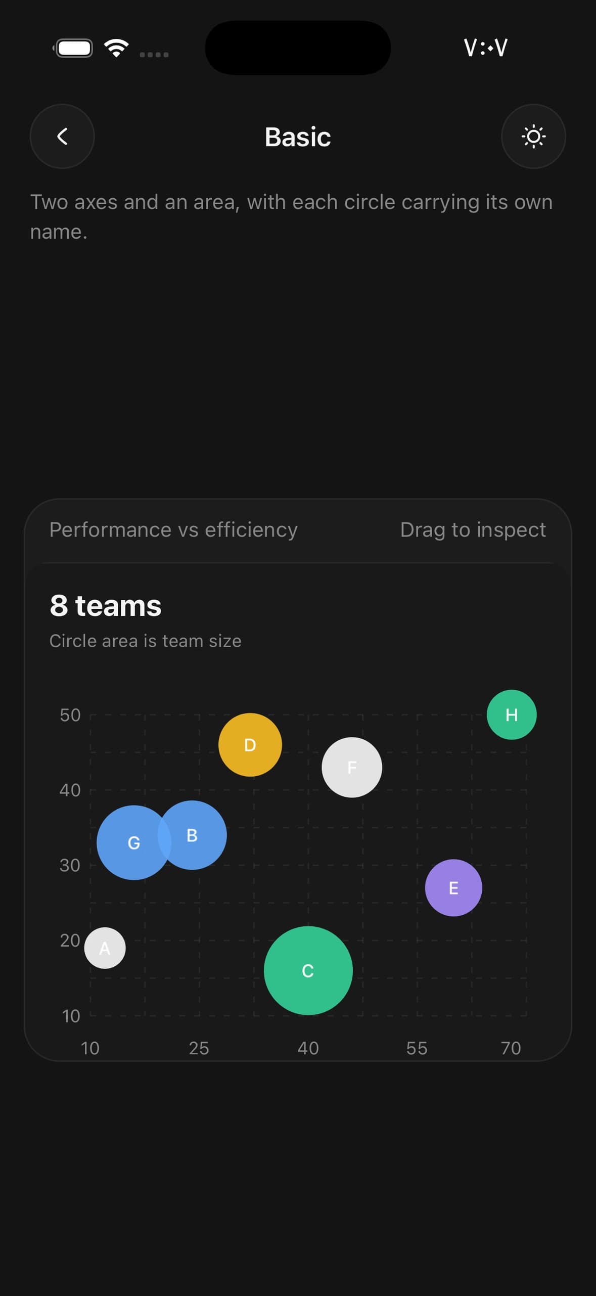
const [active, setActive] = useState<{ label: string; size: number | null } | null>(null);

<BubbleChart
  data={teams}
  xDataKey="efficiency"
  yDataKey="performance"
  sizeKey="people"
  labelKey="team"
  sizeRange={[14, 30]}
  aspectRatio={1.4}
  onActivePointChange={(point) =>
    setActive(point ? { label: point.label, size: point.size } : null)
  }
>
  <BubbleChart.Header
    value={active ? `Team ${active.label}` : '8 teams'}
    caption={
      active && active.size !== null ? `${active.size} people` : 'Circle area is team size'
    }
  />
  <BubbleChart.Grid />
  <BubbleChart.Bubbles />
  <BubbleChart.Labels />
  <BubbleChart.XAxis />
  <BubbleChart.YAxis />
  <BubbleChart.Tooltip />
</BubbleChart>
Named beside
A smaller sizeRange makes circles too small to hold a name. BubbleChart.Legend names them alongside instead of inside, and Labels comes out — a name that does not fit is a name cropped to two letters.
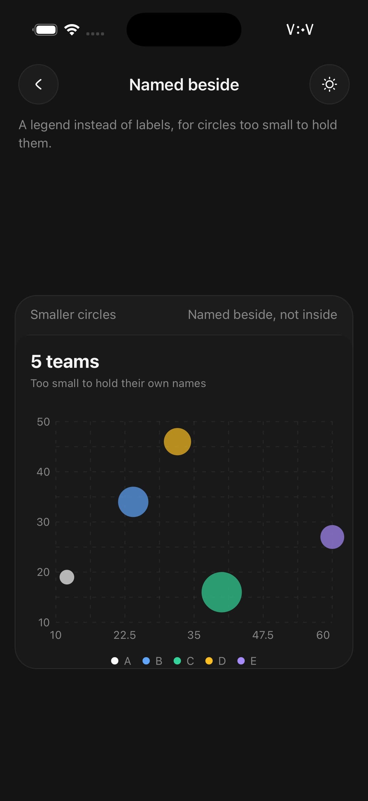
<BubbleChart
  data={teams.slice(0, 5)}
  xDataKey="efficiency"
  yDataKey="performance"
  sizeKey="people"
  labelKey="team"
  sizeRange={[8, 22]}
  aspectRatio={1.4}
>
  <BubbleChart.Header value="5 teams" caption="Too small to hold their own names" />
  <BubbleChart.Grid />
  <BubbleChart.Bubbles opacity={0.7} />
  <BubbleChart.Legend />
  <BubbleChart.XAxis />
  <BubbleChart.YAxis />
  <BubbleChart.Tooltip />
</BubbleChart>
Four quadrants
BubbleChart.Quadrants splits the plot at the average of each axis and names the corner each split makes. The four captions are the point of it: a crosshair on its own says where the middle is, and the names say what being in one corner rather than another means.
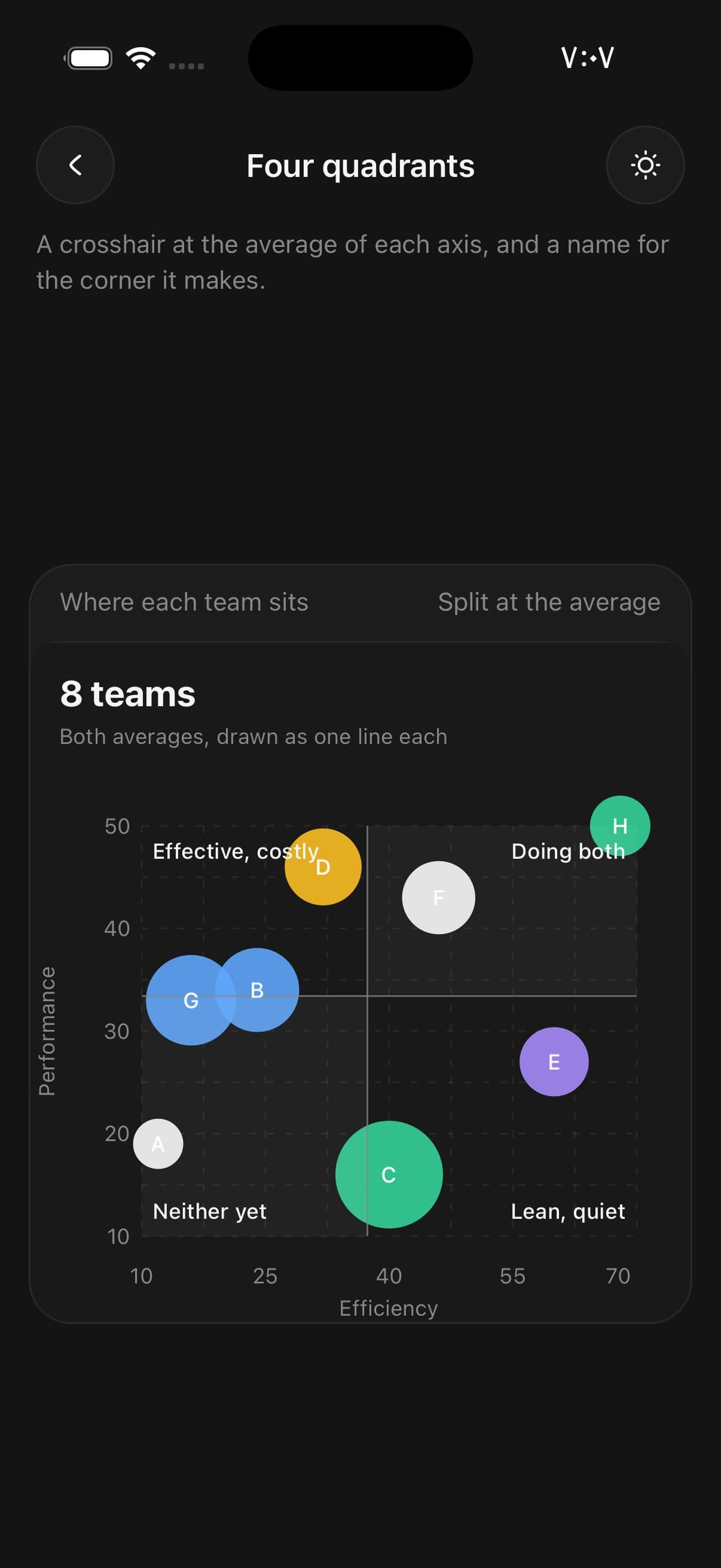
<BubbleChart
  data={teams}
  xDataKey="efficiency"
  yDataKey="performance"
  sizeKey="people"
  labelKey="team"
  sizeRange={[14, 30]}
  aspectRatio={1.2}
>
  <BubbleChart.Header value="8 teams" caption="Both averages, drawn as one line each" />
  <BubbleChart.Grid />
  <BubbleChart.Quadrants
    labels={{
      topLeft: 'Effective, costly',
      topRight: 'Doing both',
      bottomLeft: 'Neither yet',
      bottomRight: 'Lean, quiet',
    }}
  />
  <BubbleChart.Bubbles />
  <BubbleChart.Labels />
  <BubbleChart.XAxis label="Efficiency" />
  <BubbleChart.YAxis label="Performance" />
  <BubbleChart.Tooltip />
</BubbleChart>
What the area means
Area is the one quantity the chart has no axis for, so nothing on screen says what a circle is worth until BubbleChart.SizeKey does. Three nested circles — largest, middle, smallest — sharing a bottom edge and a centre line, so the areas are laid over one another rather than stacked.
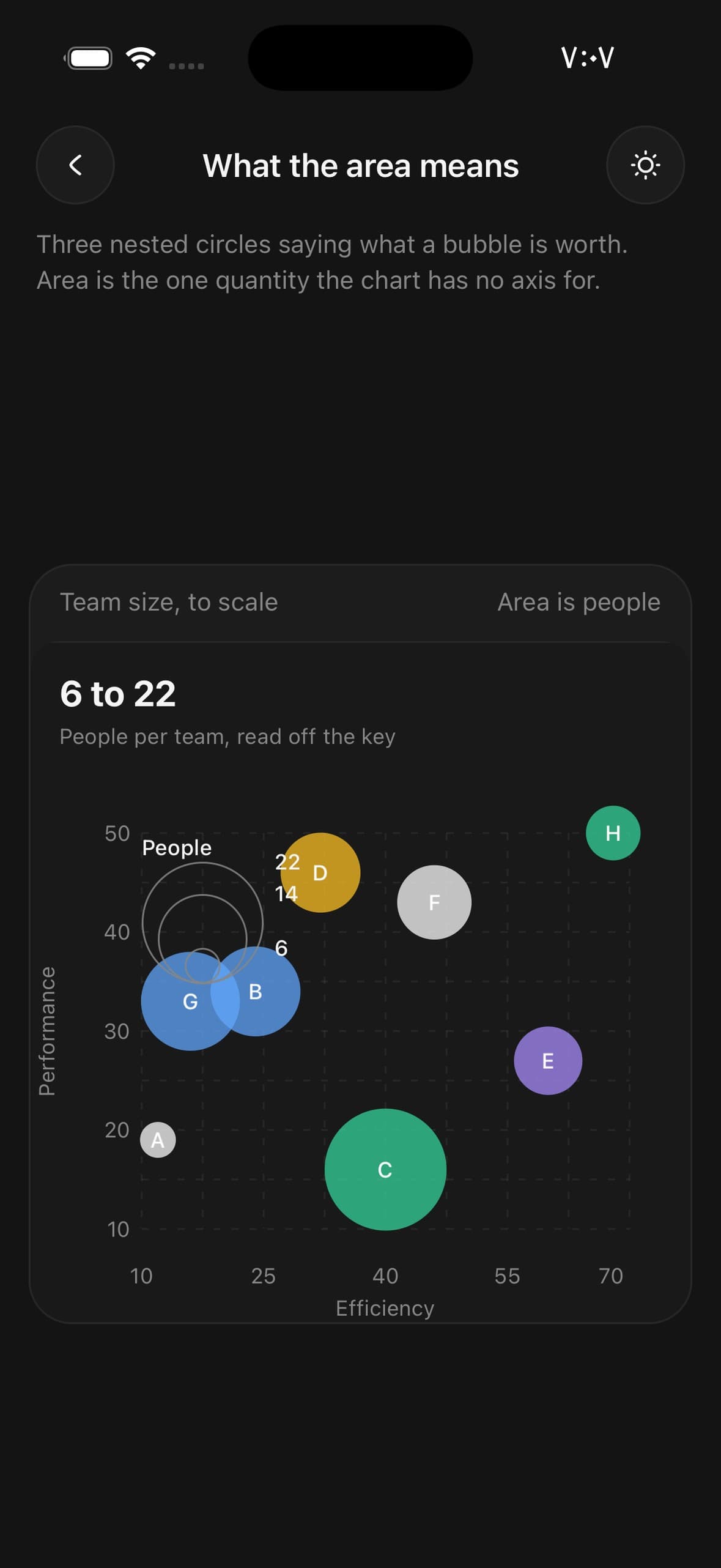
<BubbleChart
  data={teams}
  xDataKey="efficiency"
  yDataKey="performance"
  sizeKey="people"
  labelKey="team"
  sizeRange={[10, 34]}
  aspectRatio={1.2}
>
  <BubbleChart.Header value="6 to 22" caption="People per team, read off the key" />
  <BubbleChart.Grid />
  <BubbleChart.Bubbles opacity={0.75} />
  <BubbleChart.Labels />
  <BubbleChart.SizeKey placement="top-left" label="People" />
  <BubbleChart.XAxis label="Efficiency" />
  <BubbleChart.YAxis label="Performance" />
  <BubbleChart.Tooltip />
</BubbleChart>
The line through it
BubbleChart.Trend fits a least-squares line through the circles and reports the fit through onFit, so how tightly they sit on it can be said in words above the plot. The line alone claims a relationship; the coefficient is what says whether there is one.
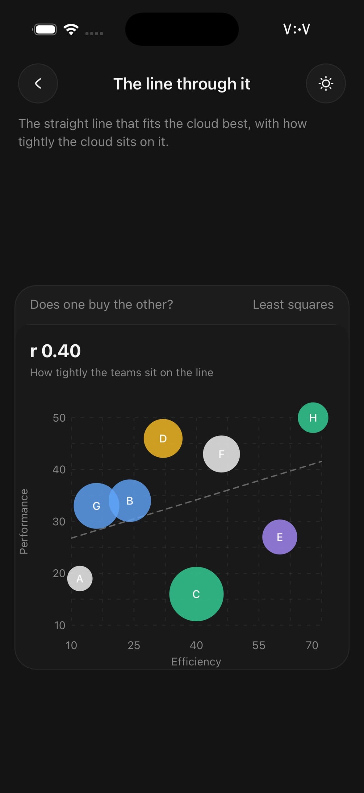
const [fit, setFit] = useState<{ slope: number; r: number } | null>(null);

<BubbleChart
  data={teams}
  xDataKey="efficiency"
  yDataKey="performance"
  sizeKey="people"
  labelKey="team"
  sizeRange={[14, 30]}
  aspectRatio={1.2}
>
  <BubbleChart.Header
    value={fit ? `r ${fit.r.toFixed(2)}` : '—'}
    caption={
      fit && fit.r < 0.3 ? 'Barely a relationship' : 'How tightly the teams sit on the line'
    }
  />
  <BubbleChart.Grid />
  <BubbleChart.Trend onFit={setFit} />
  <BubbleChart.Bubbles opacity={0.8} />
  <BubbleChart.Labels />
  <BubbleChart.XAxis label="Efficiency" />
  <BubbleChart.YAxis label="Performance" />
  <BubbleChart.Tooltip />
</BubbleChart>
Loading
status="loading" draws BubbleChart.Skeleton — a still field of muted circles in the plot's own geometry — and dissolves it as the real circles land. The axes and the grid stay put throughout, so the chart does not resize under the reader at the moment the data arrives.
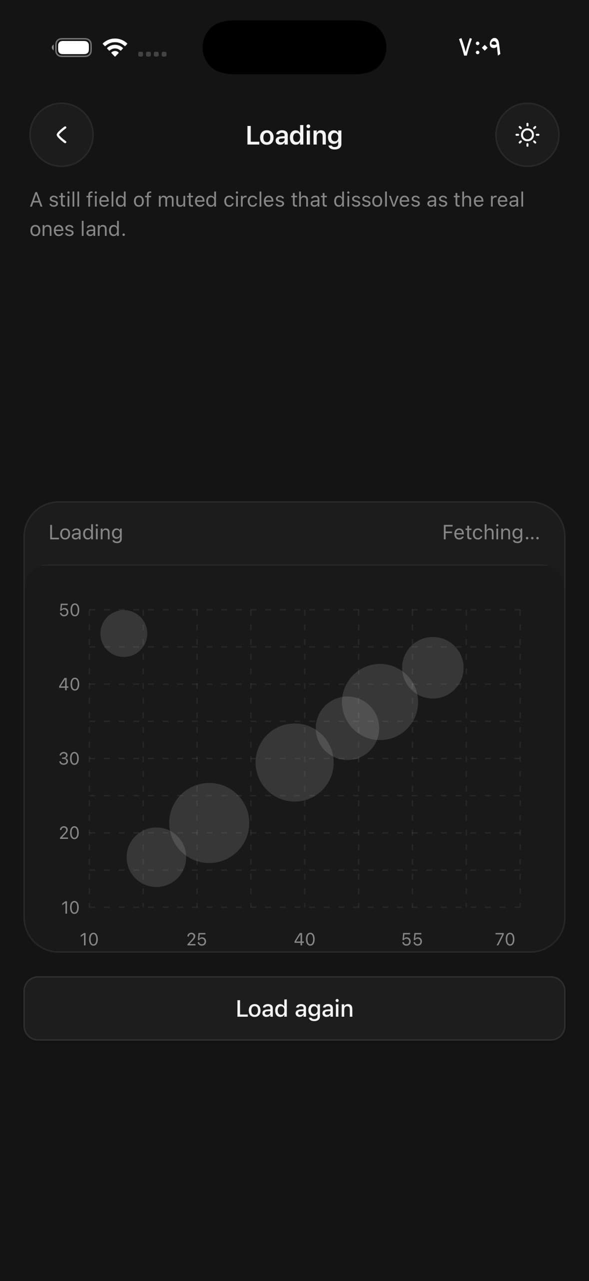
<BubbleChart
  data={teams}
  xDataKey="efficiency"
  yDataKey="performance"
  sizeKey="people"
  labelKey="team"
  sizeRange={[14, 30]}
  status={status}
  aspectRatio={1.4}
>
  <BubbleChart.Grid />
  <BubbleChart.Skeleton />
  <BubbleChart.Bubbles />
  <BubbleChart.Labels />
  <BubbleChart.XAxis />
  <BubbleChart.YAxis />
</BubbleChart>
API Reference
BubbleChart
| Prop | Type | Default | Description |
|---|---|---|---|
className | string | — | |
data | BubbleChartDatum[] | — | The rows. One bubble each. |
xDataKey | string | 'x' | Key holding the horizontal value. |
yDataKey | string | 'y' | Key holding the vertical value. |
sizeKey | string | — | Key holding the third quantity, mapped to each bubble's area. Without it every bubble is drawn at the middle of sizeRange and the chart is a scatter plot with names on it. |
labelKey | string | — | Key holding the name written inside the circle. |
colorKey | string | — | Key holding a colour for the row — either a CSS colour or a number from 1 to 5 naming a --color-chart-* token. Without it the ramp cycles by row. |
sizeRange | [number, number] | — | Smallest and largest radius sizeKey maps onto, in points. The largest is also what the plot holds back at every edge, so raising it costs room. |
status | BubbleChartStatus | 'ready' | loading shows a still field of muted circles and dissolves it as the real bubbles grow in. One component throughout, rather than a spinner swapped for a chart — swapping loses the transition. Add a BubbleChart.Skeleton for something to stand in the plot meanwhile. |
aspectRatio | number | 1 | Width ÷ height. 1 is the square shape a bubble field reads best in. |
animationDuration | number | 800 | Milliseconds for the bubbles to grow in on mount. |
domainDuration | number | 500 | Milliseconds for the axes to settle after the data changes. |
xDomain | [number, number] | — | Fix the horizontal axis instead of deriving it. |
yDomain | [number, number] | — | Fix the vertical axis instead of deriving it. |
onActivePointChange | (point: BubbleChartPoint | null) => void | — | The bubble under the finger, and null when it lifts. |
BubbleChart.Grid
| Prop | Type | Default | Description |
|---|---|---|---|
rows | number | 8 | Horizontal rules across the plot. Eight, which is twice the four intervals an axis is divided into by default, so every second line carries a number and the ones between it are halves of a labelled step rather than an unrelated rhythm. Squares this size recede behind the circles; the coarse grid a smaller number draws reads as blocks laid over the plot. |
columns | number | 8 | Vertical rules up it. Both axes are measured, so both earn lines. |
dashArray | string | — | Dash pattern for the rules. Pass undefined for solid ones. |
color | string | — | |
opacity | number | 1 |
BubbleChart.Trend
| Prop | Type | Default | Description |
|---|---|---|---|
onFit | (fit: { slope: number; intercept: number; r: number }) => void | — | The line's slope and intercept, and how tightly the cloud sits on it, once they have been computed. r runs 0 to 1: 1 is every bubble on the line, 0 is a cloud with no direction at all. Given here rather than left for the caller to work out, because the fit is already being computed to draw the line and doing it twice invites the two answers to disagree. It fires when the numbers change, not on every render that produced the same ones, so putting the fit straight into state is safe. |
color | string | — | |
strokeWidth | number | 1.5 | |
dashArray | string | — | Dash pattern. Dashed by default: the line is a reading, not a measurement. |
opacity | number | 0.7 |
BubbleChart.Bubbles
| Prop | Type | Default | Description |
|---|---|---|---|
opacity | number | 1 | Fill opacity. Below 1 by default so that overlapping bubbles read as denser rather than hiding each other — in a crowded corner that overlap is the finding, and opaque circles erase it. |
color | string | — | One colour for every bubble, overriding the per-row ramp. |
BubbleChart.Skeleton
| Prop | Type | Default | Description |
|---|---|---|---|
count | number | — | How many placeholder circles to scatter. |
color | string | — |
BubbleChart.Labels
| Prop | Type | Default | Description |
|---|---|---|---|
minRadius | number | 10 | Smallest radius a bubble may have and still be given its label. Below it the name is wider than the circle it names. |
format | (point: BubbleChartPoint) => string | — | Turn a bubble into its label. Defaults to the value at labelKey. |
className | string | — |
BubbleChart.Quadrants
| Prop | Type | Default | Description |
|---|---|---|---|
x | number | — | Where the vertical rule stands. Defaults to the mean of the x values. |
y | number | — | Where the horizontal rule lies. Defaults to the mean of the y values. |
labels | { | — | A word for each corner, written in the corner it belongs to. |
topLeft | string | — | |
topRight | string | — | |
bottomLeft | string | — | |
bottomRight | string | — | |
tint | boolean | true | Tint the high-high and low-low corners. On by default. |
color | string | — | |
className | string | — |
BubbleChart.SizeKey
| Prop | Type | Default | Description |
|---|---|---|---|
placement | 'top-left' | 'top-right' | 'bottom-left' | 'bottom-right' | 'bottom-right' | Which corner of the plot it sits in. |
format | (value: number) => string | — | Turn a value into its label. Defaults to a compact number. |
label | string | — | A word for what the area means — "people", "revenue". |
className | string | — |
BubbleChart.XAxis
| Prop | Type | Default | Description |
|---|---|---|---|
ticks | number | — | How many intervals to divide the axis into. Yields ticks + 1 labels. Four, and the domain is rounded out to four steps to match, so the numbers come out round. Fewer leaves most of the grid unnamed — a line with nothing beside it is a line the reader has to count their way to. |
format | (value: number) => string | — | Turn a value into its label. Defaults to a compact number. |
label | string | — | What the axis measures, written under the numbers. |
className | string | — |
BubbleChart.YAxis
| Prop | Type | Default | Description |
|---|---|---|---|
ticks | number | — | How many intervals to divide the axis into. Yields ticks + 1 labels. Four, matching the four steps the domain is rounded out to and every second line of the default grid. |
format | (value: number) => string | — | Turn a value into its label. Defaults to a compact number. |
label | string | — | What the axis measures, written up the side of it. |
className | string | — |
BubbleChart.Tooltip
| Prop | Type | Default | Description |
|---|---|---|---|
showLabel | boolean | true | Float a small readout beside the selected bubble. On by default. |
formatX | (value: number) => string | — | Format the x value for the readout. Defaults to a compact number. |
formatY | (value: number) => string | — | Format the y value for the readout. Defaults to a compact number. |
formatSize | (value: number) => string | — | Format the size value for the readout. Defaults to a compact number. |
hitRadius | number | 22 | Floor on the touch target, for a chart whose smallest bubbles are tiny. |
className | string | — |
BubbleChart.Legend
| Prop | Type | Default | Description |
|---|---|---|---|
className | string | — | |
limit | number | — | Cap on how many bubbles are named. The rest are left to the readout. |
BubbleChart.Header
| Prop | Type | Default | Description |
|---|---|---|---|
className | string | — | |
title | string | — | Small line above the value — what the chart is of. |
value | string | — | The readout. The largest thing on the card, and the first thing read. |
caption | string | — | One muted line under the value — what the area means, usually. |
Every part also accepts the underlying React Native props (ViewProps or TextProps) and a className for Tailwind utilities.
Notes
Area, not radius
sizeKey maps to a circle's area. Doubling a radius quadruples the ink, so a chart that scaled the radius would show a doubled value as four times the size and the reader would believe the picture. sizeRange is the smallest and largest radius the scale runs between, and the scale runs over the whole data set so one bubble's size means the same thing as another's. Its upper end is also what the plot holds back at every edge — a circle is drawn about its centre, so without that the bubble carrying the largest value is the one cropped in half.
Without a sizeKey every bubble is drawn at the middle of sizeRange, which is a scatter plot with names on it — and an honest one.
The grid, and the numbers on it
The grid draws eight rules each way and each axis prints five numbers, so every second gridline carries one. That relationship is the point of both defaults: a number beside every line of a grid fine enough to read against is a column of numbers, and a grid coarse enough for that reads as blocks laid behind the circles.
The domain is rounded out to the same four steps the axes are divided into, so the numbers come out round rather than ending wherever the data happened to end.
rows, columns and ticks all move independently if a chart wants a different rhythm — keep the grid a whole multiple of the ticks, or the numbers stop landing on lines.
Naming the axes
label on XAxis and YAxis says what each one measures. The chart reserves the room before it lays the plot out, so adding one moves the plot rather than writing over it. The y label is turned on its side, which is the only way a word fits a gutter sized for numbers.
Colour
The ramp cycles by row. Pass colorKey to name a colour per row: either a CSS colour, or a number from 1 to 5 selecting a --color-chart-* token. BubbleChart.Bubbles also takes a single color for every circle, which is what a chart with a legend usually wants.
Selection
The readout clears the edge of the bubble rather than its centre, and drops below it where there is no room above — lifted by a constant it landed on the larger circles, which are exactly the ones a finger is most likely to be resting on.
A touch picks the nearest bubble whose own circle — or the hitRadius floor, whichever is larger — reaches the finger. Nearest rather than topmost, because where bubbles overlap the one drawn last is not the one being aimed at.
Accessible data
The chart exposes one screen-reader summary and one semantic entry per data row; its SVG circles, axes and labels stay decorative. Set accessibilityLabel for the summary, accessibilityLabelForDatum to phrase a row in your own words, and onAccessibilityDatumPress to make each row activatable. Pass accessible={false} to drop the semantic layer entirely.
Public exports
Values: BubbleChart, useBubbleChart
Types: BubbleChartProps, BubbleChartHandle, BubbleChartHeaderProps, BubbleChartGridProps, BubbleChartQuadrantsProps, BubbleChartTrendProps, BubbleChartBubblesProps, BubbleChartLabelsProps, BubbleChartSizeKeyProps, BubbleChartSkeletonProps, BubbleChartXAxisProps, BubbleChartYAxisProps, BubbleChartTooltipProps, BubbleChartLegendProps, BubbleChartDatum, BubbleChartPoint, BubbleChartStatus