

ButtonGroup
Several buttons drawn as one control — a segmented run, a split action, a toolbar.

Several buttons drawn as one control: a segmented run, a split action, a toolbar down the side of a canvas.
The buttons stay Buttons. Anything a button does — an icon, a badge, a loading state, a disabled segment, opening a Popover — it still does inside a group, because the group is a container rather than a component that takes a list of items and renders them for you.
It is not a selection control, and it does not track which button is on. Use ToggleButtonGroup when the control owns which one is selected, and Tabs when the buttons switch between panels of content — a segmented run that swaps a screen is navigation, and it should say so to a screen reader.
Installation
ButtonGroup ships with the library — no separate install.
import { ButtonGroup, Button, Badge, Popover, Text, PencilIcon, CopyIcon, TrashIcon, FileIcon, ImageIcon, BookmarkIcon, SendIcon, ChevronDownIcon, StarIcon, EyeIcon, PlusIcon, MinusIcon, MaximizeIcon, CrosshairIcon } from 'panelui-native';Or copy the source into your project, to own and edit it:
npx panelui-cli@latest add button-groupUsage
<ButtonGroup variant="outline">
  <Button startContent={<PencilIcon size={16} />}>Rename</Button>
  <Button startContent={<CopyIcon size={16} />}>Duplicate</Button>
  <Button startContent={<TrashIcon size={16} />} disabled>Remove</Button>
</ButtonGroup>
Examples
A view switcher
variant and size fill in for any button that did not choose its own, so a run of three does not repeat the same two props three times. The current segment says secondary for itself and wins — which is all “selected” needs to be once the surrounding shape is already drawn.
const [view, setView] = useState('media');

<ButtonGroup size="sm">
  {views.map(({ value, label, icon: Icon }) => (
    <Button
      key={value}
      variant={view === value ? 'secondary' : 'ghost'}
      startContent={<Icon size={15} />}
      onPress={() => setView(value)}
    >
      {label}
    </Button>
  ))}
</ButtonGroup>
Sharing the row
fullWidth spans the container and splits it equally between the segments — equally, not by content. A row sized to its labels is a row whose divisions move when the labels change, and a picker whose thirds are different widths reads as though one of them matters more.
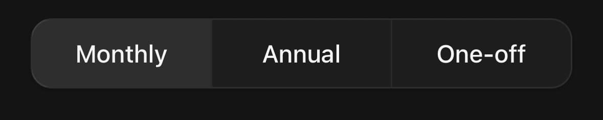
<ButtonGroup fullWidth>
  <Button variant="ghost">Monthly</Button>
  <Button variant="secondary">Annual</Button>
  <Button variant="ghost">One-off</Button>
</ButtonGroup>
A split action
The thing itself, and the other ways to do it. The chevron segment is a Button inside a Popover.Trigger — a button nested inside something else — which still picks the group up, because the group passes its variant and size down through context rather than by rewriting the children it can see.
<ButtonGroup variant="outline">
  <Button startContent={<SendIcon size={16} />}>Publish</Button>
  <Popover>
    <Popover.Trigger>
      <Button size="icon" accessibilityLabel="More ways to publish">
        <ChevronDownIcon size={16} />
      </Button>
    </Popover.Trigger>
    <Popover.Content align="end" className="w-56 p-1.5">
      {/* …the other ways… */}
    </Popover.Content>
  </Popover>
</ButtonGroup>
A count inside a segment
endContent takes a Badge the same way it would outside a group. Nothing about being in a run changes what a button can hold.
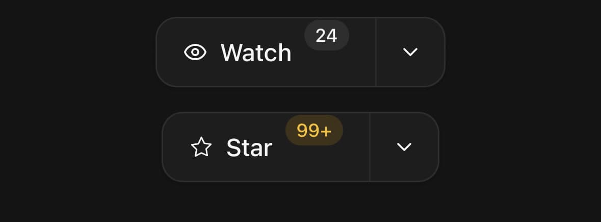
<ButtonGroup variant="outline">
  <Button
    startContent={<StarIcon size={16} />}
    endContent={<Badge variant="warning" count={148} />}
  >
    Star
  </Button>
  <Button size="icon" accessibilityLabel="Star options">
    <ChevronDownIcon size={16} />
  </Button>
</ButtonGroup>
Down the side
orientation="vertical" stacks the run and turns the dividers with it. With size="icon" this is the toolbar beside a canvas.
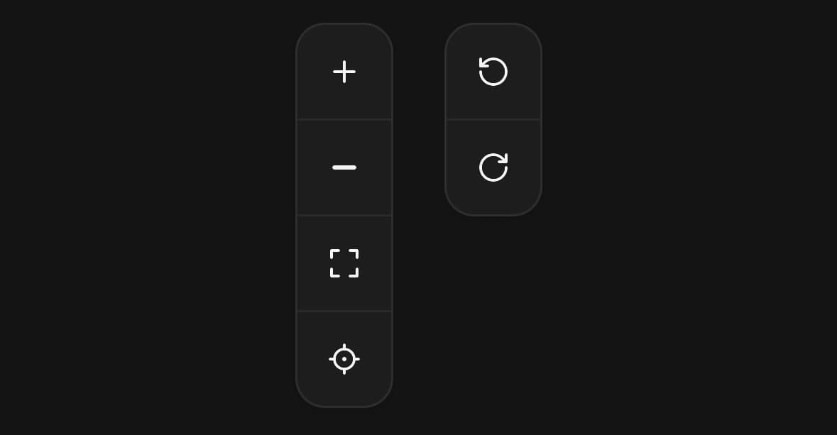
<ButtonGroup orientation="vertical" variant="outline" size="icon">
  <Button accessibilityLabel="Zoom in"><PlusIcon size={16} /></Button>
  <Button accessibilityLabel="Zoom out"><MinusIcon size={16} /></Button>
  <Button accessibilityLabel="Fit to screen"><MaximizeIcon size={16} /></Button>
</ButtonGroup>
Sharing the props without sharing the shape
attached={false} keeps the inherited variant and size and drops the joined shape, leaving a spaced row of ordinary buttons. A toolbar rather than a segmented control.
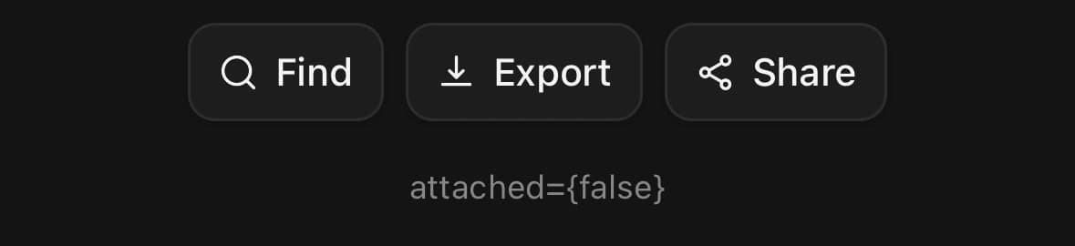
<ButtonGroup attached={false} variant="outline" size="sm">
  <Button startContent={<SearchIcon size={15} />}>Find</Button>
  <Button startContent={<DownloadIcon size={15} />}>Export</Button>
  <Button startContent={<ShareNodesIcon size={15} />}>Share</Button>
</ButtonGroup>
Busy and unavailable
A segment carries its own state. loading swaps its label for a spinner and stops it answering; disabled fades it and deafens it. Neither takes the segment out of the run — a joined shape with a hole in it is harder to read than a dim segment, and the row would resize under the finger as the state changed.
<ButtonGroup variant="outline">
  <Button startContent={<PencilIcon size={16} />}>Rename</Button>
  <Button startContent={<CopyIcon size={16} />}>Duplicate</Button>
  <Button startContent={<TrashIcon size={16} />} disabled>
    Remove
  </Button>
</ButtonGroup>

<ButtonGroup variant="outline">
  <Button loading={saving} onPress={save}>
    {saving ? 'Saving' : 'Save layout'}
  </Button>
  <Button size="icon" accessibilityLabel="Revert">
    <PlusIcon size={16} />
  </Button>
</ButtonGroup>
Three sizes
size on the group is the size of every segment in it, and it sets the height, the padding and the type together so the joined edges still meet. A segment that names its own size wins, which is how the chevron on a split action stays square while the rest of the run is not.
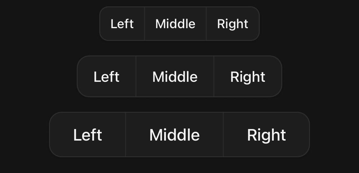
{(['sm', 'md', 'lg'] as const).map((size) => (
  <ButtonGroup key={size} size={size} variant="outline">
    <Button>Left</Button>
    <Button>Middle</Button>
    <Button>Right</Button>
  </ButtonGroup>
))}
Variants
orientation
horizontal(default)vertical
<ButtonGroup orientation="horizontal">…</ButtonGroup>
<ButtonGroup orientation="vertical">…</ButtonGroup>
attached
true(default)false
<ButtonGroup attached>…</ButtonGroup>
<ButtonGroup attached={false}>…</ButtonGroup>
size
smmd(default)lgxlicon
<ButtonGroup size="sm">…</ButtonGroup>
<ButtonGroup size="md">…</ButtonGroup>
<ButtonGroup size="lg">…</ButtonGroup>
<ButtonGroup size="xl">…</ButtonGroup>
<ButtonGroup size="icon">…</ButtonGroup>
fullWidth
true
<ButtonGroup fullWidth>…</ButtonGroup>API Reference
ButtonGroup
| Prop | Type | Default | Description |
|---|---|---|---|
className | string | — | |
orientation | ButtonGroupOrientation | horizontal | Which way the run reads. Vertical is the toolbar down the side of a canvas. |
variant | ButtonVariant | — | Fills in for any button that did not choose its own. |
size | ButtonSize | md | Fills in for any button that did not choose its own, and sets the radius. |
attached | boolean | true | Draw the run as one joined shape. On by default — that is what a group is. Turn it off for a plain row of separate buttons that should still share a variant and a size, which is a toolbar rather than a segmented control. |
fullWidth | boolean | false | Span the container, with the segments sharing it equally. Equally, not by content: a row of segments at their natural widths is a row whose divisions move when the labels change, and a picker whose halves are different sizes reads as though one of them matters more. |
Every part also accepts the underlying React Native props (ViewProps or TextProps) and a className for Tailwind utilities.
Notes
Why the container draws the border
A joined run could be built by giving the first and last segments their corners, squaring the ones between, and collapsing every shared edge with a negative margin. That works on the web and is a stack of off-by-one problems on a phone: the hairlines land on different fractions of a pixel per device, and a run that wraps has no first or last segment any more.
So the group draws the shape once — one border, one radius, one shadow, clipped — and the buttons inside draw none of their own. The dividers are real one-pixel views the group puts between its children, which is why they are always exactly one pixel and always in the same place.
What a button gives up inside one
Its radius and its shadow, because the group owns both. Its border turns transparent rather than being removed — it is holding a pixel of the button's height, and dropping it would leave an outline segment a hair shorter than a ghost one beside it.
Its press feedback changes too. A button on its own shrinks slightly when pressed, which inside a joined run would pull the segment away from its neighbours and show the container through the gap, so an attached segment takes a background instead. Pass pressScale yourself to override that.
Native buttons are not grouped
A native button is drawn by the platform, so it has no border, radius or shadow for the group to take over. Several of them in a row would be platform buttons with a border drawn around them rather than a segmented control, so a native button inside a group ignores it and stays exactly what it was.
Public exports
Values: ButtonGroup
Types: ButtonGroupProps, ButtonGroupOrientation