

RingChart
Concentric arcs, each measured against its own target.
Progress towards several targets, as concentric arcs.
Each ring is a value against its own target, so three rings can all sit at ninety percent of three unrelated numbers and that is the reading. Nothing is normalised across rings and nothing has to add up.
That is the difference from a PieChart, which divides one whole between its slices and whose angles must come to a full turn.
If the chart you need is not one of these, Plot is the same drawing machinery with nothing decided: you compose the marks — columns, lines, fills, dots, and marks you write yourself — over one measured box and one shared scale.
Installation
RingChart ships with the library — no separate install.
import { RingChart, type RingDatum, Frame, Text } from 'panelui-native';Or copy the source into your project, to own and edit it:
npx panelui-cli@latest add ring-chartUsage
<RingChart data={goals} size={208}>
  <RingChart.Header title="Today" value="81%" legend />
  {goals.map((goal, index) => (
    <RingChart.Ring key={goal.label} index={index} />
  ))}
  <RingChart.Center />
</RingChart>
Composition
<RingChart data={…}>
  <RingChart.Header />                 {/* the strip above the rings */}
  <RingChart.Ring index={0} />         {/* one per entry, outermost first */}
  <RingChart.Ring index={1} />
  <RingChart.Center />                 {/* the readout in the hole */}
  <RingChart.Legend />
</RingChart>RingChart.Header— The strip above the rings — what the chart is of, what it reads, and a key for the colours. The chart introducing itself, as distinct from the caption on the card around it.RingChart.Ring— One ring: a track, and the arc showing how far along it the value has got. Segment it into ticks withsegments.RingChart.Center— The readout in the hole. Shows the outermost ring until one is selected, then that ring’s own figures.RingChart.Legend— A swatch, a name and a percentage per ring — pressable in the same way the rings are, and usually the easier target of the two. PreferHeader legendon a chart that has a header.
Examples
The data
Each ring carries its own target. maxValue is what makes an arc mean something: without it the arc shows how far something went, and with it, how far it went of what it was aiming at.
const goals: RingDatum[] = [
  { label: 'Move', value: 486, maxValue: 600 },
  { label: 'Exercise', value: 24, maxValue: 30 },
  { label: 'Stand', value: 9, maxValue: 12 },
];
Selecting a ring
Press a ring, or its row in the legend, and the centre swaps to that ring’s figures. Pressing it again clears the selection. Control it from outside with activeIndex and onActiveIndexChange when something else on the screen has to stay in step.
const [active, setActive] = useState(-1);

<RingChart data={goals} activeIndex={active} onActiveIndexChange={setActive}>
  {goals.map((goal, index) => (
    <RingChart.Ring key={goal.label} index={index} />
  ))}
  <RingChart.Center />
  <RingChart.Legend />
</RingChart>
Drawing the middle yourself
Center takes a render function instead of its default layout. It is given the selected ring, or null when nothing is selected.
<RingChart.Center>
  {(ring) => (
    <>
      <Text size="xs" muted>{ring ? ring.label : 'Today'}</Text>
      <Text size="xl" weight="semibold">
        {ring ? `${Math.round((ring.value / ring.maxValue) * 100)}%` : '3 goals'}
      </Text>
    </>
  )}
</RingChart.Center>
Sizing it
Left alone the chart measures its container and stays square — which inside a card means a plot twice as tall as a bar or area chart at aspectRatio={2}. Give it a size and it draws that square and centres it in whatever it was handed. strokeWidth and ringGap decide how much of it the rings take and how much hole is left, and the hole is what the centre readout has to fit inside, so a chart of many thick rings has room for a number and not much else.
{/* Sized, and centred in its container. The usual answer in a card. */}
<RingChart data={goals} size={208} strokeWidth={16} ringGap={6}>…</RingChart>

{/* Or left to fill, when the chart is the screen. */}
<RingChart data={goals} strokeWidth={18} ringGap={6}>…</RingChart>
Opening the ring into a gauge
startAngle and endAngle are degrees clockwise from twelve o’clock. Leave a turn between them and the ring closes; leave less and the gap becomes the notch a dial has always had at the bottom. The track stops where the arc stops, and so does the touch target — the dead part of a gauge stays dead.
<RingChart data={[health]} size={208} startAngle={-135} endAngle={135} strokeWidth={18}>
  <RingChart.Header title="Score" value="82 of 100" />
  <RingChart.Ring index={0} />
  <RingChart.Center formatValue={(value) => `${value}`} />
</RingChart>
Counting in ticks
segments breaks the ring into that many ticks, lit one at a time as the value climbs. For a target made of countable things: eight of twelve sessions reads off ticks you can count, and off a smooth arc only as “about two thirds”. The ends square themselves off unless you say otherwise, because a rounded cap on a tick as long as it is wide draws a lozenge.
<RingChart data={[{ label: 'Sessions', value: 8, maxValue: 12 }]} size={208} strokeWidth={16}>
  <RingChart.Header title="Sessions attended" value="8 of 12" />
  <RingChart.Ring index={0} segments={12} segmentGap={6} />
  <RingChart.Center formatValue={(value) => `${value}`} />
</RingChart>
Versions
Today's goals
Three targets, each read against its own rather than against each other. Selecting a ring swaps the header’s figures for that ring’s.
<RingChart data={goals} size={208} strokeWidth={16} ringGap={6} activeIndex={active} onActiveIndexChange={setActive}>
  <RingChart.Header value={`${percent}%`} caption={caption} legend />
  {goals.map((goal, index) => (
    <RingChart.Ring key={goal.label} index={index} />
  ))}
  <RingChart.Center defaultLabel="Move" />
</RingChart>
Gauge
The ring opened to three quarters of a turn, with the notch at the bottom where a dial has always had it. One value, and the room a wide hole gives the number.
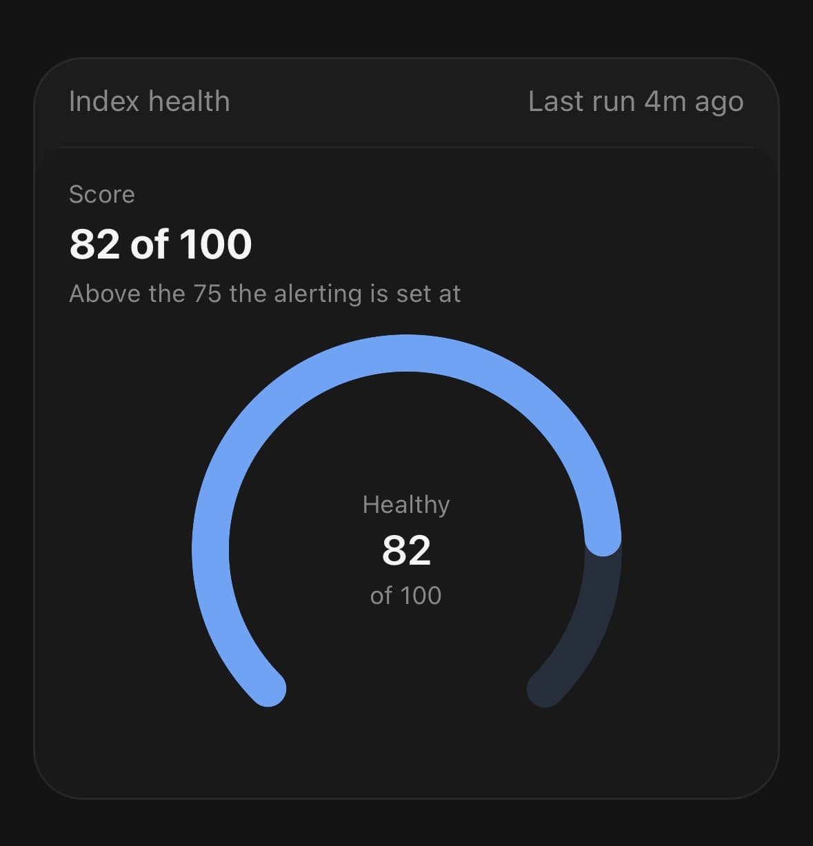
<RingChart data={[health]} size={208} startAngle={-135} endAngle={135} strokeWidth={18}>
  <RingChart.Header title="Score" value="82 of 100" caption="Above the 75 the alerting is set at" />
  <RingChart.Ring index={0} colorIndex={2} />
  <RingChart.Center formatValue={(value) => `${value}`} />
</RingChart>
Segmented
Ticks rather than an arc, for a target made of countable things. Twelve sessions, eight of them attended, and you can count them.
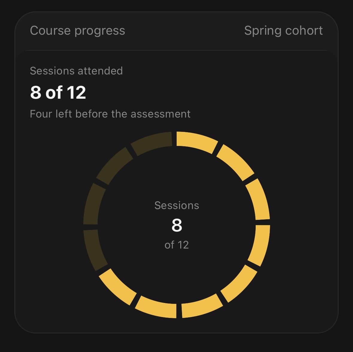
<RingChart data={[sessions]} size={208} strokeWidth={16}>
  <RingChart.Header title="Sessions attended" value="8 of 12" />
  <RingChart.Ring index={0} segments={12} segmentGap={6} colorIndex={4} />
  <RingChart.Center formatValue={(value) => `${value}`} />
</RingChart>
Separate dials
Three charts rather than three rings. Concentric, the outer ring is longer than the inner one at the same percentage and the eye reads the length — so targets that are not read against each other are better off apart.
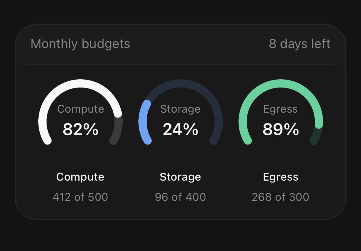
{budgets.map((budget, index) => (
  <RingChart key={budget.label} data={[budget]} size={92} strokeWidth={9} startAngle={-120} endAngle={120}>
    <RingChart.Ring index={0} colorIndex={index + 1} />
    <RingChart.Center formatValue={() => `${percentOf(budget)}%`} />
  </RingChart>
))}
API Reference
RingChart
| Prop | Type | Default | Description |
|---|---|---|---|
className | string | — | |
data | RingDatum[] | — | One entry per ring, outermost first. |
size | number | — | Fixed diameter in points. Measured from the container when omitted. |
strokeWidth | number | 12 | Thickness of each ring. |
ringGap | number | 6 | Gap between one ring and the next. |
startAngle | number | 0 | Where the arcs begin, in degrees clockwise from twelve o'clock. 0 is the top, 90 the right-hand side. |
endAngle | number | 360 | Where they end, on the same clock. Leaving a turn's worth between the two gives a closed ring; anything less leaves a gap and reads as a gauge — startAngle={-90} endAngle={90} is the half circle over the top. |
animationDuration | number | 700 | Milliseconds for the arcs to sweep in. |
activeIndex | number | — | Selected ring. Leave unset to let the chart track it. |
onActiveIndexChange | (index: number) => void | — | Fires with the selected ring, or -1 when the selection is cleared. |
RingChart.Ring
| Prop | Type | Default | Description |
|---|---|---|---|
index | number | — | Which entry in data this ring draws. |
color | string | — | Explicit colour, overriding the datum's and the token. |
colorIndex | SeriesColorIndex | — | Which of the five chart tokens to take, when the datum names no colour. |
lineCap | 'round' | 'butt' | — | Rounded ends, or square ones. Defaults to round, and to square when the ring is segmented — a rounded cap on a tick as long as it is wide draws a lozenge rather than a tick. |
trackOpacity | number | 0.15 | Opacity of the track behind the arc. |
segments | number | — | Break the ring into this many ticks, lit one at a time as the value climbs. For a target made of countable things — eight of twelve sessions reads off ticks you can count, and off a smooth arc only as "about two thirds". |
segmentGap | number | 3 | Gap between one tick and the next, in points. |
RingChart.Center
| Prop | Type | Default | Description |
|---|---|---|---|
defaultLabel | string | — | Heading shown when no ring is selected. Defaults to the outermost ring's own name, which is what the centre shows when nothing has been picked. |
formatValue | (value: number, ring: RingDatum | null) => string | — | Format the number under the label. Defaults to a compact number. |
className | string | — |
RingChart.Legend
| Prop | Type | Default | Description |
|---|---|---|---|
className | string | — | |
showValue | boolean | — | Show each ring's percentage of its own target beside its name. |
RingChart.Header
| Prop | Type | Default | Description |
|---|---|---|---|
className | string | — | |
title | string | — | Small line above the value — what the chart is of. |
value | string | — | The readout. The largest thing on the card, and the first thing read. |
caption | string | — | One muted line under the value — a period, a comparison, a target. |
labels | Record<string, string> | — | Prettier names for the rings, keyed by their label. |
legend | boolean | false | Draw a swatch and a name per ring along the trailing edge. Prefer this to RingChart.Legend on a chart that has a header: that legend hangs off the bottom of the square, where it overlaps whatever is under the chart. |
Every part also accepts the underlying React Native props (ViewProps or TextProps) and a className for Tailwind utilities.
Notes
Why every ring has a track
An arc drawn on nothing shows how far something went. An arc drawn on a full circle shows how far it went of what it was aiming at, which is the entire question a ring chart is asked. The track is the target made visible.
A value past its target fills the ring and stops there. Going round twice would draw 110% as 10%, which is the wrong answer told confidently.
What the centre shows
The outermost ring, until one is selected. Not a total: the rings measure different things against different targets, so their values do not add up and their percentages do not average — a total in the middle would be a confident number about nothing. Pass a render function to Center when your rings do share a unit and a total is honest.
The header, and the card around it
RingChart.Header belongs to the chart; the card's header belongs to the tray the chart sits in. The distinction is worth keeping: the header's value changes as a ring is selected, and its legend is the list the chart itself is holding. Pass the formatted value in rather than expecting it to be derived — there is no total to derive from targets that measure different things.
Touch, not hover
Rings are selected by pressing them. There is no equivalent here of a pointer resting somewhere without committing, so a chart that only revealed its numbers on hover would never reveal them at all — and because a twelve-point band is below the size a finger reliably hits, the touch target is widened well past the ring it belongs to.
Reduced motion
The sweep is skipped and the arcs draw at their final length.
Public exports
Values: RingChart, useRingChart
Types: RingChartProps, RingChartHandle, RingChartRingProps, RingChartCenterProps, RingChartLegendProps, RingDatum