

Alert
Status message with a built-in icon.
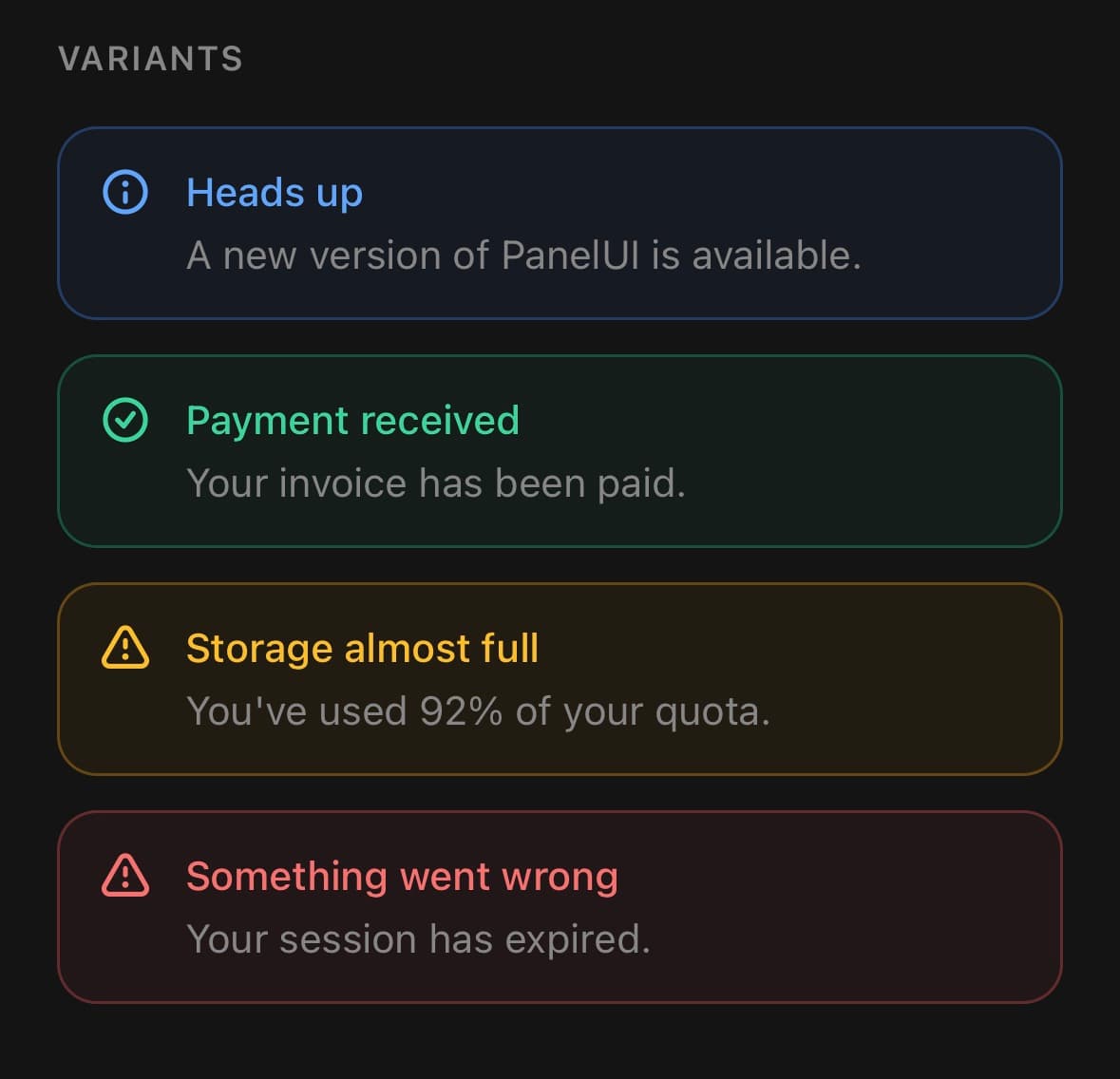
A status message: something the reader needs to know about the screen they are on.
Alert.Indicator resolves both the icon and its colour from the alert's variant, so neither is passed in and both follow the active theme.
Use it for a condition that persists on the page. For something transient that arrives and leaves, use Toast.
Installation
Alert ships with the library — no separate install.
import { Alert, ShieldCheckIcon } from 'panelui-native';Or copy the source into your project, to own and edit it:
npx panelui-cli@latest add alertUsage
<Alert variant="success">
  <Alert.Indicator />
  <Alert.Content>
    <Alert.Title>Payment received</Alert.Title>
    <Alert.Description>Your invoice has been paid.</Alert.Description>
  </Alert.Content>
</Alert>
Composition
<Alert>
  <Alert.Indicator />
  <Alert.Content>
    <Alert.Title>…</Alert.Title>
    <Alert.Description>…</Alert.Description>
  </Alert.Content>
</Alert>Alert.Indicator— Leading status icon, picked from the variant. Pass children to override it.Alert.Content— Flex-1 wrapper for the title and description.Alert.Title— Heading, coloured by the variant.Alert.Description— Body text, always muted.
Examples
With a title and description
The indicator picks its icon from the variant, so most alerts need no icon prop.
<Alert variant="warning">
  <Alert.Indicator />
  <Alert.Content>
    <Alert.Title>Card expiring</Alert.Title>
    <Alert.Description>
      Your card ending 4242 expires next month.
    </Alert.Description>
  </Alert.Content>
</Alert>
Title only
Drop the description when the title says everything.

<Alert variant="success">
  <Alert.Indicator />
  <Alert.Content>
    <Alert.Title>Changes saved</Alert.Title>
  </Alert.Content>
</Alert>
A custom icon
Pass icon on the root to replace the variant icon everywhere, or give Alert.Indicator children to replace it for one alert.
<Alert variant="info" icon={<ShieldCheckIcon size={18} />}>
  <Alert.Indicator />
  <Alert.Content>
    <Alert.Title>Two-factor authentication is on</Alert.Title>
  </Alert.Content>
</Alert>
No icon
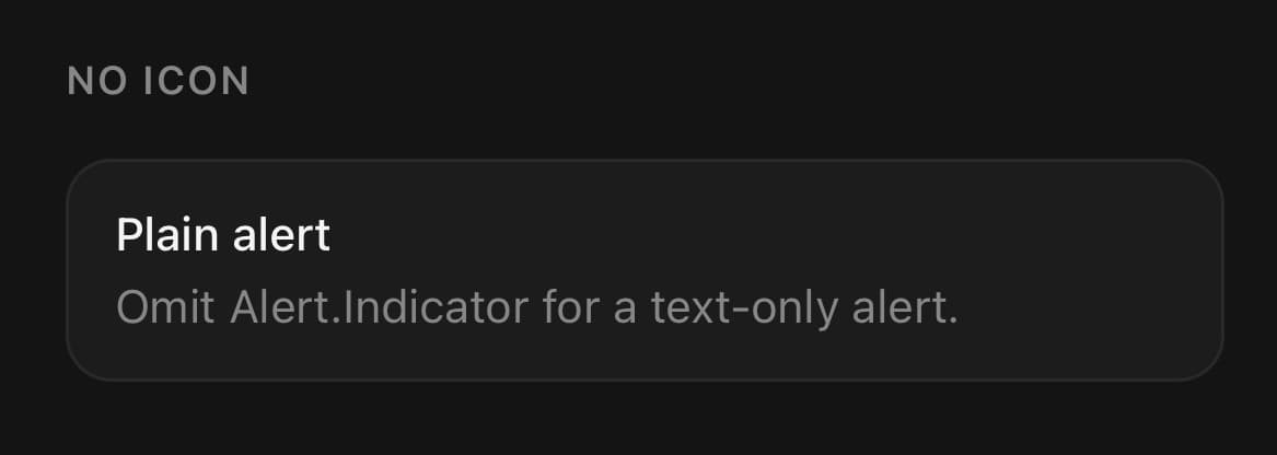
Leave out Alert.Indicator for a text-only alert.
<Alert>
  <Alert.Content>
    <Alert.Title>Plain alert</Alert.Title>
    <Alert.Description>Omit Alert.Indicator for a text-only alert.</Alert.Description>
  </Alert.Content>
</Alert>
Variants
variant
default(default)infosuccesswarningdestructive
<Alert variant="default">…</Alert>
<Alert variant="info">…</Alert>
<Alert variant="success">…</Alert>
<Alert variant="warning">…</Alert>
<Alert variant="destructive">…</Alert>
API Reference
Alert
| Prop | Type | Default | Description |
|---|---|---|---|
className | string | — | |
icon | ReactNode | — | Leading element rendered before the content. Deprecated. Prefer <Alert.Indicator>, which picks a status icon for you. Still honoured so v0.2 call sites keep rendering. |
Alert.Indicator
| Prop | Type | Default | Description |
|---|---|---|---|
className | string | — | |
iconProps | { size?: number; color?: string } | — | Overrides the size/colour of the default status icon. |
Every part also accepts the underlying React Native props (ViewProps or TextProps) and a className for Tailwind utilities.
Notes
Omit Alert.Indicator for a text-only alert. The legacy icon prop still renders, but prefer the indicator.
Public exports
Values: Alert
Types: AlertProps, AlertIndicatorProps