

Surface
Elevated container with a variant ladder.
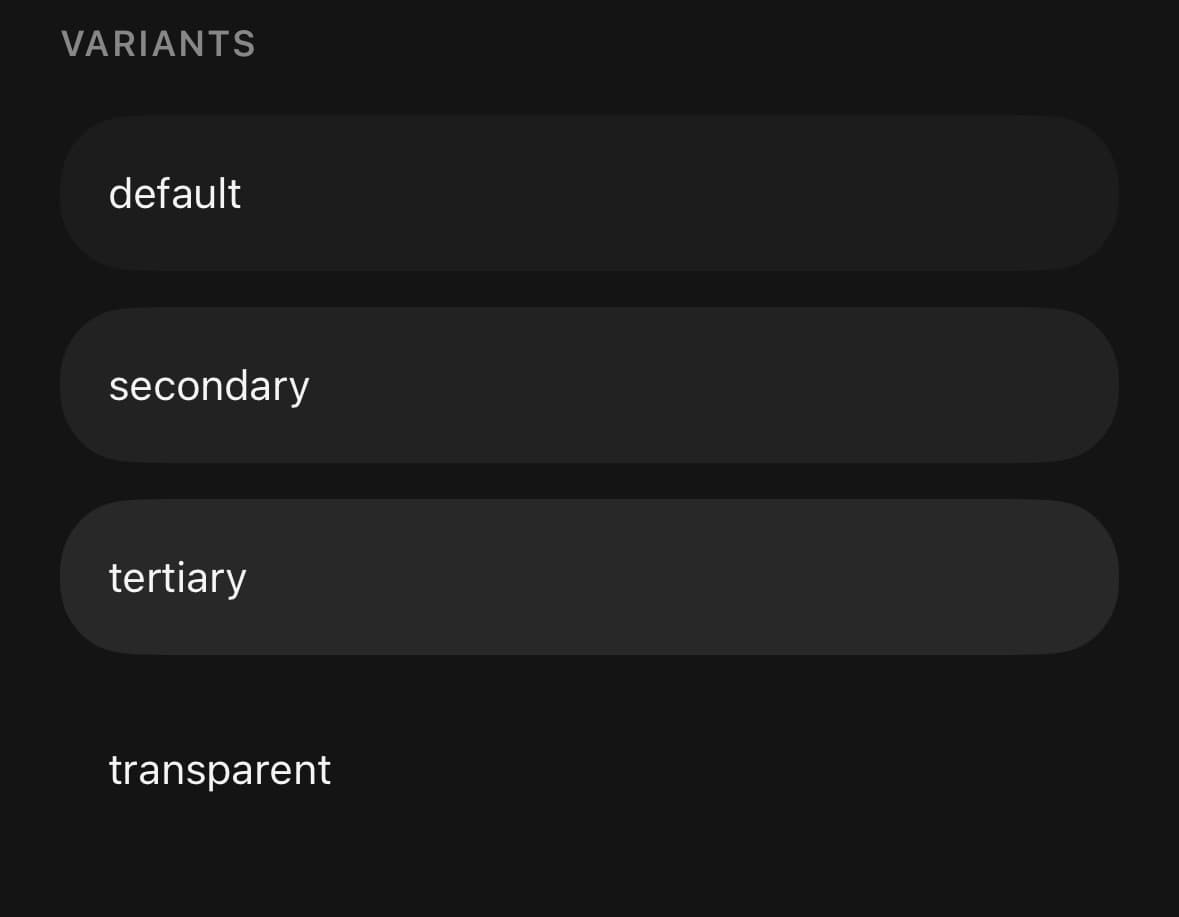
An elevated container, with a variant ladder for building hierarchy.
Nest the variants: each level sits one step further from the page background than the one around it.
Both the fill and the corner radius follow the active theme. The variants resolve to themed surface tokens and rounded-3xl resolves through the per-theme radius scale, so the same Surface is a 24px corner under Panel and a 32px one under Moon without knowing about either.
For a surface with a header, body and footer, use Card.
Installation
Surface ships with the library — no separate install.
import { Surface, Text } from 'panelui-native';Or copy the source into your project, to own and edit it:
npx panelui-cli@latest add surfaceUsage
<Surface>
  <Text weight="medium">Account</Text>

  <Surface variant="secondary" className="mt-3">
    <Text size="sm" muted>Signed in as khalid@example.com</Text>

    <Surface variant="tertiary" className="mt-3">
      <Text size="xs" muted>Session expires in 12 days</Text>
    </Surface>
  </Surface>
</Surface>
Examples
Nested hierarchy
The variants form a ladder, not a palette: each step sits one level further from the background, so nesting them builds depth without naming a colour.
<Surface>
  <Text weight="medium">Account</Text>
  <Surface variant="secondary" className="mt-3">
    <Text size="sm" muted>Signed in as khalid@example.com</Text>
    <Surface variant="tertiary" className="mt-3">
      <Text size="xs" muted>Session expires in 12 days</Text>
    </Surface>
  </Surface>
</Surface>
Bordered and elevated
A surface the same colour as the page needs a hairline to read as its own plane. elevated adds a soft shadow that lifts it off the page — off by default, because a nested surface takes its depth from its fill.
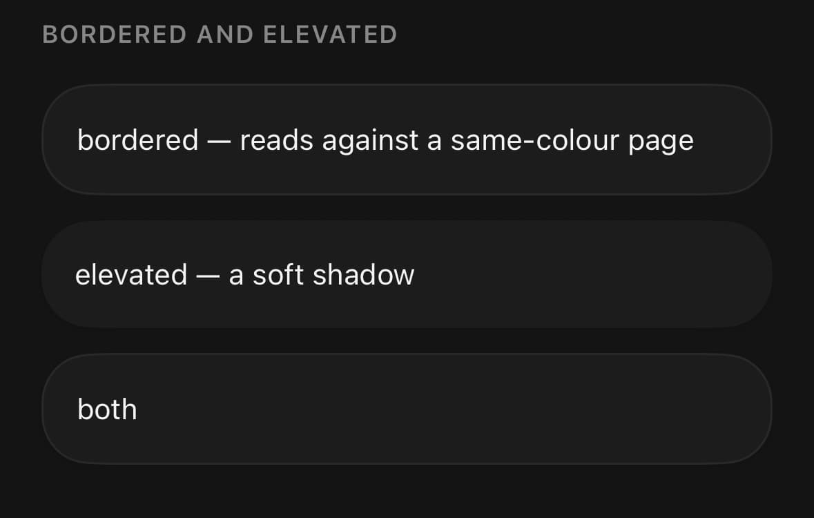
<Surface bordered>…</Surface>
<Surface elevated>…</Surface>
<Surface bordered elevated>…</Surface>
Padding scale
padding scales the inner spacing. none is for a surface wrapping a bled image or a chart, where the content reaches the edge.
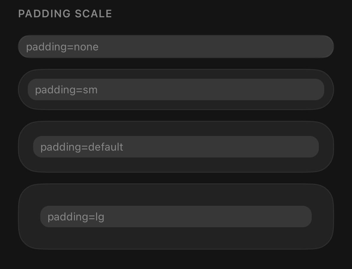
<Surface padding="none">…</Surface>
<Surface padding="sm">…</Surface>
<Surface padding="default">…</Surface>
<Surface padding="lg">…</Surface>
As a stat card
A bordered surface with generous padding is the whole card for a metric.
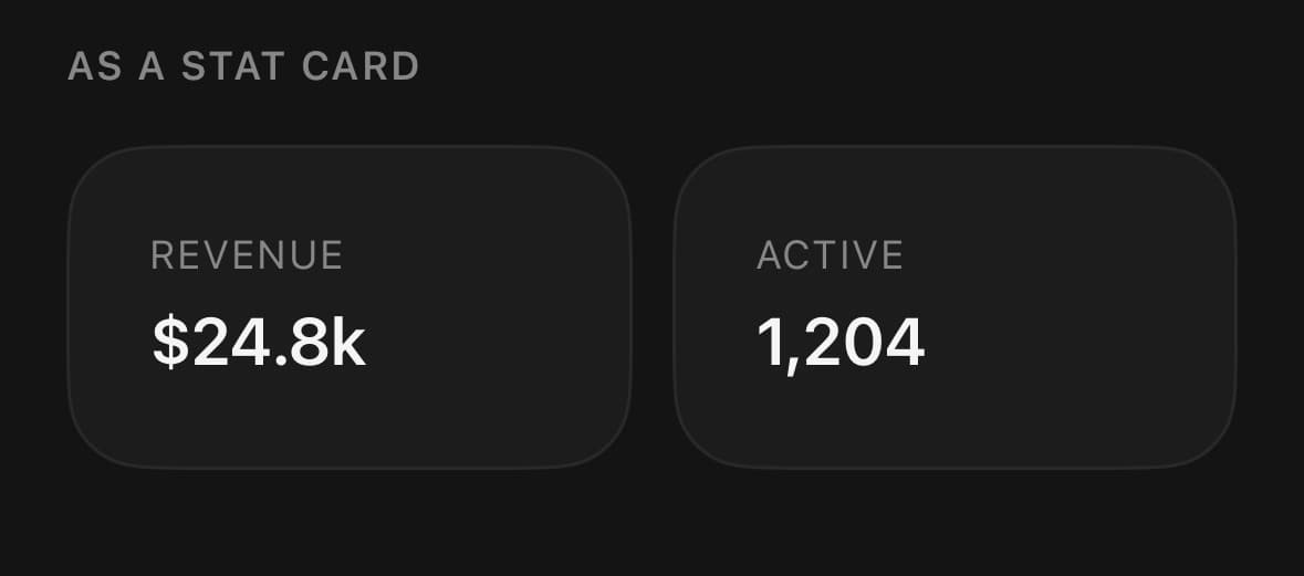
<Surface bordered padding="lg" className="flex-1">
  <Text size="xs" muted className="uppercase tracking-wider">Revenue</Text>
  <Text size="xl" weight="semibold" className="mt-1">$24.8k</Text>
</Surface>
Variants
variant
default(default)secondarytertiarytransparent
<Surface variant="default" className="p-4">Default</Surface>
<Surface variant="secondary" className="p-4">Secondary</Surface>
<Surface variant="tertiary" className="p-4">Tertiary</Surface>
<Surface variant="transparent" className="p-4">Transparent</Surface>
padding
nonesmdefault(default)lg
<Surface padding="none">…</Surface>
<Surface padding="sm">…</Surface>
<Surface padding="default">…</Surface>
<Surface padding="lg">…</Surface>
bordered
true
<Surface bordered>…</Surface>elevated
true
<Surface elevated>…</Surface>API Reference
Surface
| Prop | Type | Default | Description |
|---|---|---|---|
className | string | — | |
bordered | boolean | — | A hairline border. A surface the same colour as what it sits on needs one to read as a distinct plane rather than dissolving into the background. |
elevated | boolean | — | A soft shadow lifting the surface off the page. Off by default because a nested surface reads its depth from its fill, not from a shadow it would only cast onto its parent. |
padding | 'none' | 'sm' | 'default' | 'lg' | default | Inner spacing. none is for a surface wrapping a bled image or a chart. |
Every part also accepts the underlying React Native props (ViewProps or TextProps) and a className for Tailwind utilities.
Notes
borderCurve: 'continuous' is applied on iOS, giving Apple's squircle corner rather than a circular arc — visibly smoother at this radius. Android ignores it.
Use variant="transparent" when you want the padding and radius without a fill.
Public exports
Values: Surface
Types: SurfaceProps