

Typography
Semantic text presets.
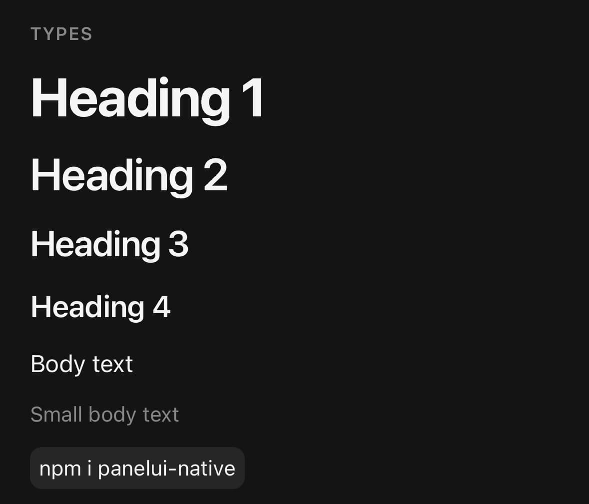
Semantic text presets, built on the Text primitive.
A preset sets size, weight and tracking together. The marks — underline, italic, strike — and weight, align and transform layer on top of whichever preset is in force.
They are props rather than class names, so a screen never has to know which utilities add up to "a bolded lead paragraph".
Installation
Typography ships with the library — no separate install.
import { Typography } from 'panelui-native';Or copy the source into your project, to own and edit it:
npx panelui-cli@latest add typographyUsage
<Typography type="h1">Heading 1</Typography>
<Typography type="body-sm" muted>Small body text</Typography>
<Typography underline>Terms of service</Typography>

<Typography.Heading type="h2">Section title</Typography.Heading>
<Typography.Paragraph>Body copy.</Typography.Paragraph>
<Typography.Code>npm i panelui-native</Typography.Code>
Composition
<Typography type="h1">…</Typography>

<Typography.Heading type="h2">…</Typography.Heading>
<Typography.Paragraph>…</Typography.Paragraph>
<Typography.Code>…</Typography.Code>
<Typography.Blockquote>…</Typography.Blockquote>

<Typography.List>
  <Typography.ListItem>…</Typography.ListItem>
</Typography.List>Typography.Heading— Heading text, wired up with the matching accessibility heading level.Typography.Paragraph— Body copy, at any of the body presets.Typography.Code— Inline code on a muted surface.Typography.Blockquote— A quotation, marked by a rule down its leading edge.Typography.List— A bulleted or numbered list. Draws the markers React Native does not have.Typography.ListItem— One line of a list. The marker beside it belongs to the list.
Examples
Headings and body
The type scale in one place, so headings stay consistent instead of being rebuilt from size and weight classes. lead is the sentence under a heading; large and small are the two steps either side of body.
<Typography.Heading type="h1">Ship it</Typography.Heading>

<Typography.Paragraph type="lead">
  Everything you need to build a screen, and nothing you have to style twice.
</Typography.Paragraph>

<Typography.Paragraph>
  Body copy at the default size.
</Typography.Paragraph>

<Typography.Paragraph type="small" muted>
  Updated 3 minutes ago
</Typography.Paragraph>
Marks
underline, italic and strike are booleans and stack, and weight overrides whatever the preset set — which is how a paragraph gets bolded without becoming a heading.
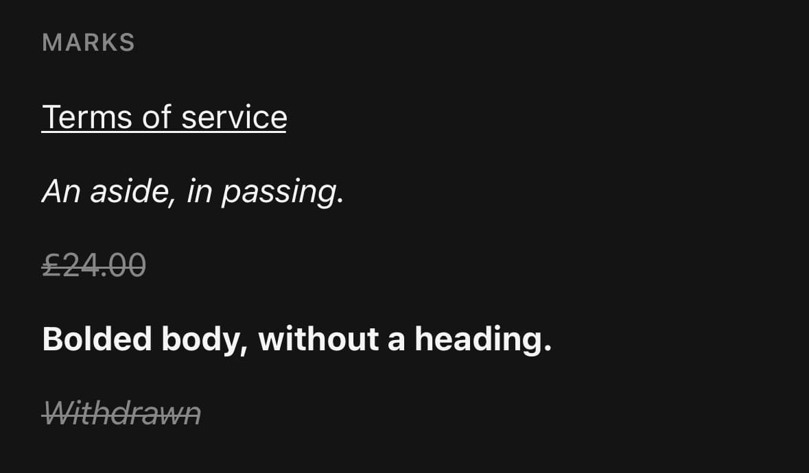
<Typography underline>Terms of service</Typography>
<Typography italic>An aside, in passing.</Typography>
<Typography strike muted>£24.00</Typography>
<Typography weight="bold">Total due today</Typography>

{/* They stack. */}
<Typography italic strike muted>Withdrawn</Typography>
Alignment and case
transform changes how the text is drawn, not the string underneath — so a screen reader still announces the original, and a label copied out of the UI is not shouting.
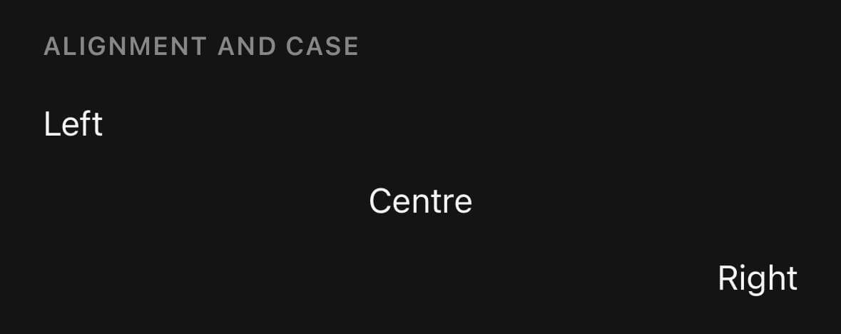
<Typography align="center">Centred</Typography>

<Typography type="body-xs" transform="uppercase" muted>
  Section label
</Typography>
Quotes and lists
React Native draws no list markers and has no blockquote, so both are built here: a rule down the leading edge for the quote, and a marker beside each row for the list. The bullet is a view rather than the • character, whose size and baseline move with the platform font. Both use logical edges, so they mirror under a right-to-left Direction.
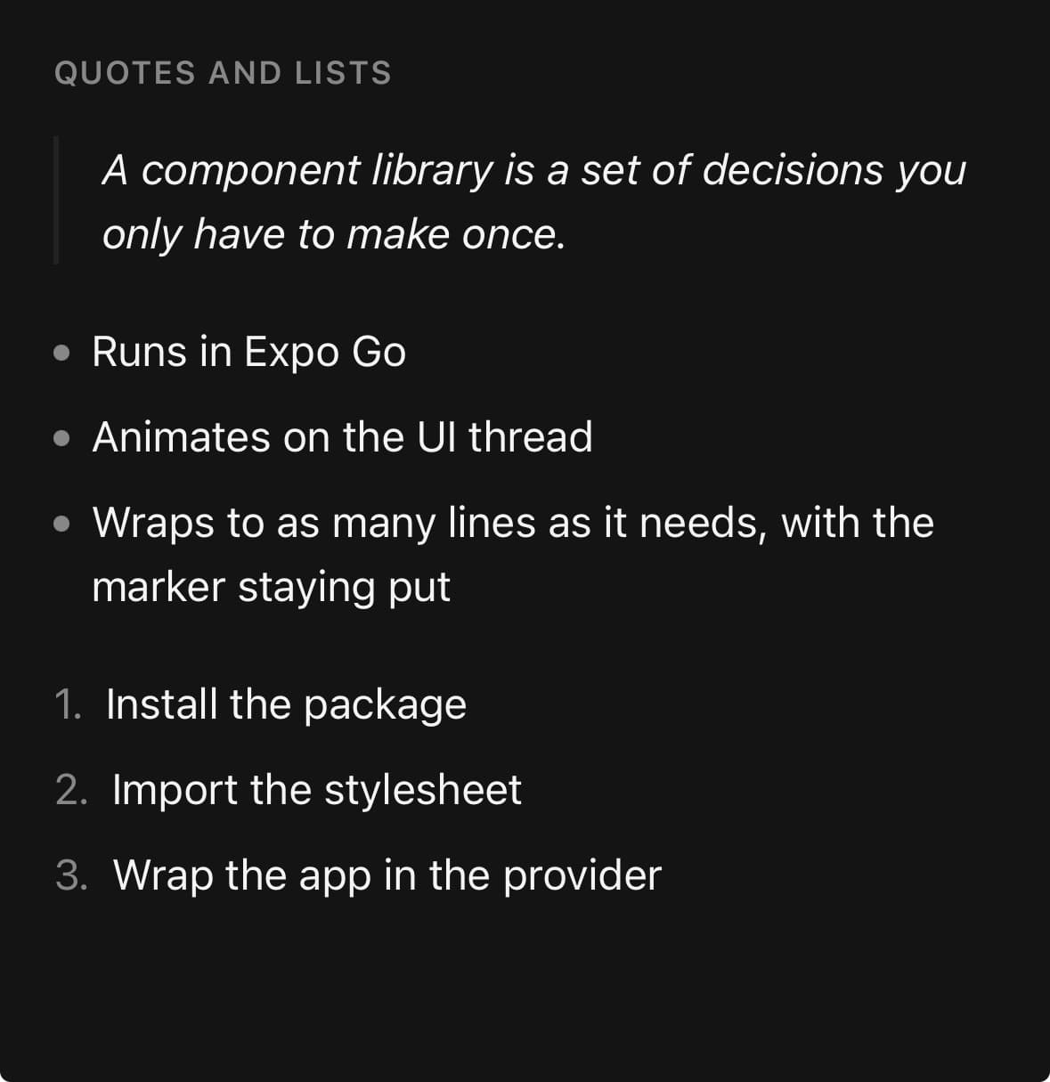
<Typography.Blockquote>
  A component library is a set of decisions you only have to make once.
</Typography.Blockquote>

<Typography.List>
  <Typography.ListItem>Runs in Expo Go</Typography.ListItem>
  <Typography.ListItem>Animates on the UI thread</Typography.ListItem>
</Typography.List>

<Typography.List ordered>
  <Typography.ListItem>Install the package</Typography.ListItem>
  <Typography.ListItem>Import the stylesheet</Typography.ListItem>
</Typography.List>
Inline and block code
<Typography.Paragraph>
  Run <Typography.Code>npx expo install</Typography.Code> first.
</Typography.Paragraph>
Paragraphs
Typography.Paragraph for body copy, with type and muted for emphasis.
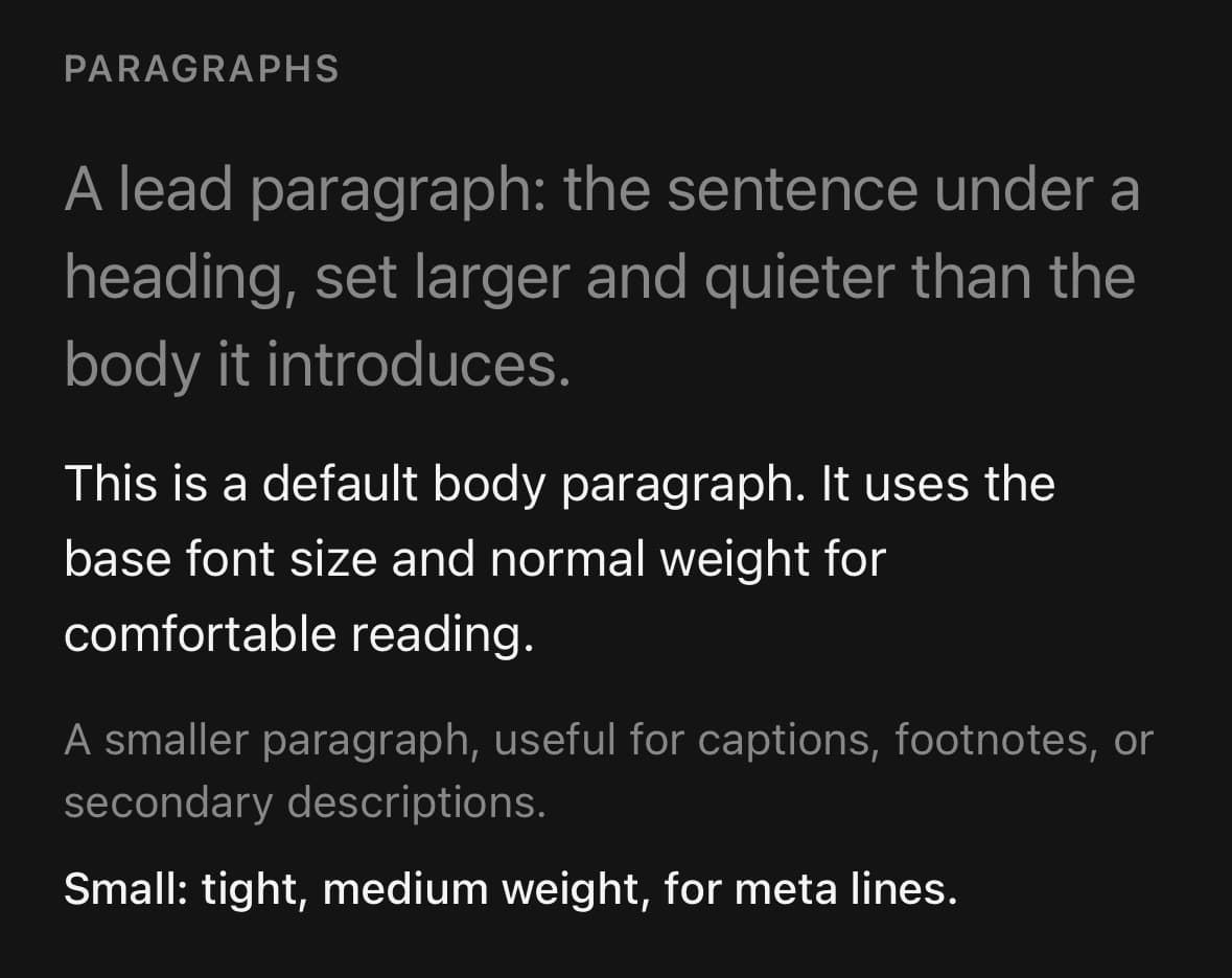
<Typography.Paragraph type="lead">
  A lead paragraph: the sentence under a heading, set larger and quieter than the body it introduces.
</Typography.Paragraph>
<Typography.Paragraph>
  A default body paragraph, at the base size and weight.
</Typography.Paragraph>
<Typography.Paragraph type="body-sm" muted>
  A smaller, muted paragraph for captions and footnotes.
</Typography.Paragraph>
A section label
A small, uppercase overline to head a section.

<Typography.Paragraph type="small" muted className="uppercase tracking-wider">
  Section label
</Typography.Paragraph>
Variants
type
h1h2h3h4h5h6leadbody(default)body-smbody-xslargesmallblockquotecode
<Typography.Heading type="h1">Heading 1</Typography.Heading>
<Typography.Heading type="h4">Heading 4</Typography.Heading>
<Typography.Paragraph type="lead">Lead</Typography.Paragraph>
<Typography.Paragraph type="body">Body</Typography.Paragraph>
<Typography.Paragraph type="large">Large</Typography.Paragraph>
<Typography.Paragraph type="small">Small</Typography.Paragraph>
<Typography.Blockquote>Quoted</Typography.Blockquote>
<Typography.Code>inline code</Typography.Code>
weight
normalmediumsemiboldbold
<Typography weight="normal">Normal</Typography>
<Typography weight="medium">Medium</Typography>
<Typography weight="semibold">Semibold</Typography>
<Typography weight="bold">Bold</Typography>
align
startendleftcenterright
<Typography align="left">Left</Typography>
<Typography align="center">Centre</Typography>
<Typography align="right">Right</Typography>
transform
uppercaselowercasecapitalize
<Typography transform="uppercase">shouted</Typography>
<Typography transform="lowercase">Quietened</Typography>
<Typography transform="capitalize">title case</Typography>
underline
true
<Typography underline>…</Typography>italic
true
<Typography italic>…</Typography>strike
true
<Typography strike>…</Typography>muted
true
<Typography muted>…</Typography>API Reference
Typography
| Prop | Type | Default | Description |
|---|---|---|---|
className | string | — | |
weight | TypographyWeight | — | Overrides the weight the preset sets. This is the one to reach for when a paragraph needs a bolded run and a heading would be wrong. |
underline | boolean | — | Underlines the text — a link, a defined term, a signature line. |
italic | boolean | — | Slants the text. |
strike | boolean | — | Strikes the text through: an old price, a completed task. |
align | 'left' | 'center' | 'right' | — | Horizontal alignment within whatever the text is laid out in. |
transform | 'uppercase' | 'lowercase' | 'capitalize' | — | Case, applied for display without changing the string underneath. |
Typography.Heading
| Prop | Type | Default | Description |
|---|---|---|---|
type | HeadingType | body |
Typography.Paragraph
| Prop | Type | Default | Description |
|---|---|---|---|
type | ParagraphType | body |
Typography.Code
| Prop | Type | Default | Description |
|---|---|---|---|
containerClassName | string | — | Classes for the surface behind the code text. |
Typography.Blockquote
| Prop | Type | Default | Description |
|---|---|---|---|
containerClassName | string | — | Classes for the row that carries the rule. |
Typography.List
| Prop | Type | Default | Description |
|---|---|---|---|
className | string | — | |
ordered | boolean | — | Numbered rather than bulleted. The numbers are drawn, not counted by CSS. |
Typography.ListItem
| Prop | Type | Default | Description |
|---|---|---|---|
type | ParagraphType | body |
Every part also accepts the underlying React Native props (ViewProps or TextProps) and a className for Tailwind utilities.
Notes
weight, align, transform and the marks apply to every preset and to every part — a heading, a list item and a blockquote all take them.
Typography.List draws its own markers because React Native has none. It reads its children to number them, so an ordered list counts correctly however the items were generated, and the marker is a view rather than the • character — that character's size and baseline shift with the platform font, and a view does not.
Public exports
Values: Typography
Types: TypographyProps, TypographyType, TypographyHeadingProps, TypographyParagraphProps, TypographyCodeProps