

MarkdownEditor
A field for writing markdown, with a formatting toolbar and a rendered preview.
A field for writing markdown, with a formatting toolbar and a rendered preview.
Writing and reading are two modes rather than two panes. Side-by-side does not survive the trip to a phone — two columns of a phone's width are both too narrow to read, and the keyboard covers the bottom half of the screen exactly when the writer is using it. The toolbar carries the switch between the modes, because the toolbar is the one thing on screen in both.
The preview is Response, the same renderer used for a model's answer, so there is one markdown parser in the library rather than two to keep in step. It renders through Typography, CodeBlock and Table — your app's own type and colours, not a document viewer's.
Installation
MarkdownEditor ships with the library — no separate install.
import { MarkdownEditor, Button, MarkdownEditorHandle, Text } from 'panelui-native';Or copy the source into your project, to own and edit it:
npx panelui-cli@latest add markdown-editorUsage
const [draft, setDraft] = useState('');

<MarkdownEditor value={draft} onValueChange={setDraft} rows={12} />
Composition
<MarkdownEditor>
  <MarkdownEditor.Toolbar />   {/* formatting, and the write/preview switch */}
  <MarkdownEditor.Input />     {/* draws while writing */}
  <MarkdownEditor.Preview />   {/* draws while previewing */}
</MarkdownEditor>
Written without children the editor draws all three in that order, which is the whole component — so most uses need no parts at all. Write them out when you want to reorder them, drop one, or put something else on the toolbar row.
Examples
The whole component
No children: the toolbar, the field and the preview in that order. rows sizes the field and placeholder goes to it.
const [draft, setDraft] = useState('');

<MarkdownEditor
  value={draft}
  onValueChange={setDraft}
  rows={10}
  placeholder="Write something…"
/>
A floating toolbar
variant="pill" draws the capsule instead of the row: icon-only buttons grouped by hairlines, with the way out of the writing pane as a round button beside it rather than a segment of it.
It is a fixed row of targets, so it takes no children — a capsule with a word count in it is a bar with rounded ends. The capsule's own default set is eight actions rather than the bar's; pass actions to choose, and the hairlines follow wherever the family changes.
<MarkdownEditor value={draft} onValueChange={setDraft}>
  <MarkdownEditor.Toolbar variant="pill" />
  <MarkdownEditor.Input rows={8} placeholder="Write something…" />
  <MarkdownEditor.Preview emptyText="Write a line and press the eye." />
</MarkdownEditor>
Starting on the reading side
defaultMode decides which pane opens first. Reading first suits a draft that already exists — a note being reviewed rather than written.
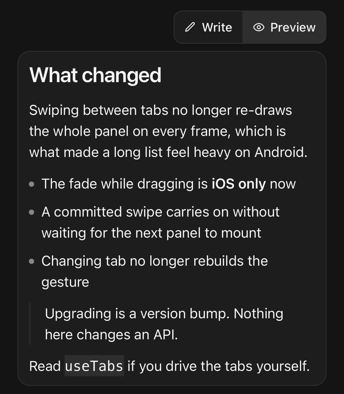
<MarkdownEditor value={draft} onValueChange={setDraft} defaultMode="preview" />Choosing the actions, and adding to the row
actions is the list, in the order you want them. The toolbar’s children sit beside the mode switch, for anything that belongs to the draft rather than to the text.
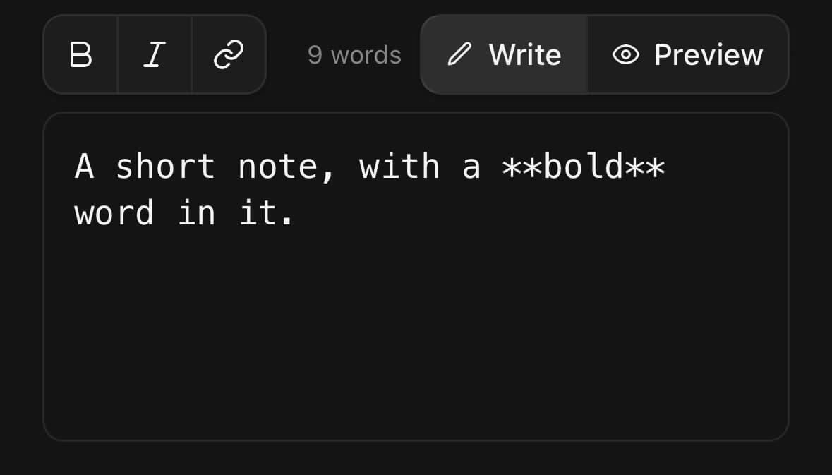
<MarkdownEditor value={draft} onValueChange={setDraft}>
  <MarkdownEditor.Toolbar actions={['bold', 'italic', 'link']}>
    <Text size="xs" muted>{words} words</Text>
  </MarkdownEditor.Toolbar>
  <MarkdownEditor.Input rows={6} placeholder="Say something…" />
  <MarkdownEditor.Preview emptyText="Write a line and switch to Preview." />
</MarkdownEditor>
A composer with no preview
Leave MarkdownEditor.Preview out and turn the switch off with showModeSwitch={false}. What is left is a comment box whose toolbar formats and nothing else.
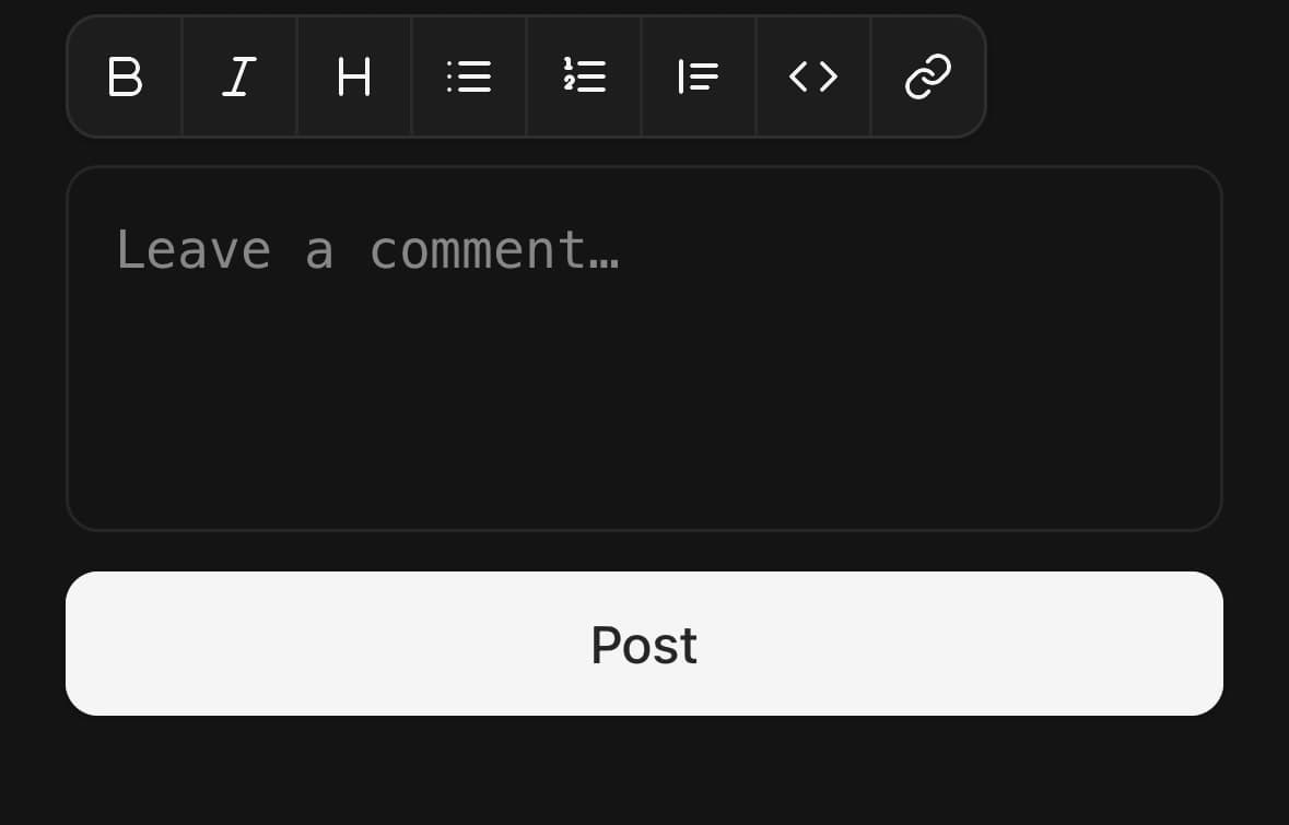
<MarkdownEditor value={draft} onValueChange={setDraft}>
  <MarkdownEditor.Toolbar showModeSwitch={false} />
  <MarkdownEditor.Input rows={4} placeholder="Leave a comment…" />
</MarkdownEditor>

<Button fullWidth disabled={!draft.trim()} onPress={post}>Post</Button>
Your own controls
A ref gives you the same transforms the toolbar runs, so a keyboard accessory, a context-menu entry or a single Bold button somewhere else on the screen does not have to reimplement any of them. getActive reports what is already applied where the caret is, which is what a control of your own needs to draw itself correctly.
const editor = useRef<MarkdownEditorHandle>(null);

<MarkdownEditor ref={editor} value={draft} onValueChange={setDraft}>
  <MarkdownEditor.Input rows={6} />
</MarkdownEditor>

<Button onPress={() => editor.current?.apply('bold')}>Bold</Button>
<Button onPress={() => editor.current?.focus()}>Write</Button>
Variants
variant
bar(default)pill
<MarkdownEditor variant="bar">…</MarkdownEditor>
<MarkdownEditor variant="pill">…</MarkdownEditor>
API Reference
MarkdownEditor
| Prop | Type | Default | Description |
|---|---|---|---|
className | string | — | |
value | string | — | Controlled text. Leave unset and pass defaultValue to run uncontrolled. |
defaultValue | string | '' | Starting text when uncontrolled. |
onValueChange | (value: string) => void | — | |
mode | MarkdownEditorMode | — | Controlled pane. |
defaultMode | MarkdownEditorMode | 'write' | Starting pane when uncontrolled. |
onModeChange | (mode: MarkdownEditorMode) => void | — | |
disabled | boolean | false | Stop the field being edited and the formatting actions being pressed. The switch between the panes stays live: a draft nobody may edit is still a draft somebody may want to read rendered. |
placeholder | string | — | Forwarded to the field when the editor draws its own. |
rows | number | — | Height of the field, in lines. Forwarded to the field the editor draws. |
avoidKeyboard | boolean | — | Lift the editor above the keyboard. Forwarded to the field the editor draws, and off by default because it changes which component renders the container — so it cannot be toggled at runtime without remounting the field and dropping focus. |
continueLists | boolean | true | Continue a list when Return is pressed inside one, and end it when Return is pressed on an item with nothing in it. On by default: a list that stops numbering itself after the first item is a list the writer finishes by hand. |
MarkdownEditor.Toolbar
| Prop | Type | Default | Description |
|---|---|---|---|
className | string | — | |
variant | MarkdownEditorToolbarVariant | bar | How the toolbar is drawn. bar is the full-width row, with room on it for a word count or a submit. pill is the floating capsule: icon-only, grouped by hairlines, with the pane switch as a round button beside it. |
actions | MarkdownEditorAction[] | — | Which formatting actions to offer, in the order given. The capsule groups whatever it is given by family — what the words look like, what is being put into the document, what shape the block is — and draws a hairline where the family changes. |
showModeSwitch | boolean | true | Show the write/preview switch. On by default — a preview nobody can reach is a pane that does not exist. |
MarkdownEditor.Input
| Prop | Type | Default | Description |
|---|---|---|---|
className | string | — |
MarkdownEditor.Preview
| Prop | Type | Default | Description |
|---|---|---|---|
className | string | — | |
emptyText | string | — | What to show when there is nothing written yet. |
Every part also accepts the underlying React Native props (ViewProps or TextProps) and a className for Tailwind utilities.
Notes
What is already applied
A button whose action is in effect where the caret is draws as pressed. Every formatting button is a toggle, and a toggle that looks the same in both states is a toggle nobody discovers is one — the rule below about pressing twice is only useful if the first press is visible.
The check runs when the caret moves or an action is applied, not on every keystroke: typing a letter cannot change what is applied at the caret, and eight predicates over the whole document per character is work nobody asked for.
Where the caret lands
Every toolbar button is a function of the text and where the caret is in it, and what makes a formatting toolbar feel broken is never the characters it inserts — it is where the caret ends up afterwards. Three rules hold for all of them:
- Pressing twice undoes it. A button that only ever adds is a button you can press once, and every press after that damages the text.
- A selection stays selected. Bolding three words and then italicising the same three is two presses, not a press and a re-selection.
- With nothing selected, the caret lands where the writing goes — between the new markers rather than after them.
A line-level action — heading, list, quote — applies to every line the selection touches, even partly, and removes itself only when all of them already have it. A mixed block is a block someone is trying to make uniform, so the useful answer there is to add.
After one, the caret keeps its distance from the end of its line rather than from the start. These actions change what sits in front of the text, so a caret held at the same column lands inside the bullet it just gained.
An inline marker never spans a line break: a selection crossing one is wrapped line by line, because **one\ntwo** is bold in no reader at all.
Return continues a list
Inside - item or 1. item, Return starts the next item at the same indent, and numbered lists count on. On an item with nothing in it, Return ends the list — a writer pressing Return on an empty bullet has run out of items, and the alternative is a trail of empty bullets to delete by hand. Turn it off with continueLists={false}.
It is read off the text change rather than off the key, because a key event in a React Native field cannot be prevented: acting on the key would insert the marker and the line break the field was always going to add.
The field is monospaced, and does not correct you
A markdown source is code as much as it is prose. Autocapitalisation and autocorrection are off, because an editor that capitalises the word after a fence, or rewrites a hyphen into an en dash, is an editor that quietly changes what the document renders as.
No platform markdown
SwiftUI's Text can parse markdown and Jetpack Compose's cannot, so an editor backed by the platform would render on iOS and show a plain string on Android. The parser here is JavaScript and the output is React Native views, which is why the two platforms agree.
Public exports
Values: MarkdownEditor
Types: MarkdownEditorProps, MarkdownEditorToolbarProps, MarkdownEditorInputProps, MarkdownEditorPreviewProps, MarkdownEditorHandle, MarkdownEditorMode, MarkdownEditorAction, MarkdownEditorToolbarVariant, EditorSelection, EditResult