

Separator
Horizontal or vertical rule between content, optionally labelled.
A rule between content, optionally with a label in it.
React Native has no <hr>, so a separator is a view sized on one axis and stretched on the other. That is why the orientation is a prop rather than something the layout works out — the component has to know which axis carries the thickness.
Installation
Separator ships with the library — no separate install.
import { Separator, Surface, Text, Button } from 'panelui-native';Or copy the source into your project, to own and edit it:
npx panelui-cli@latest add separatorUsage
<Separator />

{/* Vertical, inside a row that gives it a height. */}
<View className="h-5 flex-row items-center">
  <Text size="sm">Components</Text>
  <Separator orientation="vertical" className="mx-3" />
  <Text size="sm">Themes</Text>
</View>
Examples
Between sections
The common pair: a horizontal rule splitting a card, and vertical rules between inline links.
<Surface variant="secondary" className="px-6 py-7">
  <Text weight="medium">PanelUI</Text>
  <Text size="sm" muted>A React Native component library.</Text>

  <Separator className="my-4" />

  <View className="h-5 flex-row items-center">
    <Text size="sm">Components</Text>
    <Separator orientation="vertical" className="mx-3" />
    <Text size="sm">Themes</Text>
    <Separator orientation="vertical" className="mx-3" />
    <Text size="sm">Examples</Text>
  </View>
</Surface>
Labelled divider
Passing children breaks the rule around a centred label — the "or continue with" split in a sign-in form. The label is always announced; the flanking rules never are.
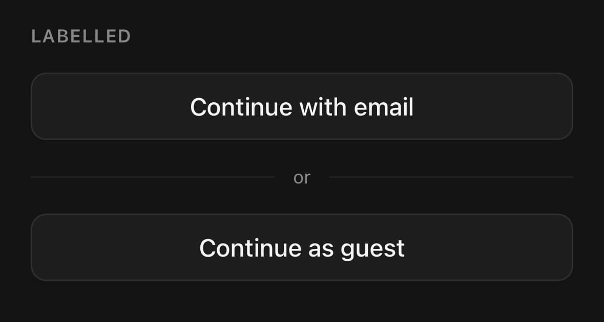
<View className="gap-4">
  <Button variant="outline">Continue with email</Button>
  <Separator>or</Separator>
  <Button variant="outline">Continue as guest</Button>
</View>
Custom thickness
When neither variant is right, thickness takes a number of pixels and overrides them.

<Separator thickness={1} />
<Separator thickness={3} />
<Separator thickness={6} />
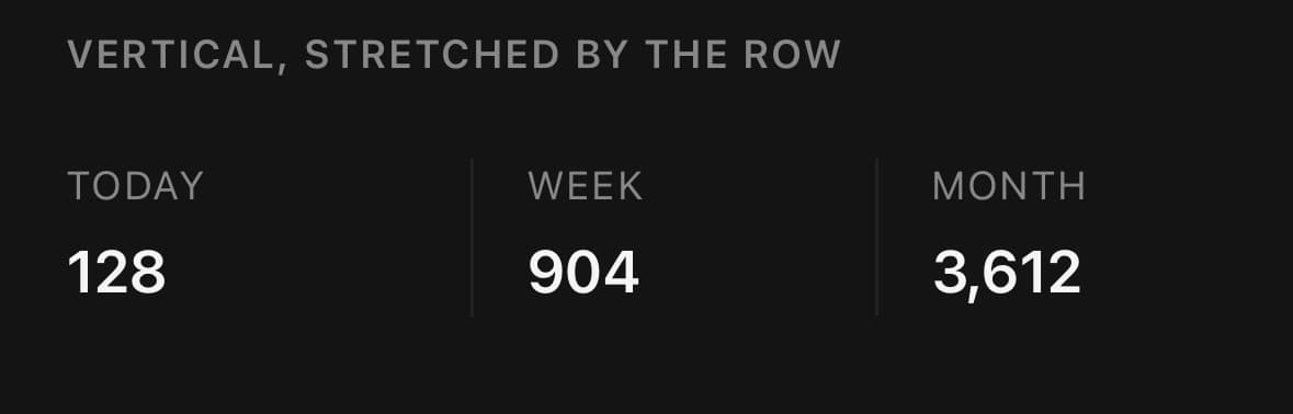
Vertical, stretched by the row
A vertical separator has no length of its own. items-stretch on the row gives it one; without a height from somewhere it measures zero and nothing draws.
<View className="flex-row items-stretch gap-4 py-2">
  <View className="flex-1 gap-1">
    <Text size="xs" muted className="uppercase tracking-wider">Today</Text>
    <Text size="lg" weight="semibold">128</Text>
  </View>

  <Separator orientation="vertical" />

  <View className="flex-1 gap-1">
    <Text size="xs" muted className="uppercase tracking-wider">Week</Text>
    <Text size="lg" weight="semibold">904</Text>
  </View>
</View>
Announced, not decorative
Separators are skipped by screen readers by default. Set decorative={false} when the split itself carries meaning — between two groups of menu items, say — and it is announced with its orientation.
<Separator decorative={false} />Variants
orientation
horizontal(default)vertical
<Separator orientation="horizontal" />

{/* Needs a height from the parent. */}
<View className="h-5 flex-row items-center">
  <Separator orientation="vertical" />
</View>
variant
thin(default)thick

<Separator variant="thin" />
<Separator variant="thick" />
API Reference
Separator
| Prop | Type | Default | Description |
|---|---|---|---|
className | string | — | |
thickness | number | — | Thickness in pixels, overriding the variant. Sets the height of a horizontal separator and the width of a vertical one. |
decorative | boolean | true | Whether the separator is only visual. A decorative separator is skipped by screen readers; set false when the split itself carries meaning — between two groups of menu items, say — and it is announced instead. A labelled separator is never decorative: its label is content, so it is always read. |
labelClassName | string | — | Styles the label text of a labelled separator. |
Every part also accepts the underlying React Native props (ViewProps or TextProps) and a className for Tailwind utilities.
Notes
A horizontal separator fills its parent's width; a vertical one fills its parent's height. The vertical case is the one that catches people out — inside a flex-row the row has no intrinsic height, so pair it with items-stretch on the row or an explicit h-* somewhere.
thickness wins over variant. Both set the height of a horizontal separator and the width of a vertical one, so the same value reads the same either way round.
Pass children to make a labelled separator: the rule splits around the content, so a divider can carry an "or" without a second element. Only the horizontal axis takes a label — a stacked word is not a divider, so a vertical separator ignores its children.
Public exports
Values: Separator
Types: SeparatorProps