

BumpChart
How a set of things ranked against each other over time.
Each series is drawn at its rank in every column, with an S-curve wherever it changes places. Use it for league tables, leaderboards, search positions or any ranking that is tracked over time.
The rows are evenly spaced whatever the gap between the scores behind them, so the chart shows order and not distance. When how far apart the series are matters, use a LineChart of the scores instead.
More than three or four lines in their own colours are hard to follow through the crossings. Pick one out with highlight: it is drawn in its colour and on top, and the rest are drawn in a muted grey.
Installation
BumpChart ships with the library — no separate install.
import { BumpChart, type BumpChartDatum, bumpRanks, Frame } from 'panelui-native';Or copy the source into your project, to own and edit it:
npx panelui-cli@latest add bump-chartUsage
<BumpChart data={league} xDataKey="week" defaultHighlight="harbour">
  <BumpChart.Grid />
  <BumpChart.Line dataKey="harbour" label="Harbour" colorIndex={3} />
  <BumpChart.Line dataKey="northside" label="Northside" />
  <BumpChart.Line dataKey="kestrel" label="Kestrel" />
  <BumpChart.Line dataKey="oldMill" label="Old Mill" />
  <BumpChart.Line dataKey="riverside" label="Riverside" />
  <BumpChart.YAxis />
  <BumpChart.XAxis />
  <BumpChart.Labels />
  <BumpChart.Tooltip />
</BumpChart>
Composition
<BumpChart data={…}>
  <BumpChart.Header />    {/* the strip above the plot */}
  <BumpChart.Grid />      {/* a guide down every column */}
  <BumpChart.Skeleton />  {/* a bar on every row while loading */}
  <BumpChart.Line />      {/* one per series */}
  <BumpChart.YAxis />     {/* #1, #2… down the side */}
  <BumpChart.XAxis />     {/* column labels along the bottom */}
  <BumpChart.Labels />    {/* each name beside its last point */}
  <BumpChart.Tooltip />   {/* the scrub, and the standings it opens */}
  <BumpChart.Legend />    {/* a swatch and a name per series */}
</BumpChart>BumpChart.Header— The strip above the plot: a title, a value, a caption and an optional legend or control. Pass the value yourself; followonHighlightChangeoronActiveIndexChangeif it should track the chart.BumpChart.Grid— Dashed guides down every column, and optionally across every rank withhorizontal.BumpChart.Line— One series. It registers its colour and label with the chart; the lines are drawn together so the picked-out one can sit on top of every crossing.BumpChart.Skeleton— The loading state: a thin bar on every rank row with a sweep across them, shown whilestatus="loading".BumpChart.XAxis— Column labels along the bottom.tickssets how many are shown.BumpChart.YAxis— The ranks down the side, one on every row. The chart keeps a gutter for them.formatchanges#1to anything else.BumpChart.Labels— Each series' name level with its last point, in a column the chart reserves on the right. The names move with their lines when the data changes. Tapping one picks that line out, and tapping it again clears it; passpressable={false}to turn that off.BumpChart.Tooltip— The scrub across the columns, with a card listing every series in the order it stood at the column under the finger. The card sits beside the crosshair, on whichever side has room.BumpChart.Legend— A swatch and a name per series, floated over the top corner of the plot. On a chart with a header, preferHeader legend.
Examples
The data
One row per column. Each series is a key holding its rank in that column, with 1 at the top. A missing or non-numeric value leaves a gap in that line rather than dropping it to the bottom.
const league: BumpChartDatum[] = [
  { week: 'w32', harbour: 3, northside: 2, kestrel: 1, oldMill: 4, riverside: 5 },
  { week: 'w33', harbour: 3, northside: 2, kestrel: 1, oldMill: 5, riverside: 4 },
  { week: 'w34', harbour: 2, northside: 3, kestrel: 1, oldMill: 4, riverside: 5 },
  // …
  { week: 'Now', harbour: 1, northside: 2, kestrel: 3, oldMill: 4, riverside: 5 },
];
Ranking from scores
Pass the scores themselves with values="score" and the chart ranks every column, highest first. Two equal scores keep the order the lines are declared in, so they never draw on top of each other.
bumpRanks(data, keys, { values: 'score' }) runs the same ranking outside the chart, for a header or a table that has to agree with it.
<BumpChart data={takings} xDataKey="month" values="score" aspectRatio={1.8}>
  <BumpChart.Header title="Top shop in June" value="Quay" />
  <BumpChart.Grid />
  <BumpChart.Line dataKey="quay" label="Quay" colorIndex={1} strokeWidth={2} />
  <BumpChart.Line dataKey="market" label="Market" colorIndex={2} strokeWidth={2} />
  <BumpChart.Line dataKey="station" label="Station" colorIndex={3} strokeWidth={2} />
  <BumpChart.Line dataKey="college" label="College" colorIndex={4} strokeWidth={2} />
  <BumpChart.YAxis />
  <BumpChart.XAxis ticks={6} />
  <BumpChart.Labels pressable={false} />
  <BumpChart.Tooltip />
</BumpChart>
Picking a line out
highlight is the series drawn in colour; the others are drawn muted and underneath it. null picks none, and every line keeps its own colour.
Pass defaultHighlight to start with one picked out and let Labels handle taps. Pass highlight with onHighlightChange when something else on the screen has to follow it.
const [picked, setPicked] = useState<string | null>('kestrel');

<BumpChart data={league} xDataKey="week" highlight={picked} onHighlightChange={setPicked}>
  <BumpChart.Header title={picked ?? 'No club picked'} value={picked ? `#${placeNow}` : '—'} />
  <BumpChart.Grid />
  {clubs.map((club, index) => (
    <BumpChart.Line key={club.key} dataKey={club.key} label={club.label} colorIndex={index + 1} />
  ))}
  <BumpChart.YAxis />
  <BumpChart.XAxis />
  <BumpChart.Labels />
</BumpChart>
When the data changes
New data moves every line from where it is drawn to its new places, over morphDuration milliseconds. A change that arrives mid-move starts from the lines' current positions.
<BumpChart data={season === 'this' ? league : lastSeason} xDataKey="week" defaultHighlight="harbour">
  <BumpChart.Grid />
  {/* …the same five lines… */}
  <BumpChart.YAxis />
  <BumpChart.XAxis />
  <BumpChart.Labels />
  <BumpChart.Tooltip />
</BumpChart>
Loading, and then data
status="loading" hides the lines and names. Add a Skeleton to show a bar on every row meanwhile. The lines are drawn in from the left when it turns ready.
<BumpChart data={league} xDataKey="week" status={status} defaultHighlight="harbour">
  <BumpChart.Grid />
  <BumpChart.Skeleton />
  {/* …lines… */}
  <BumpChart.YAxis />
  <BumpChart.XAxis />
  <BumpChart.Labels />
  <BumpChart.Tooltip />
</BumpChart>
Versions
Basic
Five clubs over seven weeks, with one picked out against the rest.
<BumpChart data={league} xDataKey="week" defaultHighlight="harbour">
  <BumpChart.Grid />
  <BumpChart.Line dataKey="harbour" label="Harbour" colorIndex={3} />
  <BumpChart.Line dataKey="northside" label="Northside" />
  <BumpChart.Line dataKey="kestrel" label="Kestrel" />
  <BumpChart.Line dataKey="oldMill" label="Old Mill" />
  <BumpChart.Line dataKey="riverside" label="Riverside" />
  <BumpChart.YAxis />
  <BumpChart.XAxis />
  <BumpChart.Labels />
  <BumpChart.Tooltip />
</BumpChart>
Ranked from scores
Monthly takings passed as money; the chart ranks each month itself.
<BumpChart data={takings} xDataKey="month" values="score" aspectRatio={1.8}>
  <BumpChart.Header title="Top shop in June" value="Quay" />
  <BumpChart.Grid />
  <BumpChart.Line dataKey="quay" label="Quay" colorIndex={1} strokeWidth={2} />
  <BumpChart.Line dataKey="market" label="Market" colorIndex={2} strokeWidth={2} />
  <BumpChart.Line dataKey="station" label="Station" colorIndex={3} strokeWidth={2} />
  <BumpChart.Line dataKey="college" label="College" colorIndex={4} strokeWidth={2} />
  <BumpChart.YAxis />
  <BumpChart.XAxis ticks={6} />
  <BumpChart.Labels pressable={false} />
  <BumpChart.Tooltip />
</BumpChart>
Picking a line
Tap a name to pick it out; the header reads the club you picked.
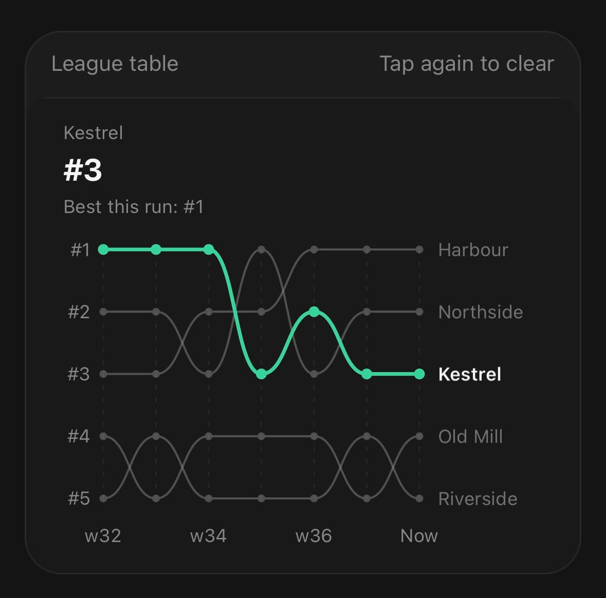
const [picked, setPicked] = useState<string | null>('kestrel');

<BumpChart data={league} xDataKey="week" highlight={picked} onHighlightChange={setPicked}>
  <BumpChart.Header title={picked ?? 'No club picked'} value={picked ? `#${placeNow}` : '—'} />
  <BumpChart.Grid />
  {clubs.map((club, index) => (
    <BumpChart.Line key={club.key} dataKey={club.key} label={club.label} colorIndex={index + 1} />
  ))}
  <BumpChart.YAxis />
  <BumpChart.XAxis />
  <BumpChart.Labels />
</BumpChart>
Changing data
Switch seasons and every line moves to its new places.
<BumpChart data={season === 'this' ? league : lastSeason} xDataKey="week" defaultHighlight="harbour">
  <BumpChart.Grid />
  {/* …the same five lines… */}
  <BumpChart.YAxis />
  <BumpChart.XAxis />
  <BumpChart.Labels />
  <BumpChart.Tooltip />
</BumpChart>
Loading
A bar on every row while the table loads.
<BumpChart data={league} xDataKey="week" status={status} defaultHighlight="harbour">
  <BumpChart.Grid />
  <BumpChart.Skeleton />
  {/* …lines… */}
  <BumpChart.YAxis />
  <BumpChart.XAxis />
  <BumpChart.Labels />
  <BumpChart.Tooltip />
</BumpChart>
API Reference
BumpChart
| Prop | Type | Default | Description |
|---|---|---|---|
className | string | — | |
data | BumpChartDatum[] | — | The rows. Each one is a column: a week, a round, a release. |
xDataKey | string | 'date' | Key holding the column's label. |
values | 'rank' | 'score' | 'rank' | What the series columns hold. rank (the default) takes them as places, 1 at the top. score ranks every row for you, highest first. |
highlight | string | null | — | The series drawn in its colour and on top, with the rest muted. null picks none, and every line keeps its own colour. Controlled — pair it with onHighlightChange. |
defaultHighlight | string | null | null | The series picked out on first render, when highlight is not passed. |
onHighlightChange | (key: string | null) => void | — | Called when a name in BumpChart.Labels is tapped. |
status | BumpChartStatus | 'ready' | loading hides the lines and shows BumpChart.Skeleton if there is one. The lines are revealed when it turns ready. |
aspectRatio | number | 1.7 | Width ÷ height. |
animationDuration | number | 700 | Milliseconds for the reveal on mount. |
morphDuration | number | 500 | Milliseconds for the lines to move to new places when the data changes. |
onActiveIndexChange | (index: number, datum: BumpChartDatum | null) => void | — | The column under the scrub as it moves, and -1/null when it lifts. Fires when the index changes, not per frame. |
compact | boolean | false | Drop the axis padding, for a chart with no axes. |
BumpChart.Grid
| Prop | Type | Default | Description |
|---|---|---|---|
vertical | boolean | true | A guide down every column. |
horizontal | boolean | false | A guide across every rank. |
color | string | — | |
dashArray | string | — | |
opacity | number | 1 |
BumpChart.Line
| Prop | Type | Default | Description |
|---|---|---|---|
dataKey | string | — | Column in the data holding this series' rank, or its score with values="score". |
label | string | — | The name shown by Labels, the tooltip and the legend. Defaults to dataKey. |
color | string | — | Explicit colour. Defaults to the --color-chart-* token for colorIndex. |
colorIndex | SeriesColorIndex | 1 | Which of the five chart tokens to take. |
strokeWidth | number | 1.5 | Thickness of the line. The picked-out line is drawn one point thicker. |
showDots | boolean | true | Draw a dot at every column. |
BumpChart.Skeleton
| Prop | Type | Default | Description |
|---|---|---|---|
duration | number | — | Milliseconds for one pass of the sweep. |
color | string | — | |
rows | number | — | How many rank rows to stand in for. |
BumpChart.XAxis
| Prop | Type | Default | Description |
|---|---|---|---|
ticks | number | — | How many columns to label, spread across the run. |
format | (datum: BumpChartDatum, index: number) => string | — | |
className | string | — |
BumpChart.YAxis
| Prop | Type | Default | Description |
|---|---|---|---|
format | (rank: number) => string | — | Format a rank. Defaults to #1, #2… |
className | string | — |
BumpChart.Labels
| Prop | Type | Default | Description |
|---|---|---|---|
width | number | — | Room kept to the right of the plot for the names. Longer names are cut short. |
pressable | boolean | — | Let a tap on a name pick that line out, and a second tap clear it. |
className | string | — |
BumpChart.Tooltip
| Prop | Type | Default | Description |
|---|---|---|---|
color | string | — | |
formatRank | (rank: number) => string | — | Format a rank in the readout. Defaults to #1, #2… |
formatX | (datum: BumpChartDatum) => string | — | Format the readout's heading from the row. Defaults to the value at xDataKey. |
className | string | — |
BumpChart.Legend
| Prop | Type | Default | Description |
|---|---|---|---|
className | string | — |
BumpChart.Header
| Prop | Type | Default | Description |
|---|---|---|---|
className | string | — | |
title | string | — | Small line above the value — what the chart is of. |
value | string | — | The readout. The largest thing on the card, and the first thing read. |
caption | string | — | One muted line under the value — a period, a comparison, a total. |
legend | boolean | false | Draw a swatch and a name per series along the trailing edge. |
Every part also accepts the underlying React Native props (ViewProps or TextProps) and a className for Tailwind utilities.
Notes
With values="rank" a rank must be a finite number of at least 1; anything else is a gap. The number of rows is the lowest rank any series holds, so a table of five with one series missing still keeps five rows.
Room at the sides
YAxis and Labels each reserve room beside the plot before it is laid out. Labels takes 84 points by default; set its width for longer or shorter names. A name that does not fit is cut short.
Reduced motion
The reveal and the move between data sets are both skipped, and the chart draws straight to its final shape.
aspectRatio measures the plot, not the whole chart. The header sits above the drawing area, so a chart with one is taller than the ratio alone suggests.
Accessibility
The SVG drawing is decorative. BumpChart exposes one summary and one entry per column, listing each series' rank there. The names in Labels are buttons with a selected state. Use accessibilityLabel and accessibilityHint for context, accessibilityLabelForDatum to replace a column's spoken text, and onAccessibilityDatumPress when a column has an equivalent action.
Public exports
Values: BumpChart, useBumpChart, bumpRanks
Types: BumpChartProps, BumpChartHandle, BumpChartHeaderProps, BumpChartGridProps, BumpChartLineProps, BumpChartSkeletonProps, BumpChartXAxisProps, BumpChartYAxisProps, BumpChartLabelsProps, BumpChartTooltipProps, BumpChartLegendProps, BumpChartStatus, BumpChartDatum, BumpRanks