

Tree
A hierarchy you can open a level at a time.
A hierarchy you can open a level at a time — a file browser, a folder of settings, a category picker, a table of contents.
A closed branch renders nothing below it, so a tree costs what is open in it rather than what is in it.
Accordion is the one-level version of the same idea; a tree's items can hold items, to any depth.
Installation
Tree ships with the library — no separate install.
import { Tree, Badge, FileIcon, FolderIcon, FolderOpenIcon, Spinner, Text } from 'panelui-native';Or copy the source into your project, to own and edit it:
npx panelui-cli@latest add treeUsage
<Tree defaultExpanded={['src']} selectionMode="single" showLines>
  <Tree.Item value="src">
    <Tree.Trigger>
      <Tree.Indicator />
      <Tree.Icon><FolderOpenIcon size={15} /></Tree.Icon>
      <Tree.Label>src</Tree.Label>
    </Tree.Trigger>
    <Tree.Group>
      <Tree.Item value="src/index.ts">
        <Tree.Trigger>
          <Tree.Indicator />
          <Tree.Icon><FileIcon size={14} /></Tree.Icon>
          <Tree.Label>index.ts</Tree.Label>
        </Tree.Trigger>
      </Tree.Item>
    </Tree.Group>
  </Tree.Item>
</Tree>
Composition
<Tree>
  <Tree.Item value="…">
    <Tree.Trigger>
      <Tree.Indicator />
      <Tree.Icon>…</Tree.Icon>
      <Tree.Label>…</Tree.Label>
      <Tree.Actions>…</Tree.Actions>
    </Tree.Trigger>
    <Tree.Group>
      <Tree.Item value="…">…</Tree.Item>
    </Tree.Group>
  </Tree.Item>
</Tree>
An item is a branch because it holds a Tree.Group, not because it was declared one, so there is no second fact to keep true. A branch whose children have not been fetched yet is the exception: it has no group to be recognised by, so it sets hasChildren to earn its chevron.
Examples
A file tree
The default. defaultExpanded names the branches that start open; everything below a closed one has not rendered at all. Folders take a glyph of their own rather than an empty Tree.Icon, so a folder's name starts where the names of the files under it do.
<Tree defaultExpanded={['src']}>
  <Tree.Item value="src">
    <Tree.Trigger>
      <Tree.Indicator />
      <Tree.Icon><FolderOpenIcon size={15} /></Tree.Icon>
      <Tree.Label>src</Tree.Label>
    </Tree.Trigger>
    <Tree.Group>
      <Tree.Item value="src/index.ts">
        <Tree.Trigger>
          <Tree.Indicator />
          <Tree.Icon><FileIcon size={14} /></Tree.Icon>
          <Tree.Label>index.ts</Tree.Label>
        </Tree.Trigger>
      </Tree.Item>
    </Tree.Group>
  </Tree.Item>
</Tree>
Guide lines
showLines draws a hairline down each level, connecting a branch to the rows inside it. The indent is unchanged — the line lands midway through it rather than adding a step of its own.
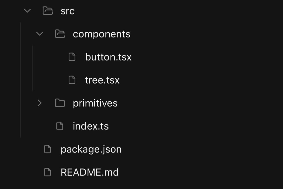
<Tree defaultExpanded={['src', 'src/components']} showLines>
  {/* …items… */}
</Tree>
Selecting a node
selectionMode turns the rows from expanders into choices. single keeps one selected; multiple switches value to an array.
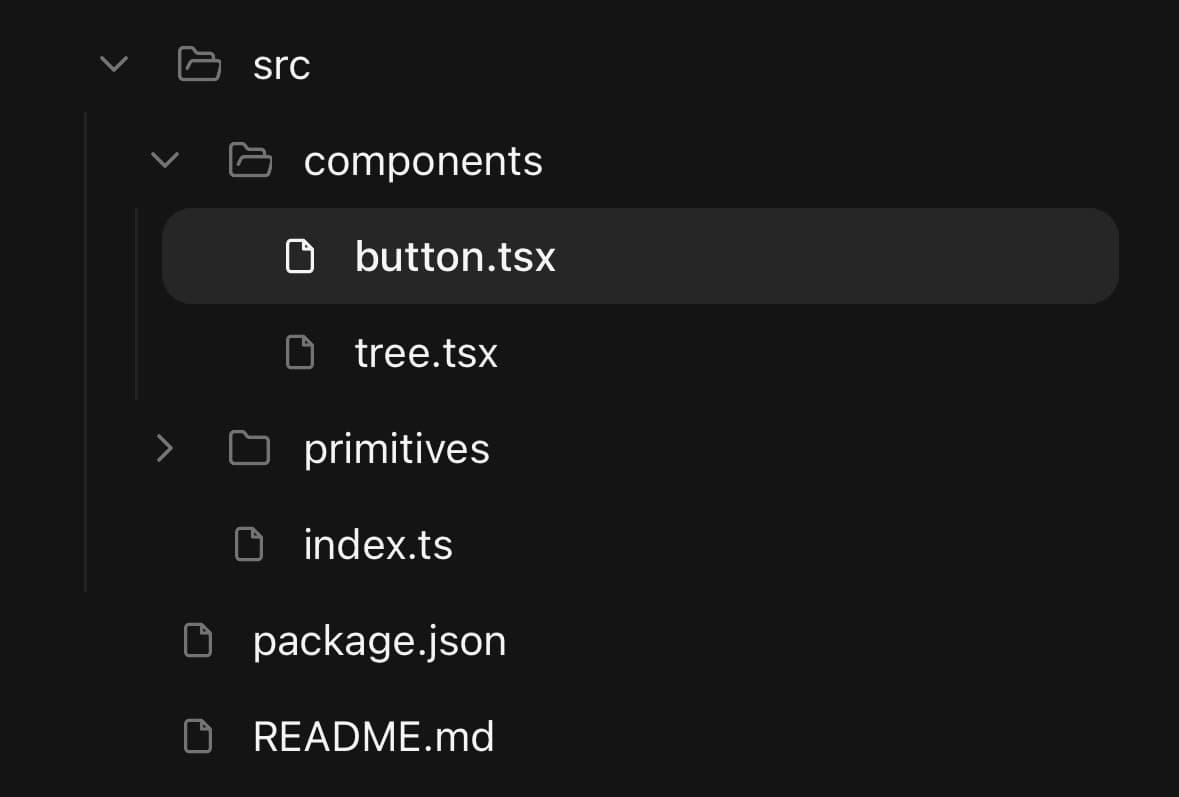
const [selected, setSelected] = useState<string | string[]>('');

<Tree
  selectionMode="single"
  value={selected}
  onValueChange={setSelected}
  defaultExpanded={['src']}
  showLines
>
  {/* …items… */}
</Tree>
A sidebar nav
size="sm" for a denser row, expandOnPress={false} so pressing a section selects it without opening it, and Tree.Actions for the unread count. The chevron still opens the section either way.

<Tree size="sm" selectionMode="single" expandOnPress={false} defaultExpanded={['inbox']}>
  <Tree.Item value="inbox">
    <Tree.Trigger>
      <Tree.Indicator />
      <Tree.Label>Inbox</Tree.Label>
    </Tree.Trigger>
    <Tree.Group>
      <Tree.Item value="inbox/unread">
        <Tree.Trigger>
          <Tree.Indicator />
          <Tree.Label>Unread</Tree.Label>
          <Tree.Actions><Badge variant="secondary" count={12} /></Tree.Actions>
        </Tree.Trigger>
      </Tree.Item>
    </Tree.Group>
  </Tree.Item>
</Tree>
A branch that loads when opened
hasChildren gives a chevron to a branch that has no Tree.Group yet, and onExpandedChange is where the fetch goes. The rows appear underneath once they arrive.
const [expanded, setExpanded] = useState<string[]>([]);
const [files, setFiles] = useState<string[] | null>(null);

<Tree
  expanded={expanded}
  onExpandedChange={(next) => {
    setExpanded(next);
    if (next.includes('archive') && !files) fetchArchive().then(setFiles);
  }}
>
  <Tree.Item value="archive" hasChildren>
    <Tree.Trigger>
      <Tree.Indicator />
      <Tree.Label>archive</Tree.Label>
      <Tree.Actions>{!files ? <Spinner size="sm" /> : null}</Tree.Actions>
    </Tree.Trigger>
    {files ? <Tree.Group>{/* …rows… */}</Tree.Group> : null}
  </Tree.Item>
</Tree>
Selecting more than one
selectionMode="multiple" switches value from a string to an array, and a row toggles rather than replacing what was chosen. Selection and expansion stay separate: picking a folder does not open it, and opening one does not pick it.
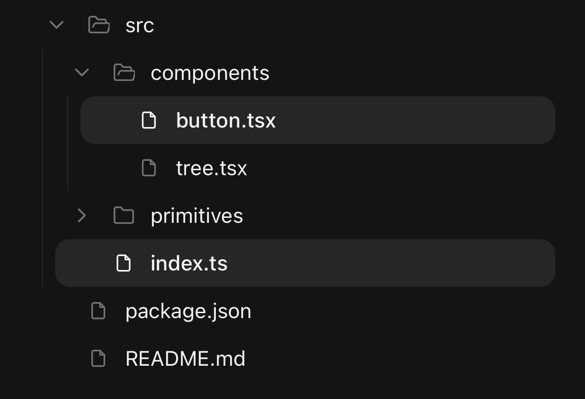
const [selected, setSelected] = useState<string[]>([]);

<Tree
  selectionMode="multiple"
  value={selected}
  onValueChange={setSelected}
  expanded={expanded}
  onExpandedChange={setExpanded}
  showLines
>
  {/* …items… */}
</Tree>
Variants
size
smdefault(default)
<Tree size="sm">…</Tree>
<Tree size="default">…</Tree>
isSelected
true
<Tree isSelected>…</Tree>API Reference
Tree
| Prop | Type | Default | Description |
|---|---|---|---|
className | string | — | |
size | TreeSize | default | Row density. sm for a sidebar or a picker inside a sheet. |
selectionMode | TreeSelectionMode | 'none' | Whether a row can be the chosen one, and how many can be at once. |
value | string | string[] | — | Selected value(s), controlled. An array when selectionMode is multiple. |
defaultValue | string | string[] | — | |
onValueChange | (value: string | string[]) => void | — | Handed back in the shape it was given — a string when single, an array when multiple. |
expanded | string[] | — | Values of the open branches, controlled. |
defaultExpanded | string[] | — | |
onExpandedChange | (expanded: string[]) => void | — | Fires with the next set of open branches — the hook to load a branch's children on. |
expandOnPress | boolean | true | Whether pressing anywhere on a branch's row opens it, as well as selecting it. Turn it off when selecting a branch has to be possible without opening it; the chevron still opens it either way. |
showLines | boolean | false | Draw a hairline down each level, connecting a branch to the rows inside it. |
indent | number | 16 | How far one level is drawn in from its parent, in points. |
Tree.Item
| Prop | Type | Default | Description |
|---|---|---|---|
className | string | — | |
value | string | — | Identifies this node in the tree's expanded and selected state. |
isDisabled | boolean | — | |
hasChildren | boolean | — | Marks the item as a branch when it has no Tree.Group to be detected by — a folder whose contents are fetched the first time it is opened. It gets a chevron, and opening it fires onExpandedChange with nothing to show yet. |
Tree.Trigger
| Prop | Type | Default | Description |
|---|---|---|---|
className | string | — |
Tree.Indicator
| Prop | Type | Default | Description |
|---|---|---|---|
className | string | — |
Tree.Icon
| Prop | Type | Default | Description |
|---|---|---|---|
className | string | — |
Tree.Actions
| Prop | Type | Default | Description |
|---|---|---|---|
className | string | — |
Tree.Group
| Prop | Type | Default | Description |
|---|---|---|---|
className | string | — |
Every part also accepts the underlying React Native props (ViewProps or TextProps) and a className for Tailwind utilities.
Notes
Expansion and selection are separate pieces of state, because a tree commonly needs one without the other. Expansion is expanded / defaultExpanded / onExpandedChange and is always an array. Selection is value / defaultValue / onValueChange, is off until you set selectionMode, and hands its value back in the shape you gave it — a string when single, an array when multiple.
The rows are laid out with paddingStart and a start-edge border rather than left-hand ones, so a tree in a right-to-left subtree indents away from the correct edge.
Because a closed branch is unmounted, the work a tree does is proportional to the rows on screen. A single branch holding thousands of open rows is the case that is not covered: render that one inside a virtualised list of your own.
Public exports
Values: Tree
Types: TreeProps, TreeItemProps, TreeTriggerProps, TreeIndicatorProps, TreeIconProps, TreeActionsProps, TreeGroupProps, TreeSize, TreeSelectionMode