

HeatmapChart
Contribution grid with a themed colour ramp and a readout.
A calendar of bins shaded by how much happened in each — one column per period, one row per bin inside it.
It answers "when was this busy" at a glance, which a line cannot: a year of daily numbers plotted as a series is a hairball, and the same numbers as a grid are a pattern.
It is the wrong shape for reading exact values. Use it to find where to look, and a BarChart or the readout to say how much.
If the chart you need is not one of these, Plot is the same drawing machinery with nothing decided: you compose the marks — columns, lines, fills, dots, and marks you write yourself — over one measured box and one shared scale.
Installation
HeatmapChart ships with the library — no separate install.
import { HeatmapChart, buildHeatmapCalendar, Frame, Text } from 'panelui-native';Or copy the source into your project, to own and edit it:
npx panelui-cli@latest add heatmap-chartUsage
<HeatmapChart data={weeks} weekStartDay={1}>
  <HeatmapChart.Header title="Contributions" value="1,204" legend />
  <HeatmapChart.XAxis />
  <HeatmapChart.YAxis />
  <HeatmapChart.Cells />
  <HeatmapChart.Tooltip />
</HeatmapChart>
Composition
<HeatmapChart>
  <HeatmapChart.Header />     {/* the strip above the grid */}
  <HeatmapChart.XAxis />      {/* month labels, above the grid */}
  <HeatmapChart.YAxis />      {/* weekday labels, beside it */}
  <HeatmapChart.Separator />  {/* rules grouping the columns */}
  <HeatmapChart.Cells />      {/* the grid itself */}
  <HeatmapChart.Tooltip />    {/* the readout under the finger */}
  <HeatmapChart.Legend />     {/* the Less → More key, below */}
</HeatmapChart>HeatmapChart.Header— The strip above the grid — what the chart is of, what it reads, and the ramp as a key. The place to put the key on a grid that scrolls sideways, whereLegendwould scroll away with the cells.HeatmapChart.Cells— The grid. Every row of every column is drawn, including the empty ones.HeatmapChart.Separator— Vertical rules grouping the columns — quarters, months, sprints.HeatmapChart.XAxis— Month labels above the grid, emitted where the month changes. Passlabelsfor columns that are not weeks.HeatmapChart.YAxis— Row labels beside the grid. Weekdays by default; passlabelsfor anything else.HeatmapChart.Tooltip— The readout that follows the finger across the grid.HeatmapChart.Legend— TheLess ▢▢▢▢▢ Morekey, under the grid.
Examples
Building the calendar
Data arrives as dates and numbers; buildHeatmapCalendar does the bucketing — including the two parts that are easy to get wrong. It backs up to the first day of the week the range starts in, so every row lines up with a weekday for the rest of the chart, and it emits a cell for every day in the range whether or not there was an entry, because a calendar with holes in it stops being a calendar.
const weeks = buildHeatmapCalendar(commits, {
  start: new Date(2025, 6, 23),
  end: new Date(2026, 6, 23),
  weekStartDay: 1,
});

<HeatmapChart data={weeks} weekStartDay={1}>
  <HeatmapChart.Cells />
</HeatmapChart>
Scrolling a full year
Fifty-three weeks do not fit across a phone. fluid draws the cells at binSize and lets the grid be as wide as it needs to be, so a horizontal ScrollView is all it takes. The legend belongs at the card's width rather than the grid's, so give it a chart of its own outside the scroller. The readout inside waits for a held press before it takes the touch, so the swipe still scrolls.
<ScrollView horizontal showsHorizontalScrollIndicator={false}>
  <HeatmapChart data={weeks} binSize={13} weekStartDay={1}>
    <HeatmapChart.XAxis />
    <HeatmapChart.YAxis />
    <HeatmapChart.Cells />
    <HeatmapChart.Tooltip />
  </HeatmapChart>
</ScrollView>

<HeatmapChart data={[]}>
  <HeatmapChart.Legend swatchSize={12} />
</HeatmapChart>
Filling the width instead
For a short range — a quarter, a sprint — fill divides the available width between the columns rather than drawing them at a fixed size, so the chart always meets both edges.
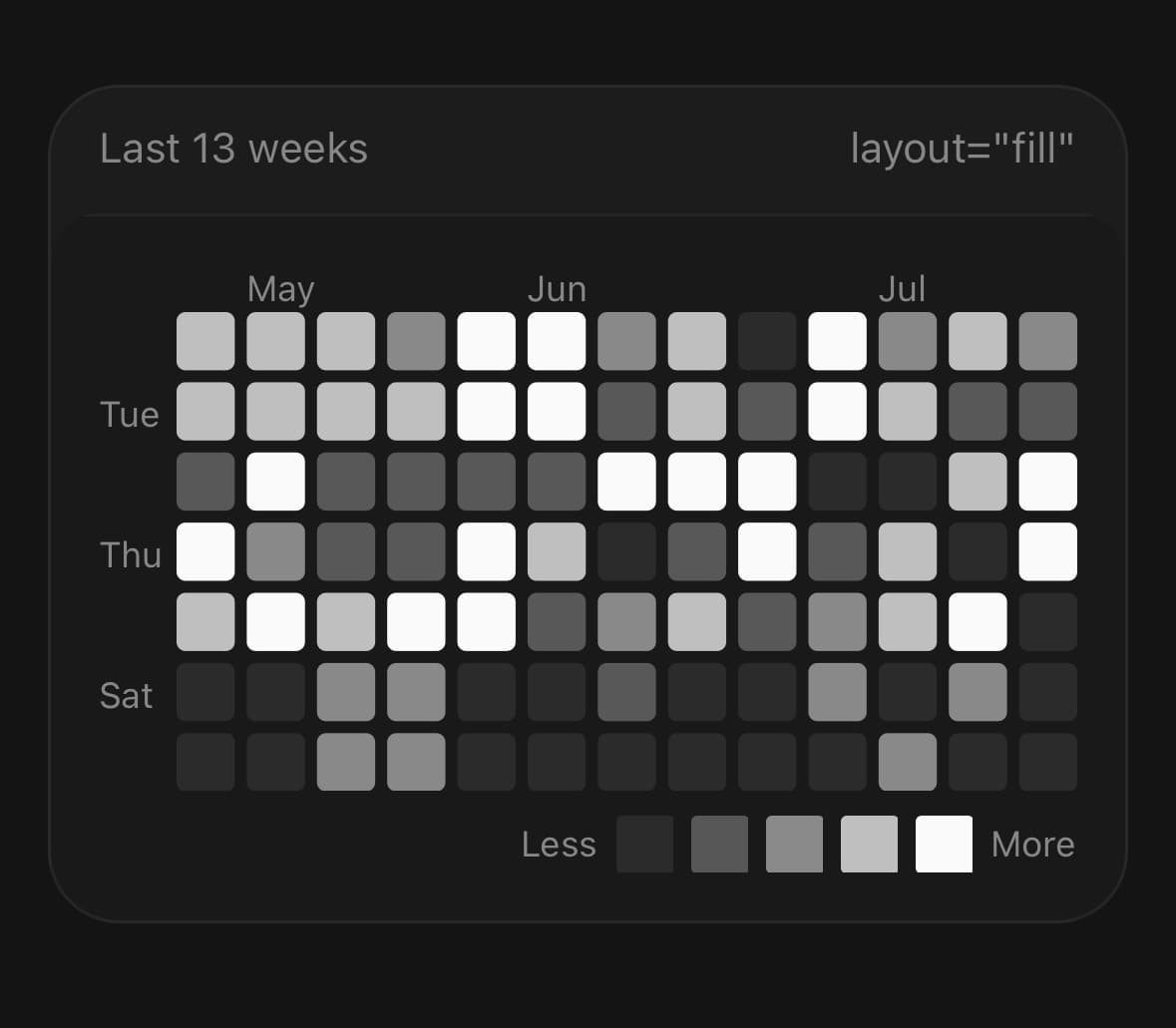
<HeatmapChart data={weeks.slice(-13)} layout="fill" gap={4}>
  <HeatmapChart.XAxis />
  <HeatmapChart.YAxis />
  <HeatmapChart.Cells cornerRadius={3} />
  <HeatmapChart.Tooltip />
  <HeatmapChart.Legend />
</HeatmapChart>
Changing the colour
Name a theme token and the ramp follows it through light and dark. emptyColor is the cell with nothing in it, and levelOpacity retunes the contrast between the four busy levels without having to name five colours. levelColors is still there for a ramp that is not one colour at all.
{/* A token, so the ramp still follows the theme. */}
<HeatmapChart data={weeks} color="--color-chart-3" />

{/* A literal works too, for a colour that is not in the theme. */}
<HeatmapChart data={weeks} color="#2dd4bf" emptyColor="--color-surface-secondary" />

{/* Flatter contrast between the busy levels. */}
<HeatmapChart data={weeks} levelOpacity={[1, 0.45, 0.62, 0.8, 1]} />

{/* Five colours outright, when the ramp is not one colour fading. */}
<HeatmapChart
  data={weeks}
  levelColors={['#1c1c1c', '#0e4429', '#006d32', '#26a641', '#39d353']}
/>
A grid whose rows are not days
Seven rows is a calendar week, but the grid does not care. Twenty-four gives a day of hours, with the columns as dates — the cells, the ramp and the readout all work the same way.
<HeatmapChart data={hours} rows={24} binSize={9}>
  <HeatmapChart.Cells />
  <HeatmapChart.Tooltip formatLabel={(cell) => `${cell.count} requests`} />
</HeatmapChart>
Reading the active cell above the chart
useHeatmapChart only reaches children of the chart. A readout in the card's header is outside that subtree, so it takes onActiveCellChange instead — which fires when the cell changes, not once per frame.
const [active, setActive] = useState(null);

<Card.Header>
  <Card.Description>
    {active ? `${active.count} on ${active.date?.toDateString()}` : 'Drag to read a day.'}
  </Card.Description>
</Card.Header>

<HeatmapChart data={weeks} onActiveCellChange={setActive}>
  <HeatmapChart.Cells />
  <HeatmapChart.Tooltip />
</HeatmapChart>
Labelling columns that are not weeks
The x-axis emits a label where the month changes, which a grid of weekdays never does — there is no month in it to change. labels overrides them with one per column, the way YAxis already takes one per row, so a grid can be rows of hours by columns of days.
<HeatmapChart data={week} layout="fill" rows={4} gap={4}>
  <HeatmapChart.Header title="Tickets opened" legend />
  <HeatmapChart.XAxis labels={['Mon', 'Tue', 'Wed', 'Thu', 'Fri', 'Sat', 'Sun']} />
  <HeatmapChart.YAxis labels={['00', '06', '12', '18']} tickFilter="all" width={24} />
  <HeatmapChart.Cells cornerRadius={3} />
  <HeatmapChart.Tooltip />
</HeatmapChart>
Versions
Contribution grid
A full year with a readout that follows the finger. Fifty-three weeks do not fit across a phone, so the chart is fluid inside a horizontal ScrollView — and the header sits outside that scroller, at the frame's width, or it would scroll away with the cells. Press and hold to read a day; a swipe scrolls the chart instead.
<HeatmapChart data={[]}>
  <HeatmapChart.Header value={active ? `${active.count}` : total} caption={caption} legend />
</HeatmapChart>

<ScrollView horizontal showsHorizontalScrollIndicator={false}>
  <HeatmapChart data={weeks} weekStartDay={1} binSize={13} onActiveCellChange={setActive}>
    <HeatmapChart.XAxis />
    <HeatmapChart.YAxis />
    <HeatmapChart.Cells />
    <HeatmapChart.Tooltip />
  </HeatmapChart>
</ScrollView>
Filling the width
For a short range, fill divides the available width between the columns rather than drawing them at a fixed size, so the chart always meets both edges of its card. No chart header here — the card's own already says what this is, and a second title under the first says it twice.
<HeatmapChart data={weeks.slice(-13)} layout="fill" weekStartDay={1} gap={4}>
  <HeatmapChart.XAxis />
  <HeatmapChart.YAxis />
  <HeatmapChart.Cells cornerRadius={3} />
  <HeatmapChart.Tooltip />
  <HeatmapChart.Legend />
</HeatmapChart>
Quarters
A rule every thirteen columns, and the ramp derived from a colour of your own instead of the chart token. tickFilter="all" labels every row, which a narrower axis has room for once the labels are initials.
<HeatmapChart data={weeks} weekStartDay={1} binSize={11} color={success}>
  <HeatmapChart.XAxis />
  <HeatmapChart.YAxis tickFilter="all" labelFormat="initial" width={16} />
  <HeatmapChart.Separator every="quarter" dashArray="2,3" />
  <HeatmapChart.Cells />
  <HeatmapChart.Tooltip />
</HeatmapChart>
Punchcard
Rows that are hours and columns that are weekdays. “When is this busy” is a question the year grid cannot answer, having already spent its rows on the days of the week — rows and a pair of labels turn the same grid on its side. Four six-hour bins: fill sizes a cell off the width, so with seven columns every extra row costs a lot of height.
<HeatmapChart data={week} layout="fill" rows={4} gap={4} onActiveCellChange={setActive}>
  <HeatmapChart.Header title="Tickets opened" value="06:00 – 18:00" legend />
  <HeatmapChart.XAxis labels={weekdays} />
  <HeatmapChart.YAxis labels={hours} tickFilter="all" width={24} />
  <HeatmapChart.Cells cornerRadius={3} />
  <HeatmapChart.Tooltip
    formatLabel={(cell) => `${cell.count} · ${weekdays[cell.column]} ${hours[cell.row]}:00`}
  />
</HeatmapChart>
API Reference
HeatmapChart
| Prop | Type | Default | Description |
|---|---|---|---|
className | string | — | |
data | HeatmapColumn[] | — | One column per period, with its row bins inside. |
layout | HeatmapLayout | 'fluid' | fluid draws cells at binSize and lets the grid be as wide as it needs to be — put it in a horizontal ScrollView for a full year. fill divides the available width between the columns instead. |
binSize | number | 12 | Side of one cell in fluid layout, in pixels. |
gap | number | 3 | Space between cells, in pixels. |
cornerRadius | number | 2 | Corner radius of a cell. |
weekStartDay | number | 0 | Which weekday is the top row. 0 is Sunday. Labels follow it. |
rows | number | 7 | Rows per column. Seven for a calendar; use another number when the bins are not weekdays — twenty-four for a grid of hours. |
levels | number[] | — | The four counts at which the ramp steps up. Derived from the data's own quartiles when omitted, so a chart of single digits and a chart of thousands both use the whole ramp. |
levelColors | string[] | — | Five colours — empty, then the four activity levels. Replaces the derived ramp outright. Omit it and the ramp is --color-chart-1 at five opacities, which follows the theme. |
color | string | — | Base colour for the derived ramp — the colour the busiest cells are drawn in, with the quieter levels the same colour at lower opacity. Takes a theme token by name as well as a literal, so "--color-chart-3" recolours the chart and keeps following the theme through light and dark. Defaults to --color-chart-1. |
emptyColor | string | — | Colour of a cell with nothing in it. Takes a token name too. Defaults to --color-muted, which is the right weight for "measured, and empty" — override it for a chart that should read as denser or fainter than that. |
levelOpacity | number[] | — | Opacity of the base colour at each of the five levels, quietest first. The way to retune the ramp's contrast without having to name five colours. Ignored when levelColors is given, which sets the colours outright. |
animationDuration | number | 900 | Milliseconds for the reveal on mount. |
inactiveOpacity | number | 1 | Opacity of every cell that is not the one under the finger. |
onActiveCellChange | (cell: HeatmapCell | null) => void | — | The cell under the finger as it moves, and null when it lifts. This is how a readout above the chart gets its value — that readout is outside the chart, so it cannot use useHeatmapChart. |
HeatmapChart.HeatmapCells
| Prop | Type | Default | Description |
|---|---|---|---|
cornerRadius | number | 2 | Corner radius of a cell. Falls back to the chart's. |
HeatmapChart.HeatmapSeparator
| Prop | Type | Default | Description |
|---|---|---|---|
every | 'quarter' | number | — | quarter draws a rule every thirteen columns; a number draws one every that many columns. |
color | string | — | |
dashArray | string | — | Dash pattern, e.g. "2,4". Omit for a solid rule. |
HeatmapChart.HeatmapXAxis
| Prop | Type | Default | Description |
|---|---|---|---|
className | string | — | |
formatLabel | (date: Date, column: number) => string | — | Label a column. Given the first dated bin in it, so a month name can be derived. Return an empty string to leave the column unlabelled. |
labels | string[] | — | Column labels, left to right. Overrides the month names — for a grid whose columns are not weeks, where there is no month to change and so nothing to emit a label on. |
HeatmapChart.HeatmapYAxis
| Prop | Type | Default | Description |
|---|---|---|---|
className | string | — | |
width | number | 26 | Width reserved for the labels. The grid is sized around it. |
tickFilter | 'all' | 'odd' | 'even' | 'odd' | Which rows get a label. Every other row is the usual choice. |
labelFormat | 'initial' | 'full' | 'full' | initial is the single letter; full is the abbreviated name. |
labels | string[] | — | Row labels, top to bottom. Overrides the weekday names — for a grid whose rows are not days. |
HeatmapChart.HeatmapTooltip
| Prop | Type | Default | Description |
|---|---|---|---|
className | string | — | |
formatLabel | (cell: HeatmapCell) => string | — | The line shown for a cell. Defaults to the count and the date. |
activateAfterLongPress | number | 180 | How long a press has to be held before the readout takes over, in milliseconds. It is not zero, and cannot be: a full year of columns lives inside a horizontal scroller, and a readout that claims the touch on the first pixel of movement means the chart can never be scrolled. Holding first is what separates "I am moving the chart" from "I am reading it". Set 0 only for a chart that is not inside a scroll view at all. |
HeatmapChart.HeatmapLegend
| Prop | Type | Default | Description |
|---|---|---|---|
className | string | — | |
lessLabel | string | 'Less' | Text at the low end of the ramp. |
moreLabel | string | 'More' | Text at the high end. |
swatchSize | number | — | Side of a swatch, in pixels. Defaults to the chart's cell size. |
HeatmapChart.HeatmapHeader
| Prop | Type | Default | Description |
|---|---|---|---|
className | string | — | |
title | string | — | Small line above the value — what the grid is of. |
value | string | — | The readout. The largest thing on the card, and the first thing read. |
caption | string | — | One muted line under the value — a period, a total, the held cell. |
legend | boolean | false | Draw the ramp along the trailing edge, Less ▢▢▢▢▢ More. The key for a grid that scrolls sideways, where HeatmapChart.Legend under the cells would scroll away with them. |
lessLabel | string | 'Less' | Text at the low end of the ramp, when legend is set. |
moreLabel | string | 'More' | Text at the high end. |
Every part also accepts the underlying React Native props (ViewProps or TextProps) and a className for Tailwind utilities.
Notes
The colour ramp
One colour at five opacities, not five colours. A heatmap reads as more and less of one thing, and five distinct hues read as five different things — which is what the --color-chart-* tokens are for, and why only the first of them is used here. The base is --color-chart-1, so the ramp follows the active theme.
There are four ways to change it, in rough order of how often you want them:
colorswaps the base. It takes a token by name —color="--color-chart-3"— as readily as a literal, and naming the token is almost always what you meant: a literal is a colour frozen at the moment it was written, and it cannot follow the theme into dark mode.emptyColoris the cell with nothing in it,--color-mutedby default. Take it lighter or darker when "measured, and empty" should read differently from the surface around it.levelOpacityretunes the contrast between the five steps without naming five colours.levelColorsreplaces all five outright, for a ramp that is not one colour fading. The opacities are dropped then, since dimming a colour someone chose on purpose is not a ramp.
The four thresholds are the data's own quartiles by default, so a chart of single-digit counts and a chart of thousands both use the whole ramp. Zero is its own level and is left out of the quartiles — counting it drags every threshold to nothing on a sparse chart. Pass levels to fix them yourself.
Reading a grid that is not a calendar
The tooltip's default label names contributions on a date, because that is what the cells usually are. A grid built from bins with no date gets the count on its own — it is not a calendar, so there is nothing to say after the number, and it is emphatically not "no data". Pass formatLabel to name what the cells actually count.
Where the key goes
A grid that scrolls sideways has two places for its ramp and only one of them works. Legend sits under the cells, inside the scroller, and slides out of view with them; Header legend sits above the grid at the chart's own width and stays put. On a grid that fits, either is fine.
Layout
The parts sit in a real layout rather than stacking over the plot: the labels are beside and above the grid and the legend is below it, so they take up room and the grid is sized with them accounted for. Only the cells and the rules are SVG — every label is a React Native view, because SVG text ignores the platform's text scaling and the theme's font.
Reading a cell without hijacking the scroll
HeatmapChart.Tooltip waits for the press to be held before it claims the touch. It has to: a full year of columns lives inside a horizontal scroller, and a readout that takes over on the first pixel of movement means the chart can never be scrolled at all. Holding first is what separates “I am moving the chart” from “I am reading it”, and dragging from there moves the readout as usual.
activateAfterLongPress={0} gives the touch back immediately, for a chart that is not inside a scroll view and so has no scroll to protect.
The cell is resolved on the UI thread and only crosses into JS when it changes, so a drag across a year costs a handful of re-renders rather than one per frame.
The reveal
Columns arrive left to right on mount, drawn by one clip rectangle wiping across the grid rather than by an animation per column. The effect is the same and it costs one animated value instead of fifty-two. It plays once; a data change redraws without replaying it, because repeating it turns a refresh into an animation. useReducedMotion skips it.
Accessible data
The chart exposes one screen-reader summary and one semantic entry per data row; its SVG paths, axes and markers stay decorative. Set accessibilityLabel for a domain-specific summary, accessibilityLabelForDatum to format each row, and onAccessibilityDatumPress when selecting a row should perform an action. Pass accessible={false} only when the same data is already available nearby in an accessible table.
Public exports
Values: HeatmapChart, useHeatmapChart, buildHeatmapCalendar
Types: HeatmapChartProps, HeatmapCellsProps, HeatmapSeparatorProps, HeatmapXAxisProps, HeatmapYAxisProps, HeatmapTooltipProps, HeatmapLegendProps, HeatmapColumn, HeatmapBin, HeatmapCell, HeatmapLayout