

Steps
Stepper for multi-step flows.
A stepper for a multi-step flow: where the reader is, what is behind them, and what is left.
It does not own your flow — it reflects whichever step your app says is active. For a flow the component runs itself, question by question, use Questionnaire.
Installation
Steps ships with the library — no separate install.
import { Steps, Text } from 'panelui-native';Or copy the source into your project, to own and edit it:
npx panelui-cli@latest add stepsUsage
<Steps value={step} onValueChange={setStep}>
  {items.map((item, index) => (
    <Steps.Item key={item.title} step={index} className="flex-1">
      <Steps.Trigger>
        <Steps.Indicator />
        <Steps.Title>{item.title}</Steps.Title>
      </Steps.Trigger>
    </Steps.Item>
  ))}
</Steps>
Composition
<Steps>
  <Steps.Item step={0}>
    <Steps.Trigger>
      <Steps.Indicator />
      <Steps.Title>…</Steps.Title>
      <Steps.Description>…</Steps.Description>
    </Steps.Trigger>
  </Steps.Item>
</Steps>Steps.Item— One step.stepis its zero-based position.Steps.Trigger— Makes the item selectable. Accepts Pressable props and composesonPressbefore selection. Omit it for a read-only stepper.Steps.Indicator— The circle — step number, a check once complete, a spinner while loading.Steps.Title— Step heading.Steps.Description— Supporting line.Steps.Separator— Connector to the next step. Every item draws one already — write it only to dress a particular connector, inside the item whose state it reads.
Examples
A horizontal wizard
value is the index of the current step; anything before it is completed. The connector between one item and the next comes with the item.
const [step, setStep] = useState(1);

<Steps value={step} onValueChange={setStep}>
  <Steps.Item step={0} className="flex-1">
    <Steps.Trigger>
      <Steps.Indicator />
      <Steps.Title>Account</Steps.Title>
    </Steps.Trigger>
  </Steps.Item>
  <Steps.Item step={1} className="flex-1">
    <Steps.Trigger>
      <Steps.Indicator />
      <Steps.Title>Payment</Steps.Title>
    </Steps.Trigger>
  </Steps.Item>
  <Steps.Item step={2}>
    <Steps.Trigger>
      <Steps.Indicator />
      <Steps.Title>Confirm</Steps.Title>
    </Steps.Trigger>
  </Steps.Item>
</Steps>
Vertical, with descriptions
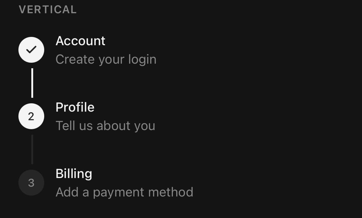
<Steps orientation="vertical" value={step}>
  <Steps.Item step={0}>
    <Steps.Trigger>
      <Steps.Indicator />
      <View className="flex-1">
        <Steps.Title>Connect your repo</Steps.Title>
        <Steps.Description>We only read metadata.</Steps.Description>
      </View>
    </Steps.Trigger>
  </Steps.Item>
  {/* …more items… */}
</Steps>
A step that is loading or blocked
<Steps.Item step={1} loading={isDeploying}>
  {/* … */}
</Steps.Item>

<Steps.Item step={3} disabled={!hasPaid}>
  {/* … */}
</Steps.Item>
Variants
orientation
horizontal(default)vertical
<Steps orientation="horizontal" value={step}>…</Steps>
<Steps orientation="vertical" value={step}>…</Steps>
state
inactive(default)activecompletedloading
<Steps state="inactive">…</Steps>
<Steps state="active">…</Steps>
<Steps state="completed">…</Steps>
<Steps state="loading">…</Steps>
API Reference
Steps
| Prop | Type | Default | Description |
|---|---|---|---|
className | string | — | |
defaultValue | number | 0 | Active step when uncontrolled. |
value | number | — | Active step, controlled. |
onValueChange | (value: number) => void | — | |
orientation | StepsOrientation | horizontal | |
separators | boolean | true | Draw the connector between one item and the next. On by default — an item that holds its own Steps.Separator is left alone either way, so this is for a stepper that wants no connectors at all rather than for one that places them by hand. |
Steps.Item
| Prop | Type | Default | Description |
|---|---|---|---|
className | string | — | |
step | number | — | This item's position in the flow, zero-based by convention. |
completed | boolean | — | Force the completed state, regardless of the active step. |
disabled | boolean | — | |
loading | boolean | — | Shows a spinner in place of the number while this step is active. |
Steps.Trigger
| Prop | Type | Default | Description |
|---|---|---|---|
className | string | — |
Steps.Indicator
| Prop | Type | Default | Description |
|---|---|---|---|
className | string | — |
Steps.Separator
| Prop | Type | Default | Description |
|---|---|---|---|
className | string | — |
Every part also accepts the underlying React Native props (ViewProps or TextProps) and a className for Tailwind utilities.
Notes
Steps are zero-based internally but the indicator renders them as 1, 2, 3.
Steps.Trigger accepts the normal Pressable contract. Its onPress runs before the step selection callback, while selection, the button role, position/state announcement, and an item-level disabled state remain owned by Steps. A trigger-level disabled prop combines with the item instead of re-enabling it.
The connectors are drawn for you: the root counts the items it holds and every one but the last joins to the next, so there is no separator to forget or leave dangling. Pass separators={false} for a stepper with none, or put a Steps.Separator inside an item to dress that one connector yourself — an item that has its own keeps it and gets no second.
Knowing the count is also what lets a step say where it sits: a screen reader reaching the middle of a wizard hears the step's title, then its position and state — “Payment, step 2 of 3, completed”.
Public exports
Values: Steps
Types: StepsProps, StepsItemProps, StepsTriggerProps, StepsIndicatorProps, StepsSeparatorProps, StepState, StepsOrientation