

aiInput
A prompt composer: a field that grows to five lines, a row of controls, and the sheet they open.
The composer a person types a prompt into: a field that grows with what is written in it, a row of controls under it, and the sheet those controls open.
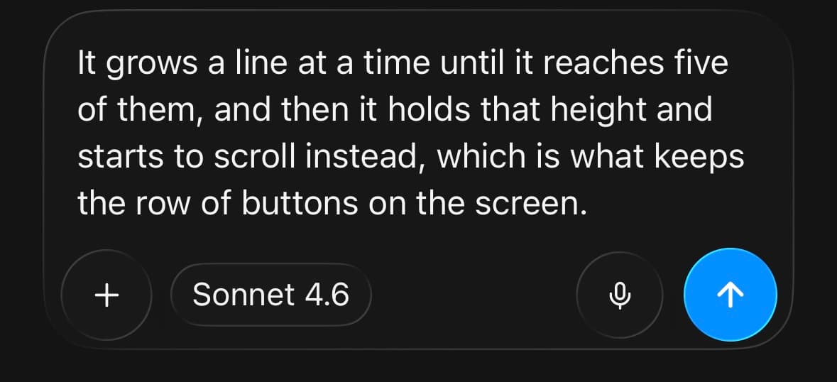
The field opens one line tall and follows the text up to maxRows. After that it holds its height and scrolls its own content, so the composer cannot grow until the send button is off the bottom of the screen. Five rows is the default.
Nothing here touches the microphone. There is a recording state and it draws a live meter, but the app owns the recorder and passes back a level and a status — which is what keeps the composer free of an audio dependency.
The surfaces ask for the iOS system material and get it on iOS 26 and above. Below that, on Android, and for anyone with Reduce Transparency switched on, they are drawn as solid token surfaces. Both are finished looks — nothing is faked where the material does not exist, which is the same rule Button follows and explains.
For a plain multi-line field with a label and a character count, use Textarea. For the answer coming back, use Response.
Installation
AIInput ships with the library — no separate install.
import { AIInput, PlusIcon, MicIcon, CameraIcon, GlobeIcon, FileIcon, Text } from 'panelui-native';Or copy the source into your project, to own and edit it:
npx panelui-cli@latest add ai-inputUsage
<AIInput value={value} onValueChange={setValue} onSubmit={send}>
  <AIInput.Field placeholder="Ask anything" />
  <AIInput.Toolbar>
    <AIInput.Action label="Add" icon={<PlusIcon />} onPress={() => setSheet(true)} />
    <AIInput.Pill label="Sonnet 4.6" detail="High" onPress={() => setModels(true)} />
    <AIInput.Spacer />
    <AIInput.Action label="Dictate" icon={<MicIcon />} onPress={record} />
    <AIInput.Submit />
  </AIInput.Toolbar>
</AIInput>
Composition
<AIInput>
  <AIInput.Field />
  <AIInput.Toolbar>
    <AIInput.Action />
    <AIInput.Pill />
    <AIInput.Spacer />
    <AIInput.Submit />
  </AIInput.Toolbar>
  <AIInput.Recording />
</AIInput>

<AIInput.Sheet>
  <AIInput.Sheet.Screen id="root" title="Add to chat">
    <AIInput.Sheet.Group>
      <AIInput.Sheet.Row />
      <AIInput.Sheet.Toggle />
      <AIInput.Sheet.Choice />
    </AIInput.Sheet.Group>
  </AIInput.Sheet.Screen>
</AIInput.Sheet>

<AIInput.VoiceMode />AIInput.Screen— See props below.AIInput.Group— See props below.AIInput.Row— The field and its controls on a single line, instead of the field above them. The composer at its smallest — a bar that is always on screen rather than the focus of it.AIInput.Toggle— See props below.AIInput.Choice— See props below.
Examples
Growing, and then scrolling
maxRows is where the field stops. Up to it the composer follows the text; past it the height holds and the field scrolls, which is what keeps the toolbar on screen.
minRows moves the floor if a composer should open taller than one line.
<AIInput value={value} onValueChange={setValue} maxRows={5}>
  <AIInput.Field placeholder="Ask anything" />
  <AIInput.Toolbar>
    <AIInput.Spacer />
    <AIInput.Submit />
  </AIInput.Toolbar>
</AIInput>
On one line
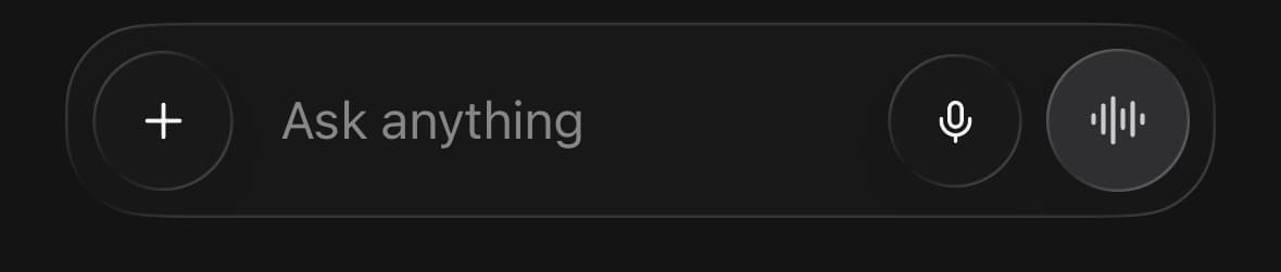
AIInput.Row puts the field between the controls rather than above them, which is the whole composer in one pill.
The field still grows — it grows the row. Reach for it when the composer is always on screen, and for the stacked one when it is what the screen is for.
<AIInput value={value} onValueChange={setValue} onSubmit={send}>
  <AIInput.Row>
    <AIInput.Action label="Add" icon={<PlusIcon />} onPress={add} />
    <AIInput.Field placeholder="Ask anything" />
    <AIInput.Action label="Dictate" icon={<MicIcon />} onPress={record} />
    <AIInput.Submit />
  </AIInput.Row>
</AIInput>
The platform's own controls
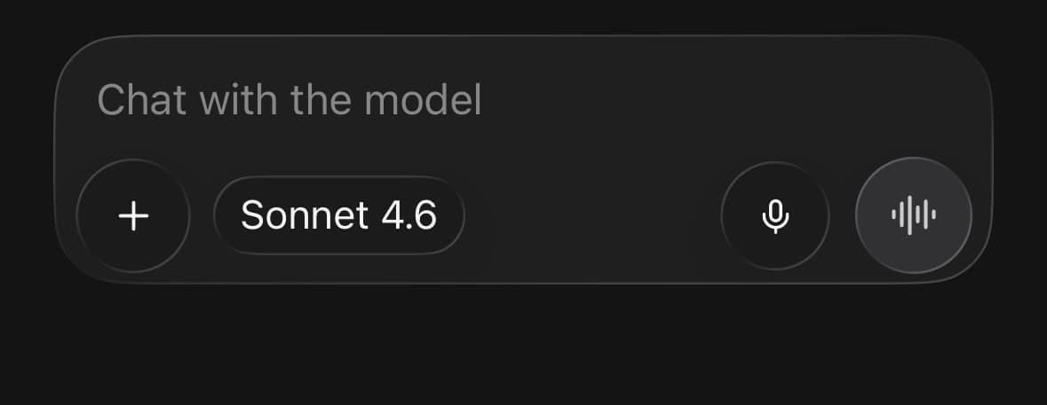
native hands a control to the platform, which draws it in its own material — Liquid Glass on iOS 26. The card behind it is still ours, and still glass.
The platform owns their colour, metrics and shape while this is on, so className and the theme tokens stop reaching them, and the row they sit in takes the platform's height rather than the one our own controls would need.
The platform is given text, never elements: a hosted view inside a labelled native button has no width anything can resolve. A pill's detail goes over as part of the label, so a handed-over pill is one label in one weight rather than a value and a quieter one beside it. An indicator is an element and cannot go at all — name the glyph with indicatorSymbol and the platform draws it from its own symbol set.
<AIInput native value={value} onValueChange={setValue}>
  <AIInput.Field />
  <AIInput.Toolbar>
    <AIInput.Action label="Add" icon={<PlusIcon />} onPress={add} />
    <AIInput.Pill label="Sonnet 4.6" accessibilityLabel="Change model" />
    <AIInput.Spacer />
    <AIInput.Submit />
  </AIInput.Toolbar>
</AIInput>
One button, three jobs
AIInput.Submit reads status and whether anything has been typed, and offers the one thing that is worth doing: voice mode on an empty composer, send once there is a prompt, stop while the answer is arriving.
One control rather than three, because a row of dimmed siblings is a row of things that look broken.
<AIInput
  value={value}
  onValueChange={setValue}
  status={status}
  onSubmit={send}
  onStop={stop}
  onVoice={() => router.push('/voice')}
>
  <AIInput.Field />
  <AIInput.Toolbar>
    <AIInput.Spacer />
    <AIInput.Submit />
  </AIInput.Toolbar>
</AIInput>
Recording, without a recorder
The composer draws the meter; the app runs the recorder. Pass a Reanimated shared value as level and metering arriving every 30ms never re-renders anything above the composer.
With no level at all the meter animates plausible motion, so the screen can be built before any audio exists.
const level = useSharedValue(0);

<AIInput status={recording ? 'recording' : 'ready'} level={level}
  onRecordCancel={discard} onRecordConfirm={transcribe}>
  <AIInput.Field placeholder="Chat with the model" />
  {recording ? <AIInput.Recording /> : (
    <AIInput.Toolbar>
      <AIInput.Spacer />
      <AIInput.Action label="Dictate" icon={<MicIcon />} onPress={start} />
      <AIInput.Submit />
    </AIInput.Toolbar>
  )}
</AIInput>
A sheet that goes deeper
A row with to pushes the screen with that id onto the same sheet. The sheet stays where it is, the close button becomes a back button, and the body slides — which is what makes one level deeper read as the same surface rather than another one landing on top.
The sheet forgets where it was when it closes, so reopening always starts at the first screen.
<AIInput.Sheet open={open} onOpenChange={setOpen}>
  <AIInput.Sheet.Screen id="root" title="Add to chat">
    <AIInput.Sheet.Group>
      <AIInput.Sheet.Row icon={<FileIcon />} label="Add files" onPress={pick} />
    </AIInput.Sheet.Group>
    <AIInput.Sheet.Group>
      <AIInput.Sheet.Row label="Add to project" value={project ?? 'None'} to="project" />
      <AIInput.Sheet.Row label="Tool access" value={tools} to="tools" />
    </AIInput.Sheet.Group>
    <AIInput.Sheet.Group>
      <AIInput.Sheet.Toggle icon={<GlobeIcon />} label="Web search"
        value={web} onValueChange={setWeb} />
    </AIInput.Sheet.Group>
  </AIInput.Sheet.Screen>

  <AIInput.Sheet.Screen id="tools" title="Tool access">
    <AIInput.Sheet.Group>
      {TOOL_MODES.map((mode) => (
        <AIInput.Sheet.Choice
          key={mode.id}
          label={mode.label}
          description={mode.description}
          selected={tools === mode.id}
          onPress={() => setTools(mode.id)}
        />
      ))}
    </AIInput.Sheet.Group>
  </AIInput.Sheet.Screen>
</AIInput.Sheet>
An action in the header
trailing on a screen puts a second control at the far end of the header. The leading end belongs to the sheet, which draws a close button on the first screen and a back button on every screen pushed onto it.
<AIInput.Sheet.Screen
  id="project"
  title="Add to project"
  trailing={<AIInput.Action label="New project" icon={<PlusIcon />} onPress={create} />}
>
  <AIInput.Sheet.Group>
    {projects.map((project) => (
      <AIInput.Sheet.Row key={project.id} label={project.name}
        description={project.updated} onPress={() => choose(project)} />
    ))}
  </AIInput.Sheet.Group>
</AIInput.Sheet.Screen>
Versions
In a chat
The composer docked above the keyboard, over a transcript. The page behind does not move — the composer travels with the keyboard instead.
<View className="flex-1">
  <MessageScroller>{turns}</MessageScroller>
  <AIInput value={value} onValueChange={setValue} onSubmit={send} keyboardBottomInset={insets.bottom}>
    <AIInput.Field placeholder="Chat with the model" />
    <AIInput.Toolbar>
      <AIInput.Action label="Add" icon={<PlusIcon />} onPress={() => setSheet(true)} />
      <AIInput.Pill label="Sonnet 4.6" detail="High" onPress={() => setModels(true)} />
      <AIInput.Spacer />
      <AIInput.Submit />
    </AIInput.Toolbar>
  </AIInput>
</View>
The sheet it opens
Three screens on one sheet: what can be added to the chat, the project it belongs to, and how much of the toolbox the model is given.
<AIInput.Sheet open={open} onOpenChange={setOpen}>
  <AIInput.Sheet.Screen id="root" title="Add to chat" trailing={<Text muted>All photos</Text>}>
    …
  </AIInput.Sheet.Screen>
  <AIInput.Sheet.Screen id="project" title="Add to project">…</AIInput.Sheet.Screen>
  <AIInput.Sheet.Screen id="tools" title="Tool access">…</AIInput.Sheet.Screen>
</AIInput.Sheet>
Voice mode
The screen with no field on it. The wash behind everything and the capsules over the microphone are the same meter the composer draws, given the whole screen.
<AIInput.VoiceMode
  state={state}
  level={level}
  title="Start chatting anytime"
  onMicPress={toggleMute}
  onClose={() => router.back()}
>
  <AIInput.Action label="Add" icon={<PlusIcon />} onPress={add} />
  <AIInput.Pill
    label="Sonnet"
    indicator={<ChevronsUpDownIcon size={14} />}
    indicatorSymbol="chevron.up.chevron.down"
    onPress={models}
  />
</AIInput.VoiceMode>
Variants
size
smmd(default)lg
<AIInput size="sm">…</AIInput>
<AIInput size="md">…</AIInput>
<AIInput size="lg">…</AIInput>
API Reference
AIInput
| Prop | Type | Default | Description |
|---|---|---|---|
className | string | — | |
value | string | — | The prompt, when the app owns it. |
onValueChange | (value: string) => void | — | Called on every keystroke. |
defaultValue | string | '' | The prompt to start with, when the composer owns it. |
status | AIInputStatus | 'ready' | What the app is doing. ready offers to send, streaming offers to stop, and recording swaps the toolbar for the meter and its two decisions. |
onSubmit | (value: string) => void | — | Called with the prompt when it is sent. The composer does not clear itself. |
onStop | () => void | — | Called when the trailing button is pressed while streaming. |
onVoice | () => void | — | Called when the voice button is pressed on an empty composer. |
onRecordCancel | () => void | — | Called when a recording is thrown away. |
onRecordConfirm | () => void | — | Called when a recording is accepted. |
level | number | SharedValue<number> | — | Input level, 0–1, from the app's own recorder. Pass a shared value to keep metering off the JS thread entirely. Omitted, the meter animates plausible motion so a screen can be built before any audio exists. |
size | AIInputSize | 'md' | Type scale and control size. |
disabled | boolean | false | Nothing can be typed, pressed or sent. |
native | boolean | false | Draw the toolbar's controls as the platform's own buttons, in the system material — Liquid Glass on iOS 26, the platform's ordinary button style below it and on Android. The platform owns their colour, metrics and shape when this is on, so className and the theme tokens no longer reach them. The card behind them is still ours, and still glass. Needs the optional @expo/ui; without it the drawn controls are used and nothing breaks. |
minRows | number | 1 | Rows the empty field is tall. |
maxRows | number | 5 | Rows the field grows to before it holds that height and scrolls. |
avoidKeyboard | boolean | true | Lift the composer clear of the software keyboard. |
keyboardBottomInset | number | 0 | How far above the bottom edge the composer already sits. |
keyboardGap | number | 8 | Gap to leave between the composer and the top of the keyboard. A composer resting directly on the keys reads as part of them. |
AIInput.Field
| Prop | Type | Default | Description |
|---|---|---|---|
className | string | — |
AIInput.Row
| Prop | Type | Default | Description |
|---|---|---|---|
className | string | — |
AIInput.Toolbar
| Prop | Type | Default | Description |
|---|---|---|---|
className | string | — |
AIInput.Action
| Prop | Type | Default | Description |
|---|---|---|---|
className | string | — | |
label | string | — | Names the control. It is a circle with a glyph in it; nothing else says what it does. |
icon | ReactNode | — | |
onPress | () => void | — | |
disabled | boolean | false | |
size | AIInputSize | md | Control size. Inherited from the composer when it is inside one. |
native | boolean | — | Draw it as the platform's own button, in the system material. Inherited from the composer when it is inside one. The platform owns its colour and shape, so className stops reaching it. |
AIInput.Pill
| Prop | Type | Default | Description |
|---|---|---|---|
className | string | — | |
label | ReactNode | — | The current value — a model name, a mode, a project. |
detail | ReactNode | — | A second, quieter value beside it. |
indicator | ReactNode | — | A glyph after the labels, for a pill that opens a list. |
indicatorSymbol | string | — | The platform's name for indicator, used when the pill is handed over. A native button takes a glyph as a name from the system's symbol set, not as an element — an element would have to be hosted, and a hosted view inside a labelled button has no width anything can resolve. So the two are separate props rather than one: indicator is what the drawn pill renders, this is what the handed-over one asks the platform for. A pill with an indicator and no symbol is still handed over, and has no glyph on it. |
onPress | () => void | — | |
disabled | boolean | false | |
accessibilityLabel | string | — | Names the control when the label alone does not say what changing it does. |
size | AIInputSize | md | Control size. Inherited from the composer when it is inside one. |
native | boolean | — | Draw it as the platform's own button, in the system material. The platform is given text and a symbol name, never elements: a hosted view inside a labelled native button has no width anything can resolve. So a label or detail that is not a string is drawn here whatever this says, and an indicator reaches the platform only through indicatorSymbol. A handed-over pill is one label in the platform's own type, so detail stops reading as the quieter half of the pair. |
AIInput.Submit
| Prop | Type | Default | Description |
|---|---|---|---|
className | string | — | |
sendLabel | string | 'Send' | Names the button in its send state. |
voiceLabel | string | 'Voice mode' | Names it in its voice state, which is what an empty composer offers. |
stopLabel | string | 'Stop' | Names it while the model is answering. |
native | boolean | — | Draw it as the platform's own button, in the system material. |
AIInput.Recording
| Prop | Type | Default | Description |
|---|---|---|---|
className | string | — | |
cancelLabel | string | 'Discard recording' | |
confirmLabel | string | 'Use recording' | |
native | boolean | — | Draw the two decisions as the platform's own buttons. |
AIInput.SheetScreen
| Prop | Type | Default | Description |
|---|---|---|---|
className | string | — | |
id | string | — | Names this screen. AIInput.Sheet.Row's to pushes the screen with this id. |
title | ReactNode | — | Centred in the header, and the first thing a screen reader reaches. |
trailing | ReactNode | — | A control at the trailing end of the header — a second action the screen offers. The leading end is the sheet's, and is a close button on the root screen and a back button on every screen pushed onto it. |
AIInput.Sheet
| Prop | Type | Default | Description |
|---|---|---|---|
className | string | — | |
open | boolean | — | |
onOpenChange | (open: boolean) => void | — | |
defaultOpen | boolean | false | |
initialScreen | string | — | Which screen opens first. Defaults to the first one given. |
onScreenChange | (id: string) => void | — | Called whenever the screen on top changes, pushed or popped. |
blur | boolean | false | Frost the screen behind the sheet instead of dimming it. |
size | 'auto' | 'half' | 'full' | 'auto' | How tall the sheet opens. auto sizes to the screen currently on top. |
detached | boolean | true | Float the sheet clear of the screen edges instead of docking it to the bottom. On by default: the surface is a material, and a material reads as laid over the app when there is app visible around all four of its edges. Docked, its bottom edge is the screen's, and there is nothing behind it there to refract. |
AIInput.SheetGroup
| Prop | Type | Default | Description |
|---|---|---|---|
className | string | — | |
footnote | ReactNode | — | A line under the group, for what the rows in it mean. |
AIInput.SheetRow
| Prop | Type | Default | Description |
|---|---|---|---|
className | string | — | |
label | ReactNode | — | |
description | ReactNode | — | A quieter line under the label. |
icon | ReactNode | — | A glyph at the leading end. |
value | ReactNode | — | The current setting, shown at the trailing end. |
to | string | — | Push the screen with this id when the row is pressed. A row with one shows a chevron, because a row that leads somewhere should say so before it is pressed. |
onPress | () => void | — | |
disabled | boolean | false |
AIInput.SheetToggle
| Prop | Type | Default | Description |
|---|---|---|---|
className | string | — | |
label | ReactNode | — | |
description | ReactNode | — | |
icon | ReactNode | — | |
value | boolean | — | |
onValueChange | (value: boolean) => void | — | |
disabled | boolean | false |
AIInput.SheetChoice
| Prop | Type | Default | Description |
|---|---|---|---|
className | string | — | |
label | ReactNode | — | |
description | ReactNode | — | |
badge | ReactNode | — | A pill beside the label — what the choice costs, or what it needs. |
selected | boolean | false | |
onPress | () => void | — | |
disabled | boolean | false |
AIInput.VoiceMode
| Prop | Type | Default | Description |
|---|---|---|---|
className | string | — | |
state | 'idle' | 'listening' | 'thinking' | 'speaking' | 'listening' | What the app is doing, which is what the wave behind everything shows. |
level | number | SharedValue<number> | — | Input level, 0–1. A shared value keeps metering off the JS thread. |
title | ReactNode | — | A line above the microphone — a greeting, or what it is waiting for. |
onMicPress | () => void | — | |
micLabel | string | 'Mute' | |
onClose | () => void | — | |
closeLabel | string | 'End voice mode' | |
size | AIInputSize | 'md' | Type scale for the controls in the bottom row. |
native | boolean | false | Draw the bottom row's controls as the platform's own, in its material. |
Every part also accepts the underlying React Native props (ViewProps or TextProps) and a className for Tailwind utilities.
Notes
The field stops at maxRows and scrolls. The toolbar stays at the bottom of the box, so a long prompt never pushes the send button off the screen.
The trailing button is inert when there is nothing to do. With no text it offers voice mode, and only if the app took an onVoice; without one it stays disabled until something is typed, rather than looking live and doing nothing. The same goes for onStop while streaming.
onSubmit does not clear the field. The composer does not know whether the send succeeded; clear value yourself once it has.
Glass needs iOS 26. Everywhere else the surfaces are solid, which is a finished look rather than a fallback. Nothing is faked on Android.
A native row is the platform's height, not ours. A control handed over is hosted, and a hosted view only lays out where something above it is fixed on both axes. The platform frames its icon buttons at 44pt, so a row carrying them takes a definite height of its own — a shorter row is one its controls hang out of, over the field above them. The drawn controls are smaller and are laid out by the row itself, so this applies only once native is on.
avoidKeyboard is a component boundary, not a flag. Turning it off means the keyboard hook is never called at all — calling it has global consequences, and a composer that was told not to avoid the keyboard must not impose that on every other screen.
The sheet is a solid surface, not a material. It covers most of the screen, so there is almost nothing behind it left to refract. The composer keeps the glass, because a bar floating over a page is the case the material is for.
A sheet row's to names a screen id, not a route. It pushes onto the same sheet; nothing navigates.
Public exports
Values: AIInput
Types: AIInputProps, AIInputStatus, AIInputFieldProps, AIInputRowProps, AIInputToolbarProps, AIInputActionProps, AIInputPillProps, AIInputSubmitProps, AIInputRecordingProps, AIInputSheetProps, AIInputSheetScreenProps, AIInputSheetGroupProps, AIInputSheetRowProps, AIInputSheetToggleProps, AIInputSheetChoiceProps, AIInputVoiceModeProps