

InputGroup
Input with leading and trailing decorators.

An input with leading or trailing decorators — a currency symbol, a unit, a button.
The prefix and suffix are measured and their widths applied as padding on the input, so text never runs underneath them however wide they turn out to be.
Installation
InputGroup ships with the library — no separate install.
import { InputGroup, Text, Button, SearchIcon } from 'panelui-native';Or copy the source into your project, to own and edit it:
npx panelui-cli@latest add input-groupUsage
<InputGroup>
  <InputGroup.Prefix isDecorative>
    <SearchIcon size={16} />
  </InputGroup.Prefix>
  <InputGroup.Input placeholder="Search products…" />
</InputGroup>

<InputGroup>
  <InputGroup.Input placeholder="Password" secureTextEntry={!visible} />
  <InputGroup.Suffix>
    <Button variant="ghost" size="sm" onPress={toggle}>
      {visible ? 'Hide' : 'Show'}
    </Button>
  </InputGroup.Suffix>
</InputGroup>
Composition
<InputGroup>
  <InputGroup.Prefix>…</InputGroup.Prefix>
  <InputGroup.Input />
  <InputGroup.Suffix>…</InputGroup.Suffix>
</InputGroup>InputGroup.Prefix— Leading decorator, absolutely positioned.InputGroup.Input— The field itself. Accepts allInputprops.InputGroup.Suffix— Trailing decorator, absolutely positioned.
Examples
A prefix and a suffix
The decorators are measured, and the field is padded around them — so text never runs underneath.
<InputGroup>
  <InputGroup.Prefix>
    <Text muted>https://</Text>
  </InputGroup.Prefix>
  <InputGroup.Input placeholder="yoursite.com" />
  <InputGroup.Suffix>
    <Text muted>.dev</Text>
  </InputGroup.Suffix>
</InputGroup>
A search field
<InputGroup>
  <InputGroup.Prefix isDecorative>
    <SearchIcon size={16} />
  </InputGroup.Prefix>
  <InputGroup.Input
    placeholder="Search"
    value={query}
    onChangeText={setQuery}
    autoCorrect={false}
  />
</InputGroup>
An interactive suffix
Leave isDecorative off when the decorator is pressable, so it stays in the touch path.
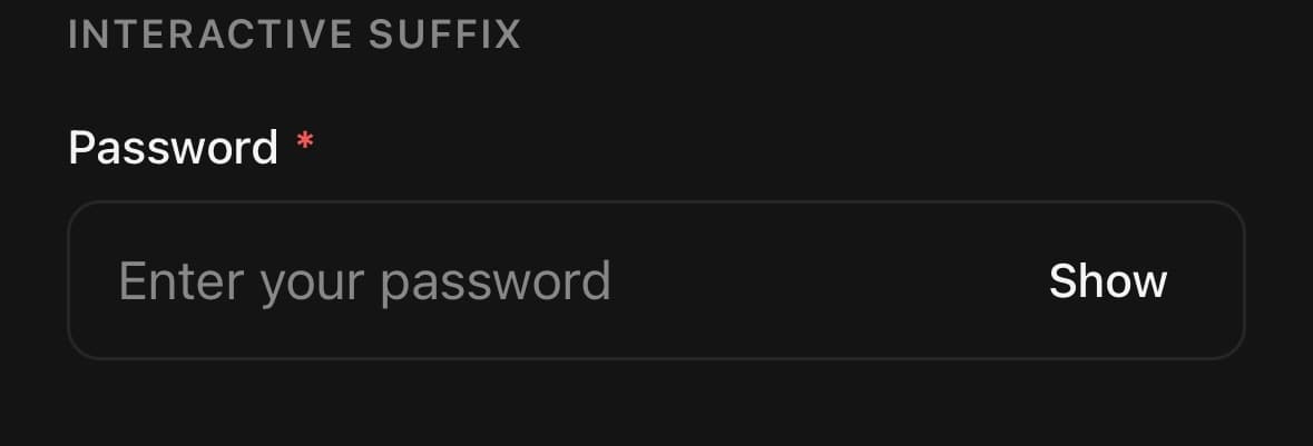
<InputGroup>
  <InputGroup.Input secureTextEntry={hidden} placeholder="Password" />
  <InputGroup.Suffix>
    <Button size="icon" variant="ghost" onPress={() => setHidden(!hidden)}>
      <Text size="sm" muted>{hidden ? 'Show' : 'Hide'}</Text>
    </Button>
  </InputGroup.Suffix>
</InputGroup>
Disabled
isDisabled on the group dims the decorators along with the field, so the whole control reads as off rather than a live input with grey furniture around it.

<InputGroup isDisabled className="w-full">
  <InputGroup.Prefix isDecorative>
    <SearchIcon size={16} />
  </InputGroup.Prefix>
  <InputGroup.Input placeholder="Disabled input" />
</InputGroup>
API Reference
InputGroup
| Prop | Type | Default | Description |
|---|---|---|---|
className | string | — | |
isDisabled | boolean | — | Disables the input and dims both decorators. |
InputGroup.Decorator
| Prop | Type | Default | Description |
|---|---|---|---|
className | string | — | |
isDecorative | boolean | — | Marks the decorator as presentation-only: touches fall through to the Input and screen readers skip it. Leave it off when the decorator holds something interactive, such as a show-password toggle. |
Every part also accepts the underlying React Native props (ViewProps or TextProps) and a className for Tailwind utilities.
Notes
Set isDecorative when the decorator is presentation-only: touches fall through to the input and screen readers skip it. Leave it off when it holds something interactive, like a show-password toggle. Prefix and Suffix measurements are removed automatically when decorators unmount, so conditionally rendered adornments do not leave stale input padding.
Public exports
Values: InputGroup
Types: InputGroupProps, InputGroupInputProps, InputGroupDecoratorProps