

ProgressButton
Press and hold to confirm, with the wait drawn on the button.
A button that has to be held rather than tapped. The wait is drawn on the button itself: a fill grows from the leading edge, and the action fires when it reaches the end.
Use it for the action a confirmation dialog exists to slow down. A dialog asks the question somewhere else and takes the answer as a tap, which makes it two taps — and two taps in a row is a rhythm a hand falls into. A hold cannot be completed by accident and cannot be completed by habit.
Nothing fires until the fill is complete. There is no tolerance near the end, because a tolerance means the button sometimes commits after the reader has deliberately let go. Released early, the fill drains back.
For an action that is ordinary rather than irreversible, use Button. For a wait the reader is not causing, use Progress.
Installation
ProgressButton ships with the library — no separate install.
import { ProgressButton, Frame, Text, Button } from 'panelui-native';
import { View } from 'react-native';
Or copy the source into your project, to own and edit it:
npx panelui-cli@latest add progress-buttonUsage
<ProgressButton onComplete={erase}>
  <ProgressButton.Label>Hold to erase</ProgressButton.Label>
</ProgressButton>
Composition
<ProgressButton>
  <ProgressButton.Label>Hold to confirm</ProgressButton.Label>
  <ProgressButton.Done />
</ProgressButton>
ProgressButton.Label renders the text twice on purpose. A single label under a translucent wash goes muddy in the middle of the wipe, which is exactly where the eye is; two labels, each at full contrast on its own ground, never do. Both copies are laid out at the button's own width, so the boundary falls in the middle of a glyph rather than between two differently wrapped lines.
ProgressButton.Done is added automatically, so most buttons never name it. Write it out to put something else there — a word beside the tick, an icon of your own — and it replaces the default rather than joining it.
Examples
Hold to confirm
The default: two seconds, and nothing happens until the fill reaches the end.
<ProgressButton onComplete={() => erase()}>
  <ProgressButton.Label>Hold to erase</ProgressButton.Label>
</ProgressButton>
Hold to pay
The fill runs out, the words go, and a tick arrives in their place. That last part is ProgressButton.Done, and it is drawn whether or not you name it — a hold that lands and shows nothing leaves the reader checking whether it worked.
The button sits on the tray below the panel rather than among the rows: the rows are what is being paid for, and this is the thing you do about them.
autoReset is deliberately absent. A payment that offers itself again a second later is a payment somebody makes twice by leaning on the button.
const [paid, setPaid] = useState(false);

<Frame>
  <Frame.Header>
    <Frame.Title>Checkout</Frame.Title>
    <Frame.Action>Delivered Thursday</Frame.Action>
  </Frame.Header>

  <Frame.Panel>
    {items.map((item) => (
      <Frame.Row key={item.id}>
        <Frame.Content>
          <Frame.Title>{item.name}</Frame.Title>
          <Frame.Description>{item.detail}</Frame.Description>
        </Frame.Content>
        <Frame.Actions>
          <Text size="sm">{item.price}</Text>
        </Frame.Actions>
      </Frame.Row>
    ))}
  </Frame.Panel>

  <View className="px-4 pb-3 pt-3">
    <ProgressButton
      variant="success"
      haptics
      fullWidth
      completed={paid}
      onComplete={() => setPaid(true)}
      onCompletedChange={setPaid}
    >
      <ProgressButton.Label>{paid ? 'Paid' : 'Hold to pay'}</ProgressButton.Label>
    </ProgressButton>
  </View>
</Frame>
The shape of an ordinary button
shape="rounded" gives the button Button's box exactly — the same radius, side padding and minimum width, at heights that already matched. Use it where the hold sits in a row of ordinary buttons and a lone pill would read as a different kind of control rather than as the one that has to be held.
The default is pill, and it is the default for a reason: the fill is clipped by the corner, so a half-circle sends the wipe's leading edge out as a curve and the button reads as filling up. A small radius sends it out square.
<View className="gap-3">
  <ProgressButton shape="rounded" fullWidth onComplete={() => remove()}>
    <ProgressButton.Label>Hold to delete</ProgressButton.Label>
  </ProgressButton>
  <Button variant="outline" fullWidth onPress={() => close()}>
    Cancel
  </Button>
</View>
How long the hold is
holdDuration is in milliseconds. Longer for something with no undo, shorter for something merely worth pausing over. It is floored at 200ms — a hold that completes on touch-down is a button with extra steps.
<ProgressButton holdDuration={3000} variant="destructive" onComplete={() => wipe()}>
  <ProgressButton.Label>Hold to wipe the device</ProgressButton.Label>
</ProgressButton>
Offering itself again
autoReset empties the fill after the action has landed, for a control the reader may want twice. Without it the button stays completed until something resets it.
<ProgressButton autoReset autoResetDelay={1200} variant="success" onComplete={() => publish()}>
  <ProgressButton.Label>Hold to publish</ProgressButton.Label>
</ProgressButton>
Owning the completed state
Pass completed to drive it from outside — a request that has to succeed before the button is allowed to look finished. onCompletedChange reports both directions.
const [done, setDone] = useState(false);

<ProgressButton
  completed={done}
  onComplete={async () => {
    await submit();
    setDone(true);
  }}
  onCompletedChange={setDone}
>
  <ProgressButton.Label>Hold to submit</ProgressButton.Label>
</ProgressButton>
A tick as it takes, a knock as it lands
haptics is off by default: whether an action is worth feeling is the caller's decision rather than the control's. The visual stands alone either way — haptics are off system-wide for many people and silent on most Android hardware.
<ProgressButton haptics variant="destructive" onComplete={() => remove()}>
  <ProgressButton.Label>Hold to delete</ProgressButton.Label>
</ProgressButton>
Something else at the end
ProgressButton.Done takes children, which replace the tick. Everything inside it is drawn in the fill's own foreground colour, so an icon needs no colour of its own.
<ProgressButton onComplete={() => archive()}>
  <ProgressButton.Label>Hold to archive</ProgressButton.Label>
  <ProgressButton.Done>
    <Text className="text-primary-foreground">Archived</Text>
  </ProgressButton.Done>
</ProgressButton>
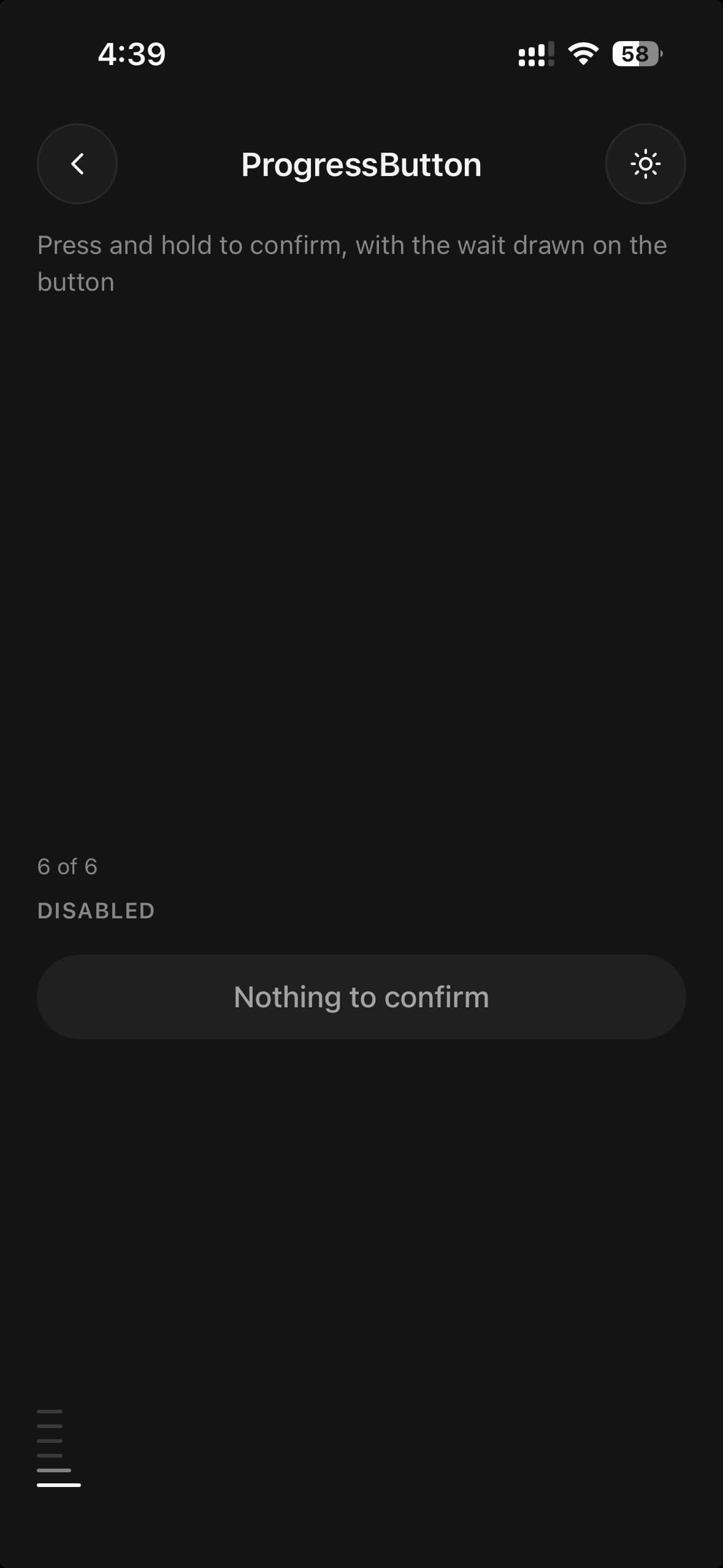
Nothing to confirm
disabled dims the button and stops it taking a hold at all — the fill never starts, so there is no half-finished state to explain. Use it for a confirmation whose subject is not there yet, rather than letting the reader hold a button for two seconds to find out.
<ProgressButton disabled fullWidth onComplete={() => wipe()}>
  <ProgressButton.Label>Nothing to confirm</ProgressButton.Label>
</ProgressButton>
Variants
variant
primary(default)secondarydestructivesuccess
<ProgressButton variant="primary">…</ProgressButton>
<ProgressButton variant="secondary">…</ProgressButton>
<ProgressButton variant="destructive">…</ProgressButton>
<ProgressButton variant="success">…</ProgressButton>
size
smmd(default)lg
<ProgressButton size="sm">…</ProgressButton>
<ProgressButton size="md">…</ProgressButton>
<ProgressButton size="lg">…</ProgressButton>
shape
pill(default)rounded
<ProgressButton shape="pill">…</ProgressButton>
<ProgressButton shape="rounded">…</ProgressButton>
fullWidth
true
<ProgressButton fullWidth>…</ProgressButton>API Reference
ProgressButton
| Prop | Type | Default | Description |
|---|---|---|---|
className | string | — | |
holdDuration | number | — | Milliseconds the button has to be held. Defaults to 2000, and is floored at 200 — a hold that completes on touch-down is a button with extra steps. |
onComplete | () => void | — | Fires once the hold has been sustained to the end. |
onCompletedChange | (completed: boolean) => void | — | Fires whenever the completed state changes, including on a reset. |
completed | boolean | — | Controlled completion. Leave unset to let the button own it. |
autoReset | boolean | false | Return to the unfilled state after autoResetDelay. |
autoResetDelay | number | — | Milliseconds to stay completed before resetting. Defaults to 1000. |
disabled | boolean | false | Dim the button and refuse the hold outright. The fill never starts, so there is no half-finished state to explain. |
haptics | boolean | false | A tick as the hold takes, and a knock when it completes. Off by default: whether an action is worth feeling is the caller's call, not the control's. |
shape | ProgressButtonShape | pill | The corner. pill by default — the fill is clipped by it, so a half-circle sends the wipe's leading edge out as a curve and the button reads as filling up. rounded gives it Button's box exactly: the same radius, side padding and minimum width, at heights that already matched. Use it where the hold stands in a row of ordinary buttons — a form's footer, a toolbar, a card's actions — and a lone pill would read as a different kind of control rather than as the one that has to be held. |
ProgressButton.Label
| Prop | Type | Default | Description |
|---|---|---|---|
className | string | — |
ProgressButton.Done
| Prop | Type | Default | Description |
|---|---|---|---|
className | string | — |
Every part also accepts the underlying React Native props (ViewProps or TextProps) and a className for Tailwind utilities.
Notes
The fill grows on the UI thread and completion is read off the animation itself, not from a timer running beside it. Two clocks agree only while the app is idle; busy, a timer fires before the fill arrives, and the action happens earlier than the reader watched it happen.
Releasing early plays the fill backwards. One animation in two directions: same rate, same easing, same stepping under reduced motion. Letting go at nine tenths of a two-second hold takes 1.8 seconds to travel home, which is the 1.8 seconds it took to get there. A fill that vanishes has been deleted; a fill that travels back has been let go, and telling those apart is the reason the wait is drawn on the button at all.
Pressing again while it is on its way back picks it up from where it is rather than restarting the clock, so a second attempt is never slower than the first. autoReset and a controlled completed going false rewind the same way — the fill is never set to empty, only ever travelled there.
The completed button stays completed. Releasing after the fill has arrived does not drain it — only a release before it does. autoReset empties it after a delay, and a controlled completed empties it whenever you say so; without either, the button holds its finished state and stops accepting presses, which is the correct answer for an action that has already happened.
A few points of finger drift will not abandon a hold. pressRetentionOffset is 16, because a hand resting on a control for two seconds moves.
With the operating system set to reduce motion the fill advances in five steps instead of sweeping. It is still an indicator — a control that asks you to wait and shows nothing is a broken button, and what that setting is about is continuous movement.
The button announces as a button, with a hint saying it has to be held and a checked state once it has been. A single activation from an assistive technology does nothing on its own, so the hint carries the instruction rather than leaving it to the visible label.
Every variant rests on the same secondary surface, and carries its colour in the label. primary, secondary, destructive and success differ in the word and in what comes across it, not in the shape of the button. Drawn as four different outlines they were four different buttons before anything had happened, and the one thing all of them do — wait to be held — was the thing the drawing did not say.
The label is drawn twice, once on the surface in the variant's colour and once inside the fill in the fill's own foreground, so contrast holds on both sides of the wipe in either theme without a hardcoded value.
Public exports
Values: ProgressButton, useProgressButton
Types: ProgressButtonProps, ProgressButtonLabelProps, ProgressButtonDoneProps, ProgressButtonVariant, ProgressButtonSize