

Meter
A measurement on a fixed scale, coloured by where it falls.
A measurement on a fixed scale: disk used, battery left, a test score, a password's strength.
It is not a progress bar. A meter is a reading that sits where it sits and may go back down; progress moves towards an end that finishing is the point of. For work completing, use Progress.
thresholds paint the bar by where the reading falls, and segments draws the scale as discrete blocks.
React Native has no meter role, so a meter exposes one read-only progress bar node with its name and formatted value. Pass label — the role will not tell a reading from a task, and the name is what does. The visible header repeats that same information visually but is not a second screen-reader stop.
Installation
Meter ships with the library — no separate install.
import { Meter } from 'panelui-native';Or copy the source into your project, to own and edit it:
npx panelui-cli@latest add meterUsage
<Meter value={68} label="Storage" showValueLabel />Examples
A scale in its own units
Set maxValue and the meter speaks in what is being measured. Nothing has to be converted to a percent on the way in, and the screen reader is told the real scale.
<Meter
  value={168}
  maxValue={256}
  label="Storage"
  showValueLabel
  formatOptions={{ style: 'unit', unit: 'gigabyte' }}
/>
Thresholds that climb
A disk filling up gets worse as it rises, so the colours rise with it. The highest threshold the reading has reached wins.
<Meter
  value={usedPercent}
  label="Disk"
  showValueLabel
  color="success"
  thresholds={[
    { from: 70, color: 'warning' },
    { from: 90, color: 'destructive' },
  ]}
/>
Thresholds that fall
A battery gets worse as it drops. Same prop, written the other way up — which direction is bad is yours to say.
<Meter
  value={charge}
  label="Battery"
  showValueLabel
  thresholds={[
    { from: 0, color: 'destructive' },
    { from: 20, color: 'warning' },
    { from: 50, color: 'success' },
  ]}
/>
Counted, not measured
Four blocks say “three out of four” where a bar says “about seventy percent”, and a password is not seventy percent strong. Pair segments with a valueLabel word rather than a number.
<Meter
  value={strength}
  maxValue={4}
  segments={4}
  label="Password strength"
  showValueLabel
  valueLabel={['Too short', 'Weak', 'Fair', 'Good', 'Strong'][strength]}
  thresholds={[
    { from: 0, color: 'destructive' },
    { from: 2, color: 'warning' },
    { from: 3, color: 'success' },
  ]}
/>
A segment per unit
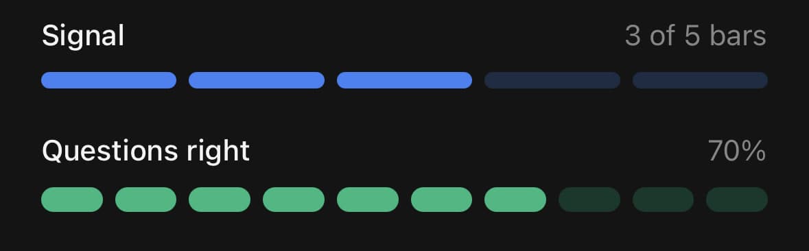
segments does not have to be a scale of its own. Set it to the number of things being counted and each block is one of them.
Give the reading a valueLabel where the count is the point — three of five bars, not sixty percent. Ten of anything is enough for a proportion to mean something, so the second one keeps its percentage.
<Meter
  value={3}
  maxValue={5}
  segments={5}
  label="Signal"
  showValueLabel
  valueLabel="3 of 5 bars"
  color="info"
/>

<Meter
  value={7}
  maxValue={10}
  segments={10}
  label="Questions right"
  showValueLabel
  size="lg"
  color="success"
/>
Colours
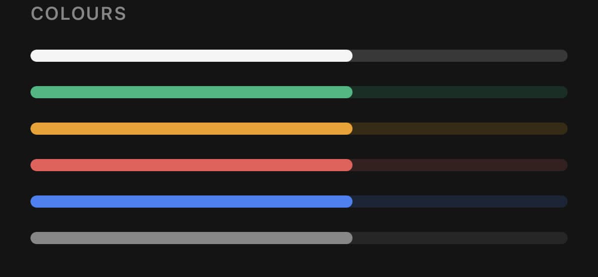
color sets the fill, and the track behind it is the same colour held back — so a meter carries its own contrast on whatever surface it is laid on.
This is for a reading whose meaning does not move with the value: a category, a brand, one series among several. Where the meaning does move with it, use thresholds and let the colour be read off the value.
<Meter value={60} color="primary" />
<Meter value={60} color="success" />
<Meter value={60} color="warning" />
<Meter value={60} color="destructive" />
<Meter value={60} color="info" />
<Meter value={60} color="muted" />
Sizes
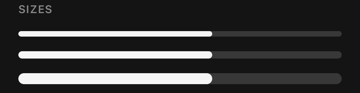
Three track heights. sm for a meter riding a row of a list, lg where the reading is the thing on the screen.
<Meter value={60} size="sm" accessibilityLabel="Small" />
<Meter value={60} size="md" accessibilityLabel="Medium" />
<Meter value={60} size="lg" accessibilityLabel="Large" />
Without a caption
Drop label and the bare track renders, with no header row. Name it another way so the reading is still attached to something.
<Meter value={42} accessibilityLabel="Signal strength" size="sm" />Variants
color
primary(default)successwarningdestructiveinfomuted
<Meter value={60} color="primary" />
<Meter value={60} color="success" />
<Meter value={60} color="warning" />
<Meter value={60} color="destructive" />
<Meter value={60} color="info" />
<Meter value={60} color="muted" />
size
smmd(default)lg
<Meter value={60} size="sm" />
<Meter value={60} size="md" />
<Meter value={60} size="lg" />
API Reference
Meter
| Prop | Type | Default | Description |
|---|---|---|---|
className | string | — | |
value | number | — | The measurement. Values outside the scale are clamped to its ends. |
minValue | number | 0 | The bottom of the scale — the value at which the bar reads as empty. Defaults to 0. |
maxValue | number | 100 | The top of the scale — the value at which the bar reads as full. Defaults to 100, so a bare percentage needs neither bound set. |
label | string | — | What is being measured. Also the accessibility label, and a meter without one announces a number with nothing attached to it — "seventy-five percent" of what is not an answer. Pass accessibilityLabel instead only where the caption is drawn some other way. |
showValueLabel | boolean | false | Draw the value above the track, opposite the label. |
valueLabel | string | — | Text for the value label. Overrides the formatted value — use it for a word where a number reads worse: Strong, Almost full. It is spoken whether or not it is drawn, so it can give a screen reader better words than the caption without changing the caption. Pair it with showValueLabel to draw it too. |
formatOptions | Intl.NumberFormatOptions | — | How to write the value, through Intl.NumberFormat. A percent style formats how far up the scale the value sits; every other style formats the value itself, so { style: 'unit', unit: 'gigabyte' } against a maxValue of 256 reads 64 GB rather than a percentage of it. Falls back to a rounded percent when omitted. |
thresholds | MeterThreshold[] | — | Points on the scale where the colour changes, each { from, color }. The highest one the reading has reached wins, so the order you list them in does not matter; below all of them the color prop applies. Non-finite from values are ignored. This is the difference between a meter and a bar: the colour is a judgement about the reading. Which direction is bad is yours to say — thresholds climbing to destructive suit a disk filling up, thresholds falling to it suit a battery running down. |
segments | number | — | Draw the scale as this many discrete blocks instead of one continuous bar. Blocks are all or nothing, which is the point of them: four blocks say "three out of four" where a bar says "about seventy percent", and a password is not seventy percent strong. Fractional counts round down and counts above 100 clamp to 100. Invalid, non-positive, or sub-one counts use the continuous bar. Any value above the floor lights at least one block, so a reading that is not empty never looks it. |
indicatorClassName | string | — | Extra classes for the fill, or for a lit segment. |
headerClassName | string | — | Extra classes for the label + value row. |
Every part also accepts the underlying React Native props (ViewProps or TextProps) and a className for Tailwind utilities.
Notes
from on a threshold is in the same units as value, not a percentage of the range — a threshold on a 0–8 GB meter is written in gigabytes. The highest finite one the value has reached wins, so the order you list them in does not matter. Below all of them, the color prop applies.
Values outside the scale clamp to its ends; NaN reads at the floor and infinities at the corresponding end. Non-finite bounds use the documented 0 and 100 defaults; an inverted or empty scale collapses at its finite floor and reads as empty. This keeps layout, animation, and native accessibility values finite and ordered.
Any reading above the floor lights at least one segment. Rounding down would leave the first quarter of a four-block meter dark, and “a little” looking like “none” is the reading a meter can least afford to get wrong.
Segments are all or nothing; a partly-filled block is not drawn. Fractional counts round down, counts above 100 clamp to 100, and invalid, non-positive, or sub-one counts use the continuous bar. If the value does not divide into whole blocks, use the continuous bar instead.
The fill is animated on the UI thread, so a value change costs one render and nothing per frame. Under the platform's reduce-motion setting it lands on the value rather than springing to it, and segments light without a fade. Motion, thresholds and segments never change the spoken value.
valueLabel is spoken whether or not it is drawn, so it can replace a number with clearer words such as “Strong”. Pair it with showValueLabel to draw it too; drawing it does not create another accessibility stop. accessibilityLabel overrides the visible label as the spoken name. Without either one the platform has no honest name to announce, so always provide one. Value updates refresh the node when rendered but are not live-region announcements, and this read-only meter does not expose adjustable actions.
Public exports
Values: Meter
Types: MeterProps, MeterColor, MeterThreshold