

Button
Pressable action with variants, sizes, loading state and icon slots.
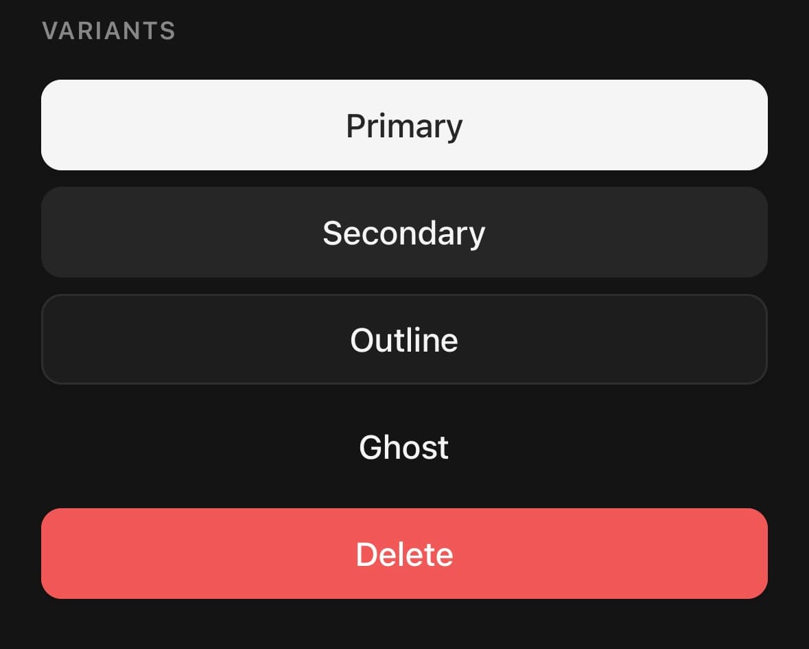
The primary action component: variants, sizes, a loading state and icon slots.
Icons in startContent and endContent inherit a colour that reads against the button's background, so they follow the theme without a hardcoded hex.
For several buttons drawn as one control, use ButtonGroup. For a button that stays down after it is pressed, use ToggleButton.
Installation
Button ships with the library — no separate install.
import { Button, SearchIcon, ChevronRightIcon, GoogleIcon, AppleIcon } from 'panelui-native';Or copy the source into your project, to own and edit it:
npx panelui-cli@latest add buttonUsage
<Button onPress={save}>Save changes</Button>

<Button variant="outline" startContent={<SearchIcon size={16} />}>
  Search
</Button>

<Button variant="social" fullWidth startContent={<GoogleIcon size={18} />}>
  Continue with Google
</Button>

<Button loading={saving} fullWidth>
  {saving ? 'Saving…' : 'Save'}
</Button>
Examples
With icons
Icons in startContent and endContent inherit a colour that reads against the button’s background, so they follow the theme without a hardcoded hex.
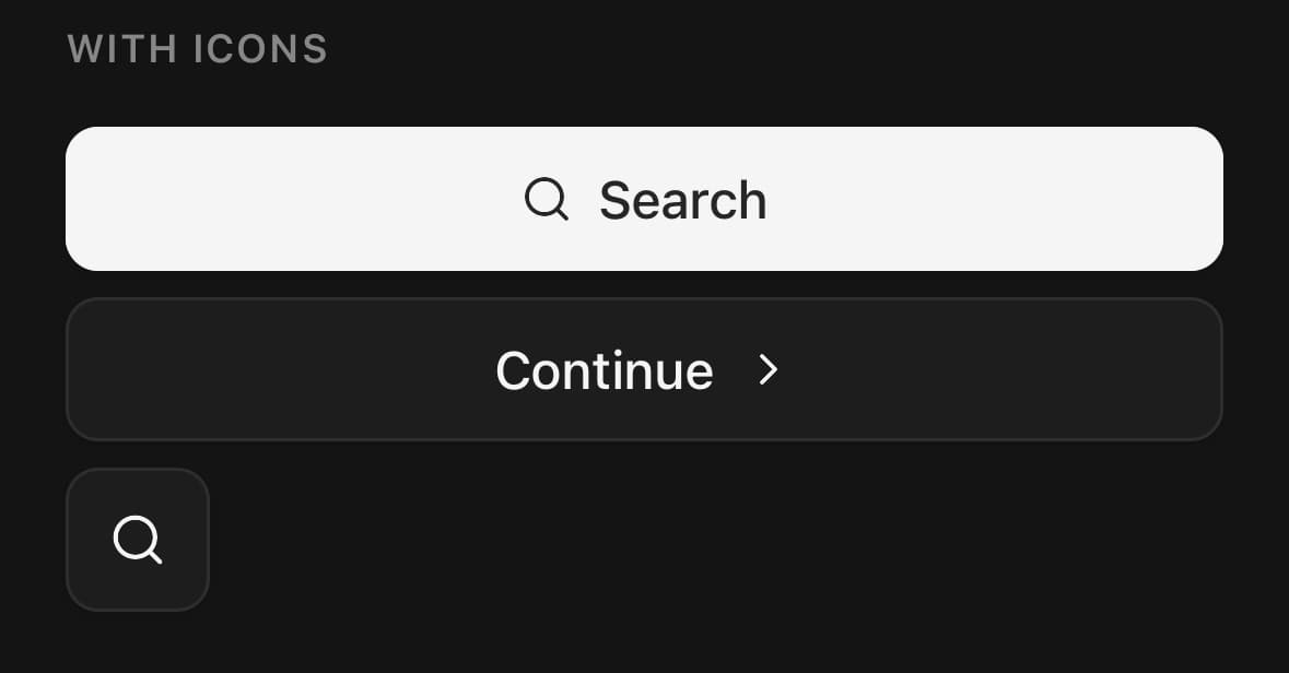
<Button startContent={<SearchIcon size={16} />}>Search</Button>

<Button variant="outline" endContent={<ChevronRightIcon size={16} />}>
  Continue
</Button>

{/* Icon-only buttons get size="icon" and an accessibility label. */}
<Button size="icon" variant="ghost" accessibilityLabel="Search">
  <SearchIcon size={18} />
</Button>
Loading
loading swaps the start content for a variant-matched spinner and blocks presses, so you do not need a separate disabled.
const [saving, setSaving] = useState(false);

async function save() {
  setSaving(true);
  try {
    await api.save(draft);
  } finally {
    setSaving(false);
  }
}

<Button loading={saving} fullWidth onPress={save}>
  {saving ? 'Saving…' : 'Save changes'}
</Button>
Spinner colour
By default the spinner is drawn in the label's colour. spinnerProps gives it its own: color takes any colour React Native accepts and paints the arc, and className takes theme tokens for the arc and the track under it. On a filled button, set the track as well. The default track is a tint of the label colour, and it shows under an arc of another colour.
import { useCSSVariable } from 'uniwind';

const info = useCSSVariable('--color-info') as string;

<Button
  variant="outline"
  loading={uploading}
  spinnerProps={{ color: info }}
  fullWidth
>
  {uploading ? 'Uploading…' : 'Upload photo'}
</Button>

<Button
  variant="secondary"
  loading={syncing}
  spinnerProps={{ className: 'border-success/24 border-t-success' }}
  fullWidth
>
  {syncing ? 'Syncing…' : 'Sync now'}
</Button>
A sign-in stack
The social variant is a neutral surface sized for a full-width column of providers.
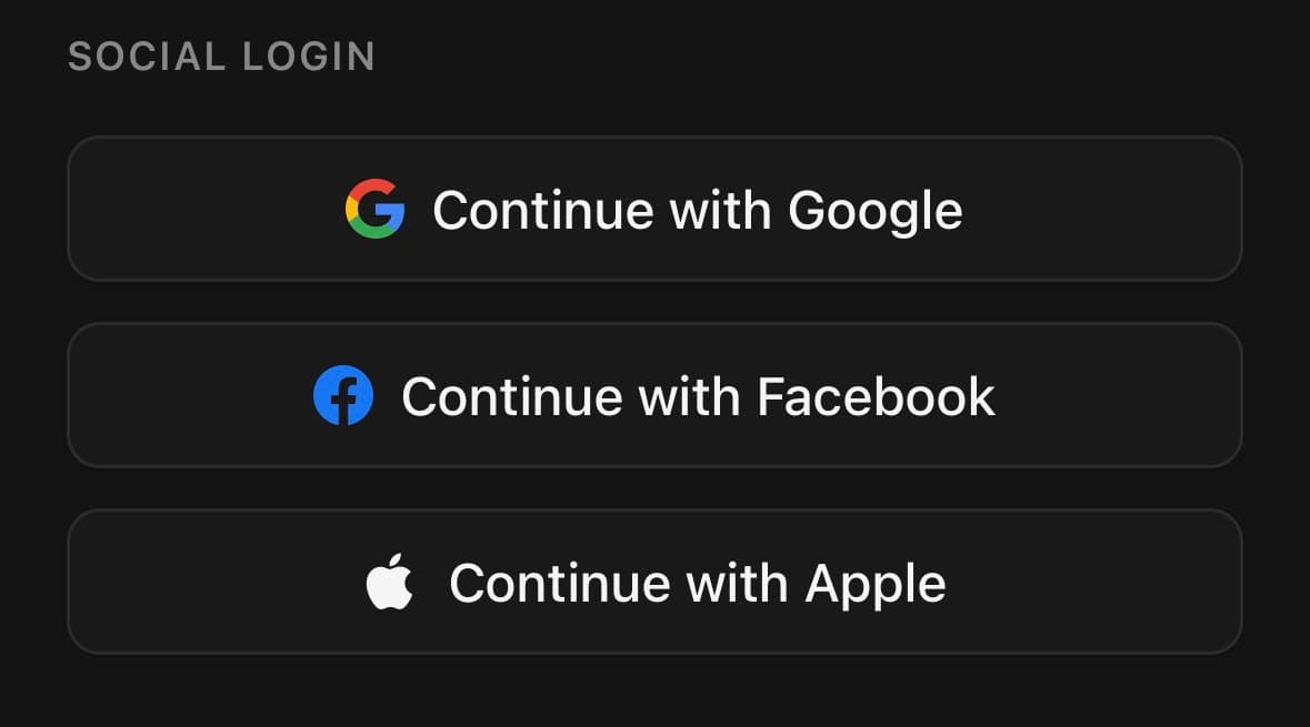
<View className="gap-2">
  <Button variant="social" fullWidth startContent={<GoogleIcon size={18} />}>
    Continue with Google
  </Button>
  <Button variant="social" fullWidth startContent={<AppleIcon size={18} />}>
    Continue with Apple
  </Button>
</View>
Destructive confirmation
<View className="flex-row gap-2">
  <Button variant="ghost" onPress={cancel}>Cancel</Button>
  <Button variant="destructive" onPress={deleteAccount}>
    Delete account
  </Button>
</View>
Variants
variant
primary(default)secondaryoutlineghostdestructivesocial
<Button>Primary</Button>
<Button variant="secondary">Secondary</Button>
<Button variant="outline">Outline</Button>
<Button variant="ghost">Ghost</Button>
<Button variant="destructive">Delete</Button>
<Button variant="social" startContent={<GoogleIcon size={18} />}>
  Continue with Google
</Button>
size
xssmmd(default)lgxlicon
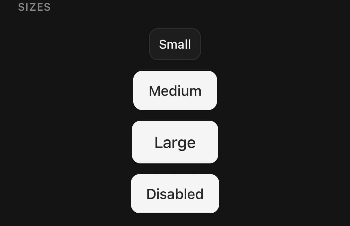
<Button size="xs">Extra small</Button>
<Button size="sm">Small</Button>
<Button size="md">Medium</Button>
<Button size="lg">Large</Button>
<Button size="xl">Extra large</Button>
<Button size="icon" accessibilityLabel="Search">
  <SearchIcon size={18} />
</Button>
fullWidth
true
<Button fullWidth>Spans its container</Button>API Reference
Button
| Prop | Type | Default | Description |
|---|---|---|---|
disabled | boolean | — | Block presses and dim the button to 64% opacity. Screen readers hear it as dimmed. To dim it by a different amount, pass an opacity class while it is disabled: className={disabled ? 'opacity-50' : undefined}. |
loading | boolean | false | Show a spinner and block presses while an action is in flight. Screen readers hear the button as busy until it ends. On Android the button needs a name to stop being read as busy afterwards. Plain-text children give it one. A button whose children include an element needs an accessibilityLabel. |
spinnerProps | Omit<SpinnerProps, 'label'> | — | Props for the spinner loading shows. Leave it unset and the spinner is drawn in the label's colour, at a size picked from the button's. color paints the turning arc and trackColor the faint ring under it — any colour React Native accepts. className takes theme tokens instead, such as border-t-success. On a filled button, set the track as well as the arc: the default track is a tint of the label colour, and beside an arc in another colour it reads as a second spinner. There is no label. The button already announces itself as busy while it loads, so a label on the spinner would announce the same wait twice. |
startContent | ReactNode | — | Content rendered before the label (replaced by the spinner while loading). |
endContent | ReactNode | — | Content rendered after the label. |
labelClassName | string | — | Extra classes for the label when children is a string. |
native | boolean | — | Render the platform's own button instead of this one. Requires the optional @expo/ui package; without it this prop does nothing. Theme tokens do not apply — the platform draws the button, so className, fullWidth, startContent, endContent, loading and spinnerProps are all ignored. variant maps onto the nearest platform style: primary/destructive → filled, outline → outlined, everything else → text; size sets the height. A native button sizes itself to its label, the way a platform button is supposed to. It does not stretch to fill its container, and fullWidth has no effect on it. Give it a string, not elements, unless size is icon. A string becomes the platform's own label. Anything else has to be hosted inside the native tree, and a hosted view only measures where something above it is definite on both axes — which is true of an icon button, because it is a square this component sizes, and false of a labelled one, whose width is its text's and known to nobody in advance. Host a label without a width and the two layout systems ask each other the same question until the app dies, in native code, where a try here has nothing to catch. |
glass | boolean | false | Draw the native button in the platform's Liquid Glass material — the one iOS 26 uses for its own floating controls. Requires native, and iOS 26 or later; anywhere else it is ignored and the button keeps its ordinary platform style rather than failing. primary and destructive take the prominent variant, which keeps the accent tint a filled button is supposed to have; every other variant takes the plain one. An icon button is drawn round rather than in the platform's default capsule. |
systemImage | string | — | A glyph beside the label, named from the platform's own symbol set rather than passed as an element. This is how a labelled native button gets an icon at all. Elements have to be hosted inside the native tree, and a hosted view inside a labelled button has no width anything can resolve — so a name is not a shortcut here, it is the only form that works. The platform draws it, at its own size, in the label's colour. iOS only, and native only. Android's toolkit has no equivalent symbol set, so a button there is its label alone; the drawn button takes startContent and always did. |
Every part also accepts the underlying React Native props (ViewProps or TextProps) and a className for Tailwind utilities.
Notes
loading swaps the start content for a variant-matched spinner and blocks presses. spinnerProps reaches that spinner — its color, trackColor, size and className — for a spinner that should not match the label. The social variant is a neutral surface sized for a full-width sign-in stack; pair it with GoogleIcon, FacebookIcon or AppleIcon.
Large text
Portable labelled buttons keep their 36/44/48/56dp default size as a minimum, not a ceiling. xl is the step above lg, for the one control a screen is built around — a compose button in a navigation panel, a primary action alone at the bottom of a sheet. With Dynamic Type or Android font scaling, the label uses its intrinsic line box, wraps when its container is constrained, and grows the button with its vertical padding. Start/end icons keep their requested size. size="icon" remains a fixed square because it has no visible text; give it an accessibilityLabel.
Native rendering
Pass native to render the platform's own button instead — SwiftUI on iOS, Jetpack Compose on Android. It needs the optional @expo/ui package and is a silent no-op without it.
Theme tokens do not apply in native mode: the platform draws the control with its own colours and metrics, so className and most styling props are ignored. variant maps onto the nearest platform style and size sets the height; fullWidth, loading, spinnerProps, startContent and endContent are dropped.
systemImage puts a glyph beside the label of a native button. It names one from the platform's own symbol set rather than taking an element, because an element has to be hosted inside the native tree and a hosted view inside a labelled button has no width anything can resolve. iOS only — Android has no equivalent set, so a button there is its label alone.
See Native rendering for the full prop-by-prop breakdown.
Liquid Glass
glass draws a native button in the material iOS 26 uses for its own floating controls. It needs native — on its own it does nothing — and on an older iOS, on Android, or without @expo/ui the button keeps its ordinary platform style rather than failing.
primary and destructive take the prominent variant, which keeps the accent tint a filled button is supposed to have; every other variant takes the plain one. A native icon button is drawn round rather than in the platform's default capsule — a lone glyph in a capsule reads as a text button somebody forgot to label. A labelled native button is sized through the platform's control scale, which size maps onto — that scales the room the style leaves around the label, and the label with it. sm, md, lg and xl reach the platform's small, regular, large and extra-large controls; lg is as big as a platform button goes without xl. An icon button is sized by padding on the glyph instead: the platform draws a button's background around its label, so padding the button pads outside the chrome and a frame only re-centres it.
<Button native glass size="icon" variant="ghost">
  <MenuIcon size={20} />
</Button>
Give a native button a string label
Anything other than a string has to be hosted inside the native tree, and a hosted view only measures where something above it is definite on both axes. An icon button is a square this component sizes, so it qualifies. A labelled one does not — its width is its text's, which nothing knows in advance — and hosting a label there leaves the width with no fixed point. The two layout systems then ask each other the same question until the app dies, in native code, where a JavaScript try has nothing to catch.
<Button native>New chat</Button>                    {/* fine */}
<Button native size="icon"><PlusIcon /></Button>    {/* fine */}
<Button native><Text>New chat</Text></Button>       {/* crashes */}
The portable Button merges any additional accessibilityState fields you supply, then keeps its button role plus disabled and loading busy state authoritative. Other Pressable props—including an explicit pressScale override—continue to pass through normally.
Public exports
Values: Button
Types: ButtonProps, ButtonVariant, ButtonSize