

ImageGeneration
The place an image will be, while it is being made.
A box that holds an image's place while the image is being made, then hands it over.
A generated image arrives seconds after it is asked for, at a size nobody knew in advance. Without something reserving the space, the screen reflows under the reader's thumb at the moment they were about to tap. This takes the aspect ratio up front and fills the box with a field of dots until there is a picture to show.
For a loading state with no shape to reserve, use Skeleton. For text arriving a token at a time, use Shimmer.
Installation
ImageGeneration ships with the library — no separate install.
import { ImageGeneration, Avatar, Message, MessageScroller, Response } from 'panelui-native';Or copy the source into your project, to own and edit it:
npx panelui-cli@latest add image-generationUsage
import { Image } from 'react-native';

<ImageGeneration status={status} prompt="a quiet mountain at sunset">
  <Image source={{ uri }} style={{ width: '100%', height: '100%' }} />
</ImageGeneration>
Composition
<ImageGeneration status={status}>
  {/* the finished image, once there is one */}
</ImageGeneration>

{/* Or the field on its own, in a box of your own. */}
<ImageGeneration.Field />ImageGeneration.Field— The dot field on its own, for a placeholder that is not an image. It fills its parent, so give it a box.
Examples
Through the work
The common path. The box is the right shape from the first frame, so nothing below it moves when the image lands.
const [status, setStatus] = useState<ImageGenerationStatus>('queued');

<ImageGeneration
  status={status}
  prompt="a quiet mountain landscape at sunset"
  resolution="1024 × 1024"
>
  <Image source={{ uri }} style={{ width: '100%', height: '100%' }} />
</ImageGeneration>
Filling the width
compact caps the box at a thumbnail and centres it, which suits a result inside a conversation. fluid takes whatever width it is given.
<ImageGeneration size="fluid" status="generating" aspectRatio={16 / 9} />A shape that is not square
aspectRatio is width over height, and it has to be right before there is an image to measure — that is the whole job.
<ImageGeneration status={status} aspectRatio={3 / 4} resolution="768 × 1024">
  <Image source={{ uri }} style={{ width: '100%', height: '100%' }} />
</ImageGeneration>
How the light moves
Three ways, at the same cost. Reach for pulse where the image is being developed rather than assembled, and scan where a row of them should feel like one process passing over all of them.
<ImageGeneration status="generating" animation="drift" />
<ImageGeneration status="generating" animation="pulse" />
<ImageGeneration status="generating" animation="scan" />
When it fails
onRetry is what puts a button under the card. Without it the error is reported and nothing is offered, which is right when the failure is not the reader's to fix.
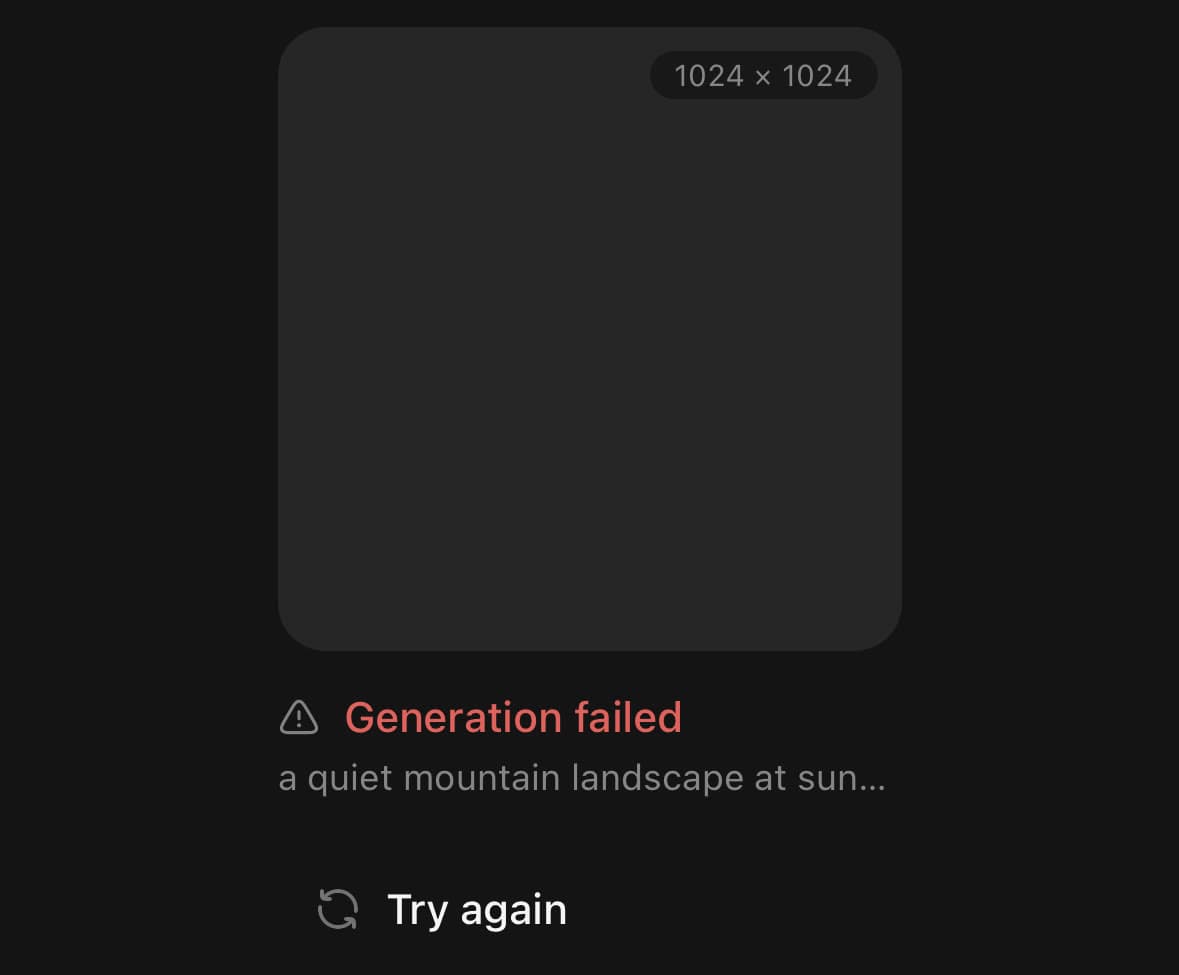
<ImageGeneration
  status="error"
  prompt="a quiet mountain landscape at sunset"
  onRetry={regenerate}
/>
The field on its own
ImageGeneration.Field is the dot field without the frame around it, for a placeholder that is not an image. It fills its parent.
<View className="h-32 w-full overflow-hidden rounded-xl bg-muted">
  <ImageGeneration.Field />
</View>
Several at once
One status line over a row of tiles, rather than one under each. showStatus={false} drops the sentence and resolution="" drops the badge, which is what makes a tile small enough to sit beside others. Several fields on one screen is the case the drawing is cheap for.
<Text className="text-sm font-medium">Creating 3 images</Text>
<View className="mt-2 flex-row gap-2">
  {jobs.map((job) => (
    <ImageGeneration
      key={job.id}
      size="fluid"
      className="flex-1"
      status={job.status}
      showStatus={false}
      resolution=""
    />
  ))}
</View>
Versions
In a conversation
The box is the right shape from the moment the request goes in, so the reply under it never moves as the image lands. That is the whole job, and it is the one thing a card sitting alone on a page cannot show. It stays at the default compact width — an image in a conversation is one turn among many, and a card the width of the screen makes the transcript around it look like a caption.
const [status, setStatus] = useState<ImageGenerationStatus>('queued');
const done = status === 'complete';

<MessageScroller className="flex-1">
  <MessageScroller.Viewport>
    <MessageScroller.Content className="gap-4 px-5 py-6">
      <MessageScroller.Item messageId="ask">
        <Message align="end">
          <Message.Content>
            <Message.Bubble>
              <Message.BubbleContent>
                Draw me a quiet mountain landscape at sunset.
              </Message.BubbleContent>
            </Message.Bubble>
          </Message.Content>
        </Message>
      </MessageScroller.Item>

      <MessageScroller.Item messageId="image">
        <Message align="start">
          <Message.Avatar>
            <Avatar size="sm" fallback="AI" />
          </Message.Avatar>
          <Message.Content>
            <ImageGeneration
              size="fluid"
              status={status}
              prompt="a quiet mountain landscape at sunset"
              resolution="1024 × 1024"
            >
              <Image
                source={{ uri: MOUNTAIN }}
                style={{ width: '100%', height: '100%' }}
              />
            </ImageGeneration>
          </Message.Content>
        </Message>
      </MessageScroller.Item>

      {done ? (
        <MessageScroller.Item messageId="reply">
          <Response>
            Here it is — late light on the far ridge, and the valley already in
            shadow. Say the word and I will try a wider crop.
          </Response>
        </MessageScroller.Item>
      ) : null}

      <MessageScroller.Item messageId="again">
        <Button variant="secondary" onPress={() => setAt(0)}>
          Ask again
        </Button>
      </MessageScroller.Item>
    </MessageScroller.Content>
  </MessageScroller.Viewport>
</MessageScroller>
Variants
size
compact(default)fluid
<ImageGeneration size="compact">…</ImageGeneration>
<ImageGeneration size="fluid">…</ImageGeneration>
error
true
<ImageGeneration error>…</ImageGeneration>status
queuedgenerating(default)refiningcompleteerror
<ImageGeneration status="queued" />
<ImageGeneration status="generating" />
<ImageGeneration status="refining" />
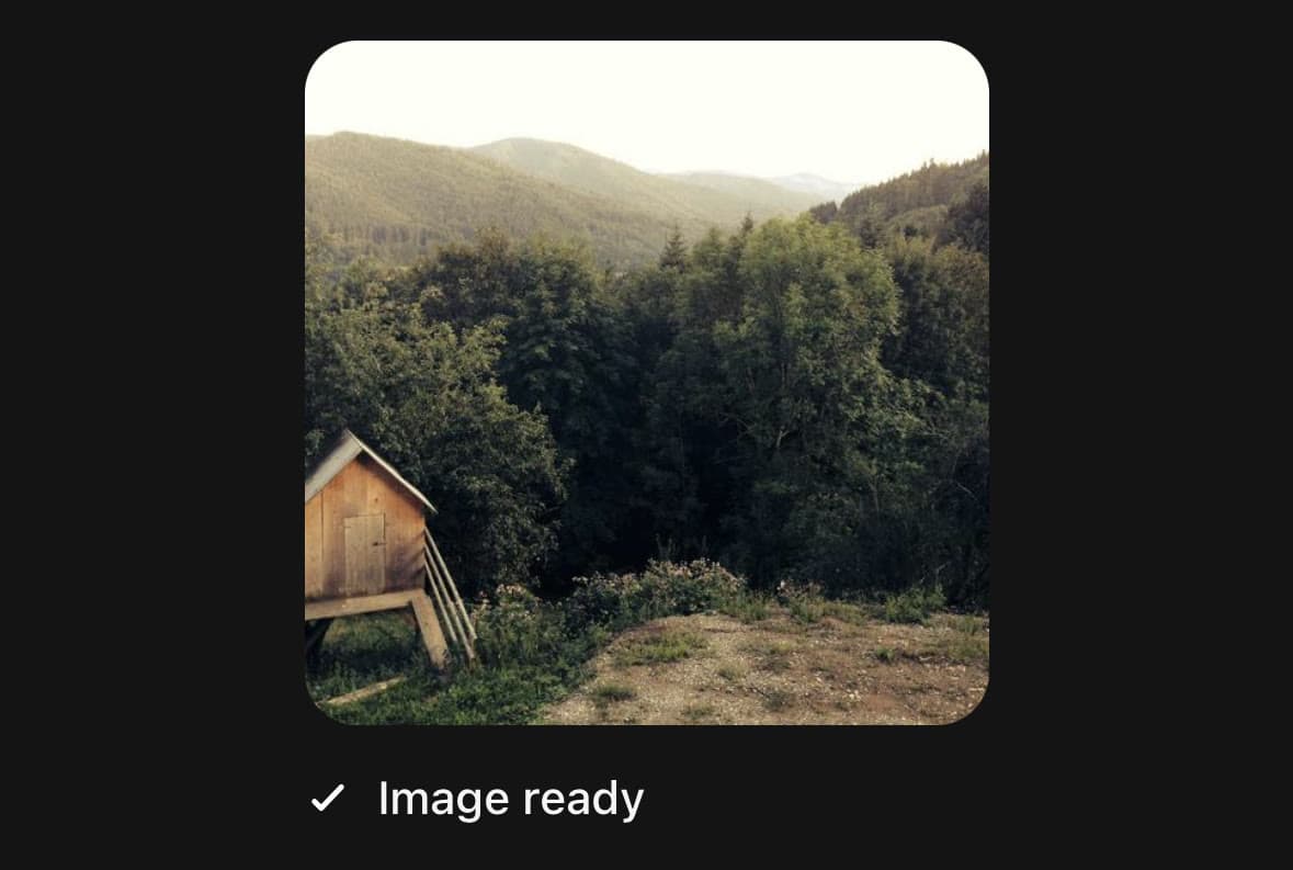
<ImageGeneration status="complete">
  <Image source={{ uri }} style={{ width: '100%', height: '100%' }} />
</ImageGeneration>
<ImageGeneration status="error" onRetry={regenerate} />
animation
drift(default)pulsescan
<ImageGeneration status="generating" animation="drift" />
<ImageGeneration status="generating" animation="pulse" />
<ImageGeneration status="generating" animation="scan" />
API Reference
ImageGeneration.Field
| Prop | Type | Default | Description |
|---|---|---|---|
className | string | — | |
paused | boolean | false | Holds the light still, at one representative frame. |
animation | DotFieldAnimation | 'drift' | How the light moves through the field. drift wanders around the middle; pulse is a ring leaving the centre; scan crosses as a band. All three cost the same. |
ImageGeneration
| Prop | Type | Default | Description |
|---|---|---|---|
className | string | — | |
status | ImageGenerationStatus | 'generating' | How far the generation has got. Defaults to generating. |
label | string | — | What the box is, for a screen reader. Defaults to the status text, with the prompt after it where there is one. |
prompt | string | — | The instruction the image was made from. Shown under the status. |
resolution | string | '1024 × 1024' | Shown in the corner of the frame. Pass an empty string to drop it. |
aspectRatio | number | 1 | The box's shape, as width over height. Defaults to 1 — square, which is what most models return, and what the frame must be before there is an image to measure. |
size | 'compact' | 'fluid' | 'compact' | compact caps the width at a thumbnail and centres it; fluid fills. |
animation | DotFieldAnimation | 'drift' | How the light behind the dots moves while there is work outstanding. drift wanders, pulse leaves the centre as a ring, scan crosses as a band. All three cost the same. |
statusText | string | — | Replaces the sentence under the frame. |
showStatus | boolean | true | Hides the status line, leaving the frame and the prompt. |
onRetry | () => void | — | Shown as a button under an error. Without it there is no button. |
frameClassName | string | — | Extra classes for the frame — its radius, ground and aspect. |
mediaClassName | string | — | Extra classes for the layer the image sits in. |
statusClassName | string | — | Extra classes for the status line. |
Every part also accepts the underlying React Native props (ViewProps or TextProps) and a className for Tailwind utilities.
Notes
The five steps
status moves the picture through the work rather than switching it.
| The field | The image | |
|---|---|---|
queued | Full | Not shown |
generating | Full | Not shown |
refining | Half | Coming through |
complete | Gone | Full |
error | Gone | Dimmed |
refining is the overlap, and it is the step worth having. An image that appears the instant the field vanishes has been swapped in; one that surfaces through it has been developed. Skip straight from generating to complete if your model gives you nothing to show in between, but pass through refining if it does.
The light, and what it costs
A region of light drifts around the middle of the box. A dot near it is brighter, larger, and pushed a little away from its centre — that displacement is what makes the light read as something passing over the grid rather than as the grid changing colour. The falloff is a smoothstep, so the light has no rim for the eye to find.
Every dot at its own opacity would be one drawing each, and a field this size has hundreds. They are banded into five opacity levels instead, one path per level, so the whole field is five native updates a frame rather than five hundred — and at a dot radius of one point the steps between levels are not visible.
A box big enough to want more than nine hundred dots gets the same picture drawn coarser rather than a thousand more circles rebuilt every frame.
Reduced motion
The band stops and the field is drawn at one still frame of itself. A placeholder showing nothing is indistinguishable from a component that failed to load, so this is a quieter picture rather than an empty one.
The image itself
children is whatever fills the frame — an Image, a video, a canvas. Give it width: '100%' and height: '100%'; the frame is already the right shape, and a child that sizes itself will not match it.
The fade is opacity and a small settle in scale. There is no blur ramp: React Native has no equivalent that runs on the UI thread, and reaching for a blur package would make an optional dependency load-bearing for the look of a placeholder.
Announcing it
The frame carries busy while there is work outstanding, so a screen reader says the box is not the answer yet, and the status line is a live region. The image itself is hidden from the reader until it has arrived — there is nothing to describe before then.
Public exports
Values: ImageGeneration
Types: ImageGenerationProps, ImageGenerationFieldProps, ImageGenerationStatus