

Accordion
Collapsible sections with single or multiple selection.
Collapsible sections, for FAQs, settings groups and anything that would otherwise be a long scroll.
Expansion animates with a Reanimated layout transition, and collapsed content unmounts. Pass keepMounted when there is state inside a section worth keeping — a half-filled form, a scroll position — at the cost of rendering every section up front.
For a single section rather than a set of them, use Collapsible, which keeps its body mounted by default.
For a hierarchy more than one level deep, use Tree.
Installation
Accordion ships with the library — no separate install.
import { Accordion, Text, Button, Textarea } from 'panelui-native';Or copy the source into your project, to own and edit it:
npx panelui-cli@latest add accordionUsage
<Accordion selectionMode="single" defaultValue="shipping">
  <Accordion.Item value="shipping">
    <Accordion.Trigger>
      <Accordion.Title>How long does shipping take?</Accordion.Title>
      <Accordion.Indicator />
    </Accordion.Trigger>
    <Accordion.Content>
      Standard delivery arrives in three to five working days.
    </Accordion.Content>
  </Accordion.Item>
</Accordion>
Composition
<Accordion>
  <Accordion.Item value="…">
    <Accordion.Trigger>
      <Accordion.Title>…</Accordion.Title>
      <Accordion.Indicator />
    </Accordion.Trigger>
    <Accordion.Content>…</Accordion.Content>
  </Accordion.Item>
</Accordion>Accordion.Item— One collapsible section. Itsvalueidentifies it in the accordion's state.Accordion.Trigger— The pressable header row. A bare string child is wrapped in the title style. Standard Pressable props are forwarded; a suppliedonPressruns before the accordion toggles the item.Accordion.Title— Heading text inside the trigger.Accordion.Indicator— Chevron that rotates 180° while the item is open.Accordion.Content— The collapsible body. Unmounts when closed, unlesskeepMountedkeeps it mounted and hidden from layout instead.
Examples
Single open section
The default. Opening one section closes the others — use it when the panels are alternatives rather than a checklist.
<Accordion defaultValue="shipping">
  <Accordion.Item value="shipping">
    <Accordion.Trigger>
      <Accordion.Title>Shipping</Accordion.Title>
      <Accordion.Indicator />
    </Accordion.Trigger>
    <Accordion.Content>
      <Text size="sm" muted>Free over $50. Arrives in 2–4 days.</Text>
    </Accordion.Content>
  </Accordion.Item>

  <Accordion.Item value="returns">
    <Accordion.Trigger>
      <Accordion.Title>Returns</Accordion.Title>
      <Accordion.Indicator />
    </Accordion.Trigger>
    <Accordion.Content>
      <Text size="sm" muted>30 days, unopened, receipt required.</Text>
    </Accordion.Content>
  </Accordion.Item>
</Accordion>
Several open at once
selectionMode="multiple" switches value from a string to an array.
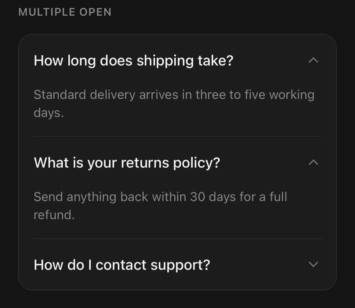
<Accordion selectionMode="multiple" defaultValue={['shipping', 'returns']}>
  {/* …items… */}
</Accordion>
Controlled
Drive it from state when something outside the accordion needs to open a section.
const [open, setOpen] = useState<string>('shipping');

<>
  <Button onPress={() => setOpen('returns')}>Jump to returns</Button>

  <Accordion value={open} onValueChange={(v) => setOpen(v as string)}>
    {/* …items… */}
  </Accordion>
</>
Disabled section
A section that exists but cannot be opened yet — an upsell, or a step not reached.
<Accordion.Item value="enterprise" isDisabled>
  <Accordion.Trigger>
    <Accordion.Title>Enterprise billing</Accordion.Title>
    <Accordion.Indicator />
  </Accordion.Trigger>
  <Accordion.Content>
    <Text size="sm" muted>Contact sales.</Text>
  </Accordion.Content>
</Accordion.Item>
Keeping a body's state
A closed section is unmounted, so anything typed into it is gone when it reopens. keepMounted hides the body instead: it takes up no room and the same layout transition plays, but the field still holds what was typed.
<Accordion variant="surface" keepMounted defaultValue="note">
  <Accordion.Item value="note">
    <Accordion.Trigger>
      <Accordion.Title>Delivery note</Accordion.Title>
      <Accordion.Indicator />
    </Accordion.Trigger>
    <Accordion.Content>
      <Textarea placeholder="Leave it with a neighbour…" />
    </Accordion.Content>
  </Accordion.Item>
</Accordion>
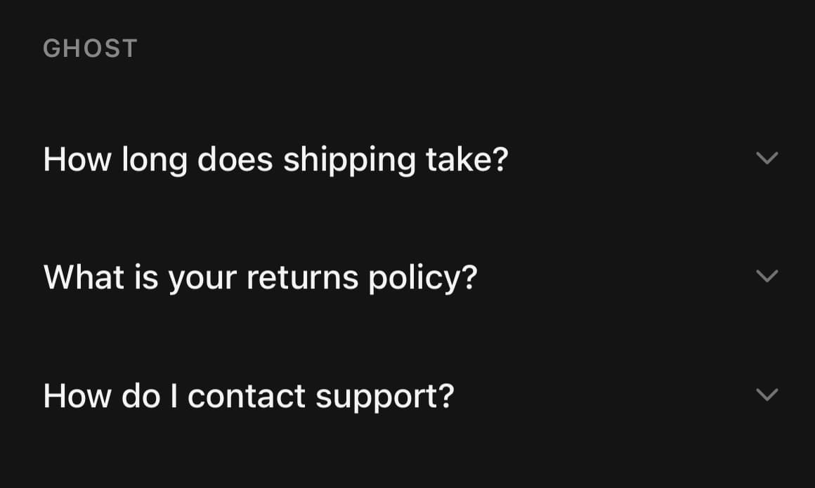
Variants
variant
default(default)surfaceseparatedborderedghost
<Accordion variant="default">…</Accordion>
<Accordion variant="surface">…</Accordion>
<Accordion variant="separated">…</Accordion>
<Accordion variant="bordered">…</Accordion>
<Accordion variant="ghost">…</Accordion>
API Reference
Accordion
| Prop | Type | Default | Description |
|---|---|---|---|
className | string | — | |
variant | AccordionVariant | default | |
selectionMode | AccordionSelectionMode | 'single' | single collapses the open item when another opens. |
value | string | string[] | — | Expanded item value(s), controlled. |
defaultValue | string | string[] | — | |
onValueChange | (value: string | string[]) => void | — | |
hideSeparator | boolean | false | Hide the hairlines drawn between items. |
keepMounted | boolean | false | Keep every body mounted while its section is closed, so state inside it — a part-filled form, a scroll position, a running animation — survives being collapsed. Costs the render of every section up front; set it per section on Accordion.Content instead when only one of them needs it. |
Accordion.Item
| Prop | Type | Default | Description |
|---|---|---|---|
className | string | — | |
value | string | — | Identifies this item in the accordion's value. |
isDisabled | boolean | — |
Accordion.Trigger
| Prop | Type | Default | Description |
|---|---|---|---|
className | string | — |
Accordion.Indicator
| Prop | Type | Default | Description |
|---|---|---|---|
className | string | — |
Accordion.Content
| Prop | Type | Default | Description |
|---|---|---|---|
className | string | — | |
keepMounted | boolean | false | Stay mounted while closed instead of unmounting, so state inside the body survives the section being collapsed. Overrides the accordion's own setting, either way round. |
Every part also accepts the underlying React Native props (ViewProps or TextProps) and a className for Tailwind utilities.
Notes
Pass an array to value / defaultValue with selectionMode="multiple". onValueChange hands back whatever shape you gave it — a string in single mode, an array in multiple.
keepMounted trades the cost of rendering every closed body up front for keeping what is inside them alive. Set it on the accordion for all of them, or on a single Accordion.Content for the one section that needs it — the prop on the content wins either way round.
With the operating system set to reduce motion the section arrives at its new height and the chevron at its new angle without travelling to either. The disclosure is the point and it still happens; the movement is what goes.
Public exports
Values: Accordion
Types: AccordionProps, AccordionItemProps, AccordionTriggerProps, AccordionIndicatorProps, AccordionContentProps, AccordionVariant, AccordionSelectionMode