

Pagination
Paged navigation over a long result set.
Moving through a result set one page at a time.
The component owns the arithmetic and nothing else: give it how many pages there are and which one you are on, and it works out which numbers to show, where the gaps fall, and which controls are dead at the ends.
It never fetches and never slices. The data is yours.
Installation
Pagination ships with the library — no separate install.
import { Pagination, Table } from 'panelui-native';Or copy the source into your project, to own and edit it:
npx panelui-cli@latest add paginationUsage
const [page, setPage] = useState(1);

<Pagination count={12} page={page} onPageChange={setPage} />
Composition
<Pagination>
  <Pagination.Status />
</Pagination>

{/* the parts the root draws for you, for a row of your own */}
<Pagination.Previous />
<Pagination.Item />
<Pagination.Ellipsis />
<Pagination.Summary />
<Pagination.Next />
The root draws its own controls, so a plain pagination is one element and no parts. The parts are exported for the row you build yourself — a page-size select between the arrows, a jump-to-first button — and each one reads the page it is on from the root above it, so none of them has to be told.
Given children, the root becomes a row with them on the leading edge and the controls on the trailing one. That is where Pagination.Status goes, and it is the shape a table footer wants.
Examples
Basic
count is how many pages there are; pages are numbered from 1. Pass page to control the component, or leave it off and give defaultPage to let it keep its own. onPageChange is called with the page that was asked for, already clamped to count.
const [page, setPage] = useState(1);

<Pagination count={12} page={page} onPageChange={setPage} />
Compact
The two arrows with 3 / 12 between them, for a footer with no room for a run of numbers. Digits and a slash rather than “Page 3 of 12”, so there is no sentence to translate.
<Pagination count={12} page={page} onPageChange={setPage} variant="compact" />Simple
Labelled Previous and Next, and no numbers at all — for a flow you walk rather than jump around in: a wizard, an article, a set of onboarding cards.

<Pagination count={5} page={page} onPageChange={setPage} variant="simple" />A long set
siblings is how many pages to keep either side of the current one, boundaries how many to pin at each end. The defaults draw about seven targets, which is what a phone fits; raise both on a tablet. The run is a fixed width rather than a sliding window, so the row does not reflow under the finger as you step through it — the number you were aiming at stays where it was.
Tapping an ellipsis jumps pageJump pages towards the end its gap is on. A dead 44pt target in a row of live ones is something people tap and then think is broken. Widening the middle costs width somewhere: this drops a boundary and the two arrows to pay for it, which is what keeps nine targets on a phone screen.
<Pagination
  count={240}
  page={page}
  onPageChange={setPage}
  siblings={2}
  boundaries={1}
  size="sm"
  controls={false}
/>
Beside a table
The component reports the page and the caller slices the rows, which is the division of labour the whole thing is built around. Pagination.Status answers the question a page number does not — how much is left — and sits on the leading edge with the controls opposite it.
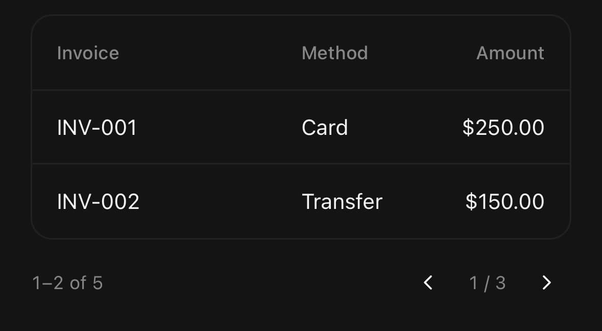
const [page, setPage] = useState(1);
const pageSize = 20;
const rows = invoices.slice((page - 1) * pageSize, page * pageSize);

<Table variant="outline" columns={columns}>
  {/* …header, and a row per entry in `rows`… */}
</Table>

<Pagination
  count={Math.ceil(invoices.length / pageSize)}
  page={page}
  onPageChange={setPage}
  variant="compact"
  size="sm"
>
  <Pagination.Status pageSize={pageSize} total={invoices.length} />
</Pagination>
While a page loads
disabled greys the row and deafens every target in it, which is what you want between asking for a page and having it — a second tap on the same arrow would otherwise queue a page you never see.
<Pagination
  count={12}
  page={page}
  onPageChange={setPage}
  disabled={isFetching}
/>
Small
size="sm" shrinks the targets and the gaps between them, for a row under a table rather than under a page. It is the size to reach for before dropping to compact: fewer points per target still lets somebody jump to page four, and the two arrows do not.

<Pagination count={12} page={page} onPageChange={setPage} size="sm" />A wider run
siblings={2} keeps two pages either side of the current one instead of one. Nine targets is as wide as a run goes on a phone, and the two arrows put it past the edge — so this trades them for the numbers, which is what asking for a wider run was for. A centred row that does not fit hangs off both ends.

<Pagination
  count={240}
  page={page}
  onPageChange={setPage}
  siblings={2}
  boundaries={1}
  size="sm"
  controls={false}
/>
With a status line
Pagination.Status says which rows these are, which is the question a page number does not answer. Give it pageSize and total and it reads the current page from the component around it, so the two can never disagree — the row count and the page are one piece of state.

<Pagination count={12} page={page} onPageChange={setPage} variant="compact">
  <Pagination.Status pageSize={20} total={240} />
</Pagination>
Variants
size
default(default)sm
<Pagination count={12} page={page} onPageChange={setPage} size="default" />
<Pagination count={12} page={page} onPageChange={setPage} size="sm" />
variant
numbers(default)compactsimple
<Pagination count={12} page={page} onPageChange={setPage} variant="numbers" />
<Pagination count={12} page={page} onPageChange={setPage} variant="compact" />
<Pagination count={12} page={page} onPageChange={setPage} variant="simple" />
API Reference
Pagination
| Prop | Type | Default | Description |
|---|---|---|---|
className | string | — | |
count | number | — | How many pages there are. Pages are numbered from 1, so this is also the last page's number. |
page | number | — | The page being shown. Pass it to control the component. |
defaultPage | number | 1 | The page to start on when the component keeps its own. Defaults to 1. |
onPageChange | (page: number) => void | — | Called with the page that was asked for, already clamped to count. |
variant | PaginationVariant | 'numbers' | Which presentation to draw. |
size | PaginationSize | default | |
siblings | number | 1 | How many pages to keep either side of the current one. Raise it on a tablet, where there is room for a longer run. |
boundaries | number | 1 | How many pages to keep pinned at each end of the run. |
controls | boolean | true | Show the previous and next arrows. Turning them off leaves the numbers alone, so only do it where something else moves the page — a swipe, a scroller reaching its end. |
pageJump | number | 5 | How far tapping an ellipsis jumps. |
disabled | boolean | false | Greys out and deafens the whole row — for a page that is still loading. |
accessibilityLabel | string | 'Pagination' | Labels the row for a screen reader. Defaults to "Pagination". |
Pagination.Item
| Prop | Type | Default | Description |
|---|---|---|---|
className | string | — | |
page | number | — | The page this target goes to. |
labelClassName | string | — | Styles the number. |
Pagination.Previous
| Prop | Type | Default | Description |
|---|---|---|---|
className | string | — | |
label | boolean | — | Write the word beside the arrow, rather than leaving it as a glyph. |
Pagination.Next
| Prop | Type | Default | Description |
|---|---|---|---|
className | string | — | |
label | boolean | — | Write the word beside the arrow, rather than leaving it as a glyph. |
Pagination.Ellipsis
| Prop | Type | Default | Description |
|---|---|---|---|
className | string | — | |
direction | -1 | 1 | — | Which way the gap runs: -1 towards page 1, 1 towards the last page. |
jump | number | — | How many pages a tap covers. |
Pagination.Summary
| Prop | Type | Default | Description |
|---|---|---|---|
className | string | — |
Pagination.Status
| Prop | Type | Default | Description |
|---|---|---|---|
className | string | — | |
page | number | — | Which page the span is counted from. Read from the root when left out. |
pageSize | number | — | How many rows a page holds. Required for the span to be worked out. |
total | number | — | How many rows there are altogether. |
Every part also accepts the underlying React Native props (ViewProps or TextProps) and a className for Tailwind utilities.
Notes
Every target clears 44pt in both axes, which is the smallest a finger reliably hits. size="sm" draws a tighter row and keeps that reach through hitSlop instead — the paint gets smaller, the touch area does not.
How wide a run can be
The run is a fixed number of targets, so siblings and boundaries decide the row's width and the container has no say in it. On a phone that ceiling is about nine targets at size="sm", and the two arrows cost two more — past that the row is wider than the screen. It is clipped to its own bounds rather than allowed to spill, because a centred row that overflows hangs the same distance past both edges and the leading number ends up half off the screen with nothing to say why. If a run is being cut, lower siblings or boundaries, or drop the arrows with controls={false} and let the numbers have the width.
Which arrowhead means “back” is a question about the reading direction: under <Direction dir="rtl"> the previous page is to the right, and the glyphs swap to match. Yoga mirrors the row itself; the arrowheads inside it have to be chosen.
paginationRange is exported for a control of your own that has to lay out the same run — a jump bar, a scrubber. Two implementations of that arithmetic would drift.
A page number past the end is clamped rather than honoured, so a count that shrinks under a controlled page — a filter narrowing the result set — lands on the last page instead of lighting nothing and disabling both arrows at once.
Number, arrow, and ellipsis controls compose a supplied onPress before their page transition. Arrow/ellipsis disabled props can add a local disabled state but cannot re-enable a control disabled by the root or a run boundary; component-owned names, state, hit areas, handlers, and classes remain authoritative after other forwarded props.
Public exports
Values: Pagination, paginationRange
Types: PaginationProps, PaginationItemProps, PaginationPreviousProps, PaginationNextProps, PaginationEllipsisProps, PaginationSummaryProps, PaginationStatusProps, PaginationVariant, PaginationSize, PaginationItemValue