

RadioGroup
Single-select list of options.
A single-select list of options, where all of them should be visible at once.
Past about five options, or when the list has to be filtered, use Select instead.
Installation
RadioGroup ships with the library — no separate install.
import { RadioGroup, Text } from 'panelui-native';Or copy the source into your project, to own and edit it:
npx panelui-cli@latest add radio-groupUsage
<RadioGroup value={plan} onValueChange={setPlan}>
  <RadioGroup.Item value="free" label="Free — $0/month" />
  <RadioGroup.Item value="pro" label="Pro — $12/month" />
  <RadioGroup.Item value="team" label="Team — $36/month" />
</RadioGroup>
Composition
<RadioGroup>
  <RadioGroup.Item value="…" label="…" />
</RadioGroup>RadioGroup.Item— One option.valueidentifies it,labelis what is shown.
Examples
A list of plans
The group owns the value; each item reports its own value up and reads selection back down.
const [plan, setPlan] = useState("pro");

<RadioGroup value={plan} onValueChange={setPlan}>
  <RadioGroup.Item value="free" label="Free — $0/month" />
  <RadioGroup.Item value="pro" label="Pro — $12/month" />
  <RadioGroup.Item value="team" label="Team — $36/month" />
</RadioGroup>
Cards
The card variant makes the whole surface the target and highlights the selected option — for a picker where each choice carries a description. The disc moves to the trailing edge as a confirmation of the row rather than the thing you aim at.
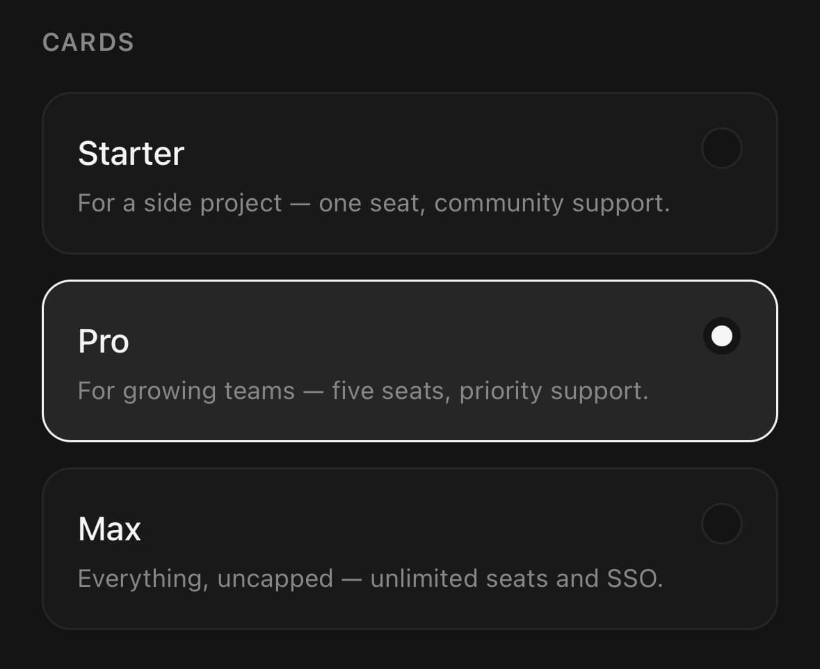
<RadioGroup value={plan} onValueChange={setPlan} variant="card">
  <RadioGroup.Item
    value="starter"
    label="Starter"
    description="For a side project — one seat, community support."
  />
  <RadioGroup.Item
    value="pro"
    label="Pro"
    description="For growing teams — five seats, priority support."
  />
</RadioGroup>
Laying the options out in a row
Short labels stacked one per line read as a longer list than they are. orientation="horizontal" wraps them along a row instead — and cards share the width rather than each filling it.
<RadioGroup orientation="horizontal" value={size} onValueChange={setSize}>
  <RadioGroup.Item value="s" label="Small" />
  <RadioGroup.Item value="m" label="Medium" />
  <RadioGroup.Item value="l" label="Large" />
</RadioGroup>

<RadioGroup
  orientation="horizontal"
  variant="card"
  value={billing}
  onValueChange={setBilling}
>
  <RadioGroup.Item value="monthly" label="Monthly" description="$12/mo" />
  <RadioGroup.Item value="yearly" label="Yearly" description="$120/yr" />
</RadioGroup>
Styling the label
className styles the row, not the text inside it: React Native does not pass a text colour down from a view. Colour or size the label with labelClassName, and the description with descriptionClassName.
<RadioGroup value={method} onValueChange={setMethod} variant="card">
  <RadioGroup.Item
    value="card"
    label="Card"
    description="Visa, Mastercard, Amex"
    className="bg-white"
    labelClassName="text-black"
    descriptionClassName="text-neutral-500"
  />
</RadioGroup>
Colouring the selected option
An item does not restyle its label when it is selected. Work the class out from the group's value and pass it as labelClassName.
Pick a colour that differs from the label's default. In the default theme text-primary resolves to the same value as text-foreground, so a selected label drawn in it looks unchanged — see Colors.
const [speed, setSpeed] = useState("standard");

<RadioGroup value={speed} onValueChange={setSpeed} variant="card">
  {speeds.map((option) => (
    <RadioGroup.Item
      key={option.value}
      value={option.value}
      label={option.label}
      description={option.description}
      labelClassName={option.value === speed ? undefined : "text-muted-foreground"}
    />
  ))}
</RadioGroup>
Variants
size
xssmmd(default)lgxl
{/* Set once on the group; every option follows it. */}
<RadioGroup size="sm" value={plan} onValueChange={setPlan}>
  <RadioGroup.Item value="free" label="Free" />
  <RadioGroup.Item value="pro" label="Pro" />
</RadioGroup>

<RadioGroup size="lg" value={plan} onValueChange={setPlan}>
  <RadioGroup.Item value="free" label="Free" />
  <RadioGroup.Item value="pro" label="Pro" />
</RadioGroup>
variant
dot(default)card
<RadioGroup variant="dot" value={value} onValueChange={setValue}>
  <RadioGroup.Item value="a" label="Option A" />
</RadioGroup>

<RadioGroup variant="card" value={value} onValueChange={setValue}>
  <RadioGroup.Item value="a" label="Option A" description="With a supporting line" />
</RadioGroup>
API Reference
RadioGroup
| Prop | Type | Default | Description |
|---|---|---|---|
className | string | — | |
value | string | — | |
onValueChange | (value: string) => void | — | |
disabled | boolean | — | |
variant | RadioVariant | dot | dot is the label-beside-a-disc row. card makes the whole surface the target and highlights the selected option — for a plan picker or a settings choice where each option carries a description. |
size | RadioSize | md | How big every option's disc and label are. Set on the group rather than per option, because options of different sizes read as though one of them matters more. The row keeps a 48-point target at every size. |
orientation | RadioOrientation | 'vertical' | horizontal lays the options out along a row that wraps — for two or three short choices, where a stacked list wastes the width and reads as longer than it is. |
RadioGroup.Item
| Prop | Type | Default | Description |
|---|---|---|---|
className | string | — | Styles the pressable row — layout, border, fill. It does not reach the label: text colour is not inherited from a view in React Native, so use labelClassName for that. |
value | string | — | |
label | string | — | |
labelClassName | string | — | Classes for the label text, merged over the defaults — e.g. text-black. |
description | string | — | Secondary line under the label. Most at home in the card variant. |
descriptionClassName | string | — | Classes for the description text, merged over the defaults. |
disabled | boolean | — | |
hideIndicator | boolean | — | Hide the disc entirely — for a card whose selected fill is enough. |
Every part also accepts the underlying React Native props (ViewProps or TextProps) and a className for Tailwind utilities.
Notes
The row of a dot item is only as wide as its label, so the empty space beside it is not part of the target — pressing nothing selects nothing. A card is the opposite on purpose: there the whole surface is what you aim at.
The options wrap rather than scroll when laid out horizontally. A choice that has run off the edge of the screen is a choice nobody knows is there.
Pressing the already selected option is a no-op: onValueChange runs only when an item requests a different value. This keeps controlled form side effects tied to real selection changes.
Public exports
Values: RadioGroup
Types: RadioGroupProps, RadioGroupItemProps, RadioSize