

GridItem
Bento tiles, and the grid that places them.
Bento tiles, and the grid that places them.
Item is a row, and a list of rows is a column of views — the layout falls out of flexbox and nothing has to be measured. A bento is not that: tiles are different sizes and the grid still has to line up, so a wide tile and the two square ones beside it share a left edge, and a tall one runs past its neighbour with the next tile filling in underneath.
A wrapping row cannot do the last of those — wrapping puts whatever did not fit on a new line, so nothing ever tucks under a tall tile. GridItem.Group measures itself, walks its children into the first free cell that fits each one, and positions them. Every tile is a whole number of cells, which is what makes the edges line up.
Installation
GridItem ships with the library — no separate install.
import { GridItem, SparklesIcon, Badge, Text, LineChart } from 'panelui-native';Or copy the source into your project, to own and edit it:
npx panelui-cli@latest add grid-itemUsage
<GridItem.Group columns={2} gap={12} aspect={1.6}>
  <GridItem colSpan={2}>
    <GridItem.Media variant="icon"><SparklesIcon size={18} /></GridItem.Media>
    <GridItem.Title>Deploys</GridItem.Title>
    <GridItem.Value>1,284</GridItem.Value>
    <GridItem.Description>this week</GridItem.Description>
  </GridItem>
  <GridItem>…</GridItem>
  <GridItem variant="muted">…</GridItem>
</GridItem.Group>
Composition
<GridItem.Group columns={2} gap={12}>
  <GridItem colSpan={2} rowSpan={1}>
    <GridItem.Background />   {/* the layer behind, clipped by the tile */}
    <GridItem.Media />        {/* an icon tile, a thumbnail, an avatar */}
    <GridItem.Title />        {/* what the tile is of */}
    <GridItem.Value />        {/* the figure */}
    <GridItem.Description />
    <GridItem.Footer>        {/* pinned to the bottom edge */}
      <GridItem.Actions />
    </GridItem.Footer>
  </GridItem>
</GridItem.Group>GridItem.Group— The grid. Ownscolumns,gap, the cell shape and the density, measures its own width, places every tile, and stands as tall as the rows they needed.GridItem.Background— The layer behind the tile's content — a chart, a gradient, an image, an oversized icon. Absolutely filling the tile and taking no touches, so it can be written anywhere among the children. It is the one part meant to be cropped: the tile clips it.GridItem.Media— Leading slot: an icon tile, a thumbnail, or an avatar passed through. Sized off the group's density.GridItem.Title— What the tile is of. Deliberately quiet, because the value under it is the message.GridItem.Value— The figure. The largest thing on the tile, and the reason it is there.GridItem.Description— One muted line — a period, a comparison, a caveat.GridItem.Footer— A strip pushed to the bottom of the tile with the space left over, rather than positioned there. A tile's height is fixed by its cells, so there is always space to push with.GridItem.Actions— Trailing slot: buttons, a chip, a chevron.
Examples
Columns, gaps and the shape of a cell
columns is how many tracks wide the grid is and gap is the gutter, in points, both ways. The cell's height comes from aspect — width ÷ height, so 1 is square and anything above it is a letterbox. Give rowHeight instead when the grid should be a fixed size rather than driven by the width it was handed.
Everything is set on the group, never on a tile: a tile that sized itself would not be in a grid.
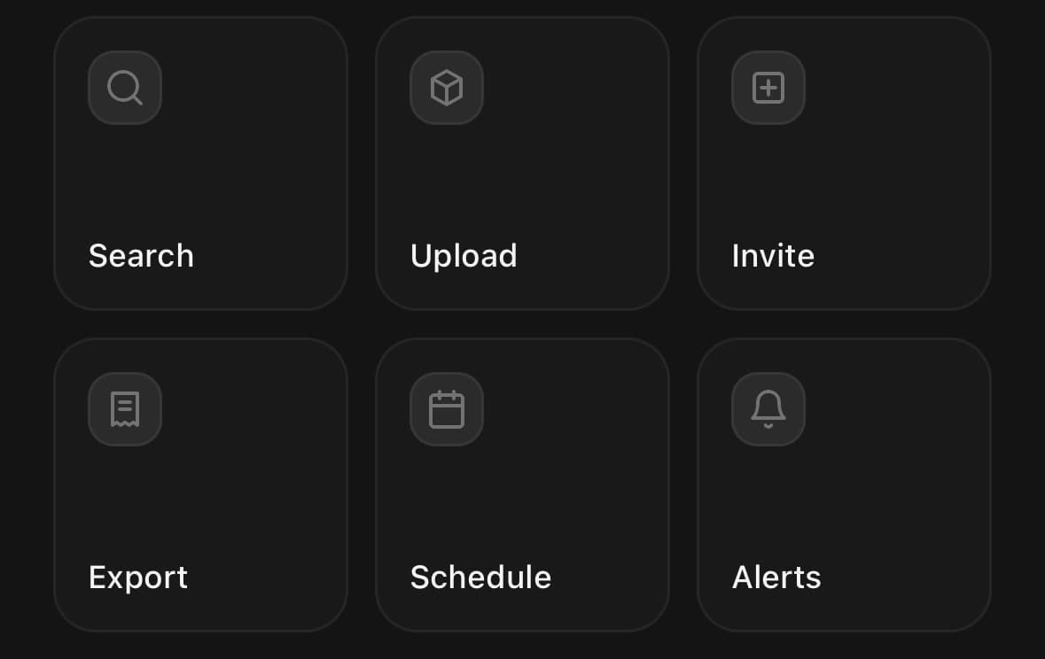
{/* Two square-ish tracks. */}
<GridItem.Group columns={2} gap={12} aspect={1.6}>…</GridItem.Group>

{/* Three narrow ones, at the smaller density. */}
<GridItem.Group columns={3} gap={10} size="sm">…</GridItem.Group>

{/* Cells of a fixed height, whatever the width. */}
<GridItem.Group columns={2} gap={12} rowHeight={120}>…</GridItem.Group>
Spanning
colSpan and rowSpan are in cells. A tile asking for more columns than the grid has is clamped to the grid rather than overflowing it.
Tiles are placed in the order they are written, each into the first free cell it fits in, scanning row by row — the same rule a grid uses for anything it is not told where to put. Nothing already placed is moved, so a tall tile leaves a gap beside it that the following tiles fill.
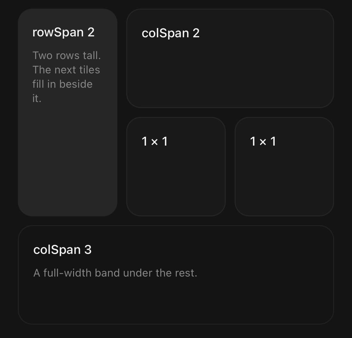
<GridItem.Group columns={3} gap={10}>
  <GridItem rowSpan={2}>Two rows tall</GridItem>
  <GridItem colSpan={2}>Two columns wide</GridItem>
  <GridItem>Fills in beside the tall one</GridItem>
  <GridItem>And so does this</GridItem>
  <GridItem colSpan={3}>A full-width band under the rest</GridItem>
</GridItem.Group>
The layer behind the text
GridItem.Background fills the tile, sits under everything else, and takes no touches, so it can be written anywhere among the children without moving them. The tile clips it — it is meant to run off the edges.
This is what makes a bento grid read as a bento grid rather than as a wall of stat cards. A sparkline pinned to the bottom, an oversized icon hung off a corner, a photo: none of them are read for values, so none of them need axes.
The icon treatment survives being used on every tile, which most decoration does not. An icon that fits inside the tile is an icon; one that runs off two edges of it at a tenth of its opacity is a texture — and giving each tile its own subject in its own --color-chart-* tint means four of them read as four different things rather than as wallpaper.

{/* A shape along the bottom. */}
<GridItem colSpan={2}>
  <GridItem.Background>
    <View className="mt-auto h-20 w-full opacity-60">
      <LineChart data={week} compact aspectRatio={3.4}>
        <LineChart.Area dataKey="v" />
        <LineChart.Line dataKey="v" />
      </LineChart>
    </View>
  </GridItem.Background>
  <GridItem.Title>Requests</GridItem.Title>
  <GridItem.Value>52.4k</GridItem.Value>
</GridItem>

{/* A watermark hung off the corner, tinted per tile. */}
<GridItem>
  <GridItem.Background>
    <View className="absolute -bottom-6 -right-5 opacity-[0.14]">
      <SparklesIcon size={72} color={useCSSVariable('--color-chart-1')} />
    </View>
  </GridItem.Background>
  <GridItem.Title>Cache hits</GridItem.Title>
  <GridItem.Value>94%</GridItem.Value>
</GridItem>
Tiles that go somewhere
Give a tile onPress and it renders as a pressable with the button role and the press animation; leave it off and it is a plain view, so a tile that is only showing a number does not announce itself as a button.
A whole tile is a generous touch target, so put the affordance in the footer rather than making a small button inside it — the chevron says where the press goes and the tile is what receives it.
<GridItem onPress={() => router.push('/billing')}>
  <GridItem.Title>Billing</GridItem.Title>
  <GridItem.Footer>
    <Text size="xs" className="flex-1 text-muted-foreground">3 invoices due</Text>
    <ChevronRightIcon size={14} />
  </GridItem.Footer>
</GridItem>
Nesting a grid inside a tile
A group inside a tile is a group like any other, and it measures the cell it was put in. That is how a bento gets a sub-rhythm — two small tiles stacked inside one cell of the outer grid — without the outer grid needing a notion of half a row. Use variant="plain" on the tile holding it, so there is not a card inside a card.
<GridItem.Group columns={2} gap={12}>
  <GridItem rowSpan={2}>…</GridItem>
  <GridItem variant="plain" className="p-0">
    <GridItem.Group columns={1} gap={12} rowHeight={54}>
      <GridItem size="sm">…</GridItem>
      <GridItem size="sm">…</GridItem>
    </GridItem.Group>
  </GridItem>
</GridItem.Group>
A bento of stats
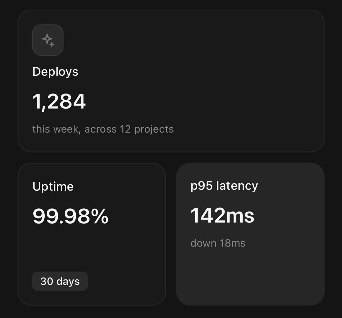
The shape the component is named for: one tile across the top and two under it, from colSpan alone. rowHeight is set from what the tallest tile has to hold rather than from the proportion that looked right — an icon, a title, a figure and a line under it — because a cell shorter than its contents clips the last of them.
<GridItem.Group columns={2} gap={12} rowHeight={164}>
  <GridItem colSpan={2}>
    <GridItem.Media variant="icon"><SparklesIcon size={18} /></GridItem.Media>
    <GridItem.Title>Deploys</GridItem.Title>
    <GridItem.Value>1,284</GridItem.Value>
    <GridItem.Description numberOfLines={1}>
      this week, across 12 projects
    </GridItem.Description>
  </GridItem>
  <GridItem>
    <GridItem.Title>Uptime</GridItem.Title>
    <GridItem.Value>99.98%</GridItem.Value>
    <GridItem.Footer><Badge variant="secondary">30 days</Badge></GridItem.Footer>
  </GridItem>
  <GridItem variant="muted">
    <GridItem.Title>p95 latency</GridItem.Title>
    <GridItem.Value>142ms</GridItem.Value>
    <GridItem.Description numberOfLines={1}>down 18ms</GridItem.Description>
  </GridItem>
</GridItem.Group>
A wall of watermarks
The same trick as the layer behind the text, repeated until it is a texture rather than an illustration. Each glyph is hung off the bottom-right corner and cut by the tile it sits in: an icon that fits inside a tile is an icon, and one that runs off two of its edges is a background. Keep the opacity low enough that the figure over it never has to compete.
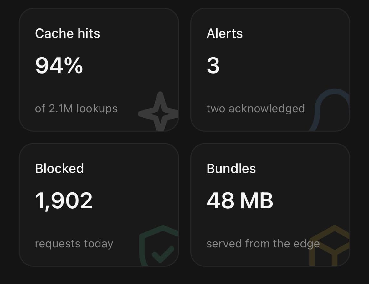
<GridItem.Group columns={2} gap={12} rowHeight={132}>
  {stats.map((stat) => (
    <GridItem key={stat.label}>
      <GridItem.Background>
        <View className="absolute -bottom-6 -right-5 opacity-[0.14]">
          <SparklesIcon size={120} color={stat.tint} />
        </View>
      </GridItem.Background>
      <GridItem.Title>{stat.label}</GridItem.Title>
      <GridItem.Value>{stat.value}</GridItem.Value>
      <GridItem.Footer>
        <Text size="xs" muted numberOfLines={1}>{stat.caption}</Text>
      </GridItem.Footer>
    </GridItem>
  ))}
</GridItem.Group>
Variants
variant
default(default)outlinemutedplain
<GridItem variant="default">…</GridItem>
<GridItem variant="outline">…</GridItem>
<GridItem variant="muted">…</GridItem>
<GridItem variant="plain">…</GridItem>
size
default(default)sm
<GridItem size="default">…</GridItem>
<GridItem size="sm">…</GridItem>
API Reference
GridItem.Group
| Prop | Type | Default | Description |
|---|---|---|---|
className | string | — | |
columns | number | 2 | How many tracks wide the grid is. |
gap | number | 12 | Gutter between tiles, in points — both ways. |
aspect | number | 1 | The shape of one cell, as width ÷ height. 1 is square; below one the cells are taller than they are wide. Ignored when rowHeight is given. |
rowHeight | number | — | Cell height in points, when the grid should not be driven by its width. |
size | GridItemSize | default | Density for every tile in the grid. Set here rather than on each one. |
GridItem
| Prop | Type | Default | Description |
|---|---|---|---|
className | string | — | |
disabled | boolean | — | |
colSpan | number | — | How many tracks wide the tile is. Clamped to the group's column count, so a tile asking for three columns of a two-column grid is two wide rather than overflowing it. Read by GridItem.Group, which does the placing — a tile does not size itself, because a tile that sized itself would not be in a grid. |
rowSpan | number | — | How many rows tall it is. Also read by the group. |
GridItem.Background
| Prop | Type | Default | Description |
|---|---|---|---|
className | string | — |
GridItem.Media
| Prop | Type | Default | Description |
|---|---|---|---|
className | string | — |
GridItem.Title
| Prop | Type | Default | Description |
|---|---|---|---|
className | string | — |
GridItem.Value
| Prop | Type | Default | Description |
|---|---|---|---|
className | string | — |
GridItem.Description
| Prop | Type | Default | Description |
|---|---|---|---|
className | string | — |
GridItem.Footer
| Prop | Type | Default | Description |
|---|---|---|---|
className | string | — |
GridItem.Actions
| Prop | Type | Default | Description |
|---|---|---|---|
className | string | — |
Every part also accepts the underlying React Native props (ViewProps or TextProps) and a className for Tailwind utilities.
Notes
A tile's height is its cells, not its content
This is the trade the grid makes, and it is the right way round for a bento: a grid of boxes that each grew to fit their own text is not a grid. But it does mean content taller than its cell is clipped rather than pushing the tile down.
So set the cell from what the tallest tile has to hold, not from the shape that looked right. At the default density a tile carrying a media tile, a title, a value and a line under it needs about 164 points, and one carrying a title, a value and a footer about 130 — rowHeight says so directly, where aspect says it only once you know how wide a track came out. Then numberOfLines on the text, size="sm", or another row for anything still over.
It draws nothing until it has measured
Every tile is placed from the group's width, so there is one frame of an empty box before the grid appears — which is better than one frame of every tile piled on the origin. The group reserves its height as soon as it knows it, so nothing below it jumps.
Reading order is writing order
Tiles are placed row by row in the order they are written, and that is also the order they sit in the tree — so a screen reader walks them the same way the eye does. Reordering the visual grid means reordering the children, which is the only way the two can be guaranteed to agree.
When to use Item instead
If every entry is the same size and the list runs down the screen, it is a list, and Item is the shape for it — one that stacks, separates and grows with its content. Reach for a grid when the sizes are deliberately different, because that difference is the only thing a bento says that a list does not.
GridItem forwards ordinary view or Pressable props for the branch it renders, while retaining ownership of its disabled announcement, tile classes, and—when interactive—its button role and primary press handler.
Public exports
Values: GridItem
Types: GridItemProps, GridItemGroupProps, GridItemBackgroundProps, GridItemMediaProps, GridItemTitleProps, GridItemValueProps, GridItemDescriptionProps, GridItemFooterProps, GridItemActionsProps