

PageHeader
Cover, face and actions at the top of a profile.
The top of a profile screen: a banner, the face over it, who the page belongs to, and what you can do about them.
Two variants, for the two places it lives. card is a surface of its own, for a profile that appears inside a scroll of other cards. page drops the surface and lets the banner run to the screen's edges, for the screen the profile is.
It draws the header and nothing under it. The tabs, the grid and the feed below are yours — put the header at the top of a ScrollView and carry on.
For a name and avatar inside a feed row rather than at the top of a screen, use Post.
Installation
PageHeader ships with the library — no separate install.
import { PageHeader, Button, Badge, Text, RefreshControl, LinkIcon, CameraIcon, CalendarIcon, GlobeIcon, EllipsisIcon, ShareNodesIcon, PencilIcon, PlusIcon } from 'panelui-native';
import { View, Image, ScrollView } from 'react-native';
Or copy the source into your project, to own and edit it:
npx panelui-cli@latest add page-headerUsage
<PageHeader>
  <PageHeader.Cover />
  <PageHeader.Avatar source={{ uri: face }} fallback="OR" verified />
  <PageHeader.Content>
    <PageHeader.Title>Olivia Rhye</PageHeader.Title>
    <PageHeader.Description>olivia@panelui.dev</PageHeader.Description>
  </PageHeader.Content>
  <PageHeader.Actions>
    <Button variant="secondary" className="flex-1">Message</Button>
    <Button className="flex-1">Follow</Button>
  </PageHeader.Actions>
</PageHeader>
Composition
<PageHeader>
  <PageHeader.Cover />          {/* the banner, or a gradient */}
  <PageHeader.Row>              {/* the face, and anything beside it */}
    <PageHeader.Avatar />
    <PageHeader.Stats>
      <PageHeader.Stat value="788" label="Followers" />
    </PageHeader.Stats>
  </PageHeader.Row>
  <PageHeader.Content>
    <PageHeader.Title>…</PageHeader.Title>
    <PageHeader.Description>…</PageHeader.Description>
    <PageHeader.Meta icon={<LinkIcon />}>…</PageHeader.Meta>
  </PageHeader.Content>
  <PageHeader.Actions>…</PageHeader.Actions>
</PageHeader>PageHeader.Cover— The banner. Give it asourcefor an image; without one it draws a gradient, because a header with no banner still has to read as a header.heightsets the band,altdescribes the picture — left out, it is treated as decoration.PageHeader.Avatar— The face, in a ring of whatever surface is behind it. It lifts over the cover's bottom edge on its own: the root looks for aPageHeader.Coveramong its children, so a header without one leaves the face where it is.overlapoverrides that either way. Passchildrento put something else in the ring — a logo, a monogram, a live thumbnail.PageHeader.Row— The face, and whatever sits beside it — for the profile that puts its counts next to the picture rather than under the name. Leave it out when the face stands alone;PageHeader.Avatarcarries its own inset then.PageHeader.Content— The text block. Everything in it takes the header's alignment.PageHeader.Title— Whose page it is. Announces itself as a heading.PageHeader.Description— The handle, the email, the one quiet line under the name.PageHeader.Meta— One fact about the account — a link, a location, the month it was opened. Theicontakes the muted colour without being told.PageHeader.Stats— The row of counts.layout="stacked"puts the label under the figure, for counts read as a set;inlineruns them together — "533 Followers" — for counts read as part of a sentence.dividedrules between them.
Centred and stacked, the counts take equal widths across the row, so the middle one lands on the same centre line as the name and the buttons.
PageHeader.Stat— One count. Announced as a single thing — "533 Followers" — because a figure and its label read apart are two pieces of nothing. Give it anonPressand it becomes a real button.PageHeader.Actions— What you can do about the account. Give the buttonsclassName="flex-1"for the pair that splits the width evenly.
Examples
The profile card
The default. The cover is held off the card's edges and rounded on its top corners only, so its bottom edge meets the content rather than floating above it.
Nothing here says the face should lift over the cover — the card can see the cover among its children and works it out.
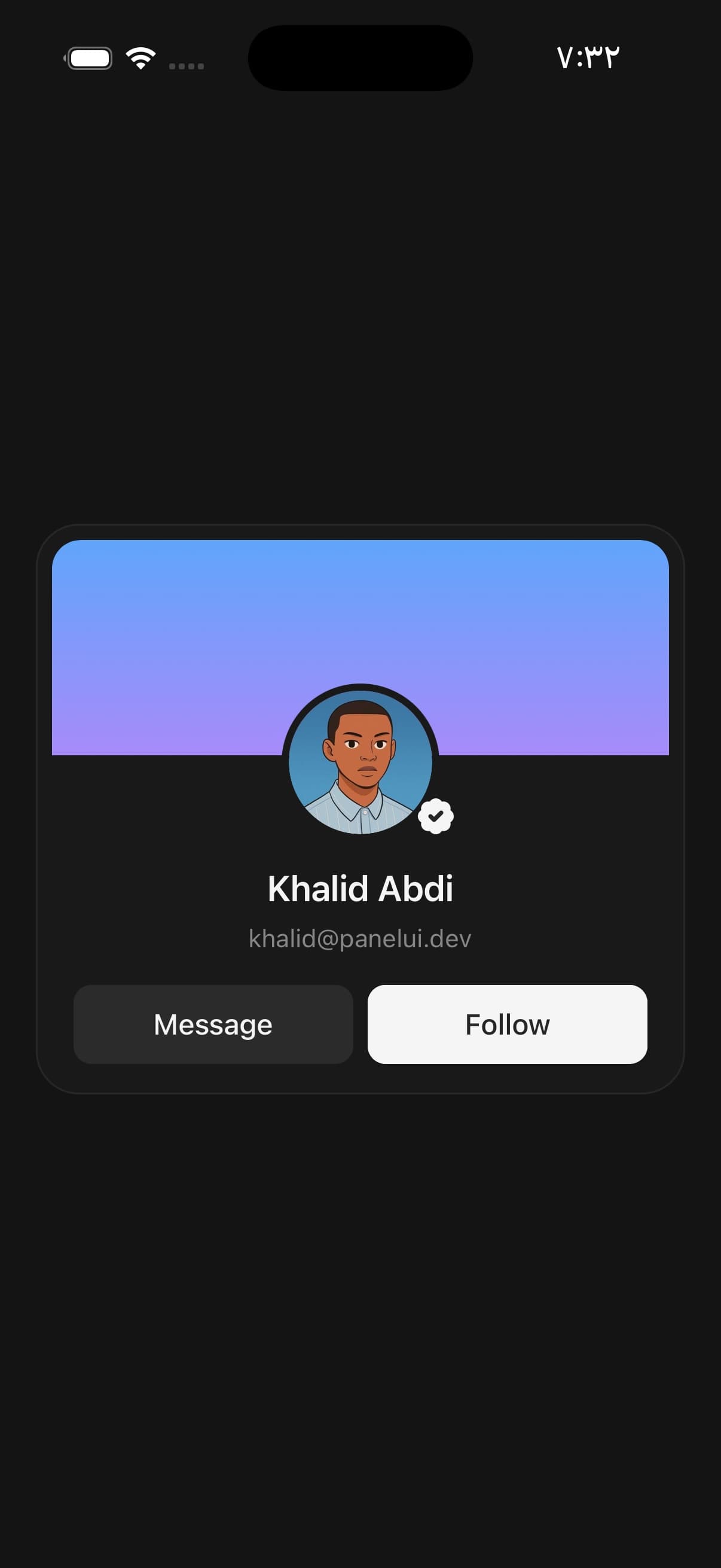
<PageHeader>
  <PageHeader.Cover />
  <PageHeader.Avatar source={{ uri: face }} fallback="OR" verified />
  <PageHeader.Content>
    <PageHeader.Title>Olivia Rhye</PageHeader.Title>
    <PageHeader.Description>olivia@panelui.dev</PageHeader.Description>
  </PageHeader.Content>
  <PageHeader.Actions>
    <Button variant="secondary" className="flex-1">Message</Button>
    <Button className="flex-1">Follow</Button>
  </PageHeader.Actions>
</PageHeader>
The face at the leading edge
align="start" moves the face, the text and the actions to the leading edge. Use it where the name is the first thing on the line rather than the middle of it — a card in a list of them, where a column of centred names is harder to scan than a column of left-aligned ones.
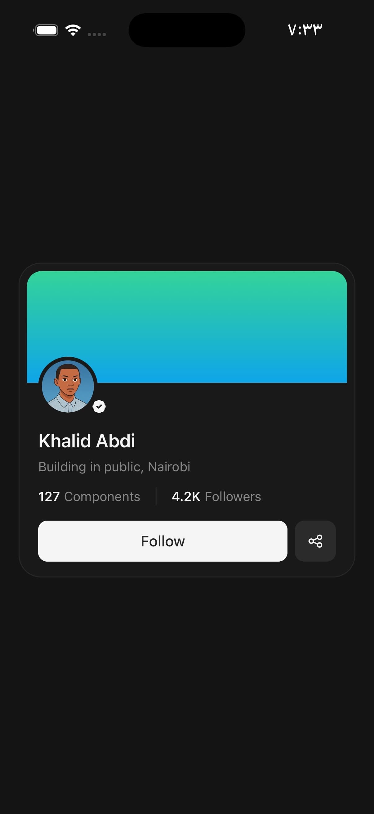
<PageHeader align="start">
  <PageHeader.Cover colors={['#34d399', '#0ea5e9']} />
  <PageHeader.Avatar size="lg" source={{ uri: face }} fallback="KA" verified />
  <PageHeader.Content>
    <PageHeader.Title>Khalid Abdi</PageHeader.Title>
    <PageHeader.Description>Building in public, Nairobi</PageHeader.Description>
    <PageHeader.Stats layout="inline" divided className="pt-2">
      <PageHeader.Stat value="127" label="Components" />
      <PageHeader.Stat value="4.2K" label="Followers" />
    </PageHeader.Stats>
  </PageHeader.Content>
  <PageHeader.Actions>
    <Button className="flex-1">Follow</Button>
    <Button variant="secondary" size="icon"><ShareNodesIcon size={18} /></Button>
  </PageHeader.Actions>
</PageHeader>
A banner of your own
Cover takes children, so anything that belongs on the banner goes there — a change-photo button, a badge, a back arrow over a translucent circle.
Give it an alt when the picture carries meaning. Without one it is announced as nothing, which is right for a gradient and wrong for a photograph of the place the account is about.
<PageHeader.Cover source={{ uri: banner }} height={150} alt="The workshop at dusk">
  <View className="absolute bottom-2 end-2">
    <Button variant="secondary" size="icon" onPress={pickCover}>
      <CameraIcon size={18} />
    </Button>
  </View>
</PageHeader.Cover>
Counts that go somewhere
A count with an onPress is a real button — press feedback and a button role — rather than a view with a handler on it. It is announced as one thing, so a screen reader says "533 Followers" instead of "533" and then "Followers".
<PageHeader.Stats>
  <PageHeader.Stat value="3" label="Posts" />
  <PageHeader.Stat
    value="788"
    label="Followers"
    onPress={() => router.push('/followers')}
  />
  <PageHeader.Stat
    value="1,882"
    label="Following"
    onPress={() => router.push('/following')}
  />
</PageHeader.Stats>
Pull to refresh
A profile header is the top of a scroll somebody pulls on, so give the scroll a RefreshControl. The spinner appears above the cover, the content holds its place, and both settle back when the refresh resolves — the gesture every social app has trained people to try first.
Tint it from a token rather than leaving it to the platform default, which is a mid grey that disappears against a dark cover.
const [refreshing, setRefreshing] = useState(false);
const tint = useCSSVariable('--color-muted-foreground');

async function refresh() {
  setRefreshing(true);
  try {
    await reloadProfile();
  } finally {
    setRefreshing(false);
  }
}

<ScrollView
  refreshControl={
    <RefreshControl
      refreshing={refreshing}
      onRefresh={refresh}
      tintColor={typeof tint === 'string' ? tint : undefined}
    />
  }
>
  <PageHeader variant="page" align="start">…</PageHeader>
  {/* the feed under it */}
</ScrollView>
A mark instead of a face
PageHeader.Avatar takes children, which fill the ring in place of the face. Use it for a logo: the face crops to fill, and a logo cropped to a circle is a logo with its corners cut off.
What you put there fills the ring edge to edge, so give it its own background and hold the mark clear of the edge yourself.
<PageHeader.Avatar>
  <View className="h-full w-full items-center justify-center bg-card">
    <Image
      source={mark}
      style={{ width: 46, height: 46 }}
      resizeMode="contain"
      accessibilityLabel="PanelUI"
    />
  </View>
</PageHeader.Avatar>
Versions
Profile screen
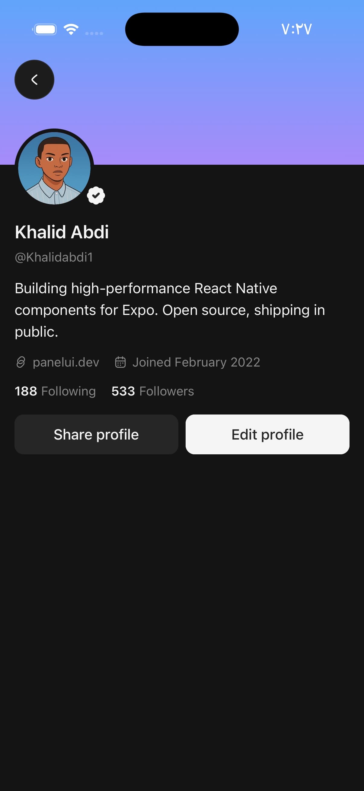
variant="page" drops the card and lets the cover run to the screen's edges. Give it the status-bar inset on top of the band you want, so the gradient reaches the top of the screen rather than stopping under the clock.
The counts are inline here because they read as part of a sentence rather than as a set to compare.
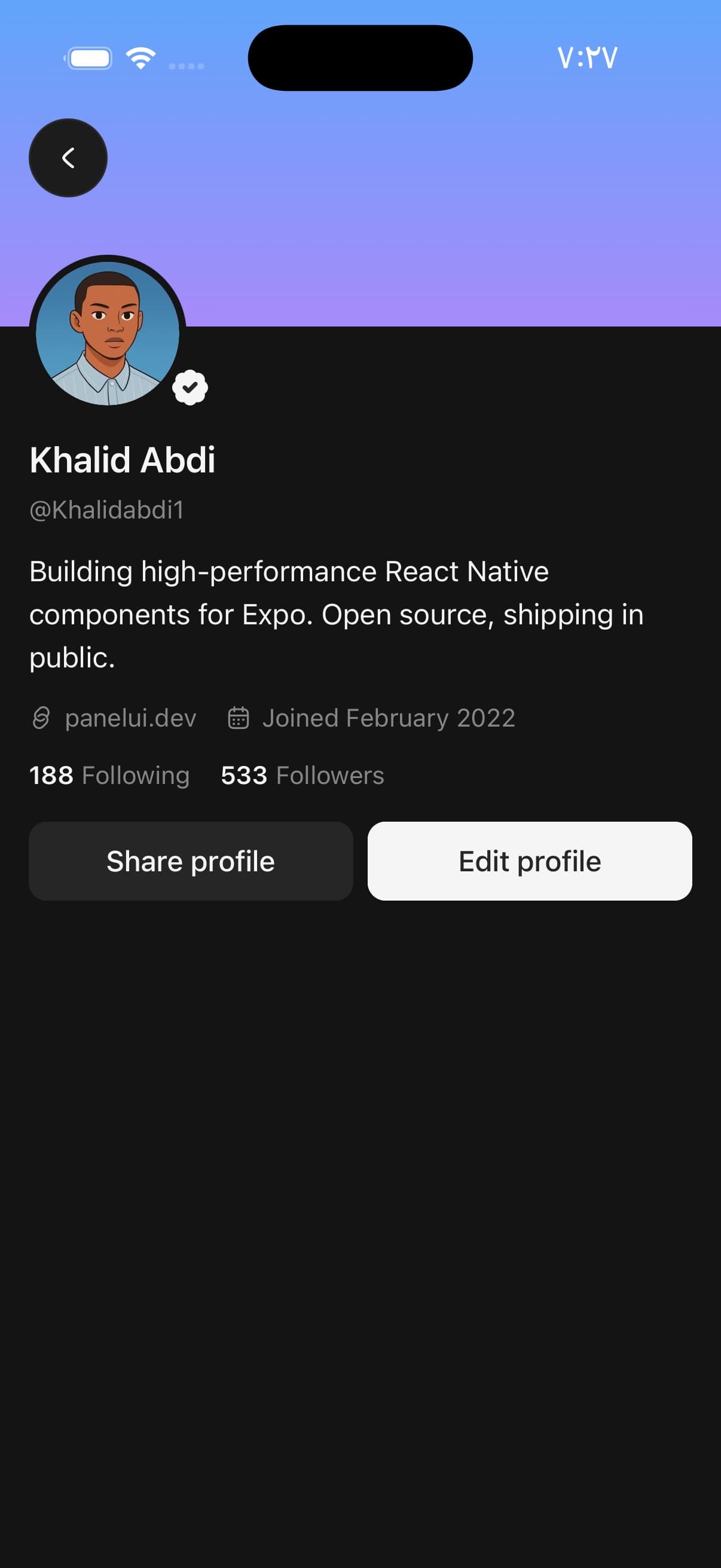
const insets = useSafeAreaInsets();

<PageHeader variant="page" align="start">
  <PageHeader.Cover height={insets.top + 120} />
  <PageHeader.Avatar source={{ uri: face }} fallback="KA" verified />
  <PageHeader.Content>
    <PageHeader.Title>Khalid Abdi</PageHeader.Title>
    <PageHeader.Description>@Khalidabdi1</PageHeader.Description>
    <Text className="pt-2">
      Building high-performance React Native components for Expo.
    </Text>
    <View className="flex-row flex-wrap gap-x-4 pt-2">
      <PageHeader.Meta icon={<LinkIcon size={14} />}>panelui.dev</PageHeader.Meta>
      <PageHeader.Meta icon={<CalendarIcon size={14} />}>
        Joined February 2022
      </PageHeader.Meta>
    </View>
    <PageHeader.Stats layout="inline" className="pt-2">
      <PageHeader.Stat value="188" label="Following" onPress={openFollowing} />
      <PageHeader.Stat value="533" label="Followers" onPress={openFollowers} />
    </PageHeader.Stats>
  </PageHeader.Content>
  <PageHeader.Actions>
    <Button variant="secondary" className="flex-1">Share profile</Button>
    <Button className="flex-1">Edit profile</Button>
  </PageHeader.Actions>
</PageHeader>
Counts beside the face
No cover, so the face has nothing to overlap and does not lift. PageHeader.Row puts the counts next to the picture instead of under the name, which is the shape that fits three of them on a phone.
badge takes the corner the rosette would have had. Resolve the glyph's colour against the surface you fill the badge with — a circle filled in the foreground colour with an icon that inherited the foreground colour is invisible in a light theme.

<PageHeader variant="page" align="start">
<PageHeader.Row>
<PageHeader.Avatar
size="lg"
source={{ uri: face }}
fallback="KA"
badge={<StoryBadge />}
/>
<PageHeader.Stats className="flex-1">
<PageHeader.Stat value="3" label="Posts" />
<PageHeader.Stat value="788" label="Followers" onPress={openFollowers} />
<PageHeader.Stat value="1,882" label="Following" onPress={openFollowing} />
</PageHeader.Stats>
</PageHeader.Row>
<PageHeader.Content>
<PageHeader.Title>Khalid Abdi</PageHeader.Title>
<PageHeader.Description>Science & Technology</PageHeader.Description>
</PageHeader.Content>
<PageHeader.Actions>
<Button variant="secondary" className="flex-1">Edit profile</Button>
<Button variant="secondary" className="flex-1">Share profile</Button>
<Button variant="secondary" size="icon"><EllipsisIcon size={18} /></Button>
</PageHeader.Actions>
</PageHeader>
/** The glyph is resolved against the page, not left to inherit. */
function StoryBadge() {
const background = useCSSVariable('--color-background');
return (
<View className="h-7 w-7 items-center justify-center rounded-full border-2 border-background bg-foreground">
<IconColorProvider color={typeof background === 'string' ? background : undefined}>
<PlusIcon size={13} />
</IconColorProvider>
</View>
);
}Everything centred
The default alignment, at full screen. The face is centred over the cover and the counts sit under the name rather than beside it, which is the arrangement that reads when the name is the first thing on the screen rather than one row of many.

<PageHeader variant="page">
  <PageHeader.Cover height={insets.top + 140} />
  <PageHeader.Avatar source={{ uri: face }} fallback="KA" verified />
  <PageHeader.Content>
    <PageHeader.Title>Khalid Abdi</PageHeader.Title>
    <PageHeader.Description>khalid@panelui.dev</PageHeader.Description>
    <PageHeader.Meta icon={<GlobeIcon size={14} />} className="pt-1">
      Remote · GMT+3
    </PageHeader.Meta>
    <PageHeader.Stats className="pt-3">
      <PageHeader.Stat value="127" label="Components" />
      <PageHeader.Stat value="533" label="Followers" onPress={openFollowers} />
      <PageHeader.Stat value="0.92" label="Version" />
    </PageHeader.Stats>
  </PageHeader.Content>
  <PageHeader.Actions>
    <Button variant="secondary" className="flex-1">Message</Button>
    <Button className="flex-1">Follow</Button>
  </PageHeader.Actions>
</PageHeader>
A hero, and no face
Every part is optional, and this is what leaving the avatar out buys: a tall banner that is the account itself. A face over it would be a second subject on the same screen.
colors takes a ramp of your own — real colour strings, because a gradient is painted rather than classed. Resolve tokens with useCSSVariable if that is where they come from.
divided rules the counts apart. Use it where each figure is a different kind of thing — karma, posts, an age — rather than three of one kind, which read fine on their own spacing.
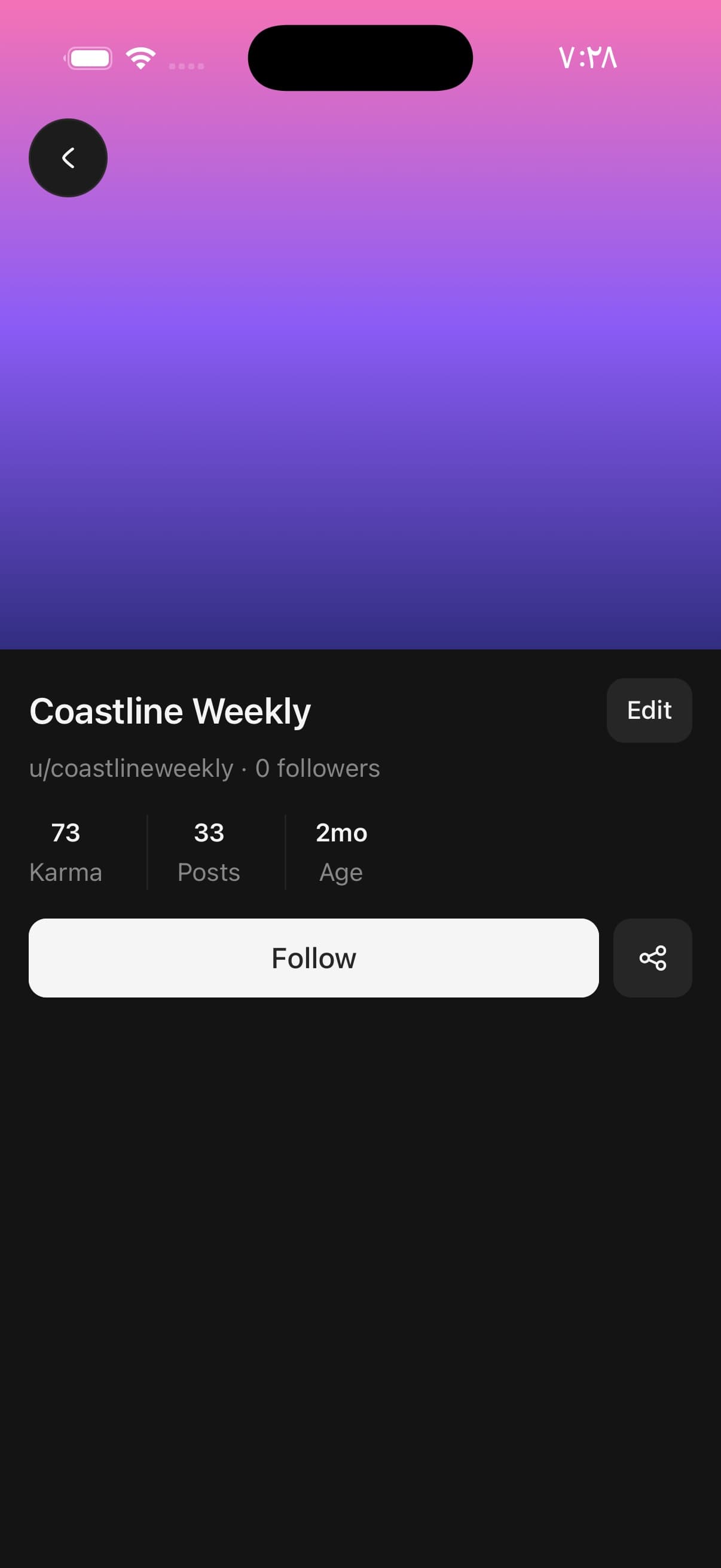
<PageHeader variant="page" align="start">
  <PageHeader.Cover
    height={insets.top + 300}
    colors={['#f472b6', '#8b5cf6', '#312e81']}
  />
  <PageHeader.Content className="pt-4">
    <View className="flex-row items-center gap-3">
      <PageHeader.Title className="flex-1">Coastline Weekly</PageHeader.Title>
      <Button variant="secondary" size="sm">Edit</Button>
    </View>
    <PageHeader.Description>u/coastlineweekly · 0 followers</PageHeader.Description>
  </PageHeader.Content>
  <PageHeader.Stats divided className="px-4 pt-4">
    <PageHeader.Stat value="73" label="Karma" />
    <PageHeader.Stat value="33" label="Posts" onPress={openPosts} />
    <PageHeader.Stat value="2mo" label="Age" />
  </PageHeader.Stats>
  <PageHeader.Actions>
    <Button className="flex-1">Follow</Button>
    <Button variant="secondary" size="icon"><ShareNodesIcon size={18} /></Button>
  </PageHeader.Actions>
</PageHeader>
An organisation
A mark rather than a face. It goes in PageHeader.Avatar's children, which fill the ring in place of the face — the face crops to fill, and a logo cropped to a circle is a logo with its corners cut off.
Title takes children, so a badge goes beside the name on the same line.

<PageHeader variant="page" align="start">
  <PageHeader.Cover height={insets.top + 120} />
  <PageHeader.Avatar>
    <View className="h-full w-full items-center justify-center bg-card">
      <Image source={mark} style={{ width: 46, height: 46 }} resizeMode="contain" />
    </View>
  </PageHeader.Avatar>
  <PageHeader.Content>
    <View className="flex-row items-center gap-2">
      <PageHeader.Title>PanelUI</PageHeader.Title>
      <Badge variant="secondary">Open source</Badge>
    </View>
    <PageHeader.Description>
      High-performance React Native components for Expo
    </PageHeader.Description>
    <PageHeader.Stats layout="inline" divided className="pt-3">
      <PageHeader.Stat value="127" label="Components" />
      <PageHeader.Stat value="6" label="Themes" />
    </PageHeader.Stats>
  </PageHeader.Content>
  <PageHeader.Actions>
    <Button className="flex-1">Install</Button>
    <Button variant="secondary" size="icon"><PencilIcon size={18} /></Button>
  </PageHeader.Actions>
</PageHeader>
Variants
variant
card(default)page
{/* A surface of its own, for a profile inside a scroll of other cards.
    The cover is held off the card's edges and attached to the content. */}
<PageHeader variant="card">…</PageHeader>

{/* No surface, and the banner runs to the screen's edges. For the screen
    the profile is, rather than a card about somebody on another one. */}
<PageHeader variant="page">…</PageHeader>
align
startcenter(default)
{/* The face and the text centred over the cover. */}
<PageHeader align="center">…</PageHeader>

{/* Everything on the leading edge — the name is the first thing on the
    line rather than the middle of it. */}
<PageHeader align="start">…</PageHeader>
API Reference
PageHeader
| Prop | Type | Default | Description |
|---|---|---|---|
className | string | — |
PageHeader.Root
| Prop | Type | Default | Description |
|---|---|---|---|
variant | PageHeaderVariant | card | card is a surface of its own, with the cover held off its edges. page drops the surface and lets the cover run to the screen's edges. |
align | PageHeaderAlign | center | Which edge the face, the text and the actions line up on. center is the profile card; start is the screen header, where the name is the first thing on the line rather than the middle of it. |
PageHeader.Cover
| Prop | Type | Default | Description |
|---|---|---|---|
className | string | — | |
source | ImageSourcePropType | — | The banner. Left out, the cover draws a gradient instead. |
height | number | — | How tall the band is. |
colors | readonly [string, string, ...string[]] | — | The gradient, when there is no image. Two colours or more, as real colour strings — this is painted rather than classed. |
alt | string | — | What the banner shows. Left out, it is treated as decoration. |
PageHeader.Avatar
| Prop | Type | Default | Description |
|---|---|---|---|
className | string | — | |
size | AvatarSizeName | 'xl' | How big the face is. |
verified | boolean | — | Draws the verification rosette in the face's bottom corner. |
badge | ReactNode | — | Anything else for that corner — a camera button, a presence dot, a "+". Wins over verified. |
overlap | boolean | — | Whether the face lifts over the cover's bottom edge. Set by the presence of a PageHeader.Cover; pass it to override that either way. |
PageHeader.Meta
| Prop | Type | Default | Description |
|---|---|---|---|
icon | ReactNode | — | A glyph before the line. Takes the muted colour without being told. |
PageHeader.Stats
| Prop | Type | Default | Description |
|---|---|---|---|
layout | PageHeaderStatsLayout | — | stacked puts the label under the figure, for a row of counts read as a set. inline runs them together — "533 Followers" — for counts read as part of a sentence. |
divided | boolean | — | Rule between each count and the next. |
PageHeader.Stat
| Prop | Type | Default | Description |
|---|---|---|---|
className | string | — | |
value | ReactNode | — | The figure. |
label | ReactNode | — | What it counts. |
divided | boolean | — | Rule before this count. PageHeader.Stats sets it; pass it to override. |
Every part also accepts the underlying React Native props (ViewProps or TextProps) and a className for Tailwind utilities.
Notes
Why the cover is inset
In card the cover is held off the card's edges by the card's own padding, and rounded on its top corners only. Its bottom edge is square and meets the content, so the two read as one object rather than as a picture with a panel under it.
The radii are a pair on the theme's own scale — rounded-3xl on the card, rounded-2xl on the cover — one step apart, which in most themes is exactly the padding between them. That keeps the curves concentric without a fixed number that would be wrong in half of them.
Restyle the card's radius and give the cover the matching one yourself. Both arrive as className strings, which the component cannot read.
The face lifts itself
PageHeader.Avatar pulls up over the cover's bottom edge by half its own diameter, and works out whether to: the root looks for a PageHeader.Cover among its children and says so through context.
A header with no cover has nothing to overlap, and an avatar that lifted anyway would hang off the top of it. Pass overlap to decide it yourself — for a cover rendered conditionally, where the children the root can see are not the children it will draw.
The ring is a surface, not a border
The ring around the face is drawn in the surface behind it — the card in card, the page in page — rather than in the border colour. A border reads as an outline on top of the cover; a ring in the surface behind reads as the face being punched out of it.
That is also why the badge hangs off a second view rather than off the ring: the ring clips to a circle, and a badge inside it would be cut in half by the very edge it is meant to sit against.
The rosette is at the bottom
Avatar.Badge pins to the top corner, which is where an unread count belongs. A verification mark belongs at the bottom, beside the name it is vouching for, so PageHeader.Avatar draws its own corner instead.
badge takes that corner for anything else — a camera button, a presence dot, a "+" to add to a story — and wins over verified.
The gradient is two series tokens
A cover with no source draws a gradient between --color-chart-2 and --color-chart-5. They are series tokens rather than a pair of hexes, so an app that puts its charts on brand puts this on brand with them.
Pass colors for a gradient of your own — two or more real colour strings, because a gradient is painted rather than classed. Resolve tokens with useCSSVariable if that is where they come from.
Give each header in an app its own ramp. A gallery of profiles that all open on the same banner reads as one page that failed to change.
At full screen, the cover needs the status bar
variant="page" runs the cover to the screen's edges, top included. Give height the safe-area inset on top of the band you want — insets.top + 120 — or the gradient stops under the clock and the header opens with a strip of page above it.
The header draws nothing over the cover, so a full-screen profile needs its own way back. Put it in PageHeader.Cover's children, or absolutely over the whole thing.
It is the top of a scroll, so let people pull on it
A profile header is the first thing under the status bar and the thing people pull down on to see whether anything is new. Give the scroll it sits in a RefreshControl — the spinner appears above the cover, the header holds its place, and both settle back when the refresh resolves.
Tint the spinner from a token. The platform default is a mid grey that disappears against a dark cover.
The header does not own the scroll, so this is yours to wire — which is also what lets the same refresh cover the feed under it.
Centred counts are measured, not just centred
A stacked row of counts under a centred name takes equal widths across the row rather than sitting at its content width.
Left to their content, the counts are centred as a block but not as figures: "Followers" is twice the width of "Posts", so the middle count sits off the centre line the name and the buttons are on. The row reads as very slightly wrong without it being obvious why.
Public exports
Values: PageHeader
Types: PageHeaderProps, PageHeaderRootProps, PageHeaderCoverProps, PageHeaderAvatarProps, PageHeaderRowProps, PageHeaderContentProps, PageHeaderMetaProps, PageHeaderStatsProps, PageHeaderStatProps, PageHeaderActionsProps, PageHeaderVariant, PageHeaderAlign, PageHeaderStatsLayout