

QRCode
A string a camera can read — framed, titled, or folded away behind a button.
A string drawn as something a camera can read — bare, framed, titled, or folded away behind a button.
Give it a value and compose the shape around it.
The encoder is ours and has no dependency behind it: the version grows to fit whatever you pass, and the whole code is drawn as a single path rather than one node per module — which for a dense code is the difference between appearing and appearing eventually.
Installation
QRCode ships with the library — no separate install.
import { QRCode, Avatar, Button, Text } from 'panelui-native';
import { ScrollView, View } from 'react-native';
Or copy the source into your project, to own and edit it:
npx panelui-cli@latest add qr-codeUsage
<QRCode value="https://panelui.dev">
  <QRCode.Frame>
    <QRCode.Header>
      <QRCode.Title>Documentation</QRCode.Title>
    </QRCode.Header>
    <QRCode.Panel>
      <QRCode.Canvas />
    </QRCode.Panel>
  </QRCode.Frame>
  <QRCode.Caption>Scan to open the docs</QRCode.Caption>
</QRCode>
Composition
<QRCode value="…" presentation="popover">
  <QRCode.Trigger>                      {/* …or no Trigger/Content at all, */}
    <Button>Show the code</Button>      {/* and the parts draw where they are */}
  </QRCode.Trigger>
  <QRCode.Content>
    <QRCode.Frame>                      {/* the tray */}
      <QRCode.Header>                   {/* the strip across the top of it */}
        <QRCode.Title>Pair a device</QRCode.Title>
        <QRCode.Action>Expires in 5m</QRCode.Action>
      </QRCode.Header>
      <QRCode.Panel>                    {/* the card the code is drawn on */}
        <QRCode.Canvas />               {/* the code itself */}
        <QRCode.Logo>…</QRCode.Logo>    {/* clears a square in the middle */}
      </QRCode.Panel>
    </QRCode.Frame>
    <QRCode.Caption>Scan to open the docs</QRCode.Caption>
    <QRCode.Value />                    {/* the string, for anyone who cannot scan */}
  </QRCode.Content>
</QRCode>
The order and the presence of the parts are yours — a bare <QRCode.Canvas /> with nothing around it is a perfectly good QR code, and everything else is optional shape.
QRCode.Content re-provides the context inside itself. Portal content mounts under the portal host rather than under the element that opened it, so a provider outside the popover is not an ancestor of what is in it.
Examples
In a frame
The tray, its title strip, and a line under the whole thing.
<QRCode value="https://panelui.dev" size="lg">
  <QRCode.Frame>
    <QRCode.Header>
      <QRCode.Title>Documentation</QRCode.Title>
      <QRCode.Action>panelui.dev</QRCode.Action>
    </QRCode.Header>
    <QRCode.Panel>
      <QRCode.Canvas />
    </QRCode.Panel>
  </QRCode.Frame>
  <QRCode.Caption>Scan to open the docs</QRCode.Caption>
</QRCode>
With something in the header
The trailing slot takes whatever the title needs qualifying with — here, how long the code is good for.
<QRCode value="https://panelui.dev/pair/8f2a41" size="lg">
  <QRCode.Frame>
    <QRCode.Header>
      <QRCode.Title>Pair a device</QRCode.Title>
      <QRCode.Action>Expires in 5m</QRCode.Action>
    </QRCode.Header>
    <QRCode.Panel>
      <QRCode.Canvas />
    </QRCode.Panel>
  </QRCode.Frame>
  <QRCode.Value />
</QRCode>
Folded away behind a button
The same code, brought up over the page when it is wanted and not before.
<QRCode value="https://panelui.dev" presentation="popover">
  <QRCode.Trigger>
    <Button variant="outline">Show QR code</Button>
  </QRCode.Trigger>
  <QRCode.Content>
    <QRCode.Canvas />
    <QRCode.Caption>Scan to open the docs</QRCode.Caption>
  </QRCode.Content>
</QRCode>
Up from the bottom edge
The same thing in a sheet, which is the shape a phone wants for something you hold up to another screen.
<QRCode value="https://panelui.dev" presentation="bottom-sheet" size="lg">
  <QRCode.Trigger>
    <Button>Share</Button>
  </QRCode.Trigger>
  <QRCode.Content>
    <QRCode.Canvas />
    <QRCode.Caption>Anyone with this code can open the page</QRCode.Caption>
  </QRCode.Content>
</QRCode>
With a mark in the middle
A logo clears a square of modules and fills it; the error correction is raised to cover the loss.
<QRCode value="https://panelui.dev" size="lg">
  <QRCode.Frame>
    <QRCode.Header>
      <QRCode.Title>PanelUI</QRCode.Title>
    </QRCode.Header>
    <QRCode.Panel>
      <QRCode.Canvas />
      <QRCode.Logo>
        <Avatar fallback="P" size="sm" />
      </QRCode.Logo>
    </QRCode.Panel>
  </QRCode.Frame>
</QRCode>
A WiFi network
Not every code is a URL. This one joins a network when it is scanned.
<QRCode value="WIFI:T:WPA;S:PanelUI Guest;P:hunter2;;" size="lg">
  <QRCode.Frame>
    <QRCode.Header>
      <QRCode.Title>PanelUI Guest</QRCode.Title>
      <QRCode.Action>WPA2</QRCode.Action>
    </QRCode.Header>
    <QRCode.Panel>
      <QRCode.Canvas />
    </QRCode.Panel>
  </QRCode.Frame>
  <QRCode.Caption>Scan to join the network</QRCode.Caption>
</QRCode>
Bare
No tray, no caption — the code and nothing else.
<QRCode value="https://panelui.dev" size="sm">
  <QRCode.Canvas />
</QRCode>
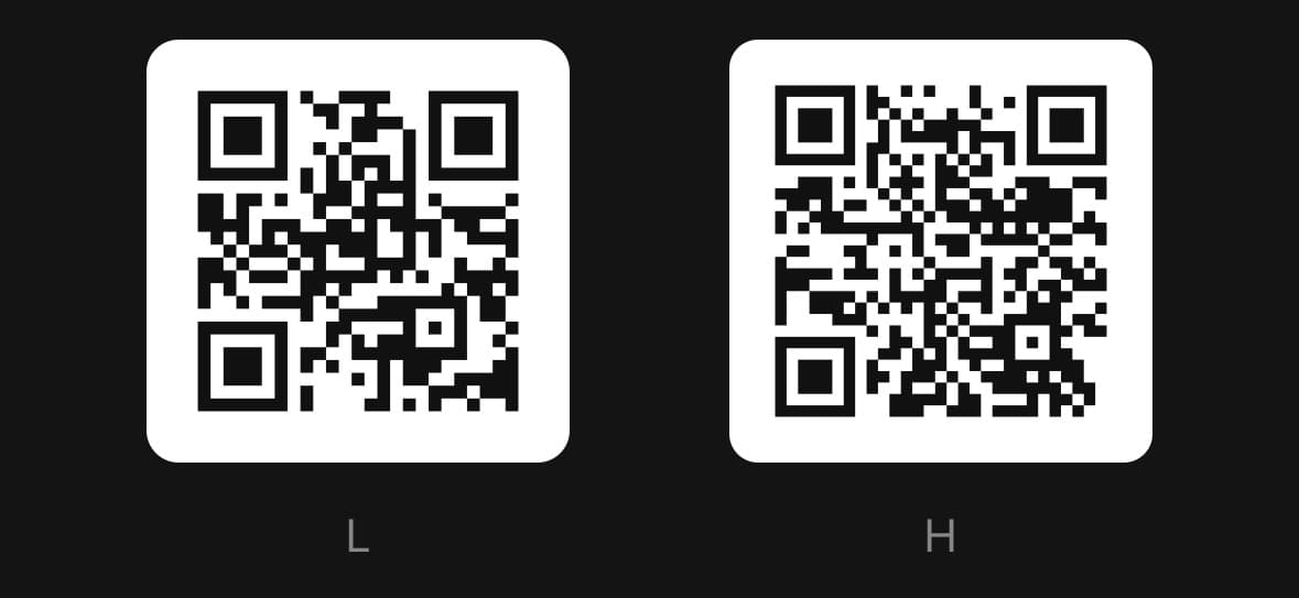
What a correction level costs
The same string at L and at H. The redundancy is made of modules, so the code that can survive losing 30% of itself is visibly denser than the one that can survive 7% — and a denser code at the same physical size is one a camera has to get closer to.
That is the whole trade. Raise it when the code will be printed, folded, put on something curved or covered in the middle, and leave it at M for a code on a screen, which nothing is damaging.
<View className="flex-row items-center justify-around">
  <QRCode value="https://panelui.dev" size="sm" errorCorrection="L">
    <QRCode.Canvas />
    <QRCode.Caption>L</QRCode.Caption>
  </QRCode>
  <QRCode value="https://panelui.dev" size="sm" errorCorrection="H">
    <QRCode.Canvas />
    <QRCode.Caption>H</QRCode.Caption>
  </QRCode>
</View>
Shaping it
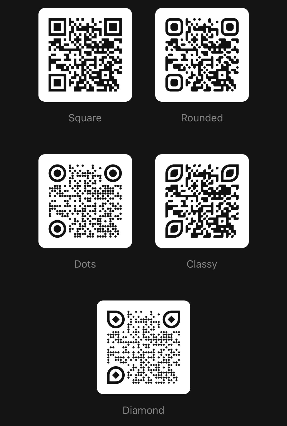
A code is three things wearing one colour: the body, which carries the data, and the three corner eyes, each a ring with a square in it. Each takes its own shape.
rounded and classy join to their neighbours — a corner is rounded only where both cells touching it are light — so a run of modules is one stroke rather than a string of beads with a light seam through it.
dot and diamond do not tile, and cost read distance for it: dot covers about two thirds of each cell and diamond exactly half, so the same code is a fainter code at the same size. Raise errorCorrection with them.
Every shape here keeps the centre of its cell dark and stays inside it, which is what a reader samples, and every eye stays exactly seven modules across, which is what a reader finds the code by. Both are checked in the library's tests.
<QRCode value="https://panelui.dev" size="lg" errorCorrection="H">
  <QRCode.Canvas moduleShape="rounded" eyeFrameShape="circle" eyeBallShape="dot" />
</QRCode>
Colouring the three parts
The body, the rings and the centres are three paths, so they take three colours. eyeFrameColor falls back to color, and eyeBallColor to eyeFrameColor, so one override is enough for the common case.
Contrast with the plate is the constraint. A reader needs the ink and the paper far apart in brightness, and a pale brand colour on white is a code that works on the screen it was designed on and not in a room. Keep the plate light and the ink dark, whatever the hue.
<QRCode value="https://panelui.dev" size="lg" errorCorrection="H">
  <QRCode.Canvas
    moduleShape="rounded"
    eyeFrameShape="rounded"
    eyeBallShape="rounded"
    color="#1f2937"
    eyeFrameColor="#4338ca"
    eyeBallColor="#f97316"
  />
</QRCode>
Versions
Framed
The tray, the title strip, and the code on the card inside it.
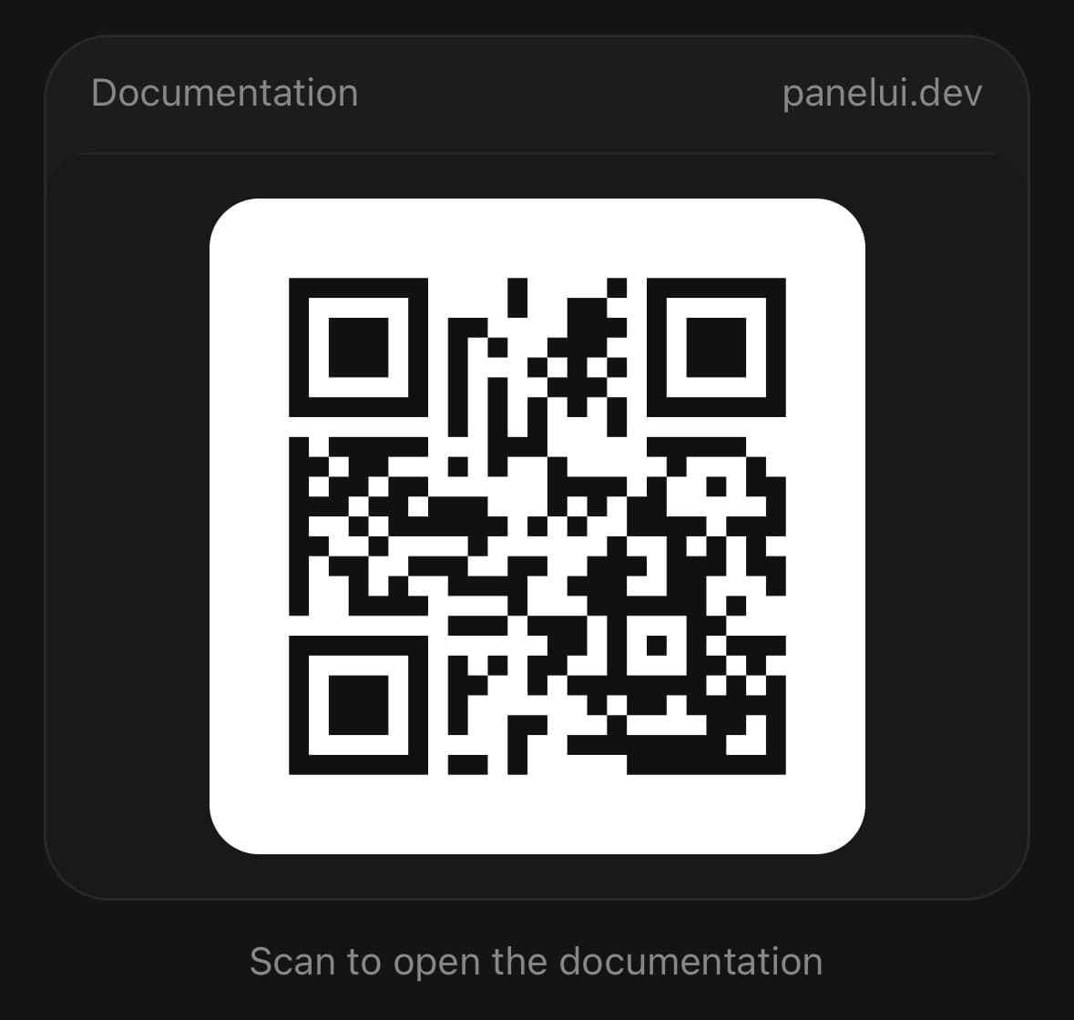
<QRCode value="https://panelui.dev" size="lg">
  <QRCode.Frame>
    <QRCode.Header>
      <QRCode.Title>Documentation</QRCode.Title>
      <QRCode.Action>panelui.dev</QRCode.Action>
    </QRCode.Header>
    <QRCode.Panel>
      <QRCode.Canvas />
    </QRCode.Panel>
  </QRCode.Frame>
  <QRCode.Caption>Scan to open the docs</QRCode.Caption>
</QRCode>
With a header
A trailing slot in the header, and the encoded string underneath.
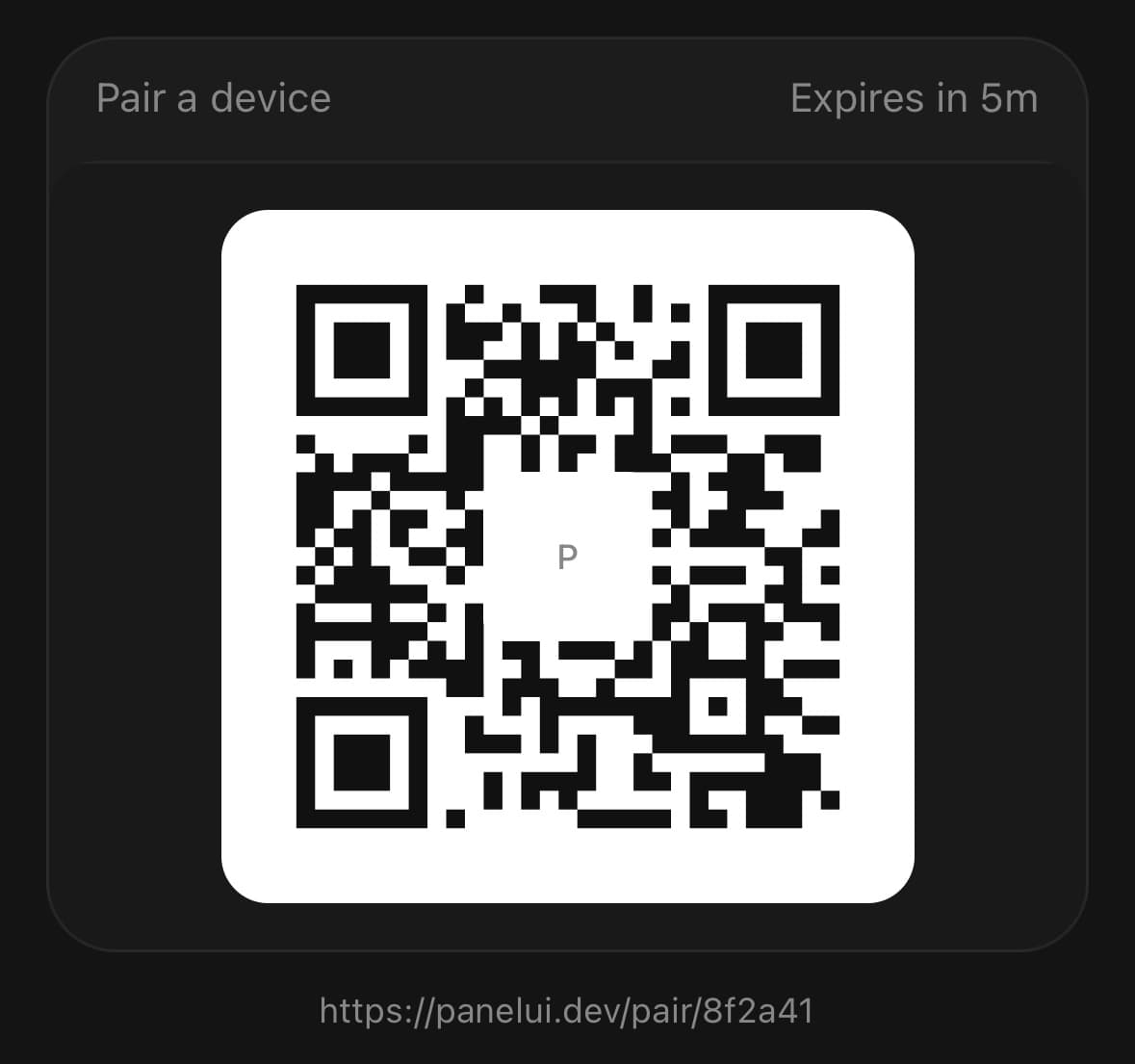
<QRCode value="https://panelui.dev/pair/8f2a41" size="lg">
  <QRCode.Frame>
    <QRCode.Header>
      <QRCode.Title>Pair a device</QRCode.Title>
      <QRCode.Action>Expires in 5m</QRCode.Action>
    </QRCode.Header>
    <QRCode.Panel>
      <QRCode.Canvas />
    </QRCode.Panel>
  </QRCode.Frame>
  <QRCode.Value />
</QRCode>
Folded away
Folded away behind a row until it is wanted, the way a colour picker folds away.
<QRCode value="https://panelui.dev" presentation="popover">
  <QRCode.Trigger>
    <Button variant="outline">Show QR code</Button>
  </QRCode.Trigger>
  <QRCode.Content>
    <QRCode.Canvas />
    <QRCode.Caption>Scan to open the docs</QRCode.Caption>
  </QRCode.Content>
</QRCode>
Every style
Each module and eye shape in turn, at H, so what each one costs in ink is visible. They all read; the point of putting them together is that they do not read equally.
Two to a row with real space between them. A quiet zone that touches the next code is a quiet zone a reader cannot find the edge of — the gap is part of the code, not padding around it.
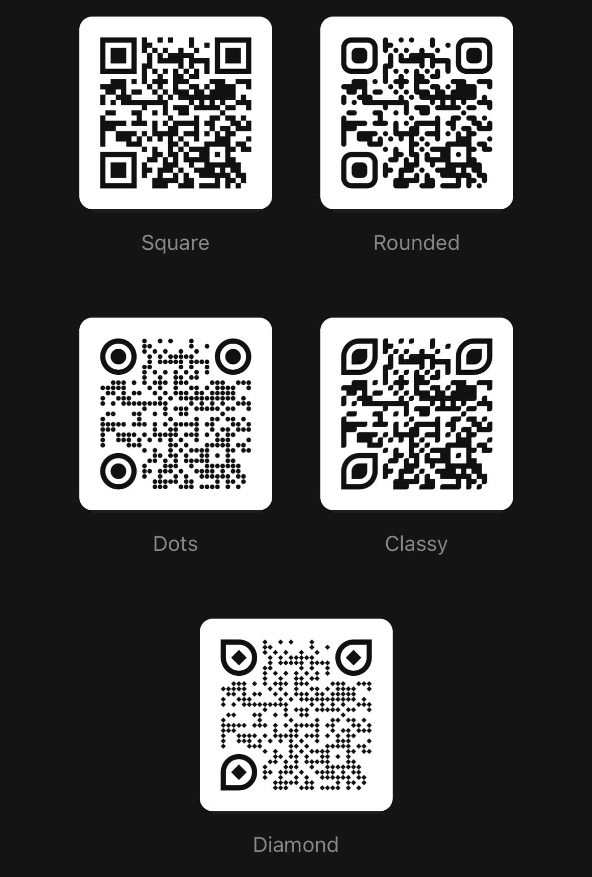
<ScrollView contentContainerClassName="flex-row flex-wrap justify-center gap-x-8 gap-y-10 p-6">
  {styles.map((style) => (
    <QRCode key={style.label} value="https://panelui.dev" size="sm" errorCorrection="H">
      <QRCode.Canvas
        moduleShape={style.module}
        eyeFrameShape={style.frame}
        eyeBallShape={style.ball}
      />
      <QRCode.Caption>{style.label}</QRCode.Caption>
    </QRCode>
  ))}
</ScrollView>
Branded
The same code in six palettes. The body, the rings and the centres are three paths, so they take three colours — which is what a brand asks for, rather than one tint over everything.
No frame around them: a titled tray is a different thing being demonstrated, and six trays would be a page about trays.
Every body here is dark and every plate is light. The hue is free; the tone is not.
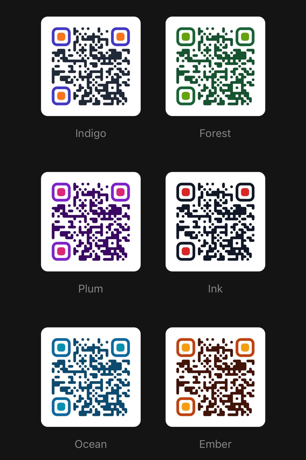
<ScrollView contentContainerClassName="flex-row flex-wrap justify-center gap-x-8 gap-y-10 p-6">
  {palettes.map((palette) => (
    <QRCode key={palette.label} value="https://panelui.dev" size="sm" errorCorrection="H">
      <QRCode.Canvas
        moduleShape="rounded"
        eyeFrameShape="rounded"
        eyeBallShape="rounded"
        color={palette.color}
        eyeFrameColor={palette.eyeFrameColor}
        eyeBallColor={palette.eyeBallColor}
      />
      <QRCode.Caption>{palette.label}</QRCode.Caption>
    </QRCode>
  ))}
</ScrollView>
Variants
size
smmd(default)lg
<QRCode value="https://panelui.dev" size="sm">
  <QRCode.Canvas />
</QRCode>
<QRCode value="https://panelui.dev" size="md">
  <QRCode.Canvas />
</QRCode>
<QRCode value="https://panelui.dev" size="lg">
  <QRCode.Canvas />
</QRCode>
API Reference
QRCode
| Prop | Type | Default | Description |
|---|---|---|---|
className | string | — | |
value | string | — | What the code encodes. Anything: a URL, a WiFi string, a vCard. Encoded as UTF-8, and the version grows to fit it. |
errorCorrection | ErrorCorrectionLevel | 'M' | How much of the code can be lost and still read — L about 7%, M 15%, Q 25%, H 30%. More correction means a denser code at the same size, so M is the default. Raised automatically when a QRCode.Logo needs it. |
version | number | — | Fix the QR version, 1–40, instead of taking the smallest that fits. Worth setting when the content changes and the code should not visibly change density with it. |
presentation | QRCodePresentation | 'inline' | Where the code appears. inline draws it where it sits; the other two put it behind a QRCode.Trigger and draw it in a QRCode.Content. |
open | boolean | — | Controlled open state. Ignored while presentation is inline. |
onOpenChange | (open: boolean) => void | — |
QRCode.Canvas
| Prop | Type | Default | Description |
|---|---|---|---|
className | string | — | |
pixelSize | number | — | Side length in points. Defaults to the size variant's. |
color | string | — | Dark modules. See the note below before overriding this. |
backgroundColor | string | — | The plate the modules sit on. See the note below. |
moduleShape | QRCodeModuleShape | 'square' | How a data module is drawn. rounded and classy join to their neighbours — a corner is rounded only where both cells touching it are light — so a run reads as one stroke rather than as a string of beads with a light seam through it. dot and diamond do not tile, and cost read distance for it: dot covers about two thirds of its cell and diamond exactly half, so the same code is a fainter code at the same size. Raise errorCorrection with them, and check a printed one rather than a screen. |
eyeFrameShape | QRCodeEyeFrameShape | 'square' | How the ring around each of the three corner eyes is drawn. |
eyeBallShape | QRCodeEyeBallShape | 'square' | How the square inside each corner eye is drawn. |
eyeFrameColor | string | — | The three corner rings. Defaults to color. |
eyeBallColor | string | — | The three corner centres. Defaults to eyeFrameColor, then color. |
QRCode.Frame
| Prop | Type | Default | Description |
|---|---|---|---|
className | string | — |
QRCode.Header
| Prop | Type | Default | Description |
|---|---|---|---|
className | string | — |
QRCode.Title
| Prop | Type | Default | Description |
|---|---|---|---|
className | string | — |
QRCode.Action
| Prop | Type | Default | Description |
|---|---|---|---|
className | string | — |
QRCode.Panel
| Prop | Type | Default | Description |
|---|---|---|---|
className | string | — |
QRCode.Description
| Prop | Type | Default | Description |
|---|---|---|---|
className | string | — |
QRCode.Caption
| Prop | Type | Default | Description |
|---|---|---|---|
className | string | — |
QRCode.Value
| Prop | Type | Default | Description |
|---|---|---|---|
className | string | — | |
full | boolean | — | Show the whole string rather than one line of it. |
QRCode.Logo
| Prop | Type | Default | Description |
|---|---|---|---|
className | string | — |
Every part also accepts the underlying React Native props (ViewProps or TextProps) and a className for Tailwind utilities.
Notes
The encoding is byte mode, so value can be anything — a URL, a WiFi string, a vCard, Japanese. It is encoded as UTF-8, which every reader in circulation understands.
The QR version — the module count, 21×21 up to 177×177 — is chosen as the smallest that fits what you passed. That means a code visibly gets denser as its content grows, which is usually what you want and occasionally is not: pass version to pin it, and the component will tell you at runtime if the content stops fitting.
Error correction, and what it is for
errorCorrection decides how much of the code can be lost and still read: L about 7%, M 15% (the default), Q 25%, H 30%. The correction is not free — the redundancy takes modules, so a higher level is a denser code at the same physical size, and a denser code is one a camera has to get closer to.
M is the default because a code on a screen is not being damaged by anything. Raise it when the code will be printed, put on something curved, or covered in the middle — and a QRCode.Logo raises it for you if the level you asked for could not afford the square it clears.
Shape and colour, without breaking it
A reader does two things, and both survive every shape here.
It finds a code by the three corner eyes — by the 1:1:3:1:1 run of dark and light through the middle of one — which holds while the eye is exactly seven modules across. Every eyeFrameShape is, and the shapes that are not symmetric turn to face outwards so all three read the same way round.
It reads each module by sampling the centre of that module's cell. Every moduleShape keeps that centre dark and stays inside its own cell, so a shaped module reads exactly as a square does.
What a shape does cost is ink. dot covers about two thirds of its cell and diamond exactly half, so the same code at the same size is a fainter one, read from closer. Raise errorCorrection when you shape a code, and check a printed one rather than one on a screen — a display is backlit and paper is not.
Making it scannable
Three things decide whether a code reads, and none of them is the code:
- The quiet zone. Four modules of clear space all round, which
QRCode.Canvasdraws and paints. Do not clip it, and do not put the code flush against a border. - Contrast, the right way round. Dark modules on a light field, and
QRCode.Canvasdraws that way whatever the theme is doing. It is the one thing in the library that ignores the tokens, and it is deliberate: inverted, a code is rejected outright by a good share of scanners and found late by most of the rest, which turns a dark theme into a bug report about a code that "sometimes does not work". On a light theme the plate is white on a near-white card and reads as nothing at all, which is the intended outcome.color,eyeFrameColor,eyeBallColorandbackgroundColoroverride the ink and the plate — but not the rule: keep the plate light and the ink dark, whatever the hue. - Size. A code needs roughly one point per module at arm's length.
smis 128 points, which is fine for a version 2 code and marginal for a version 10 one;lgis 240.
Accessibility
The canvas has an image role and a label naming what it encodes, so a screen reader announces the destination rather than "image". QRCode.Value puts the same string on screen as selectable text, which is the way through for anyone whose camera is the thing being set up.
Public exports
Values: QRCode
Types: QRCodeProps, QRCodeCanvasProps, QRCodeFrameProps, QRCodeHeaderProps, QRCodeTitleProps, QRCodeActionProps, QRCodePanelProps, QRCodeDescriptionProps, QRCodeCaptionProps, QRCodeValueProps, QRCodeLogoProps, QRCodeTriggerProps, QRCodeContentProps, QRCodeSize, QRCodePresentation, QRCodeModuleShape, QRCodeEyeFrameShape, QRCodeEyeBallShape, ErrorCorrectionLevel