

ColorPicker
A colour chosen by dragging — a saturation square or a wheel, a hue scale, and opacity.
A colour chosen by dragging rather than typed.
The controls are the colour model made visible: a square where saturation runs across and brightness runs up, or a wheel where hue is the angle and saturation the radius, under scales for whichever channels the shape does not carry.
Composition is the API. A picker with no opacity is one with no ColorPicker.Alpha in it, not one with a prop turned off.
Nothing about a drag crosses to JavaScript: the four channels are shared values, and the hue behind the square, both thumb fills and the preview swatch are computed from them on the UI thread. The picked colour bridges back on change and again on release.
Installation
ColorPicker ships with the library — no separate install.
import { ColorPicker, Button, Card, Text, Surface } from 'panelui-native';Or copy the source into your project, to own and edit it:
npx panelui-cli@latest add color-pickerUsage
<ColorPicker defaultValue="#22c55e" onValueCommit={setBrand}>
  <ColorPicker.Area />
  <ColorPicker.Hue />
  <ColorPicker.Preview showValue />
</ColorPicker>
Composition
<ColorPicker presentation="popover">
  <ColorPicker.Trigger>
    <ColorPicker.Field label="Accent" />  {/* the row that opens it */}
  </ColorPicker.Trigger>
  <ColorPicker.Content>                   {/* …or no Trigger/Content at all, */}
    <ColorPicker.Swatches colors={[…]} /> {/* and the parts stack where they are */}
    <ColorPicker.Area />                  {/* …or <ColorPicker.Wheel /> */}
    <ColorPicker.Channel channel="hue" /> {/* the readout above a track */}
    <ColorPicker.Hue />
    <ColorPicker.Brightness />
    <ColorPicker.Alpha />
    <ColorPicker.Preview showValue />
  </ColorPicker.Content>
</ColorPicker>
Every part is optional and they render in the order you write them, so the layout is yours: presets above the square, the preview at the top, opacity left out entirely.
The picker stores hue, saturation, value and alpha rather than the string it hands back. That is not an implementation detail you can ignore — it is why the thumb stays where you left it. A fully black colour is #000 whatever hue and saturation produced it, so a picker that stored its own output would lose the thumb the moment you dragged into a corner and have nowhere to put it back.
Content re-provides the picker's context around what it holds, and has to: the panel is drawn through a portal, above everything else on the screen, so by the time the parts inside it go looking for the picker they are no longer anywhere below it in the tree. That is why the controls go inside ColorPicker.Content rather than inside a Popover you assemble yourself.
Examples
Folded away behind the row
A picker is a page's worth of controls in service of one value, and that value is read far more often than it is changed. presentation puts the controls behind the row that reads it out, so two colours cost two rows rather than two panels. bottom-sheet is the same arrangement brought up from the bottom edge instead.
<ColorPicker value={accent} onValueChange={setAccent} presentation="popover">
  <ColorPicker.Trigger>
    <ColorPicker.Field label="Accent" />
  </ColorPicker.Trigger>
  <ColorPicker.Content>
    <ColorPicker.Area height={220} />
    <ColorPicker.Channel channel="hue" />
    <ColorPicker.Hue />
  </ColorPicker.Content>
</ColorPicker>
A labelled panel
The layout the parts are shaped for: a strip that names the colour and prints it, the square, then a readout naming the track under it. Every piece is optional and none of them knows about the others — this is a composition, not a variant.
<ColorPicker value={color} onValueChange={setColor}>
  <ColorPicker.Field label="Accent" />
  <Surface variant="secondary" padding="sm" className="gap-3 rounded-2xl">
    <ColorPicker.Area height={280} />
    <ColorPicker.Channel channel="hue" />
    <ColorPicker.Hue />
  </Surface>
</ColorPicker>
A wheel instead of a square
Swap Area for Wheel and hue becomes the angle, saturation the radius. Brightness then has no dimension left on the disc, so it takes a track of its own — a wheel without one can only ever pick bright colours.
<ColorPicker value={color} onValueChange={setColor}>
  <ColorPicker.Field label="Brand" />
  <ColorPicker.Wheel />
  <ColorPicker.Channel channel="brightness" />
  <ColorPicker.Brightness />
</ColorPicker>
Controlled
Hold the colour in state and apply it to something. onValueChange fires on every frame of a drag; onValueCommit fires once on release — reach for it when the change writes anywhere.
const [color, setColor] = useState('#22c55e');

<ColorPicker value={color} onValueChange={setColor}>
  <ColorPicker.Area />
  <ColorPicker.Hue />
  <ColorPicker.Preview showValue />
</ColorPicker>

<Button className="w-full" style={{ backgroundColor: color }}>
  Save theme
</Button>
With opacity
Add ColorPicker.Alpha and the colour gains a fourth channel. format decides how it is written: hex grows an #rrggbbaa pair and the other two switch to their a forms, but only once the colour is actually translucent — an opaque colour written with a trailing ff is the same colour spelled in a way half the parsers in the world reject.
<ColorPicker defaultValue="rgba(59, 130, 246, 0.6)" format="rgb" onValueCommit={save}>
  <ColorPicker.Area height={150} />
  <ColorPicker.Hue />
  <ColorPicker.Alpha />
  <ColorPicker.Preview showValue />
</ColorPicker>
Presets first
Most colour choices are one of eight, and the square is for the ninth. Putting ColorPicker.Swatches above it makes the common case a single tap without hiding the rest. Unreadable strings are dropped rather than rendered as black — a row of presets with a mystery black one in it is worse than a shorter row.
<ColorPicker defaultValue="#f97316" onValueCommit={setColor} size="sm">
  <ColorPicker.Swatches
    colors={['#ef4444', '#f97316', '#eab308', '#22c55e', '#06b6d4', '#3b82f6', '#8b5cf6', '#ec4899', '#0f172a']}
  />
  <ColorPicker.Area height={120} />
  <ColorPicker.Hue />
  <ColorPicker.Preview showValue />
</ColorPicker>
Just a hue
There is no minimum picker. A control that only needs a hue is the hue scale and nothing else, and it still reports a full colour.
<ColorPicker defaultValue="#3b82f6" onValueChange={setAccent}>
  <ColorPicker.Hue />
</ColorPicker>
Disabled
Disabled applies to every input path: touch, presets, and assistive-technology adjustment actions all leave the colour unchanged.
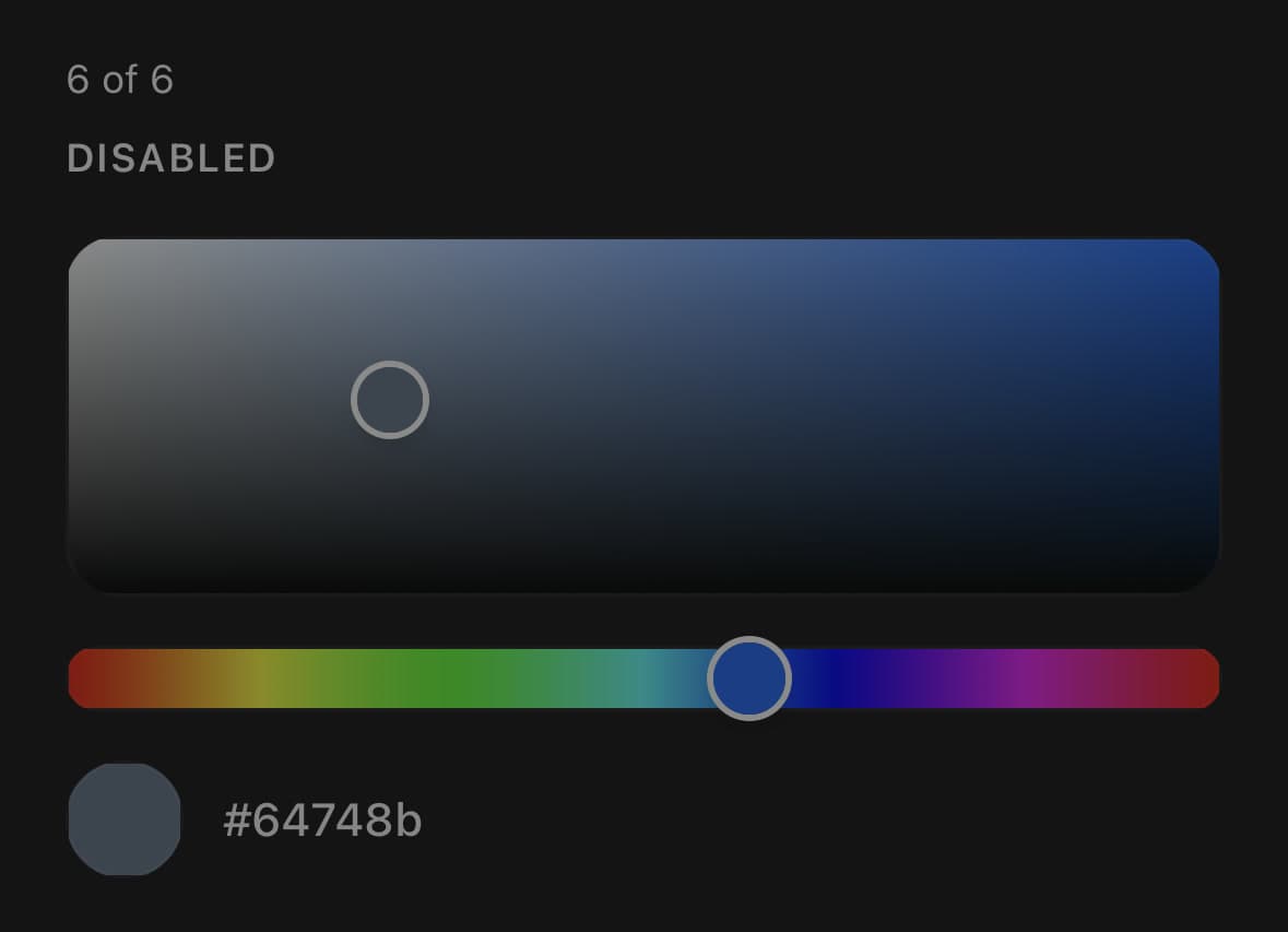
<ColorPicker defaultValue="#64748b" disabled>
  <ColorPicker.Area height={110} />
  <ColorPicker.Hue />
  <ColorPicker.Preview showValue />
</ColorPicker>
Versions
Accent card
Rows that read out a colour and open the picker over themselves when pressed.
<ColorPicker value={accent} onValueChange={setAccent} presentation="popover">
  <ColorPicker.Trigger>
    <ColorPicker.Field label="Accent" />
  </ColorPicker.Trigger>
  <ColorPicker.Content>
    <ColorPicker.Area height={220} />
    <ColorPicker.Channel channel="hue" />
    <ColorPicker.Hue />
  </ColorPicker.Content>
</ColorPicker>
In a sheet
The same folded-away picker, brought up from the bottom edge.
<ColorPicker value={color} onValueChange={setColor} presentation="bottom-sheet">
  <ColorPicker.Trigger>
    <ColorPicker.Field label="Highlight" />
  </ColorPicker.Trigger>
  <ColorPicker.Content>
    <ColorPicker.Area height={240} />
    <ColorPicker.Channel channel="hue" />
    <ColorPicker.Hue />
    <ColorPicker.Channel channel="alpha" />
    <ColorPicker.Alpha />
  </ColorPicker.Content>
</ColorPicker>
Inline panel
A labelled strip over the square, and a readout naming the track under it.
<ColorPicker value={color} onValueChange={setColor}>
  <ColorPicker.Field label="Accent" />
  <Surface variant="secondary" padding="sm" className="gap-3 rounded-2xl">
    <ColorPicker.Area height={280} />
    <ColorPicker.Channel channel="hue" />
    <ColorPicker.Hue />
  </Surface>
</ColorPicker>
Wheel
Hue around and saturation out, with brightness on a track of its own — folded away behind a row, the way the square is. The disc is a way of picking a colour rather than a different kind of control that has to live in the page.
<ColorPicker value={color} onValueChange={setColor} presentation="popover">
  <ColorPicker.Trigger>
    <ColorPicker.Field label="Brand" />
  </ColorPicker.Trigger>
  <ColorPicker.Content>
    <ColorPicker.Wheel />
    <ColorPicker.Channel channel="brightness" />
    <ColorPicker.Brightness />
    <ColorPicker.Channel channel="alpha" />
    <ColorPicker.Alpha />
  </ColorPicker.Content>
</ColorPicker>
Variants
size
smmd(default)lg
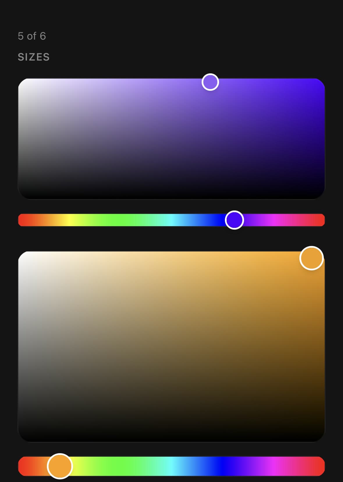
<ColorPicker size="sm" defaultValue="#8b5cf6">…</ColorPicker>
<ColorPicker size="md" defaultValue="#8b5cf6">…</ColorPicker>
<ColorPicker size="lg" defaultValue="#8b5cf6">…</ColorPicker>
API Reference
ColorPicker
| Prop | Type | Default | Description |
|---|---|---|---|
className | string | — | |
value | string | — | Controlled colour. Leave unset and pass defaultValue to run uncontrolled. |
defaultValue | string | '#ff0000' | Starting colour when uncontrolled. |
onValueChange | (color: string) => void | — | Fires on every frame of a drag — cheap updates only. The string is written in format. |
onValueCommit | (color: string) => void | — | Fires once when a drag ends. The place for expensive side effects. |
format | ColorFormat | 'hex' | How the colour is written on the way out. hex gains an #rrggbbaa alpha pair, and the other two switch to their a forms, only when the colour is actually translucent. |
disabled | boolean | false | |
haptics | boolean | false | A tick when a drag ends and when a preset is picked. Off by default — needs the optional expo-haptics, and is silent without it. There is no tick during a drag: a colour has no steps to cross, so a tick could only be a buzz proportional to speed. |
presentation | ColorPickerPresentation | 'inline' | How the controls get onto the screen. inline stacks them where they are written, and is the default. The other two put them behind a ColorPicker.Trigger and draw them in a ColorPicker.Content — which is the arrangement a colour usually wants, since a picker is a page's worth of controls in service of one value that is looked at far more often than it is changed. |
open | boolean | — | Controlled open state of the panel. Ignored by inline. |
onOpenChange | (open: boolean) => void | — |
ColorPicker.Area
| Prop | Type | Default | Description |
|---|---|---|---|
className | string | — | |
height | number | — | Height of the square in points. Defaults to the picker's size. |
thumbClassName | string | — | Extra classes for the draggable thumb. |
ColorPicker.Hue
| Prop | Type | Default | Description |
|---|---|---|---|
className | string | — | |
thumbClassName | string | — | Extra classes for the draggable thumb. |
ColorPicker.Alpha
| Prop | Type | Default | Description |
|---|---|---|---|
className | string | — | |
thumbClassName | string | — | Extra classes for the draggable thumb. |
ColorPicker.Preview
| Prop | Type | Default | Description |
|---|---|---|---|
className | string | — | |
showValue | boolean | — | Print the colour beside the swatch, in the picker's format. The string is built on the UI thread and only crosses to JavaScript when it differs from the last one, so a drag that is not changing the rounded value costs nothing. |
swatchClassName | string | — | Extra classes for the swatch. |
valueClassName | string | — | Extra classes for the printed value. |
ColorPicker.Swatches
| Prop | Type | Default | Description |
|---|---|---|---|
className | string | — | |
colors | string[] | — | The presets, in any format ColorPicker can read. |
swatchSize | number | — | Diameter of one swatch in points. Defaults to the picker's size. |
swatchClassName | string | — | Extra classes for one swatch. |
ColorPicker.Field
| Prop | Type | Default | Description |
|---|---|---|---|
className | string | — | |
label | string | — | What the colour is for — "Accent", "Background", a layer name. |
showValue | boolean | — | Print the current colour beside the swatch, in the picker's format. On by default: the strip exists to say what the colour is, and a swatch alone cannot be read out, copied down or typed into a design tool. |
swatchClassName | string | — | Extra classes for the swatch. |
onPress | (...args: unknown[]) => void | — | Makes the strip pressable, and a button to a screen reader. Mostly you do not pass this yourself: ColorPicker.Trigger clones the strip with one, which is what turns the row into the thing that opens the picker. |
ColorPicker.Channel
| Prop | Type | Default | Description |
|---|---|---|---|
className | string | — | |
channel | ColorPickerChannel | — | Which channel to read. |
label | string | — | Overrides the channel's own name. |
format | (value: number) => string | 'hex' | Writes the number yourself. Receives degrees for hue and a percentage for the other three, both already rounded. |
ColorPicker.Brightness
| Prop | Type | Default | Description |
|---|---|---|---|
className | string | — | |
thumbClassName | string | — | Extra classes for the draggable thumb. |
ColorPicker.Wheel
| Prop | Type | Default | Description |
|---|---|---|---|
className | string | — | |
size | number | md | Diameter in points. Defaults to the picker's size. |
thumbClassName | string | — | Extra classes for the draggable thumb. |
Every part also accepts the underlying React Native props (ViewProps or TextProps) and a className for Tailwind utilities.
Notes
Runs controlled (value + onValueChange) or uncontrolled (defaultValue). Both read #rgb, #rgba, #rrggbb, #rrggbbaa, rgb(), rgba(), hsl() and hsla(); a string the picker cannot read leaves it on the colour it already has, rather than snapping to black.
ColorPicker.Preview's printed value is built on the UI thread and only crosses to JavaScript when it differs from the last one, so a drag that is not changing the rounded value costs nothing.
The square is adjustable to a screen reader in both axes: increment and decrement move saturation, and a Brighter / Darker pair moves brightness. Hue and opacity are adjustable on their own. Their spoken values update when a drag ends rather than during it — nobody is listening to the middle of a gesture, and a value that re-announced every frame would be a hundred announcements for one drag.
The conversion helpers the picker is built on are exported too — parseColor, formatColor, hsvToHex, hsvToRgb, rgbToHsv, hsvToHsl, hsvToCss and isValidColor. Every one is a worklet, so they can be called from an animated style as well as from ordinary code.
The wheel, and what it cannot carry
A square holds two channels because it has two axes. A wheel holds two as well — an angle and a radius — so swapping one for the other trades brightness for a shape, not for a third channel. ColorPicker.Brightness is the track that takes it back; a wheel without one can only pick colours at full brightness.
The wheel is deliberately not mirrored under RTL, unlike the square and the tracks. Those have a start and an end, so they have a direction to be read in. A wheel has neither: reversing which way round the spectrum runs would move every colour somewhere else without making any of them easier to find.
There is no conic gradient to draw a hue ring with, so it is approximated by 120 solid wedges given a hair of overlap — three degrees each is under a pixel of colour step at any size this is drawn at, and the overlap stops the seams reading as lighter spokes. The ring is built once at module scope: it is the same wheel in every picker.
Public exports
Values: ColorPicker
Types: ColorPickerProps, ColorPickerTriggerProps, ColorPickerContentProps, ColorPickerFieldProps, ColorPickerAreaProps, ColorPickerWheelProps, ColorPickerChannelProps, ColorPickerChannel, ColorPickerHueProps, ColorPickerBrightnessProps, ColorPickerAlphaProps, ColorPickerPreviewProps, ColorPickerSwatchesProps, ColorPickerSize, ColorPickerPresentation