

ThemeSelector
Light, dark or the device's setting, drawn as three miniature screens.
Three miniatures of a screen — light, dark, and the device's own setting — with the chosen one ringed.
A row of words takes a third of the space and says the same thing, so this is not the cheaper control. What it buys is System, which is the option people hesitate over: a picture of a screen split down the middle explains it faster than a sentence does, and faster than trying it does.
It reads the live theme rather than keeping its own copy of the answer, so changing the theme anywhere else in the app moves the ring.
For a brand picker — Panel, Moon, Grass — use useTheme with swatches of your own. This chooses the mode, not the family.
Installation
ThemeSelector ships with the library — no separate install.
import { ThemeSelector, Field, Text, useThemeSelection } from 'panelui-native';
import { View } from 'react-native';
Or copy the source into your project, to own and edit it:
npx panelui-cli@latest add theme-selectorUsage
<ThemeSelector label="Choose a theme" />Composition
<ThemeSelector>
  <ThemeSelector.Option value="system" />
  <ThemeSelector.Option value="light" />
  <ThemeSelector.Option value="dark" />
</ThemeSelector>
Written without children the selector draws system, light and dark in that order, which is the whole component — most uses need no parts at all. Write them out to reorder them, drop one, or rename it: <ThemeSelector.Option value="system" label="Automatic" />.
Examples
Three options and a heading
No children and no value: the selector draws all three and reads the theme the app is actually on.
<ThemeSelector label="Choose a theme" />The other drawing
variant="card" draws a framed card with an accent on it instead of an app screen, and cuts the system option on the diagonal rather than down the middle. Same three choices; pick whichever miniature looks more like the app it is sitting in.
<ThemeSelector variant="card" label="Appearance" />Smaller
size="sm" narrows the miniatures from 88 points to 72, for a settings screen where the theme is one row among several rather than what the screen is for.
<ThemeSelector size="sm" variant="card" />Light and dark only
Write the options out to drop one. Worth doing where following the device would be misleading — a reader whose device is set to dark and whose app is pinned to light should not be offered a System that changes both.
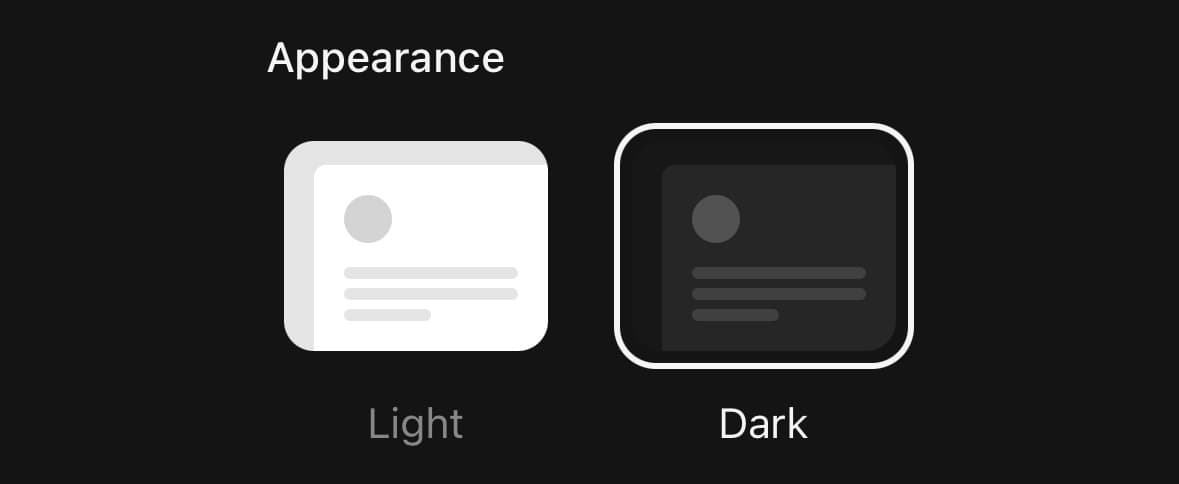
<ThemeSelector label="Appearance">
  <ThemeSelector.Option value="light" />
  <ThemeSelector.Option value="dark" />
</ThemeSelector>
Storing the choice
applyTheme={false} stops the selector changing the theme, so the app can save the choice and apply it on the next launch as well as this one. value is then what decides which option is ringed.
const [choice, setChoice] = useState<ThemeSelection>('system');

<ThemeSelector
  value={choice}
  applyTheme={false}
  onValueChange={(next) => {
    setChoice(next);
    save(next);
    apply(next);
  }}
/>
Somewhere else in the app
useThemeSelection is the same reading the selector does, for a settings row that reports the choice without offering it.
const theme = useThemeSelection();

<Field label="Appearance">
  <Text muted>{theme === 'system' ? 'Follows your device' : theme}</Text>
</Field>
API Reference
ThemeSelector
| Prop | Type | Default | Description |
|---|---|---|---|
className | string | — | |
value | ThemeSelection | — | Show this as chosen instead of whatever the app is actually on. For a settings screen that stages a choice before applying it; left unset, the selector reads the live theme. |
onValueChange | (value: ThemeSelection) => void | — | Fires with the option pressed, before the theme changes. |
applyTheme | boolean | true | Apply the choice. On by default — a theme selector that does not select a theme is a radio group. Turn it off to store the choice and apply it yourself, which is what an app that persists the preference wants. |
label | string | — | The heading above the row. Left out, there is none. |
variant | ThemePreviewVariant | 'window' | Which miniature is drawn. window is an app screen with a panel on it; card is a framed card with an accent, cut on the diagonal for system. |
size | ThemeSelectorSize | 'md' | How wide the miniatures are drawn. sm for a settings row that has other things on it; md when choosing the theme is what the screen is for. |
disabled | boolean | false | Stop the row being pressed, and dim it to say so. |
ThemeSelector.Option
| Prop | Type | Default | Description |
|---|---|---|---|
className | string | — | |
value | ThemeSelection | — | Which of the three this option chooses. |
label | string | — | What it is called under the miniature. Defaults to System, Light or Dark. |
Every part also accepts the underlying React Native props (ViewProps or TextProps) and a className for Tailwind utilities.
Notes
The miniatures are not made of your theme
They are drawn from fixed greys, which is the one decision here worth writing down. A preview built from the active theme's tokens shows the reader the theme they already have, three times over — the light option has to look light while the app around it is dark, or it is not a preview of anything. The ring and the labels do use tokens, because those belong to the app rather than to what is being previewed.
Light and dark stay inside the family
A reader on moon who picks Light gets moon, not the default light theme. The selector changes the mode and leaves the family alone.
System is the exception, and cannot be otherwise. Following the device means following what the device knows, and the device knows light and dark — so choosing it from a named family leaves that family behind. Where that matters, leave System out of the row.
It reads the theme rather than remembering it
There is already one answer to which theme the app is on, so the selector asks for it instead of keeping a copy that can drift. That is also what makes System reportable at all: the moment it is applied it resolves to light or dark, and the resulting theme name is indistinguishable from the same one chosen by hand. What separates them is whether the theme is still following the device, which is what useThemeSelection reads.
Accessibility
The row announces as a radio group and each option as a radio, so the whole control is one stop with three values rather than three separate buttons. The miniatures are decorative and are not announced — the word under each one is the option's name, and it is inside the target, because at this size it is the easier half to hit.
Public exports
Values: ThemeSelector, useThemeSelection
Types: ThemeSelectorProps, ThemeSelectorOptionProps, ThemeSelection, ThemeSelectorSize, ThemePreviewVariant