

Panelside
Navigation panel that moves the app aside instead of covering it.
A navigation panel that moves the app aside instead of covering it.
A button in the corner, and the screen slides across, shrinks, rounds its corners and dims — revealing a panel of destinations and history that was behind it all along. The app never disappears, so going back is a tap on the thing you were just looking at.
It is not a Drawer with different styling. A drawer mounts through a portal, which puts it above the app by construction and leaves the app content elsewhere in the tree, unreachable — there is nothing to push. Panelside renders inline and owns both halves, which is why the part of your app that moves has to be named.
Installation
Panelside ships with the library — no separate install.
import { Panelside, AIInput, Avatar, BottomSheet, Button, Menu, MenuIcon, MicIcon, PackageIcon, PencilIcon, PlusIcon, ShareNodesIcon, StarIcon, TrashIcon, usePanelside, Popover, SearchBar, Item } from 'panelui-native';
import { View, Pressable } from 'react-native';
Or copy the source into your project, to own and edit it:
npx panelui-cli@latest add panelsideUsage
<Panelside>
  <Panelside.Panel>
    <Panelside.Header
      title="Assistant"
      action={<Panelside.SearchTrigger onPress={openSearch} />}
    />

    <Panelside.Content>
      <Panelside.Group>
        <Panelside.GroupLabel>Recents</Panelside.GroupLabel>
        <Panelside.Item label="Migrating the design tokens" />
      </Panelside.Group>
    </Panelside.Content>

    <Panelside.Footer>
      <Panelside.Cta label="New chat" onPress={compose} />
    </Panelside.Footer>
  </Panelside.Panel>

  <Panelside.Scene>
    <Panelside.Trigger />
    <Conversation />
  </Panelside.Scene>

</Panelside>
Composition
<Panelside>
  <Panelside.Panel>
    <Panelside.Header action={<Panelside.SearchTrigger />} />
    <Panelside.Content>
      <Panelside.Group>
        <Panelside.GroupLabel>…</Panelside.GroupLabel>
        <Panelside.Item>
          <Panelside.ItemIcon>…</Panelside.ItemIcon>
          <Panelside.ItemLabel>…</Panelside.ItemLabel>
          <Panelside.ItemBadge>…</Panelside.ItemBadge>
          <Panelside.ItemActions>…</Panelside.ItemActions>
        </Panelside.Item>
      </Panelside.Group>
    </Panelside.Content>
    <Panelside.Footer>
      <Panelside.Cta />
    </Panelside.Footer>
  </Panelside.Panel>

  <Panelside.Scene>
    <Panelside.Trigger />
    <Panelside.Pages>
      <Panelside.Page />
    </Panelside.Pages>
  </Panelside.Scene>

</Panelside>
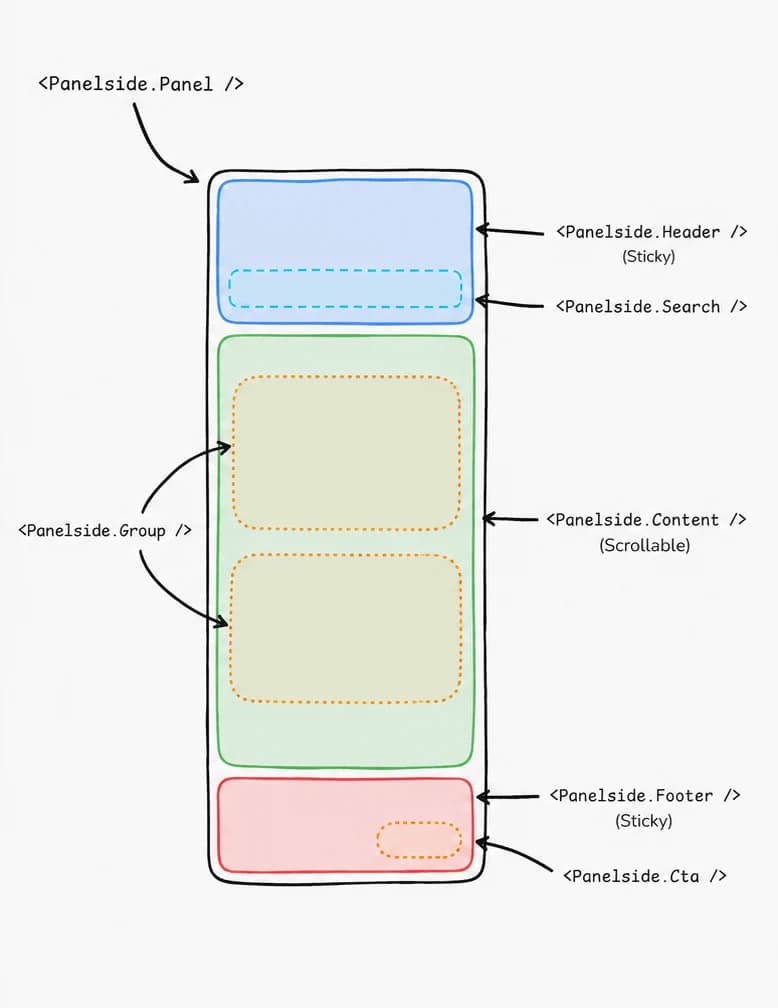
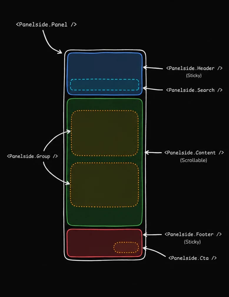
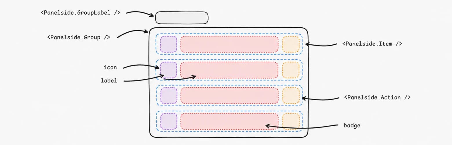
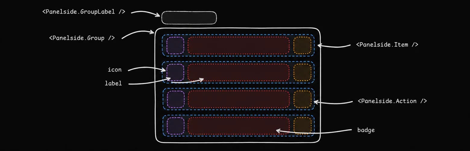
A row can be filled two ways, and they are the same row. icon, label and badge are the shorthand for the row every navigation panel has; Panelside.ItemIcon, Panelside.ItemLabel and Panelside.ItemBadge are the same three slots written out, for a row that needs a different order, a label that is not a string, or something in a slot the prop cannot take.
They compose rather than exclude each other — a row can take its label from label and still write a trailing Panelside.Action as a child.
Examples
Destinations and history
Two groups, because they are two different things. The first is where you can go and never changes; the second is what you have done and changes every session — so only the second carries a label, and only its rows carry an action.
<Panelside.Content>
  <Panelside.Group>
    <Panelside.Item icon={<MessageCircleIcon size={20} />} label="Chats" active />
    <Panelside.Item icon={<PackageIcon size={20} />} label="Projects" badge={4} />
  </Panelside.Group>

  <Panelside.Group>
    <Panelside.GroupLabel>Recents</Panelside.GroupLabel>
    {recents.map((chat) => (
      <Panelside.Item key={chat.id} label={chat.title} onPress={() => open(chat.id)}>
        <Panelside.Action label={`Options for ${chat.title}`} onPress={() => menu(chat.id)} />
      </Panelside.Item>
    ))}
  </Panelside.Group>
</Panelside.Content>
Search, as a page rather than a panel
A field in the header is the obvious way to put search in a navigation panel, and it is the wrong one on a phone. The panel is most of the screen and the field is forty points of it, so a search that returns anything has to push the history down a screen it already fills.
So the button is in the header and what it opens is a page. Searching your chats is somewhere you go and stay for a while, and a surface over the screen you came from spends that time covering the thing it is a list of.
Panelside.SearchTrigger draws the button and reports the press. Where search lives is a decision about the app — a scene of your own, a Panelside.Page, a screen pushed onto the router's stack — so the component does not answer it for you. Give the page a way back: SearchBar with cancel="always" draws the field and the Cancel beside it, and calls onCancel once the field has emptied and dropped focus.
const [searching, setSearching] = useState(false);

return (
  <Panelside>
    <Panelside.Panel>
      <Panelside.Header
        title="Assistant"
        action={
          <Panelside.SearchTrigger
            onPress={() => {
              setSearching(true);
              setOpen(false);
            }}
          />
        }
      />
      <Panelside.Content>{history}</Panelside.Content>
    </Panelside.Panel>

    <Panelside.Scene>
      {searching ? (
        <View className="flex-1">
          <View className="px-4 pb-2.5">
            <SearchBar
              shape="pill"
              variant="filled"
              value={query}
              onChangeText={setQuery}
              onCancel={() => setSearching(false)}
              placeholder="Search chats, images, files"
              cancel="always"
              autoFocus
            />
          </View>
          {results}
        </View>
      ) : (
        app
      )}
    </Panelside.Scene>
  </Panelside>
);
Settings from the account avatar
The footer's trailing slot is the account, and pressing it opens a full-height sheet. Full height because it is a settings screen rather than a confirmation: the rows go past the fold, and a sheet that stops halfway is one you have to drag before you can read it.
Under native pass nativeBackground with it. A settings list is a column of rows on a surface, and the platform's translucent material with a moving screen behind it makes every one of those rows harder to read for nothing.
Leave the sheet's top padding alone. The platform draws its grabber inside the sheet, over the first 24 to 28 points of whatever is hosted in it, and the sheet's own padding is what stands clear of it — a header row put in at the top with that padding stripped arrives with its top third behind the grabber.
const [account, setAccount] = useState(false);

<Panelside.Footer>
  <Panelside.Cta icon={<PlusIcon size={18} />} label="New chat" />
  <View className="flex-1" />
  <Pressable accessibilityRole="button" accessibilityLabel="Account" onPress={() => setAccount(true)}>
    <Avatar size="md" fallback="K" />
  </Pressable>
</Panelside.Footer>

<BottomSheet open={account} onOpenChange={setAccount} native nativeBackground snapPoints={['full']}>
  <BottomSheet.Content size="full" showClose={false}>
    …
  </BottomSheet.Content>
</BottomSheet>
Pages, and rows that go to them
A navigation panel is usually wired the same way at every call site: a piece of state for what is open, an active computed against it on every row, an onPress that sets it, and a close after.
The panel holds the route instead. A row takes a to, and from that one prop it marks itself as the current destination, sets the route and closes the panel. Panelside.Pages shows the Panelside.Page whose value matches.
A page is mounted the first time it is visited and stays mounted after that, hidden rather than removed — so returning to one is a style change rather than a mount, with its list intact and its scroll position where you left it. Pass keepAlive={false} on a page whose contents go stale.
route and onRouteChange make it controlled, for a route that comes from somewhere else. usePanelside() gives you route and navigate for a control of your own.
<Panelside defaultRoute="inbox">
  <Panelside.Panel>
    <Panelside.Content>
      <Panelside.Group>
        <Panelside.Item icon={<MessageCircleIcon size={20} />} label="Inbox" to="inbox" />
        <Panelside.Item icon={<PencilIcon size={20} />} label="Drafts" to="drafts" />
      </Panelside.Group>

      <Panelside.Group>
        <Panelside.GroupLabel>Recents</Panelside.GroupLabel>
        {chats.map((chat) => (
          <Panelside.Item key={chat.id} label={chat.title} to={`chat/${chat.id}`} />
        ))}
      </Panelside.Group>
    </Panelside.Content>
  </Panelside.Panel>

  <Panelside.Scene>
    <Panelside.Pages>
      <Panelside.Page value="inbox"><Inbox /></Panelside.Page>
      <Panelside.Page value="drafts"><Drafts /></Panelside.Page>
      {chats.map((chat) => (
        <Panelside.Page key={chat.id} value={`chat/${chat.id}`}>
          <Conversation id={chat.id} />
        </Panelside.Page>
      ))}
    </Panelside.Pages>
  </Panelside.Scene>
</Panelside>
Actions on a row
Panelside.ItemActions is the overflow button with a menu on it. Give it Menu.Item rows and it draws the button, opens the panel and dismisses it.
The menu is anchored to the button rather than presented from the bottom of the screen. The panel is a fraction of the screen wide, so an anchored menu lines up with the row it belongs to and leaves the list readable behind it, where a sheet covering both to offer four verbs costs more than it says. placement and align move it.
Pressing the button does not press the row, so a row that navigates stays where it is.
<Panelside.Item label={chat.title} to={`chat/${chat.id}`}>
  <Panelside.ItemActions label={`Options for ${chat.title}`}>
    <Menu.Item icon={<PencilIcon size={17} />} onSelect={() => rename(chat)}>Rename</Menu.Item>
    <Menu.Item icon={<StarIcon size={17} />} onSelect={() => star(chat)}>Star</Menu.Item>
    <Menu.Separator />
    <Menu.Item
      variant="destructive"
      icon={<TrashIcon size={17} />}
      onSelect={() => remove(chat)}
    >
      Delete
    </Menu.Item>
  </Panelside.ItemActions>
</Panelside.Item>
A trigger of your own
Given a child, Panelside.Trigger chains the toggle onto that element's own onPress rather than replacing it. A control sitting on the app's bare surface needs a shape to be findable, which is why this is usually a Button rather than an icon on its own. outline rather than a filled variant: the trigger sits on the app's own surface with nothing around it, so it needs a shape to be findable — and a second filled surface on a screen that already has the panel's is one too many.
<Panelside.Scene>
  <View className="flex-row items-center gap-2 px-3 pt-3">
    <Panelside.Trigger>
      <Button size="icon" variant="outline" className="rounded-full">
        <MenuIcon size={20} />
      </Button>
    </Panelside.Trigger>
    <Text size="lg" weight="semibold" className="flex-1">
      Migrating the design tokens
    </Text>
  </View>

  <Conversation />
</Panelside.Scene>
Moving something with the panel
usePanelside hands back progress as a shared value, so a header of your own can travel with the panel on the UI thread instead of re-rendering once a frame. It reads 0 closed and 1 open, and every value in between during a drag.
function SceneTitle() {
  const { progress, toggle } = usePanelside();

  const style = useAnimatedStyle(() => ({
    opacity: 1 - progress.value,
    transform: [{ translateY: progress.value * -8 }],
  }));

  return (
    <Animated.View style={style}>
      <Text size="lg" weight="semibold">Migrating the design tokens</Text>
    </Animated.View>
  );
}
A sidebar on a tablet
Past dock, the panel stops being an overlay: it takes a column of the layout, stays open, drops the gesture, narrows to a third of the container, and Panelside.Trigger renders nothing. The number is yours on purpose — set it high enough that what is left over is still a screen. Around 700 is the first width where both halves have room.
<Panelside dock={700}>
  <Panelside.Panel>{/* … */}</Panelside.Panel>
  <Panelside.Scene>
    {/* The trigger disappears on its own above 700pt. */}
    <Panelside.Trigger />
    <Conversation />
  </Panelside.Scene>
</Panelside>
Sizing and tinting it
The panel is meant to be changed. scale, radius and dim set the curve for every scene under the root, so the three numbers live where the panel is configured rather than on a part further down — a Panelside.Scene prop still wins where one screen wants something of its own. scrimClassName is for the colour of the dim, which black at 45% gets wrong in a light theme, where it reads as a hole rather than as shade.
Panelside.Cta and Panelside.Item take a size. The pill is 40pt by default so it sits level with the account button beside it; size="lg" is the 48pt one, for a footer where the call to action is the only thing in the row. Panelside.Item has size="sm" for a panel that has to show more history at once — it tightens the padding and leaves the type alone, because a list you can read is worth more than two extra rows.
<Panelside haptics scale={0.92} radius={32} dim={0.55}>
  <Panelside.Panel>
    <Panelside.Content>
      {history.map((chat) => (
        <Panelside.Item key={chat} label={chat} size="sm" />
      ))}
    </Panelside.Content>
    <Panelside.Footer>
      <Panelside.Item className="flex-1" icon={<Avatar size="md" fallback="K" />} />
      <Panelside.Cta icon={<PlusIcon size={18} />} label="New chat" />
    </Panelside.Footer>
  </Panelside.Panel>

  <Panelside.Scene scrimClassName="bg-neutral-900">
    <App />
  </Panelside.Scene>
</Panelside>
A row the props cannot describe
icon, label and badge cover the row a navigation panel is made of, and most rows should use them. Write the parts out when the row needs something the props have no argument for — a different order, a label that is not a string, two things in the trailing slot.
The two forms compose: a row can take its label from the prop and still write a Panelside.Action as a child.
<Panelside.Item active={thread.id === current} onPress={() => open(thread)}>
  <Panelside.ItemIcon>
    <Avatar size="xs" fallback={thread.initials} />
  </Panelside.ItemIcon>
  <Panelside.ItemLabel>{thread.title}</Panelside.ItemLabel>
  <Panelside.ItemBadge>
    <View className="h-2 w-2 rounded-full bg-primary" />
  </Panelside.ItemBadge>
  <Panelside.Action label={`Options for ${thread.title}`} onPress={() => rename(thread)} />
</Panelside.Item>
Versions
Assistant
The default shape. Swipe in from the leading edge and the screen slides, shrinks and rounds in step with your finger; release under 60 points and it springs back.
<Panelside>
  <AssistantPanel />
  <Panelside.Scene>
    <SceneBar />
    <Transcript />
  </Panelside.Scene>
</Panelside>
Open a conversation
The panel used as navigation rather than as a display. A row is a to and nothing else: pressing it sets the route, marks itself as the current destination and closes the panel — leaving it open would put the thing you just navigated to behind the thing you navigated from.
Each conversation is a Panelside.Page. The first press mounts one and it stays mounted after that, so going back to a conversation you have already read does not rebuild it.
const [route, setRoute] = useState(chats[0]);

<Panelside haptics route={route} onRouteChange={setRoute}>
  <Panelside.Panel>
    <Panelside.Content>
      {chats.map((chat) => (
        <Panelside.Item key={chat} label={chat} to={chat} />
      ))}
    </Panelside.Content>
  </Panelside.Panel>

  <Panelside.Scene>
    <Panelside.Pages>
      {chats.map((chat) => (
        <Panelside.Page key={chat} value={chat}>
          <Conversation title={chat} />
        </Panelside.Page>
      ))}
    </Panelside.Pages>
  </Panelside.Scene>
</Panelside>
Row actions
Every conversation carries a “…”. The menu behind it renames, stars, shares or deletes the row it belongs to, and the list changes underneath — anchored to the button, so it lines up with the row and the history stays readable behind it.
<Panelside.Item label={chat} active={chat === active} onPress={() => setActive(chat)}>
  <Panelside.ItemActions>
    <Menu.Item icon={<PencilIcon size={17} />} onSelect={() => rename(chat)}>Rename</Menu.Item>
    <Menu.Item icon={<StarIcon size={17} />} onSelect={() => star(chat)}>Star</Menu.Item>
    <Menu.Item icon={<ShareNodesIcon size={17} />}>Share</Menu.Item>
    <Menu.Separator />
    <Menu.Item
      variant="destructive"
      icon={<TrashIcon size={17} />}
      onSelect={() => remove(chat)}
    >
      Delete
    </Menu.Item>
  </Panelside.ItemActions>
</Panelside.Item>
Overlay
The same panel, sliding over a screen that stays exactly where it is — for a scene whose content cannot afford to move.
<Panelside mode="overlay">
  <AssistantPanel />
  <Panelside.Scene>
    <SceneBar />
    <Transcript />
  </Panelside.Scene>
</Panelside>
Docked
Past the width you name, the panel is a column of the layout rather than a thing you open: the trigger removes itself, the gesture goes, and the panel narrows to a third of the container — docked, every point it takes is a point the app does not get back.
<Panelside dock={700}>
  <AssistantPanel />
  <Panelside.Scene>
    <SceneBar />
    <Transcript />
  </Panelside.Scene>
</Panelside>
Deeper curve
Scale, radius and dim turned well past their defaults. scale is the one that changes the shape of the thing rather than its finish: below one the screen stops being full height and lifts away from the status bar, which is a different look and not the default for good reason.
<Panelside>
  <AssistantPanel />
  <Panelside.Scene scale={0.72} radius={44} dim={0.7}>
    <SceneBar />
    <Transcript />
  </Panelside.Scene>
</Panelside>
Full chat
A streaming transcript in the scene, anchored and scrolling on its own while the panel holds the history it came from.
<Panelside>
  <AssistantPanel />
  <Panelside.Scene>
    <SceneBar />
    <MessageScroller autoScroll className="flex-1">
      <MessageScroller.Viewport>
        <MessageScroller.Content>
          {turns.map((turn) => (
            <MessageScroller.Item
              key={turn.id}
              messageId={turn.id}
              scrollAnchor={turn.role === 'user'}
            >
              <Turn turn={turn} />
            </MessageScroller.Item>
          ))}
        </MessageScroller.Content>
      </MessageScroller.Viewport>
      <MessageScroller.Button />
    </MessageScroller>
  </Panelside.Scene>
</Panelside>
Native chat
Panelside has no native prop and cannot have one — the platform toolkits ship a switch, a picker, a sheet and a button, and none of them is a pushing navigation panel. What goes native is what is inside it: the panel's compose and account buttons, the search button, the account sheet and the attachment sheet.
The composer is AIInput under native, which hands its own controls to the platform the same way the buttons beside it are handed over. It is written the way the composer's own chat version is written, keyboard numbers included: the composer owns lifting itself, and is told how far it already sits above the bottom so it does not travel that distance twice.
The search page stays ours end to end, and that is a decision rather than an omission. Its field, its filter chips and its grouped rows have no platform equivalent that takes a leading tile, a marked-up title and a trailing meta line and still follows the theme — and a page whose every row is half-platform reads as two designs.
The account sheet is the platform's, painted solid with nativeBackground, and on iOS its rows are the platform's too — a SwiftUI list with SF Symbols, and nothing of ours hosted inside it. A hosted view inside a native control needs a definite size above it on both axes, and a list whose row heights the platform decides cannot give it one. Android has no equivalent list here, so it keeps ours.
<Panelside>
  <Panelside.Panel>
    <Panelside.Header
      title="Assistant"
      action={<Panelside.SearchTrigger native glass onPress={openSearch} />}
    />
    <Panelside.Content>{history}</Panelside.Content>
    <Panelside.Footer>
      <Panelside.Cta label="New chat" size="xl" native glass />
      <View className="flex-1" />
      {/* A plain string, not an Avatar hosted inside the button. */}
      <Button
        native
        glass
        size="xl"
        variant="ghost"
        accessibilityLabel="Account"
        onPress={openSettings}
      >
        K
      </Button>
    </Panelside.Footer>
  </Panelside.Panel>

  <Panelside.Scene>
    <Transcript />

    <AIInput
      native
      value={draft}
      onValueChange={setDraft}
      onSubmit={send}
      keyboardBottomInset={Math.max(insets.bottom, 12)}
      keyboardGap={12}
    >
      <AIInput.Field placeholder="Message the assistant" />
      <AIInput.Toolbar>
        <AIInput.Action label="Attach" icon={<PlusIcon />} onPress={() => setAttaching(true)} />
        <AIInput.Spacer />
        <AIInput.Action label="Dictate" icon={<MicIcon />} />
        <AIInput.Submit />
      </AIInput.Toolbar>
    </AIInput>

    <BottomSheet native open={attaching} onOpenChange={setAttaching} snapPoints={['half']}>
      <BottomSheet.Content>{/* … */}</BottomSheet.Content>
    </BottomSheet>
  </Panelside.Scene>

  {/* The rows are ours; the sheet the platform's, painted solid. */}
  <BottomSheet open={account} onOpenChange={setAccount} native nativeBackground snapPoints={['full']}>
    <BottomSheet.Content size="full" showClose={false}>{/* … */}</BottomSheet.Content>
  </BottomSheet>
</Panelside>
API Reference
Panelside
| Prop | Type | Default | Description |
|---|---|---|---|
open | boolean | — | Open state, when you want to own it. Pair with onOpenChange. |
onOpenChange | (open: boolean) => void | — | Called with the next open state, whether a gesture or you caused it. |
defaultOpen | boolean | false | Open state to start at when you are not controlling it. |
mode | PanelsideMode | 'push' | How the two layers relate. push moves the scene aside and curves it, which is the point of this component. overlay slides the panel over a scene that stays put — the same navigation, for a screen whose content cannot afford to move. |
width | number | — | Panel width in points. Defaults to 80% of the container capped at 360, and to a third of it capped at 320 once docked — an overlay panel gives the width back when it closes and a docked one keeps it, so they are not the same measurement. The caps are what stop a tablet getting a navigation list with a field of whitespace beside it. |
dock | number | false | false | Container width at or above which the panel stops being an overlay and becomes a permanent sidebar: laid out beside the scene, always open, with the gesture and the trigger switched off. A docked panel also narrows to a third of the container, capped at 320 — docked, every point it takes is a point the app does not get back. Off by default, and deliberately not a guess — a large phone in landscape is wider than a small tablet in portrait, so no single number is right for every app. Set it high enough that what is left over is still a screen: around 700 is the first width where both halves have room. |
swipeEnabled | boolean | true | Swipe to open, and drag the scene to close. Default true. |
swipeFrom | PanelsideSwipeFrom | 'anywhere' | Where a swipe may begin. anywhere is the default and the behaviour this pattern is known for — a sideways drag across the app opens the panel from wherever your thumb already was. edge narrows it to a strip at the leading screen edge, for a scene that has its own use for a horizontal drag: a carousel, a wide table, a chart you can pan. Anything like that under an anywhere panel will fight it, and the panel usually wins. |
edgeWidth | number | 48 | How wide the leading-edge strip that starts a swipe is, when swipeFrom is edge. Default 48 — wider than the system's own edge gestures, because there is no bezel to feel for. Ignored otherwise. |
dismissible | boolean | true | Tapping the pushed scene, or the Android back button, closes the panel. Default true. |
haptics | boolean | false | A tick under the finger when a swipe commits to opening or closing. Off by default — needs the optional expo-haptics, and is silent without it. It fires on the commit rather than during the drag: the panel following your thumb is already the feedback for the drag, and a tick per frame is what makes a gesture feel broken rather than responsive. |
scale | number | — | How far the scene shrinks at full open, as a scale factor. Sets the default for every Panelside.Scene underneath; the scene's own prop still wins. Here so the three numbers that describe the curve can be set once where the panel is configured, rather than on a part further down. |
radius | number | — | The corner radius the scene reaches at full open, in points. |
dim | number | — | How far the scene is dimmed at full open, 0 to 1. |
route | string | — | Which page the scene is showing. Controlled; pair it with onRouteChange. A route is any string you choose. It is matched against Panelside.Page's value and against Panelside.Item's to, so a row marks itself as the current destination and the scene swaps to the page without either being wired to the other. |
defaultRoute | string | '' | Which page the scene starts on, when the panel is not controlling route. |
onRouteChange | (route: string) => void | — | Called with the route a row navigated to. |
className | string | — |
Panelside.Panel
| Prop | Type | Default | Description |
|---|---|---|---|
className | string | — |
Panelside.Header
| Prop | Type | Default | Description |
|---|---|---|---|
className | string | — | |
title | string | — | Rendered as the heading. Omit it and supply your own in children. |
action | ReactNode | — | A single element pinned to the trailing end of the title row. |
surface | PanelsideSurface | 'transparent' | What the header paints behind itself. transparent is the default and paints nothing, so the header is the panel's own surface with a title on it rather than a bar sitting on top of one. In the panel's normal stacking that is the whole story — the header takes a row and the list starts below it. fade and solid are for a header the caller has lifted out of that stack — className="absolute start-0 end-0 top-0" — so the list runs underneath it. They are the two shapes Panelside.Footer offers, drawn the other way up. |
Panelside.Search
| Prop | Type | Default | Description |
|---|---|---|---|
className | string | — | |
containerClassName | string | — |
Panelside.Content
| Prop | Type | Default | Description |
|---|---|---|---|
className | string | — | |
contentContainerClassName | string | — |
Panelside.Group
| Prop | Type | Default | Description |
|---|---|---|---|
className | string | — |
Panelside.GroupLabel
| Prop | Type | Default | Description |
|---|---|---|---|
className | string | — |
Panelside.Item
| Prop | Type | Default | Description |
|---|---|---|---|
className | string | — | |
icon | ReactNode | — | Leading element — an icon, an avatar, a coloured dot. The shorthand for Panelside.ItemIcon. |
label | string | — | The row's text, truncated to one line since chat titles run long. The shorthand for Panelside.ItemLabel. |
to | string | — | The page this row goes to — a Panelside.Page's value. Pressing it sets the panel's route, and the row marks itself active while that route is the current one. It also closes the panel, since the thing you just moved to would otherwise be behind the thing you moved from. active and onPress still win where they are passed, so a row can navigate and do something else as well. |
closeOnNavigate | boolean | true | Leave the panel open after navigating. Off by default. |
active | boolean | — | Marks the row as the current destination. Derived from to when given. |
badge | ReactNode | — | Trailing count or status. A number or string renders as a pill; anything else renders as given. The shorthand for Panelside.ItemBadge. |
disabled | boolean | false | |
size | PanelsideItemSize | 'default' | Row density. sm tightens the padding for a panel that has to show more history at once, without touching the type size — a list you can read is worth more than two extra rows. |
Panelside.ItemIcon
| Prop | Type | Default | Description |
|---|---|---|---|
className | string | — |
Panelside.ItemLabel
| Prop | Type | Default | Description |
|---|---|---|---|
className | string | — |
Panelside.ItemBadge
| Prop | Type | Default | Description |
|---|---|---|---|
className | string | — |
Panelside.Action
| Prop | Type | Default | Description |
|---|---|---|---|
className | string | — | |
label | string | 'More options' | What a screen reader announces. The default control is an unlabelled glyph, so this is the only description it has. |
Panelside.ItemActions
| Prop | Type | Default | Description |
|---|---|---|---|
className | string | — | |
label | string | 'More options' | What a screen reader announces for the button. The control is an unlabelled glyph, so this is the only description it has. |
icon | ReactNode | — | Replaces the default overflow glyph. |
placement | MenuContentProps['placement'] | 'bottom' | Where the panel opens relative to the button. Defaults to below it. |
align | MenuContentProps['align'] | 'end' | How it lines up on that edge. Defaults to the button's trailing edge. |
minWidth | number | 220 | Floor for the menu's width. A panel sized to its contents takes its width from whatever inside it is not flexible — in a row of a flexible label and a fixed glyph, that is the glyph, and the menu comes up as a column of icons with the words squeezed out of it. |
contentProps | Omit<MenuContentProps, 'children' | 'placement' | 'align' | 'minWidth'> | — | Passed through to the panel — width, maxHeight, offset and the rest. |
Panelside.Footer
| Prop | Type | Default | Description |
|---|---|---|---|
className | string | — | |
floating | boolean | true | Overlay the scrolling list instead of taking a row below it. Default true — the list runs the full height of the panel behind it, and Panelside.Content leaves exactly this footer's height of room at the end. |
surface | PanelsideSurface | 'transparent' | What the footer paints behind its controls. transparent is the default and paints nothing: the list runs under the controls, which is how the panel reads as one surface with two things floating on it rather than as a list with a bar bolted to the bottom. fade dissolves the list into the panel background over the strip above the controls. It costs a band of the panel, and buys a compose button that never has a chat title running through its label — worth turning on for a panel whose history is long enough that something is always underneath. solid is a band with a hairline over it, for a footer that is a row of the layout. Implied by floating={false}, which has no list to float over. |
Panelside.Cta
| Prop | Type | Default | Description |
|---|---|---|---|
className | string | — | |
label | string | — | The button's text. |
icon | ReactNode | — | Leading element, usually an icon. |
variant | 'primary' | 'secondary' | 'primary' | primary is the filled accent pill; secondary is the quiet one. |
size | PanelsideCtaSize | 'default' | How tall the pill is. default is 44pt — a step above the account button beside it, so the footer reads as one primary control and one secondary one. lg is 52pt, for a panel where the call to action is the only thing in the row, and xl is 56pt. Ignored under native — the platform sizes its own button, and asks for a control size rather than a height. The three steps reach the platform's regular, large and extra-large controls. |
native | boolean | false | Render the platform's own button instead of the pill. Requires the optional @expo/ui package; without it this prop does nothing. Theme tokens do not apply — the platform draws the button, so className and icon are ignored and it sizes itself to label. |
glass | boolean | false | Draw the native button in the platform's Liquid Glass material. Requires native, and iOS 26 or later; ignored anywhere else. |
Panelside.Scene
| Prop | Type | Default | Description |
|---|---|---|---|
className | string | — | |
scale | number | — | How small the scene gets at full travel. Default 1 — the screen keeps its full height and stays behind the status bar, and the radius and dim do the work. Below one it shrinks about its centre, which insets it top and bottom as well as at the side. Falls back to the same prop on the Panelside root, so the three numbers that describe the curve can be set once where the panel is configured. |
radius | number | — | The corner radius the scene reaches at full travel. Default 44. |
dim | number | — | How far the scene dims at full travel, 0 to 1. Default 0.45. |
scrimClassName | string | — | Styles the layer that dims the scene. Its opacity is dim's to set, so this is for the colour — a scrim that is not black, for a light theme where black at 45% reads as a hole rather than as shade. |
Panelside.Pages
| Prop | Type | Default | Description |
|---|---|---|---|
className | string | — |
Panelside.Page
| Prop | Type | Default | Description |
|---|---|---|---|
className | string | — | |
value | string | — | What a row's to has to equal for this page to be the one shown. |
keepAlive | boolean | — | Keep the page mounted once it has been visited. Default true, which is what makes going back to it instant. Off, it is torn down on the way out and rebuilt on the way in. |
hidden | boolean | false | Set by Panelside.Pages. A hidden page is laid out by nobody, is not in the accessibility tree, and takes no touches — but it is still mounted, which is the whole point of it. |
Panelside.Trigger
| Prop | Type | Default | Description |
|---|---|---|---|
className | string | — | |
label | string | 'Open navigation panel' | What a screen reader announces. |
Panelside.SearchTrigger
| Prop | Type | Default | Description |
|---|---|---|---|
className | string | — | |
label | string | 'Search' | What a screen reader announces. |
variant | PanelsideControlVariant | 'filled' | filled is the default: a circle in the secondary surface, which is what a control sitting alone on the panel's own surface needs to read as one. outline is a ring and no fill, for a panel whose other controls are outlined too — a filled circle among them is the only thing on the screen claiming to be a second primary. Ignored under native, where the platform owns the button's chrome. |
native | boolean | false | Render the platform's own button instead of the circle. Requires the optional @expo/ui package; without it this prop does nothing. |
glass | boolean | false | Draw the native button in the platform's Liquid Glass material. Requires native, and iOS 26 or later; ignored anywhere else. |
Every part also accepts the underlying React Native props (ViewProps or TextProps) and a className for Tailwind utilities.
Notes
How far everything travels
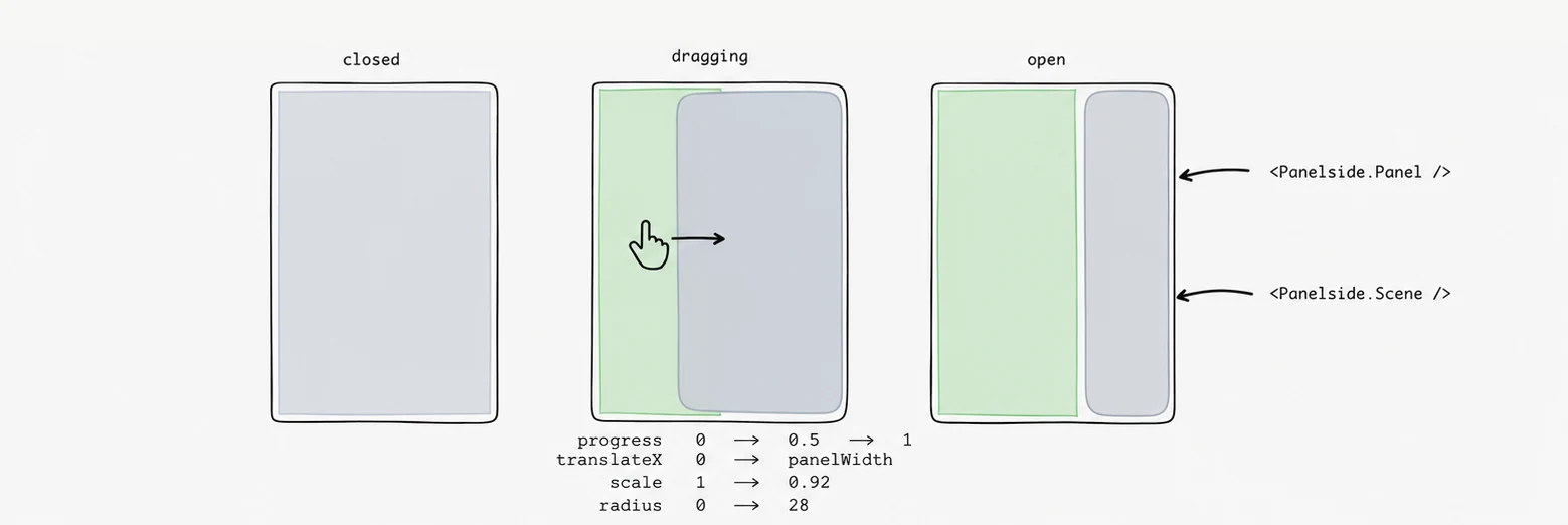
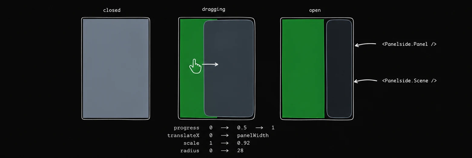
One shared value drives both layers, so a half-finished drag is a real halfway state rather than a blend of two snapshots. At progress p, with panel width W and container width C:
scale      = 1 - (1 - scale) * p
translateX = p * (W + 12) - C * (1 - scale) / 2
radius     = p * radius
scale defaults to 1, so by default the middle term falls away and the scene simply travels. That is deliberate: a scale is applied about the centre, so anything below one insets the screen at the top and the bottom as well as at the side — it lifts away from the status bar and the home indicator, and the strips of panel that appear above and below it are strips of nothing. Full height, with the corner radius and the dim carrying the effect, is what this pattern actually looks like. Only the screen's content respects the safe area, and it was already doing that on its own.
Set scale below one and the subtraction earns its place. React Native scales about the centre, so a scaled scene has already pulled its leading edge inward before any translation applies — travelling by the panel width alone would leave a gap that grows with the scale, and the panel would look mis-measured.
Where a swipe can start
A single pan opens and closes, and by default it listens across the whole surface: a sideways drag anywhere on the app brings the panel in, from wherever your thumb already was. What keeps a list usable underneath it is the pair of thresholds — the drag gives itself up on 12 points of vertical travel and only claims the touch at 14 horizontal, so anything even slightly vertical resolves as a scroll.
swipeFrom="edge" narrows the closed-state hit area to edgeWidth points at the leading screen edge instead. Reach for it when the scene has its own use for a horizontal drag — a carousel, a wide table, a pannable chart — which would otherwise fight the panel and lose.
<Panelside swipeFrom="edge" edgeWidth={64}>…</Panelside>Either way the restriction is a closed-state one. Open, the whole surface drags: the panel is already out, so there is no app underneath left to compete.
iOS claims the same edge
A native stack turns on a back-swipe from the leading screen edge, and it wins over anything JavaScript puts there — so on a screen inside one, the panel's gesture never sees a touch and only the trigger works. Turn the stack gesture off for that screen:
<Stack.Screen options={{ gestureEnabled: false }} />Give the screen another way back when you do — Panelside is usually the root of a tab, where there was nothing to go back to anyway.
Both halves leave the accessibility tree
Being covered says nothing to a screen reader: without help it reads out a navigation list nobody can see, or the app underneath an open panel. Panelside hides whichever half is not in front, so a swipe through the elements only ever reaches what is actually on the screen.
Search is a place, not a panel
Panelside.SearchTrigger draws the search button and reports the press. It goes in
Panelside.Header's action slot, it takes native and glass so the control can be the
platform's, and it does nothing else — where search lives is onPress's to decide.
A field in the header is the obvious answer and the wrong one on a phone. The panel is most of the screen and the field is forty points of it, so results have to push the history down a screen it already fills.
A surface over the app is the second wrong answer. Searching your chats is somewhere you go and stay for a while: you read the list, filter it, type, read it again. A sheet spends all of that covering the thing it is a list of, and gives the field half a screen to put results in once the keyboard is up.
So a page. Swap what Panelside.Scene renders, or give the scene a Panelside.Page and
navigate to it.
Put the field at the top with a Cancel beside it. SearchBar draws both — pass
cancel="always", and its onCancel fires after the field has emptied and dropped focus, which
is the order a page that is about to close wants. The page needs a way out: it is somewhere you
arrive at, look at, and leave, and leaving by the panel button means opening a panel to escape a
search.
Group the results and mark the match. Which section a row is in answers "is this a file or a conversation", which a mixed list of twelve titles cannot; and highlighting the query inside the line answers "why is this row in front of me" for a title that contains it once in the middle of eight words.
Before anything is typed, show recent searches and what was last open. Those are what a search screen is opened for most of the time, and answering them without a query saves the query.
Panelside.Search, the inline field, is still exported. It is the right shape for a docked panel
on a tablet, where there is width for a field and no keyboard covering half the screen.
What is yours to change
Every part takes className. On top of that: width and dock decide the geometry, scale, radius and dim the curve — settable on the root as defaults for every scene, or per scene — scrimClassName the colour of the dim, and size on Panelside.Cta and Panelside.Item the density of the two things in the panel that are not text. swipeFrom and edgeWidth decide where a swipe may start, and swipeEnabled turns it off. variant on Panelside.SearchTrigger swaps its round control between a fill and a ring, for a panel whose other controls are outlined.
Reduced motion
Every spring here resolves instantly to its target when the system setting is on. The panel still opens and the scene still ends up in the right place — it just does not travel.
Panelside.Trigger composes a supplied trigger onPress with opening/closing the panel. With a custom child, the child's own press runs first, then the trigger callback, then the panel toggle; the default button uses the same callback-before-toggle ordering and retains its name, role, classes, and primary handler after other forwarded props.
Public exports
Values: Panelside, usePanelside
Types: PanelsideProps, PanelsidePanelProps, PanelsideHeaderProps, PanelsideSearchProps, PanelsideContentProps, PanelsideGroupProps, PanelsideGroupLabelProps, PanelsideItemProps, PanelsideItemIconProps, PanelsideItemLabelProps, PanelsideItemBadgeProps, PanelsideActionProps, PanelsideItemActionsProps, PanelsideFooterProps, PanelsideCtaProps, PanelsideSceneProps, PanelsidePagesProps, PanelsidePageProps, PanelsideTriggerProps, PanelsideSearchTriggerProps, PanelsideMode, PanelsideSwipeFrom, PanelsideItemSize, PanelsideCtaSize, PanelsideSurface, PanelsideControlVariant, UsePanelsideResult