

SlideButton
Drag across to confirm, with the distance drawn on the button.
A button confirmed by dragging a thumb across it rather than by tapping it.
Use it where an action deserves a moment's deliberation and a dialog would be too much ceremony — shipping a build, ending a shift, transferring money. It cannot be reached by a stray tap, and it cannot be reached by habit, because the movement is different from every other button on the screen.
A slide asks for a movement and shows a distance. ProgressButton asks for time and shows a clock — reach for that one when the action should feel expensive rather than deliberate.
Installation
SlideButton ships with the library — no separate install.
import { SlideButton, UnlockIcon } from 'panelui-native';Or copy the source into your project, to own and edit it:
npx panelui-cli@latest add slide-buttonUsage
<SlideButton onComplete={ship}>
  <SlideButton.Label>Slide to ship</SlideButton.Label>
</SlideButton>
Composition
<SlideButton>
  <SlideButton.Label>…</SlideButton.Label>
  <SlideButton.Thumb>…</SlideButton.Thumb>
</SlideButton>SlideButton.Label— What the button says. It fades as the thumb approaches, so the two never collide.SlideButton.Thumb— The disc the finger moves. Pass children to replace the chevron; the tick that lands on completion is drawn either way.
Examples
Confirming an action
The default. Nine tenths of the rail, then it fires.
<SlideButton onComplete={() => ship()}>
  <SlideButton.Label>Slide to ship</SlideButton.Label>
</SlideButton>
How far it has to go
threshold is the fraction of the rail that counts, 0.9 by default. Lower it where the gesture is the point rather than the caution; raise it to 1 for something destructive, which asks the handle to reach the far end exactly and leaves no velocity shortcut past it.
<SlideButton threshold={0.5} autoReset fullWidth onComplete={go}>
  <SlideButton.Label>Halfway is enough</SlideButton.Label>
</SlideButton>

<SlideButton variant="destructive" threshold={1} autoReset fullWidth onComplete={wipe}>
  <SlideButton.Label>All the way, no shortcut</SlideButton.Label>
</SlideButton>
Waiting on the server
Controlled, so the button does not claim success before the request has. The thumb sits at the far end while the call is in flight and stays there once it lands.
const [sent, setSent] = useState(false);

<SlideButton
  completed={sent}
  onComplete={async () => {
    await transfer();
    setSent(true);
  }}
>
  <SlideButton.Label>Slide to transfer $240</SlideButton.Label>
</SlideButton>
Offering itself again
autoReset sends the thumb home after a second, for a control used several times in a row.
<SlideButton variant="success" autoReset onComplete={checkIn}>
  <SlideButton.Label>Slide to check in</SlideButton.Label>
</SlideButton>
A glyph of your own
Children of SlideButton.Thumb replace the chevron. The tick still lands on completion.
<SlideButton onComplete={unlock}>
  <SlideButton.Label>Slide to unlock</SlideButton.Label>
  <SlideButton.Thumb>
    <UnlockIcon size={20} />
  </SlideButton.Thumb>
</SlideButton>
Variants
The handle stays neutral in every variant and the rail carries the colour, so the eye lands on the distance rather than on the handle. There is no primary: with a neutral handle it drew the same picture as secondary in any theme whose primary sits close to its foreground.
<SlideButton autoReset fullWidth onComplete={go}>
  <SlideButton.Label>secondary</SlideButton.Label>
</SlideButton>

<SlideButton variant="destructive" autoReset fullWidth onComplete={go}>
  <SlideButton.Label>destructive</SlideButton.Label>
</SlideButton>

<SlideButton variant="success" autoReset fullWidth onComplete={go}>
  <SlideButton.Label>success</SlideButton.Label>
</SlideButton>
Sizes
Matched to ProgressButton's boxes, so the two line up in a column.
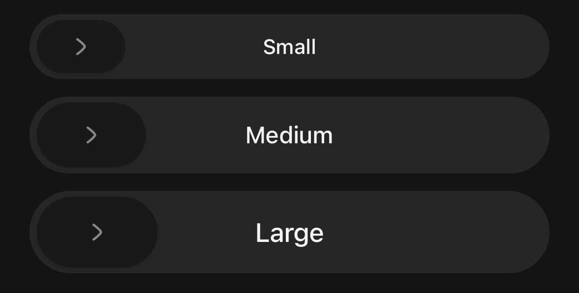
<SlideButton size="sm" fullWidth onComplete={go}>
  <SlideButton.Label>Small</SlideButton.Label>
</SlideButton>

<SlideButton size="md" fullWidth onComplete={go}>
  <SlideButton.Label>Medium</SlideButton.Label>
</SlideButton>

<SlideButton size="lg" fullWidth onComplete={go}>
  <SlideButton.Label>Large</SlideButton.Label>
</SlideButton>
Named for a screen reader
The rail publishes an activate action, because a drag cannot be performed there. Name it after what happens, not after the gesture.
<SlideButton
  accessibilityActionLabel="End the shift"
  haptics
  onComplete={endShift}
>
  <SlideButton.Label>Slide to end shift</SlideButton.Label>
</SlideButton>
Refused
disabled dims the whole control and the drag simply does not take. The handle stays where it is rather than following the finger and springing back, which would read as the slide having failed rather than as having been refused.

<SlideButton disabled fullWidth onComplete={go}>
  <SlideButton.Label>Nothing to confirm</SlideButton.Label>
</SlideButton>
Variants
variant
secondary(default)destructivesuccess
<SlideButton variant="secondary">…</SlideButton>
<SlideButton variant="destructive">…</SlideButton>
<SlideButton variant="success">…</SlideButton>
size
smmd(default)lg
<SlideButton size="sm">…</SlideButton>
<SlideButton size="md">…</SlideButton>
<SlideButton size="lg">…</SlideButton>
fullWidth
true
<SlideButton fullWidth>…</SlideButton>API Reference
SlideButton
| Prop | Type | Default | Description |
|---|---|---|---|
className | string | — | Extra classes for the rail — the box the button occupies in your layout. |
threshold | number | — | The fraction of the rail the thumb has to cover for the slide to count. Defaults to 0.9, clamped to between 0.1 and 1. |
onComplete | () => void | — | Fires once the thumb has been taken past the threshold and released. |
onCompletedChange | (completed: boolean) => void | — | Fires whenever the completed state changes, including on a reset. |
completed | boolean | — | Controlled completion. Leave unset to let the button own it. |
autoReset | boolean | false | Return to the unslid state after autoResetDelay. |
autoResetDelay | number | — | Milliseconds to stay completed before resetting. Defaults to 1000. |
disabled | boolean | false | Dim the button and refuse the drag outright. |
haptics | boolean | false | A tick as the thumb arms and a knock when it commits. Off by default, because a control used several times in a row is one a reader may not want buzzing every time. |
accessibilityActionLabel | string | 'Confirm' | What a screen reader is told the button does, in the imperative — it is announced as the action of a button rather than as an instruction to drag, since dragging is not available there. Defaults to 'Confirm'. |
SlideButton.Label
| Prop | Type | Default | Description |
|---|---|---|---|
className | string | — | Extra classes for the label's text. |
SlideButton.Thumb
| Prop | Type | Default | Description |
|---|---|---|---|
className | string | — | Extra classes for the thumb — its fill and shape. Its size comes from size. |
Every part also accepts the underlying React Native props (ViewProps or TextProps) and a className for Tailwind utilities.
Notes
How it is drawn
The handle is a stadium rather than a disc, and it is neutral: the rail around it carries the variant's colour, and the trail it leaves behind carries it too. Drawn in the accent, the handle was the loudest thing on the control, which put the eye on it rather than on the distance — and the distance is the question the button is asking.
The trail ends exactly at the handle's tail, so the two edges are one edge and the colour reads as something left behind rather than as something coming out of the middle of the handle.
The label is centred in the whole rail and does not move or fade. The handle simply passes over it. Fading it out looked tidier and read worse: the label disappears while there is most of a rail left to cross, so the button spends the second half of the gesture saying nothing.
What counts as a slide
Nothing fires until the thumb clears threshold, which defaults to nine tenths of the rail. Released short, it springs home.
Released short but travelling, it is honoured. The velocity at the moment of release is projected forward and added to the distance already covered, so a flick that had plainly committed is not refused on a technicality. The lookahead is small — a fling from halfway does not complete an action the reader was only playing with.
Raise threshold to 1 for something destructive, which asks the thumb to reach the far end exactly. It cannot be lowered below 0.1: a slide that fires the moment the thumb moves is a button with a gesture in front of it.
Sliding without a finger
A drag is not available to a screen reader, so the rail is also a button. It publishes an activate action, and performing that action completes the slide and fires onComplete — the same outcome, reached the only way that path allows.
Name it with accessibilityActionLabel, in the imperative and in terms of what happens: "Ship the build", not "Slide to ship". The instruction to drag is meaningless where dragging is not possible.
Right to left
The rail runs the other way inside a Direction dir="rtl" subtree: the thumb rests at the right edge, travels left, and the chevron turns around with it. Nothing needs passing for this.
After it completes
The thumb stays at the far end and the chevron crosses into a tick. Set autoReset to send it home again after autoResetDelay, which suits a control used repeatedly; leave it off where the completed state is the point.
completed makes it controlled, for the common case where the action is asynchronous and the button should not claim success until the server agrees.
Motion
The drag follows the finger exactly — there is no easing on the way out, because a thumb that lags its own finger reads as a slow app rather than a heavy control. Only the release is sprung, and the release carries the velocity the gesture already had.
Under reduced motion the springs become short timings. The thumb still travels: a confirmation control that shows nothing is a broken button, so this is a plainer movement rather than none.
Public exports
Values: SlideButton, useSlideButton
Types: SlideButtonProps, SlideButtonLabelProps, SlideButtonThumbProps, SlideButtonVariant, SlideButtonSize