

Progress
Determinate and indeterminate progress bar.
A progress bar, determinate or indeterminate, animated on the UI thread.
It reads its value against a range you set, and captions itself with a label and a value readout when the bar needs a heading.
Use the determinate form whenever you know the total. For work of unknown length, a Spinner says the same thing in less space.
Installation
Progress ships with the library — no separate install.
import { Progress } from 'panelui-native';Or copy the source into your project, to own and edit it:
npx panelui-cli@latest add progressUsage
<Progress value={uploaded} />
<Progress value={70} color="success" size="lg" />
<Progress value={1250} maxValue={2000} label="Budget" showValueLabel />
<Progress indeterminate color="info" />
Examples
Determinate
value against the default range of 0 to 100 — a plain percentage.
<Progress value={72} />

<Progress value={uploaded / total * 100} color="success" size="lg" />
Labelled
label captions the bar on the left; showValueLabel prints the percentage on the right. valueLabel replaces that text for anything that is not a bare percent.
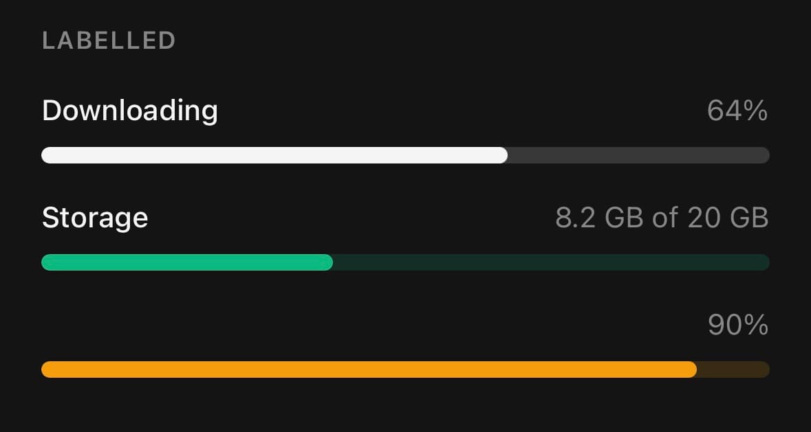
<Progress value={64} label="Downloading" showValueLabel />

<Progress
  value={40}
  label="Storage"
  valueLabel="8.2 GB of 20 GB"
  showValueLabel
/>
A range of its own
minValue and maxValue let the bar take the numbers the work is actually counted in. Nothing has to be converted to a percentage on the way in, and the screen reader is told the real range rather than a derived one.
<Progress
  value={1250}
  maxValue={2000}
  label="Budget"
  formatOptions={{ style: 'currency', currency: 'USD' }}
  showValueLabel
/>

<Progress
  value={18}
  maxValue={24}
  label="Seats"
  valueLabel={`${18} of ${24}`}
  color="info"
  showValueLabel
/>
Indeterminate
For work with no measurable progress. The animation runs on the UI thread and stops when reduce-motion is on.
<Progress indeterminate />Colour by state
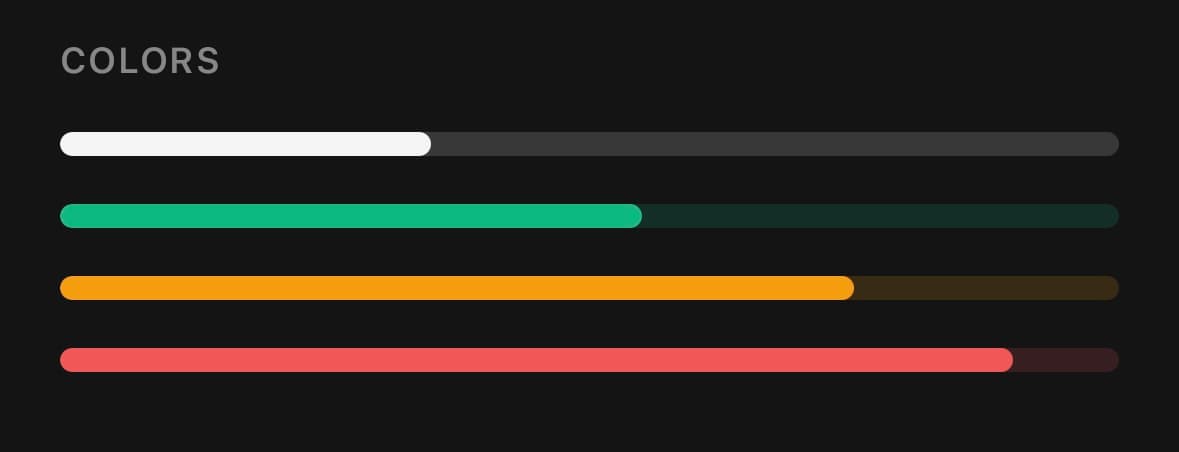
<Progress
  value={usage}
  color={usage > 90 ? 'destructive' : usage > 70 ? 'warning' : 'primary'}
/>
Variants
color
primary(default)successwarningdestructiveinfo
<Progress color="primary" value={40} />
<Progress color="success" value={40} />
<Progress color="warning" value={40} />
<Progress color="destructive" value={40} />
<Progress color="info" value={40} />
size
smmd(default)lg
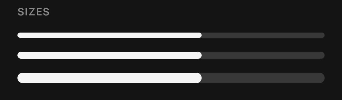
<Progress size="sm" value={40} />
<Progress size="md" value={40} />
<Progress size="lg" value={40} />
API Reference
Progress
| Prop | Type | Default | Description |
|---|---|---|---|
className | string | — | |
value | number | 0 | Where the work has got to, somewhere between minValue and maxValue. Ignored when indeterminate is set. |
minValue | number | 0 | The bottom of the range — the value at which the bar reads as empty. Defaults to 0. |
maxValue | number | 100 | The top of the range — the value at which the bar reads as full. Defaults to 100, so a bare percentage keeps working with neither bound set. |
indeterminate | boolean | false | Show a looping animation for unknown-duration work. Under the platform's reduce-motion setting the bar fills the track and pulses instead of travelling across it, so it still reads as running. |
indicatorClassName | string | — | Extra classes for the moving indicator. |
label | string | — | Caption drawn above the track, on the left. Supplying it (or showValueLabel) wraps the bar in a header row; the track alone renders otherwise. |
showValueLabel | boolean | false | Draw the percentage above the track, on the right. Hidden while indeterminate — there is nothing meaningful to show. |
valueLabel | string | — | Text for the value label. Overrides the formatted percentage — use it for a byte count, a step tally, anything that is not a bare percent. |
formatOptions | Intl.NumberFormatOptions | — | How to write the value, through Intl.NumberFormat. A percent style formats how far along the bar is; every other style formats the value itself, so { style: 'currency', currency: 'USD' } against a maxValue of 2000 reads $1,250.00 rather than a percentage of it. Falls back to a rounded percent when omitted. |
headerClassName | string | — | Extra classes for the label + value-label row. |
Every part also accepts the underlying React Native props (ViewProps or TextProps) and a className for Tailwind utilities.
Notes
value is read against minValue and maxValue, which default to 0 and 100 — a percentage needs neither. With indeterminate the value is ignored, the bar loops, and the value label is dropped. The animation runs on the UI thread. Under reduce motion the fill lands on its value rather than springing to it, and the indeterminate bar fills the track and pulses in place instead of travelling across it — a bar that stopped moving would read as a bar that had hung, which is the one thing an indeterminate bar exists to rule out.
Writing the value
formatOptions renders the readout through Intl.NumberFormat. A percent style is given how far along the bar is; every other style is given the value itself, so a currency or a byte count comes out as the quantity it is rather than as a proportion of the range. valueLabel replaces the whole thing when the text is not a number at all.
Whatever the readout says is also what a screen reader is told, alongside the real range — so a bar counting seats reads "18 of 24" rather than "75".
Public exports
Values: Progress
Types: ProgressProps