

Switch
Animated on/off toggle.
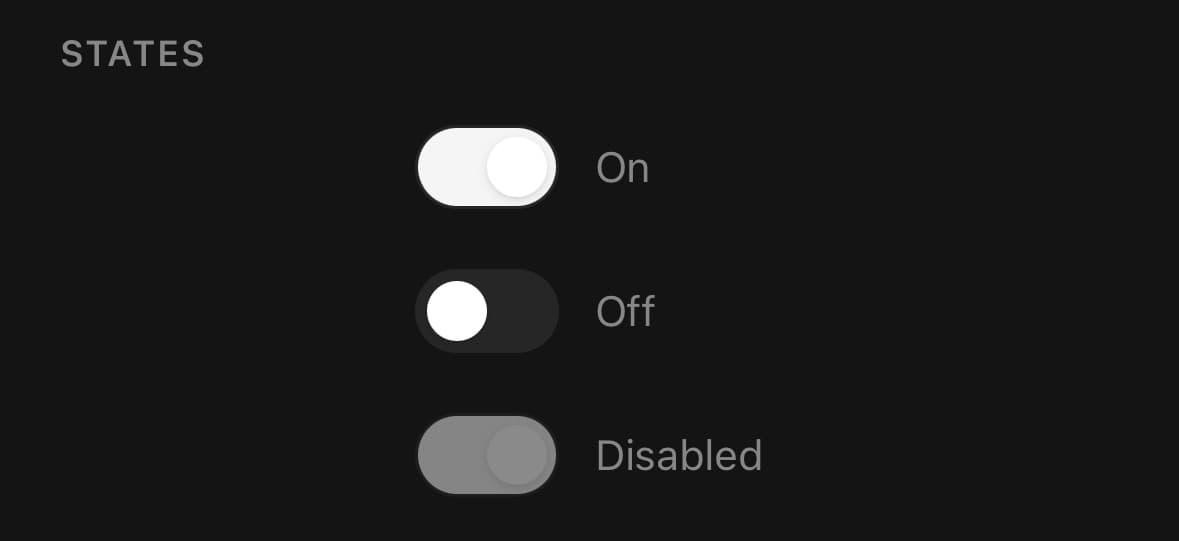
An on/off toggle, animated on the UI thread.
Use it for a setting that takes effect immediately. When the value is part of a form that gets submitted, use Checkbox — a switch implies the change has already happened.
Installation
Switch ships with the library — no separate install.
import { Switch, Text } from 'panelui-native';Or copy the source into your project, to own and edit it:
npx panelui-cli@latest add switchUsage
<Switch value={enabled} onValueChange={setEnabled} />Examples
In a settings row
<View className="flex-row items-center justify-between py-3">
  <View className="flex-1 gap-0.5">
    <Text weight="medium">Push notifications</Text>
    <Text size="sm" muted>Alerts on this device.</Text>
  </View>
  <Switch value={push} onValueChange={setPush} />
</View>
Sizes and disabled
<Switch size="sm" value={compact} onValueChange={setCompact} />
<Switch value={enabled} onValueChange={setEnabled} />
<Switch value disabled onValueChange={() => {}} />
Haptic toggle
haptics fires a light tick each time the switch flips, so the toggle feels like it clicks into place. It needs the optional expo-haptics, and is silent without it.
<Switch haptics value={enabled} onValueChange={setEnabled} />Native
Renders the platform switch, which brings a label the styled one does not have. Theme tokens do not apply.
<Switch native label="Wi-Fi" value={wifi} onValueChange={setWifi} />Variants
size
xssmmd(default)lgxl
<Switch size="xs" value={on} onValueChange={setOn} />
<Switch size="sm" value={on} onValueChange={setOn} />
<Switch size="md" value={on} onValueChange={setOn} />
<Switch size="lg" value={on} onValueChange={setOn} />
<Switch size="xl" value={on} onValueChange={setOn} />
API Reference
Switch
| Prop | Type | Default | Description |
|---|---|---|---|
className | string | — | |
value | boolean | — | |
onValueChange | (value: boolean) => void | — | |
disabled | boolean | — | |
native | boolean | — | Render the platform's own switch instead of this one. Requires the optional @expo/ui package; without it this prop does nothing. Theme tokens do not apply — the platform draws the control, so className and size are ignored. |
label | string | — | Names the control to assistive technology; native mode also draws it. |
haptics | boolean | — | Tick the haptic engine each time the switch is flipped — a toggle you feel click rather than one that merely slides. Needs the optional expo-haptics, and is silent without it. Ignored in native mode, where the platform control owns its own feedback. |
Every part also accepts the underlying React Native props (ViewProps or TextProps) and a className for Tailwind utilities.
Notes
Pass haptics to tick the platform's haptic engine each time the switch is flipped — the toggle clicks under the thumb rather than merely sliding. It needs the optional expo-haptics and is silent without it, and it is ignored in native mode, where the platform control owns its own feedback.
Native rendering
Pass native to render the platform's own switch instead — SwiftUI on iOS, Jetpack Compose on Android. It needs the optional @expo/ui package and is a silent no-op without it.
Theme tokens do not apply in native mode: the platform draws the control with its own colours and metrics, so className and most styling props are ignored. The native switch gains a label prop the styled one does not have.
See Native rendering for the full prop-by-prop breakdown.
Public exports
Values: Switch
Types: SwitchProps, SwitchSize