

Rating
A row of stars to read or set a score.
A row of stars, to read a score or to set one.
Read-only it shows a score; interactive it is an input — tap a star for a whole value, or with precision={0.5} press the left half of a star for a half.
Partial fills are drawn by clipping a filled star over an empty one of the same shape, so a half star is exactly half. Setting a value springs the stars to it, and a drag follows the finger without a spring so it never lags.
Installation
Rating ships with the library — no separate install.
import { Rating } from 'panelui-native';Or copy the source into your project, to own and edit it:
npx panelui-cli@latest add ratingUsage
<Rating defaultValue={3} />
<Rating value={score} onValueChange={setScore} />
<Rating value={4.5} precision={0.5} readOnly />
<Rating label="Rate your stay" showValue defaultValue={0} />
Examples
Controlled
Hold the value in state and read it back.
const [score, setScore] = useState(3);

<Rating value={score} onValueChange={setScore} />
Half stars
precision={0.5} lets the left half of a star mean a half — the fill follows in half-star steps.
<Rating precision={0.5} defaultValue={2.5} />Colors
color sets the filled star. warning is the default, and the rest are the same semantic tokens the other controls take — primary is available too.
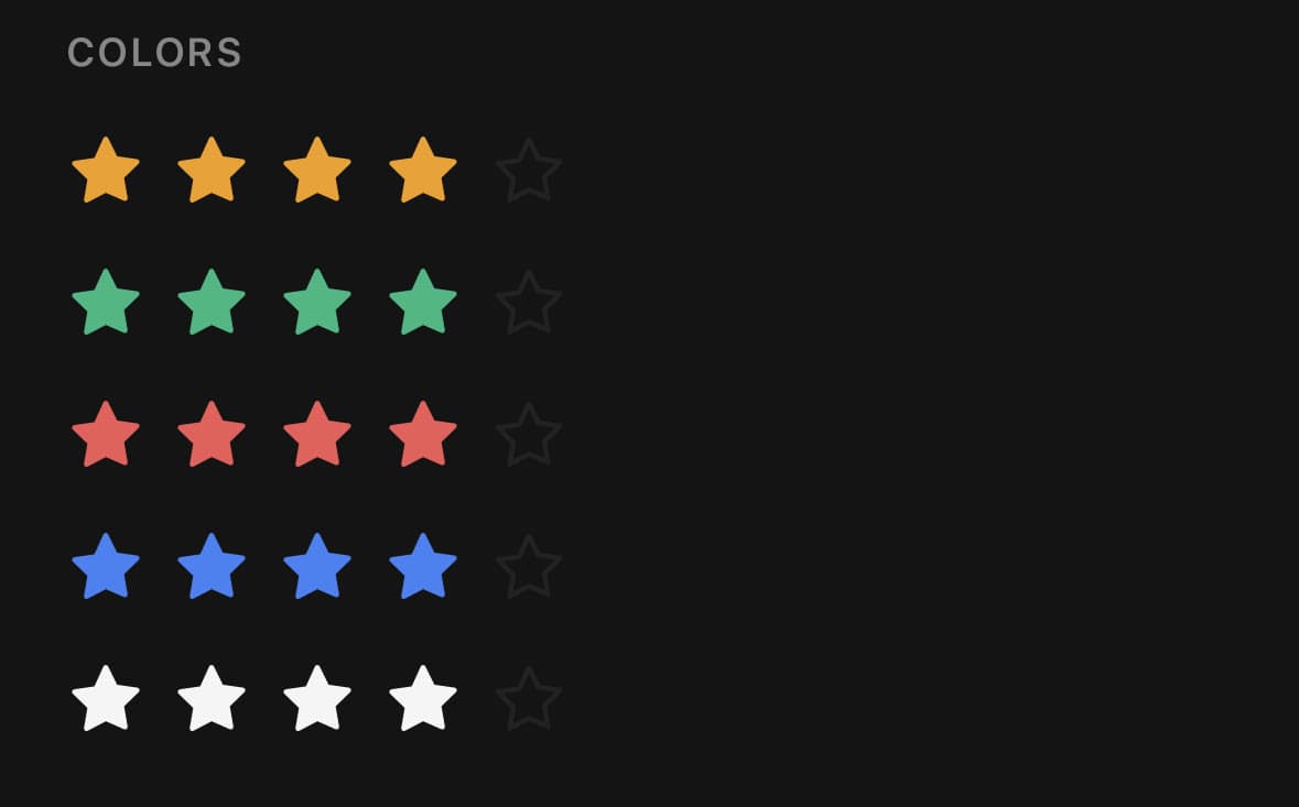
<Rating color="warning" defaultValue={4} />
<Rating color="success" defaultValue={4} />
<Rating color="destructive" defaultValue={4} />
<Rating color="info" defaultValue={4} />
<Rating color="foreground" defaultValue={4} />
Read-only display
readOnly shows any fractional value at full precision and takes no touches, so it reads a computed average as-is. The row is announced as an image.

<Rating value={4.3} precision={0.5} readOnly />With a caption row
label and showValue draw a row above the stars, and the label doubles as the accessibility label.
<Rating label="Rate your stay" showValue defaultValue={0} />Clearable and haptic
allowClear lets a second tap on the current value reset it to zero; haptics ticks as a drag crosses each star. Haptics need the optional expo-haptics and are silent without it.
<Rating defaultValue={4} allowClear haptics />Ten stars
max sets how many stars; the whole control scales from the star size.
<Rating max={10} defaultValue={7} size="sm" />Disabled
<Rating defaultValue={3} disabled />Variants
size
smmd(default)lg

<Rating size="sm" defaultValue={3} />
<Rating size="md" defaultValue={3} />
<Rating size="lg" defaultValue={3} />
API Reference
Rating
| Prop | Type | Default | Description |
|---|---|---|---|
className | string | — | |
value | number | — | Controlled value. Leave unset and pass defaultValue to run uncontrolled. |
defaultValue | number | 0 | Starting value when uncontrolled. |
max | number | 5 | How many stars. |
precision | number | 1 | Smallest step a tap can pick, as a fraction of a star. 1 is whole stars, 0.5 lets the left half of a star mean a half. Reading a value renders any precision — this only constrains what a finger can set. |
onValueChange | (value: number) => void | — | Fires as the value changes, including live while dragging. |
onValueCommit | (value: number) => void | — | Fires once when a tap or drag ends — the place for expensive side effects. |
readOnly | boolean | false | Show the stars but ignore touches — the display half of the component. |
disabled | boolean | false | |
allowClear | boolean | false | Let a second tap on the current value clear it back to zero, so a rating given by mistake can be taken back without a separate control. |
color | RatingColor | 'warning' | Which token the filled stars are painted with. |
label | string | — | Caption above the stars. Also becomes the accessibility label. |
showValue | boolean | false | Show the numeric value on the caption row, opposite the label. |
formatValue | (value: number) => string | — | Format the shown value. Defaults to the number as written. |
haptics | boolean | false | A tick under the finger each time a drag crosses onto a new star. Off by default — needs the optional expo-haptics, and is silent without it. |
headerClassName | string | — | Extra classes for the caption row. |
rowClassName | string | — | Extra classes for the row of stars. |
Every part also accepts the underlying React Native props (ViewProps or TextProps) and a className for Tailwind utilities.
Notes
Runs controlled (value + onValueChange) or uncontrolled (defaultValue). onValueChange fires live while dragging; onValueCommit fires once when the tap or drag ends — reach for it when the change is expensive.
precision only constrains what a finger can set; a read value renders at any precision, so a computed 4.3 average shows four-and-a-bit stars even though a tap can only pick whole or half stars. Invalid or non-positive precision falls back to 1.
max is normalized to a positive whole number because it is both the rendered star count and the accessibility maximum. Invalid values fall back to 5, and fractional counts round down. Non-finite ratings render safely as zero; finite values are clamped to the normalized range.
Set readOnly for a pure display and the row is announced as an image rather than an adjustable control; set allowClear to let a second tap on the current value reset it to zero.
Public exports
Values: Rating
Types: RatingProps, RatingColor, RatingSize