

Marker
Inline note between conversation turns.

An inline note between conversation turns.
Transcripts are not only messages. Between the turns sit things the conversation did rather than said: a tool that ran, a file that was read, the point where yesterday ended. None of those have a speaker, so none should look like a bubble.
A marker is the quieter row that carries them — small, muted, and aligned to the transcript rather than to a side of it.
Installation
Marker ships with the library — no separate install.
import { Marker, CheckIcon, SearchIcon, InfoIcon, Message, Avatar } from 'panelui-native';Or copy the source into your project, to own and edit it:
npx panelui-cli@latest add markerUsage
<Marker>
  <Marker.Icon>
    <CheckIcon size={14} />
  </Marker.Icon>
  <Marker.Content>Explored 4 files</Marker.Content>
</Marker>
Composition
<Marker>
  <Marker.Icon>…</Marker.Icon>
  <Marker.Content>…</Marker.Content>
</Marker>Marker.Icon— Decorative leading slot. Hidden from screen readers, and tinted to the muted foreground.Marker.Content— The line of text. Takesshimmerwhile the step is still running.
Examples
Status rows
The common case: a short line of what just happened, one row per step.
<Marker>
  <Marker.Icon><SearchIcon size={14} /></Marker.Icon>
  <Marker.Content>Explored 4 files</Marker.Content>
</Marker>

<Marker>
  <Marker.Icon><CheckIcon size={14} /></Marker.Icon>
  <Marker.Content>Applied 2 edits to invoice.ts</Marker.Content>
</Marker>
A step still running
Add shimmer to the content while the step is in flight. The sweep is masked to the glyphs, so the text itself catches the light. Drop it the moment the step finishes — a marker that shimmers forever reads as a stuck one.
<Marker>
  <Marker.Icon><CheckIcon size={14} /></Marker.Icon>
  <Marker.Content>Read 12 files</Marker.Content>
</Marker>

<Marker>
  <Marker.Icon><SearchIcon size={14} /></Marker.Icon>
  <Marker.Content shimmer>Searching the codebase…</Marker.Content>
</Marker>
A day divider
The separator variant centres the content between two rules, for the break between one day of a thread and the next. It takes no icon.
<Marker variant="separator">
  <Marker.Content>Yesterday</Marker.Content>
</Marker>
In a transcript
Markers sit between messages at the same width, so the eye reads them as the same column. Give one an onPress and it becomes a button — for expanding the step it summarises.
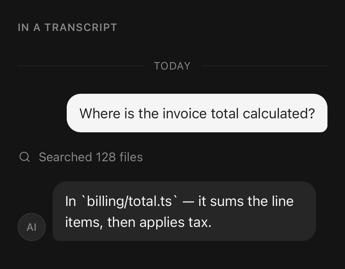
<Marker variant="separator">
  <Marker.Content>Today</Marker.Content>
</Marker>

<Message align="end">
  <Message.Content>
    <Message.Bubble>
      <Message.BubbleContent>Where is the invoice total calculated?</Message.BubbleContent>
    </Message.Bubble>
  </Message.Content>
</Message>

<Marker onPress={() => expand(step)}>
  <Marker.Icon><SearchIcon size={14} /></Marker.Icon>
  <Marker.Content>Searched 128 files</Marker.Content>
</Marker>

<Message>
  <Message.Avatar><Avatar size="sm" fallback="AI" /></Message.Avatar>
  <Message.Content>
    <Message.Bubble>
      <Message.BubbleContent>In billing/total.ts — it sums the line items, then applies tax.</Message.BubbleContent>
    </Message.Bubble>
  </Message.Content>
</Message>
Variants
variant
default(default)borderseparator
{/* The plain status row. */}
<Marker>
  <Marker.Icon><InfoIcon size={14} /></Marker.Icon>
  <Marker.Content>Model set to Opus</Marker.Content>
</Marker>

{/* Closed by a hairline, for a step that ends a section. */}
<Marker variant="border">
  <Marker.Icon><CheckIcon size={14} /></Marker.Icon>
  <Marker.Content>Finished 3 tool calls</Marker.Content>
</Marker>

{/* Centred label with a rule out to each edge. */}
<Marker variant="separator">
  <Marker.Content>Yesterday</Marker.Content>
</Marker>
API Reference
Marker
| Prop | Type | Default | Description |
|---|---|---|---|
className | string | — | |
disabled | boolean | — | |
variant | MarkerVariant | default | default is the inline status row. border closes it with a hairline. separator centres the content between two rules — the "Yesterday" divider shape. |
Marker.Icon
| Prop | Type | Default | Description |
|---|---|---|---|
className | string | — |
Marker.Content
| Prop | Type | Default | Description |
|---|---|---|---|
className | string | — | |
shimmer | boolean | — | Sweep a highlight through the text, for a step that is still running. Drop it when the step finishes — a marker that shimmers forever reads as a stuck one. |
Every part also accepts the underlying React Native props (ViewProps or TextProps) and a className for Tailwind utilities.
Notes
A marker with no onPress renders as a plain view and is not announced as a button — the same rule Item follows. Give it an onPress and it becomes a pressable with the press feedback every other pressable in the library has.
Marker.Icon is hidden from screen readers. It repeats what the content already says, and announcing both is noise. It also picks up the muted foreground automatically, so an icon dropped inside needs no color.
The separator variant draws its rules with Separator, so they follow the same token and thickness as every other rule in the app.
Marker forwards ordinary view or Pressable props according to the rendered branch, but keeps ownership of its disabled announcement, styled surface, and—when interactive—its button role and primary press handler.
Public exports
Values: Marker
Types: MarkerProps, MarkerIconProps, MarkerContentProps