

Badge
Compact status label, dot, or notification count.
A compact label for status, a count or a state.
Set count for a notification bubble and shape="dot" for a bare status dot.
It only shows — nothing about it is pressable. Use Chip for the interactive version: a filter, a tag, a removable token.
Installation
Badge ships with the library — no separate install.
import { Badge, Text } from 'panelui-native';Or copy the source into your project, to own and edit it:
npx panelui-cli@latest add badgeUsage
<Badge>Default</Badge>
<Badge variant="success">Active</Badge>
<Badge variant="destructive" count={128} />
<Badge variant="success" shape="dot" />
Examples
Status labels
The default shape — a pill with a text label.
<Badge>Default</Badge>
<Badge variant="success">Paid</Badge>
<Badge variant="warning">Pending</Badge>
<Badge variant="destructive">Failed</Badge>
<Badge variant="outline">Draft</Badge>
A count
shape="count" sizes to a number. Pass count and it renders the digits for you.
<Badge shape="count" count={3} variant="destructive" />

{/* Clamp it yourself for large numbers. */}
<Badge shape="count" count={Math.min(unread, 99)} />
A bare dot
No label at all — an unread marker beside a title.
<View className="flex-row items-center gap-2">
  <Text weight="medium">Inbox</Text>
  <Badge shape="dot" variant="info" />
</View>
With a status dot
A small dot inside the badge, for a status row.
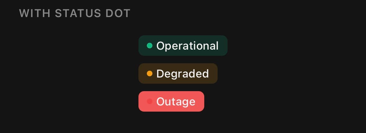
<Badge variant="success">
  <View className="h-1.5 w-1.5 rounded-full" style={{ backgroundColor: '#10b981' }} />
  Operational
</Badge>
Variants
size
xssmmd(default)lgxl
<Badge size="xs">Extra small</Badge>
<Badge size="sm">Small</Badge>
<Badge size="md">Medium</Badge>
<Badge size="lg">Large</Badge>
<Badge size="xl">Extra large</Badge>

{/* A count and a dot follow the same steps. */}
<Badge size="lg" count={12} />
<Badge size="sm" shape="dot" variant="success" />
shape
default(default)dotcount
<Badge shape="default">Label</Badge>
<Badge shape="dot" variant="success" />
<Badge shape="count" count={12} />
variant
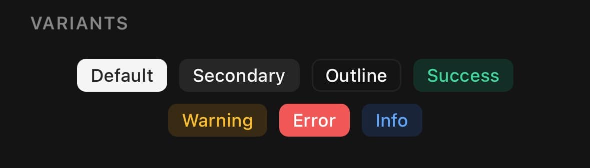
default(default)secondaryoutlinedestructivesuccesswarninginfo
<Badge>Default</Badge>
<Badge variant="secondary">Secondary</Badge>
<Badge variant="outline">Outline</Badge>
<Badge variant="destructive">Failed</Badge>
<Badge variant="success">Paid</Badge>
<Badge variant="warning">Pending</Badge>
<Badge variant="info">Info</Badge>
API Reference
Badge
| Prop | Type | Default | Description |
|---|---|---|---|
className | string | — | |
labelClassName | string | — | |
count | number | — | Renders a number instead of children, clamped to "99+". Implies the count shape unless you set one. |
Every part also accepts the underlying React Native props (ViewProps or TextProps) and a className for Tailwind utilities.
Notes
count clamps at 99+ so the pill keeps its shape, and sets an "N unread" accessibility label. Passing count implies shape="count" unless you set a shape yourself.
Public exports
Values: Badge
Types: BadgeProps, BadgeSize