

Frame
Widget shell — a card of rows sitting in a titled tray.
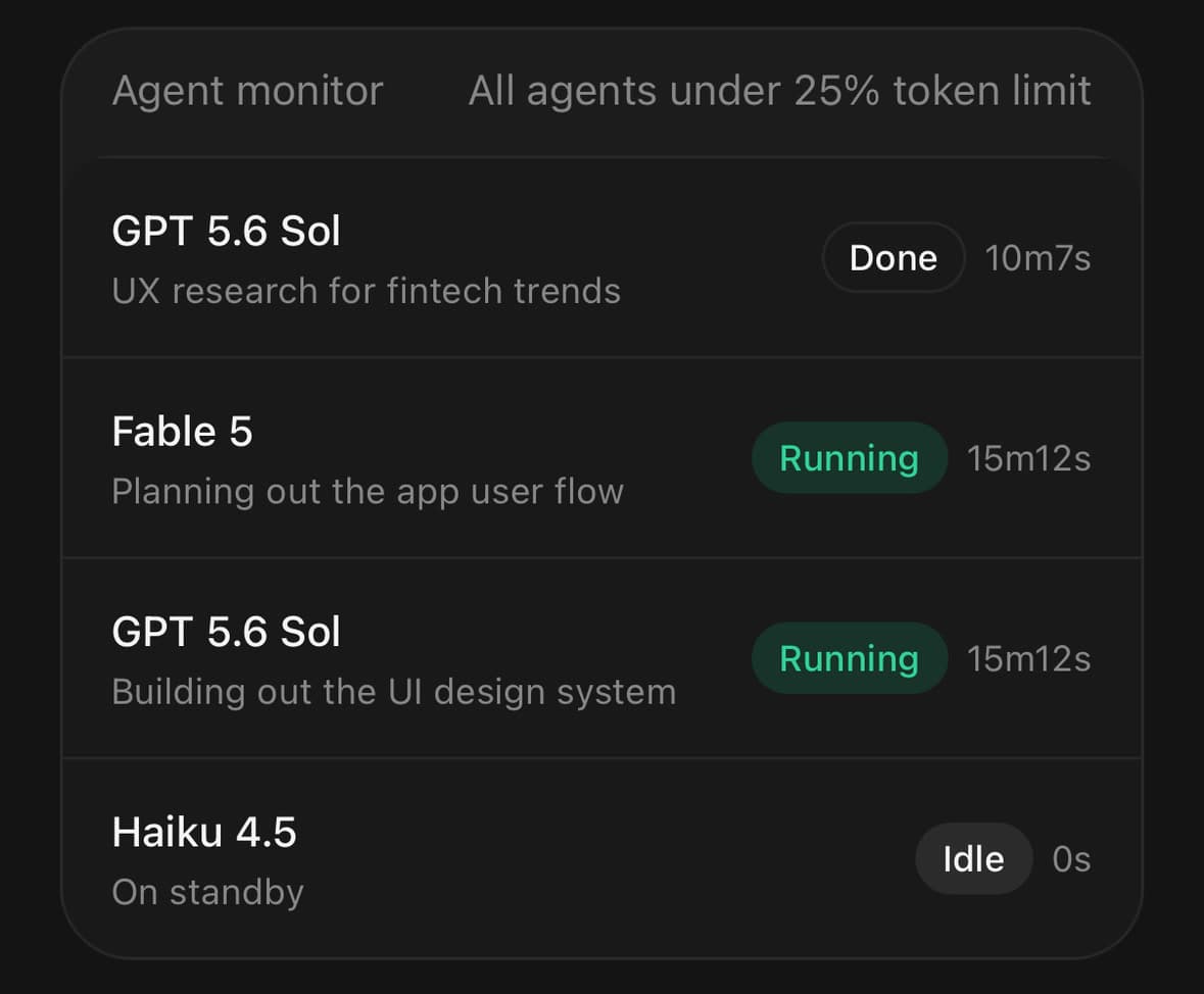
A card of rows sitting in a titled tray — the shell a widget sits in.
The tray shows along one edge only; the strip left above the card is the header. The card is flush to its left, right and bottom, and draws the hairlines between its own rows.
variant="inset" nests the two the other way: the card floats clear of the tray on all four sides, and the band left around it carries Frame.Footer.
Installation
Frame ships with the library — no separate install.
import { Frame, Button, Switch, Text, Badge, Card, Chip, Avatar } from 'panelui-native';Or copy the source into your project, to own and edit it:
npx panelui-cli@latest add frameUsage
<Frame>
  <Frame.Header>
    <Frame.Title>Agent monitor</Frame.Title>
    <Frame.Action>All agents under 25% token limit</Frame.Action>
  </Frame.Header>
  <Frame.Panel>
    <Frame.Row>
      <Frame.Content>
        <Frame.Title>opus-4.6</Frame.Title>
        <Frame.Description>Indexing the repository</Frame.Description>
      </Frame.Content>
      <Frame.Actions>
        <Chip size="sm" variant="success">Running</Chip>
      </Frame.Actions>
    </Frame.Row>
  </Frame.Panel>
</Frame>
Composition
<Frame>
  <Frame.Header>
    <Frame.Title>…</Frame.Title>
    <Frame.Action>…</Frame.Action>
  </Frame.Header>
  <Frame.Panel>
    <Frame.Section title="…">
      <Frame.Row>
        <Frame.Media>…</Frame.Media>
        <Frame.Content>
          <Frame.Title>…</Frame.Title>
          <Frame.Description>…</Frame.Description>
        </Frame.Content>
        <Frame.Actions>…</Frame.Actions>
      </Frame.Row>
    </Frame.Section>
  </Frame.Panel>
  <Frame.Footer>…</Frame.Footer>
</Frame>Frame.Header— The strip of shell above the panel, holding the title and the action.Frame.Title— Frame heading. Muted in a header; inside aFrame.Contentit is the row's subject instead, so it takes the foreground colour and truncates to one line.Frame.Action— Trailing slot on the header — a label, a button, a badge. Strings render muted.Frame.Description— Secondary line under a title, in a column-wrapped header or inside aFrame.Content.Frame.Panel— The card holding the rows. Divides them for you.Frame.Footer— The row of actions under the panel — what somebody does with the widget rather than more of what it says. Underinsetit sits in the band, held further in than the panel so it reads as things to press rather than as another edge of the shell, and it shapes what is put in it: equal widths and full pills. Underdefaultandplainit is a padded row below the panel, which stops the panel being flush at the bottom.Frame.Section— A labelled cluster of rows, for a panel holding more than one group.Frame.Row— A row inside the panel. Give it anonPressand it becomes a pressable.Frame.Media— Leading slot on a row — an icon, an avatar, a status dot. Holds its size.Frame.Content— The flexible middle of a row. Takes what the other two leave and is allowed to shrink past its content.Frame.Actions— Trailing slot on a row — a chip, a value, a switch, a small button. Holds its size.
Examples
A settings panel
Nothing has to say where the hairlines go — the panel puts one above every row but the first.
<Frame>
  <Frame.Header>
    <Frame.Title>Notifications</Frame.Title>
    <Frame.Description>How we reach you.</Frame.Description>
  </Frame.Header>
  <Frame.Panel>
    <Frame.Row>
      <Text className="flex-1">Push</Text>
      <Switch value={push} onValueChange={setPush} />
    </Frame.Row>
    <Frame.Row>
      <Text className="flex-1">Email</Text>
      <Switch value={email} onValueChange={setEmail} />
    </Frame.Row>
    <Frame.Row>
      <Text className="flex-1">SMS</Text>
      <Switch value={sms} onValueChange={setSms} />
    </Frame.Row>
  </Frame.Panel>
</Frame>
Rows that show a value
A label on the left and its current value on the right, muted. Give the label flex-1 so the value is pushed to the trailing edge.
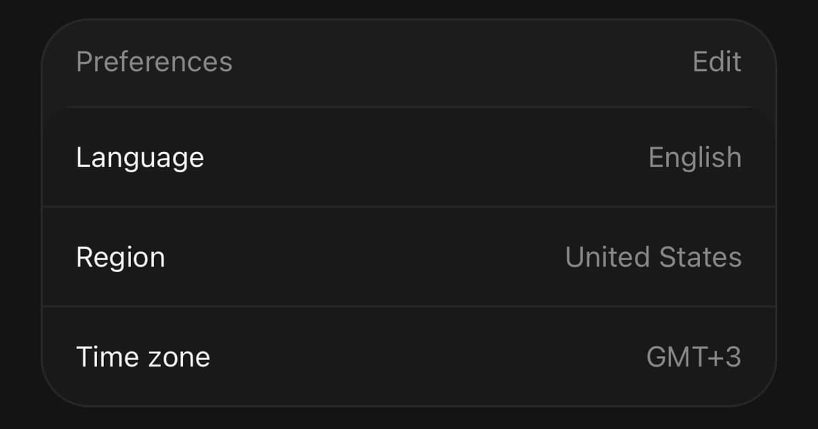
<Frame>
  <Frame.Header>
    <Frame.Title>Preferences</Frame.Title>
    <Frame.Action>Edit</Frame.Action>
  </Frame.Header>
  <Frame.Panel>
    {preferences.map(([label, value]) => (
      <Frame.Row key={label}>
        <Text size="sm" className="flex-1">{label}</Text>
        <Text size="sm" muted>{value}</Text>
      </Frame.Row>
    ))}
  </Frame.Panel>
</Frame>
A member list
An avatar in Frame.Media, a name and an email in Frame.Content, and the role in Frame.Actions. The header's action can be a badge instead of text.
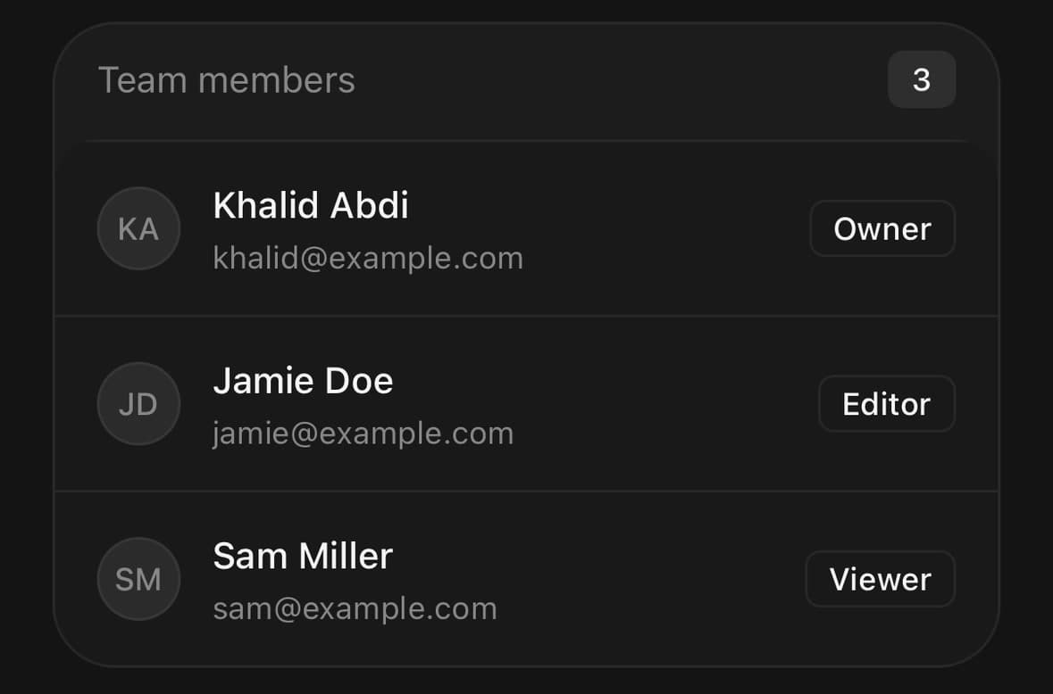
<Frame>
  <Frame.Header>
    <Frame.Title>Team members</Frame.Title>
    <Frame.Action>
      <Badge variant="secondary">{members.length}</Badge>
    </Frame.Action>
  </Frame.Header>
  <Frame.Panel>
    {members.map((member) => (
      <Frame.Row key={member.email}>
        <Frame.Media>
          <Avatar size="sm" fallback={member.initials} />
        </Frame.Media>
        <Frame.Content>
          <Frame.Title>{member.name}</Frame.Title>
          <Frame.Description>{member.email}</Frame.Description>
        </Frame.Content>
        <Frame.Actions>
          <Badge variant="outline">{member.role}</Badge>
        </Frame.Actions>
      </Frame.Row>
    ))}
  </Frame.Panel>
</Frame>
A leading graphic
Frame.Media holds any small graphic at its own size. Here each row leads with a progress ring of the app's own.
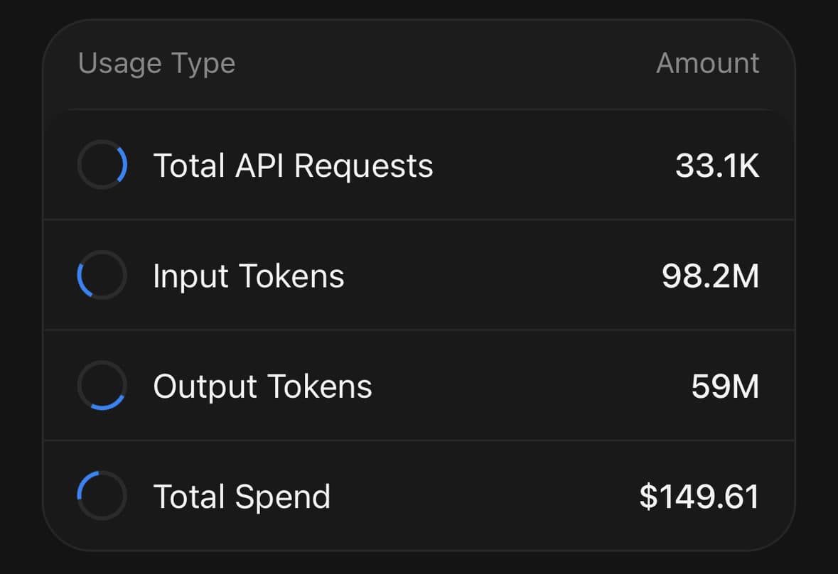
<Frame>
  <Frame.Header>
    <Frame.Title>Usage Type</Frame.Title>
    <Frame.Action>Amount</Frame.Action>
  </Frame.Header>
  <Frame.Panel>
    {usage.map((item) => (
      <Frame.Row key={item.label}>
        <Frame.Media>
          <UsageRing percent={item.percent} />
        </Frame.Media>
        <Frame.Content>
          <Text numberOfLines={1}>{item.label}</Text>
        </Frame.Content>
        <Frame.Actions>
          <Text weight="medium">{item.value}</Text>
        </Frame.Actions>
      </Frame.Row>
    ))}
  </Frame.Panel>
</Frame>
A row that would not fit
Everything here is longer than the room it has. The media and the actions hold their size, the content column shrinks around them, and nothing is clipped — at any width, without measuring anything.
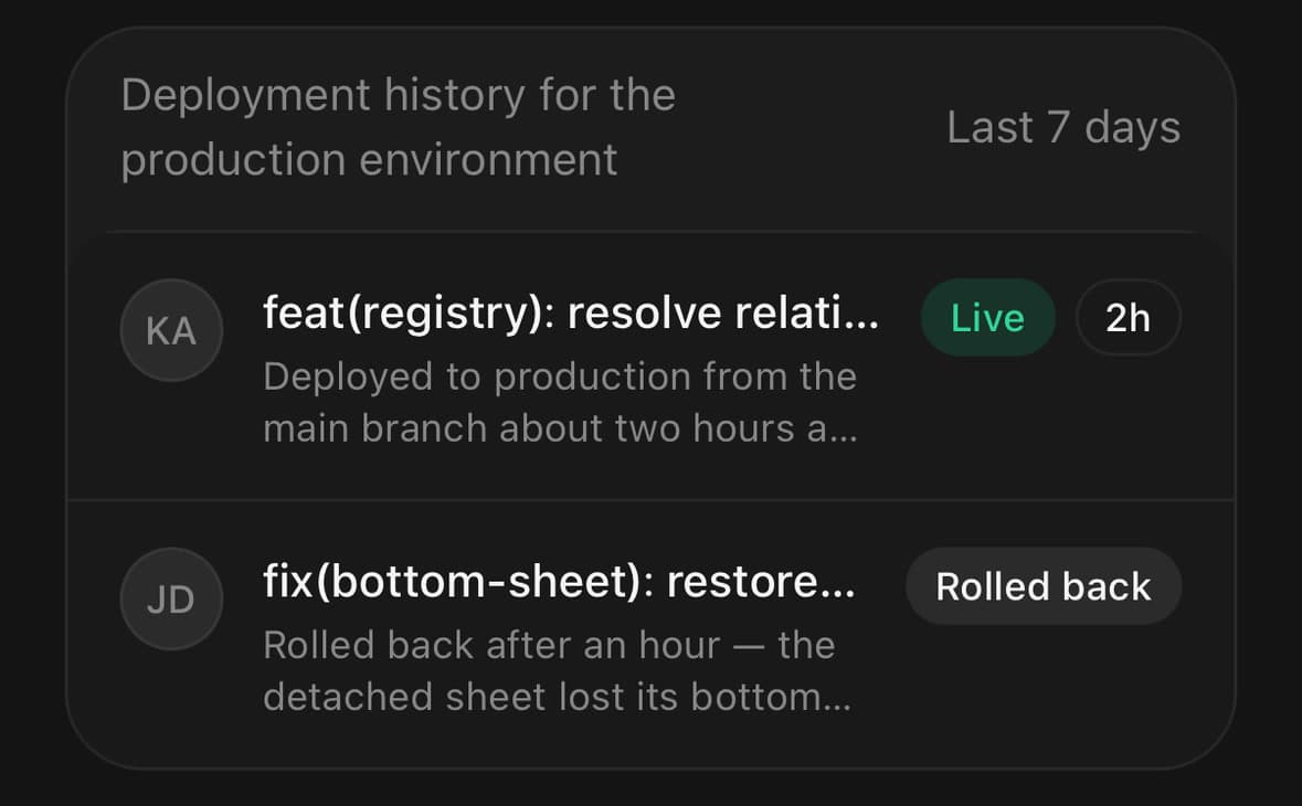
<Frame.Panel>
  {deploys.map((deploy) => (
    <Frame.Row key={deploy.id} align="start">
      <Frame.Media>
        <Avatar size="sm" fallback={deploy.initials} />
      </Frame.Media>
      <Frame.Content>
        <Frame.Title>{deploy.message}</Frame.Title>
        <Frame.Description>{deploy.detail}</Frame.Description>
      </Frame.Content>
      <Frame.Actions>
        <Chip size="sm" variant="success">Live</Chip>
        <Chip size="sm" variant="outline">{deploy.age}</Chip>
      </Frame.Actions>
    </Frame.Row>
  ))}
</Frame.Panel>
A row of chips that wraps
wrap lets the row run onto a second line. For a cluster of tags, a second line beats one of them disappearing off the edge.
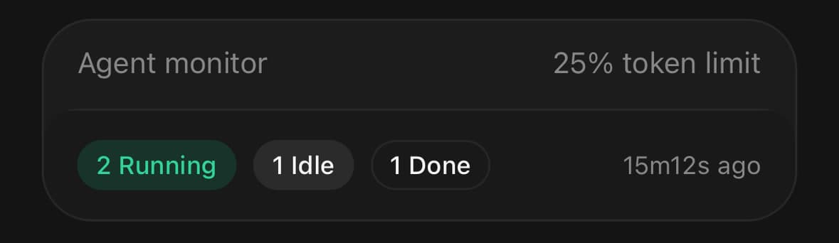
<Frame.Panel>
  <Frame.Row wrap className="gap-2">
    <Chip size="sm" variant="success">2 Running</Chip>
    <Chip size="sm">1 Idle</Chip>
    <Chip size="sm" variant="outline">1 Done</Chip>
    <Frame.Actions className="ml-auto">
      <Text size="xs" muted>15m12s ago</Text>
    </Frame.Actions>
  </Frame.Row>
</Frame.Panel>
With a header action and a footer
<Frame>
  <Frame.Header>
    <Frame.Title>API keys</Frame.Title>
    <Frame.Action>
      <Button size="sm" variant="outline">New key</Button>
    </Frame.Action>
  </Frame.Header>
  <Frame.Panel>
    {keys.map((key) => (
      <Frame.Row key={key.id}>
        <Text>{key.name}</Text>
        <Badge variant="outline">{key.lastUsed}</Badge>
      </Frame.Row>
    ))}
  </Frame.Panel>
</Frame>
Rows that lead somewhere
A row with an onPress is a real pressable — press feedback and a button role — instead of a View with a handler bolted on. chevron says so before you tap it.
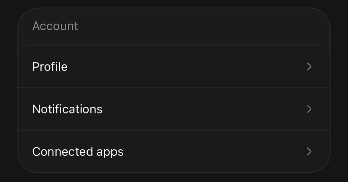
<Frame.Panel>
  {sections.map((section) => (
    <Frame.Row
      key={section.id}
      chevron
      onPress={() => router.push(section.href)}
    >
      <Text size="sm" className="flex-1">{section.label}</Text>
    </Frame.Row>
  ))}
</Frame.Panel>
Sections inside a panel
For a widget with more than one cluster of rows. Each section labels its group and divides its own rows.
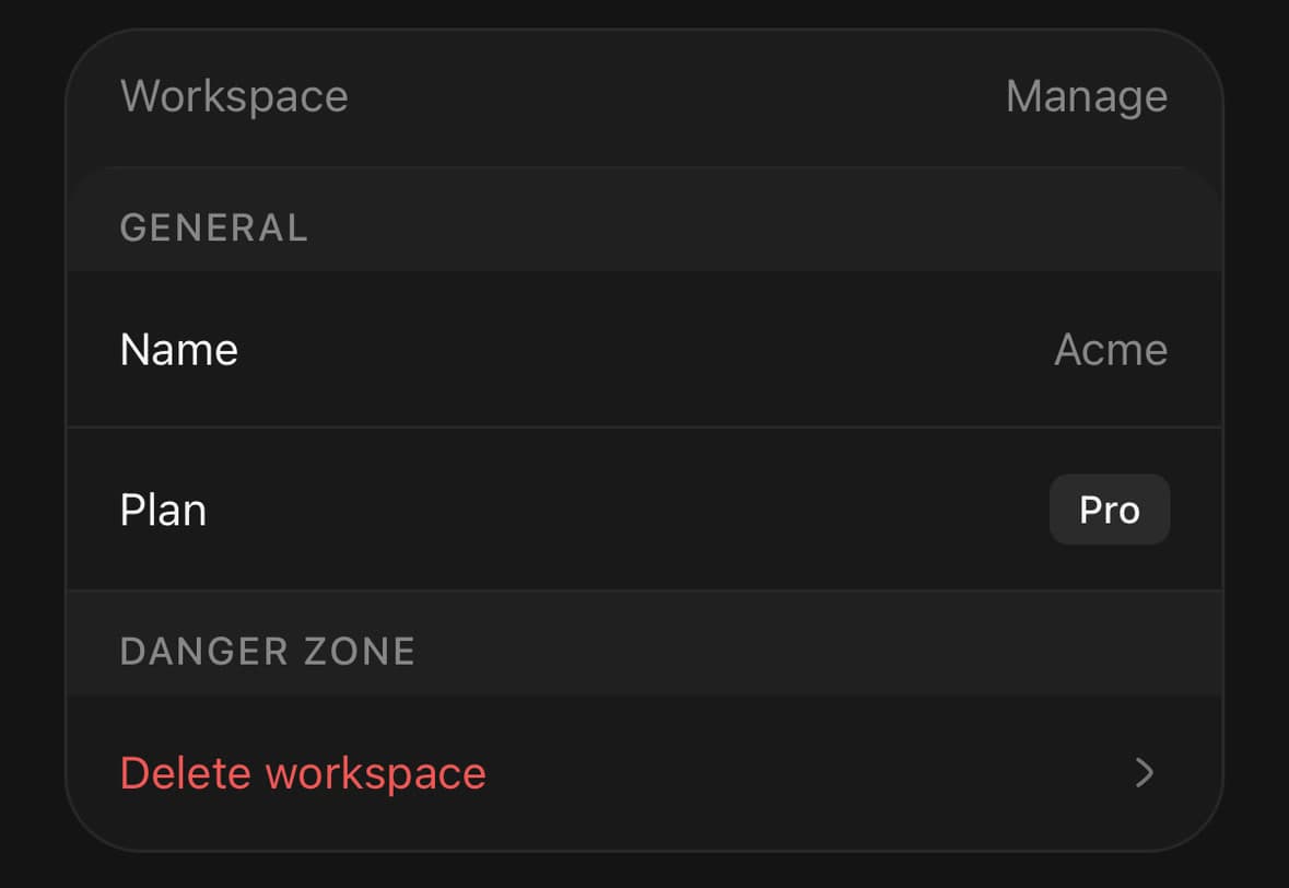
<Frame.Panel>
  <Frame.Section title="General">
    <Frame.Row>…</Frame.Row>
    <Frame.Row>…</Frame.Row>
  </Frame.Section>
  <Frame.Section title="Danger zone">
    <Frame.Row chevron onPress={confirmDelete}>
      <Text size="sm" className="flex-1 text-destructive">
        Delete workspace
      </Text>
    </Frame.Row>
  </Frame.Section>
</Frame.Panel>
A widget that asks for something
inset is for a widget with a decision at the bottom of it. The panel is set into a recessed band on all four sides and Frame.Footer puts the actions in that band, so what the widget says and what you do about it are on two surfaces rather than one.
The band shapes what is put in it. The actions take equal widths and full pills without being asked — a row of equal decisions should not arrive with three different radii — and the footer is held in further than the panel, because a row running the full width of the shell reads as another edge of it.
For a widget that only reports, keep the default. A band with nothing in it is a margin.
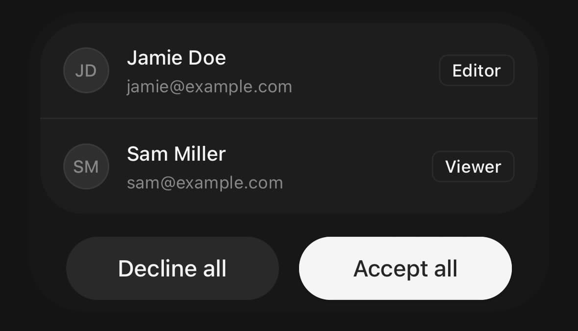
<Frame variant="inset">
  <Frame.Panel>
    {invites.map((invite) => (
      <Frame.Row key={invite.id}>
        <Frame.Media>
          <Avatar size="sm" fallback={invite.initials} />
        </Frame.Media>
        <Frame.Content>
          <Frame.Title>{invite.name}</Frame.Title>
          <Frame.Description>{invite.email}</Frame.Description>
        </Frame.Content>
        <Frame.Actions>
          <Badge variant="outline">{invite.role}</Badge>
        </Frame.Actions>
      </Frame.Row>
    ))}
  </Frame.Panel>
  <Frame.Footer>
    <Button variant="secondary" onPress={declineAll}>Decline all</Button>
    <Button onPress={acceptAll}>Accept all</Button>
  </Frame.Footer>
</Frame>
A header in the band
Under inset the header sits in the band above the panel, the same way the footer sits in the band below it.
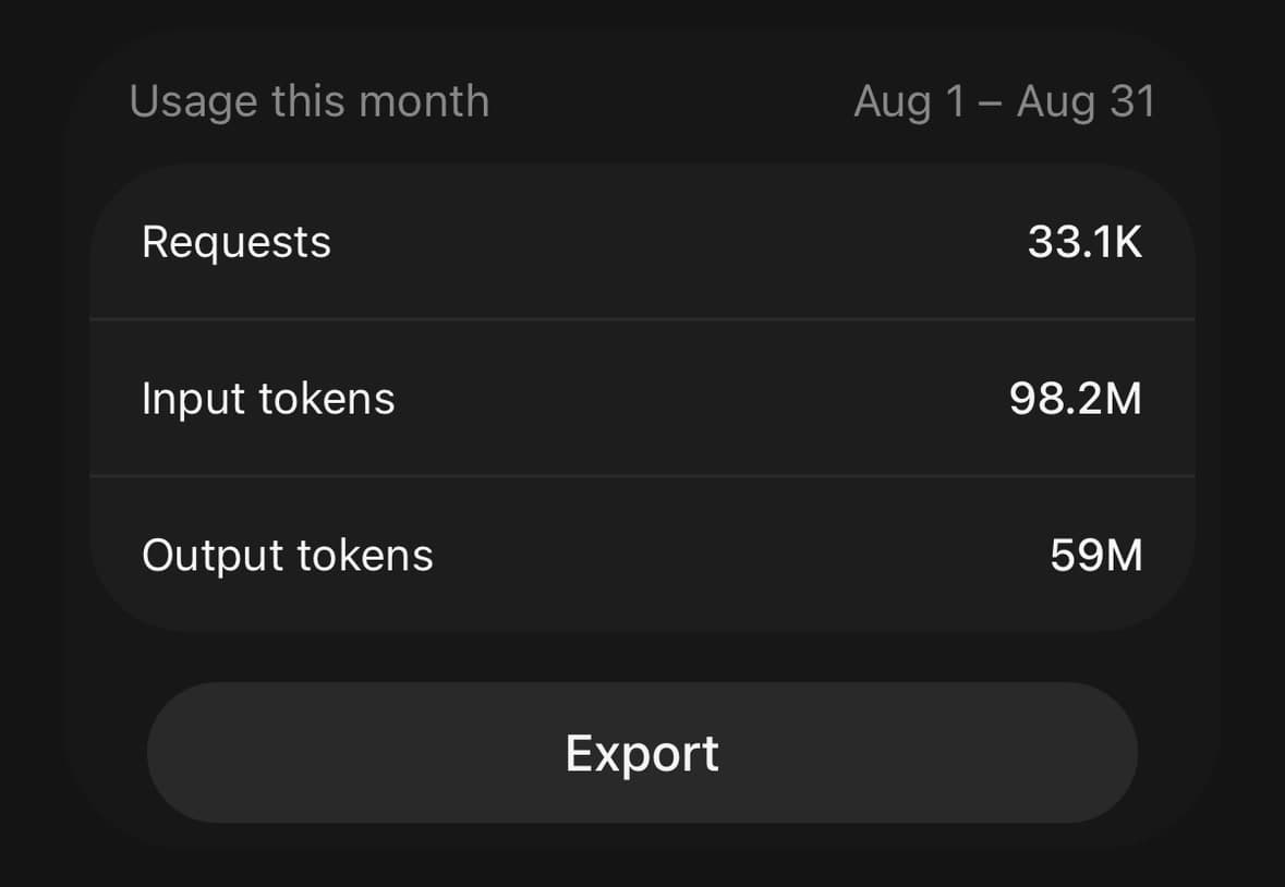
<Frame variant="inset">
  <Frame.Header>
    <Frame.Title>Usage this month</Frame.Title>
    <Frame.Action>Aug 1 – Aug 31</Frame.Action>
  </Frame.Header>
  <Frame.Panel>
    {usage.map(([label, value]) => (
      <Frame.Row key={label}>
        <Text size="sm" className="flex-1">{label}</Text>
        <Text size="sm" weight="medium">{value}</Text>
      </Frame.Row>
    ))}
  </Frame.Panel>
  <Frame.Footer>
    <Button variant="secondary">Export</Button>
  </Frame.Footer>
</Frame>
Variants
variant
default(default)plaininset
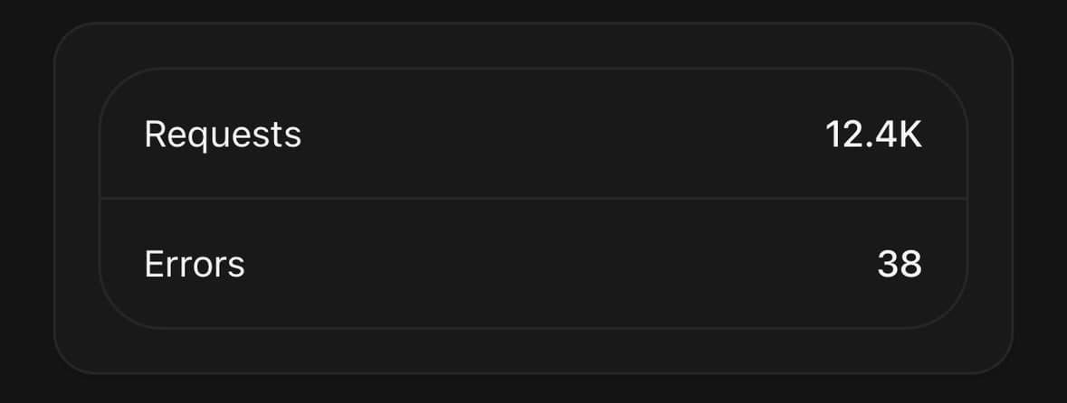
{/* The default: a card flush inside a shell, with the header in the strip above it. */}
<Frame variant="default">…</Frame>

{/* No shell — for a Frame inside a card that already draws a border,
    where the shell’s own edge just inside it reads as a double line. */}
<Card>
  <Card.Content className="p-4">
    <Frame variant="plain">
      <Frame.Panel>…</Frame.Panel>
    </Frame>
  </Card.Content>
</Card>

{/* The panel set into a recessed band on all four sides, with the
    actions in the band under it. */}
<Frame variant="inset">
  <Frame.Panel>…</Frame.Panel>
  <Frame.Footer>
    <Button variant="secondary">Not now</Button>
    <Button>Review</Button>
  </Frame.Footer>
</Frame>
API Reference
Frame
| Prop | Type | Default | Description |
|---|---|---|---|
className | string | — |
Frame.Root
| Prop | Type | Default | Description |
|---|---|---|---|
variant | FrameVariant | default | plain drops the outer shell so the panel is the widget — for a Frame inside a container that already draws its own border. inset sets the panel into a recessed band on all four sides instead, and gives Frame.Footer somewhere to sit. |
Frame.Panel
| Prop | Type | Default | Description |
|---|---|---|---|
dividers | boolean | — | Set false to place the hairlines by hand instead — for a panel whose rows are generated somewhere the divider order is not obvious. |
Frame.Row
| Prop | Type | Default | Description |
|---|---|---|---|
className | string | — | |
divided | boolean | — | Draw a hairline above this row. Frame.Panel sets it for you; pass it explicitly to override the panel's decision either way. |
chevron | boolean | — | Trailing chevron marking the row as leading somewhere. |
wrap | boolean | — | Let the row run onto a second line instead of holding one. For a cluster of chips or tags, where the alternative is the last ones being clipped. |
align | 'center' | 'start' | — | Where the row's slots sit against each other. start for a row two or three lines tall, where centring an icon against a tall text column leaves it floating in the middle. |
Frame.Section
| Prop | Type | Default | Description |
|---|---|---|---|
title | ReactNode | — | Heading above the rows. Strings are wrapped for you. |
divided | boolean | — |
Every part also accepts the underlying React Native props (ViewProps or TextProps) and a className for Tailwind utilities.
Notes
Why the card is flush
The two surfaces are nested rather than stacked, and only one edge of the outer one is ever visible. The panel meets the shell's left, right and bottom exactly, so the shell reads as something the card is sitting in rather than as a border drawn around it — and the strip left at the top is the header, which is why the header needs no rule under it and no background of its own.
The shell's radius is the larger of the two, and the panel's top corners are tighter. That is the reverse of the usual nested-radius rule, and it is deliberate: with only the top corners free, matching them would make the two surfaces read as one misdrawn shape. The panel's bottom corners are not set at all — the shell clips them, so they take its radius exactly, which is what overflow-hidden on the root is doing.
Thickening the shell's border
That clip follows the shell's border box, not the box inside its border. Along the straight edges the panel is held off by the border width and the edge shows through, but at the corner arcs the panel's square corner is clipped to the outer radius and paints across the border. At the default hairline that is a sliver nobody sees. Give the shell a thicker border and the corners visibly eat it, so tell the panel where to stop:
<Frame className="rounded-[28px] border-2 border-dashed">
  <Frame.Panel className="rounded-b-[26px]">…</Frame.Panel>
</Frame>
The radius to use is the shell's less its border width. It is on you rather than on the component because both arrive as className strings, which Frame cannot read.
Dividers
React Native has no :first-child, so the hairline between rows cannot be a CSS rule. Frame.Panel places them instead — a line above every child but the first. Passing divided on a row overrides that either way, and dividers={false} on the panel hands the whole job back to you.
Frame.Section divides its own rows the same way, so the two nest without either needing to know about the other.
Why a row has slots
Yoga defaults flexShrink to 0, the opposite of the web. A child that is not told to shrink never does, so a fourth thing in a row pushes the others past the edge — where the frame's overflow-hidden cuts them off silently, rather than wrapping or truncating the way a browser would.
Frame.Media and Frame.Actions hold their size. Frame.Content takes what is left and carries min-w-0, which is the part that is easy to miss: a flex child's minimum size is its content unless told otherwise, so flex-1 alone still refuses to go narrower than the longest word inside it.
For a row that genuinely has too much in it — a handful of chips, say — wrap lets it take a second line instead. align="start" is for a row two or three lines tall, where centring an icon against a tall text column leaves it floating in the middle.
Frame.Row forwards ordinary view or Pressable props for the branch it renders, while retaining ownership of its row classes and—when interactive—its button role and primary press handler.
Where the recess comes from
Under inset the shell is the popover surface with --color-inset laid over it rather than a colour of its own. That token is a translucent black in every theme, so the band always comes out darker than the panel it holds.
The surface ladder cannot do this job: it runs darker in a light theme and lighter in a dark one, and the recess has to read the same way in both.
There is no shadow under an inset frame. A recessed band and a drop shadow are opposite claims about where a surface sits, and this one is set into the page.
The corners are concentric
The panel's radius is the shell's less the shell's padding. Both are fixed numbers rather than classes, because an arbitrary Tailwind value a running dev server has not already compiled turns into nothing at all — no error, no warning, the corner simply squares off.
The consequence is that inset does not follow the theme's radius scale the way default and plain do. Restyle it with className and give Frame.Panel the matching radius yourself: the shell's, less the shell's padding.
What the band does to an action
An inset footer gives every element child h-11 flex-1 rounded-full: equal widths, and a full pill. The band is a row of equal decisions, and one arriving with the radius it happened to have breaks that.
Your own className is merged after, so any of it can be overridden — flex-none and w-11 for a trailing icon button that should stay square, say.
Public exports
Values: Frame
Types: FrameProps, FrameRootProps, FramePanelProps, FrameFooterProps, FrameRowProps, FrameSectionProps, FrameHeaderProps, FrameActionProps, FrameMediaProps, FrameContentProps, FrameActionsProps, FrameVariant