

Tabs
Segmented navigation with an animated indicator.
Switch between panels of content that belong to the same screen. One indicator slides between the triggers, so moving two tabs at once reads as a single movement rather than two states swapping.
Use it when the panels are alternatives and the reader picks one. It is not navigation — a tab set announces itself to a screen reader as a tab set, and moving between screens belongs to your router. For a row of buttons that do something rather than switch something, use ButtonGroup; for a control that owns which option is on, use ToggleButtonGroup.
Installation
Tabs ships with the library — no separate install.
import { Tabs, Text, Button, Input, Badge, PackageIcon, MessageCircleIcon, CalendarIcon } from 'panelui-native';Or copy the source into your project, to own and edit it:
npx panelui-cli@latest add tabsUsage
<Tabs defaultValue="account">
  <Tabs.List>
    <Tabs.Trigger value="account">Account</Tabs.Trigger>
    <Tabs.Trigger value="password">Password</Tabs.Trigger>
  </Tabs.List>
  <Tabs.Content value="account">…</Tabs.Content>
  <Tabs.Content value="password">…</Tabs.Content>
</Tabs>
Composition
<Tabs>
  <Tabs.List>
    <Tabs.Trigger value="…">…</Tabs.Trigger>
  </Tabs.List>
  <Tabs.Content value="…">…</Tabs.Content>
</Tabs>Tabs.List— Holds the triggers and the animated indicator. Takesscrollablefor more tabs than fit.Tabs.Trigger— One tab, with optionalicon,badgeanddisabled. Must be insideTabs.List.Tabs.Content— Panel for a tab. Unmounted while inactive unless the root setskeepMounted.
Examples
Uncontrolled
defaultValue is required — the tabs need a starting panel.
<Tabs defaultValue="overview">
  <Tabs.List>
    <Tabs.Trigger value="overview">Overview</Tabs.Trigger>
    <Tabs.Trigger value="activity">Activity</Tabs.Trigger>
    <Tabs.Trigger value="settings">Settings</Tabs.Trigger>
  </Tabs.List>

  <Tabs.Content value="overview">
    <Text>Usage and billing at a glance.</Text>
  </Tabs.Content>
  <Tabs.Content value="activity">
    <Text>Everything that happened this week.</Text>
  </Tabs.Content>
  <Tabs.Content value="settings">
    <Text>Names, members and integrations.</Text>
  </Tabs.Content>
</Tabs>
Controlled
Needed when something outside the tab strip changes the panel — a deep link, or a button in one panel that jumps to another.
const [tab, setTab] = useState('overview');

<>
  <Button onPress={() => setTab('settings')}>Go to settings</Button>

  <Tabs value={tab} onValueChange={setTab} defaultValue="overview">
    {/* …list and content… */}
  </Tabs>
</>
More tabs than fit
A fixed row splits its width between the triggers, which crushes every label once there are more than about four. scrollable gives each trigger its natural width, puts the row in a horizontal scroller, and scrolls the active tab into view when it changes from elsewhere.
<Tabs variant="underline" defaultValue="overview">
  <Tabs.List scrollable>
    {sections.map((s) => (
      <Tabs.Trigger key={s.id} value={s.id}>{s.name}</Tabs.Trigger>
    ))}
  </Tabs.List>

  {/* …content… */}
</Tabs>
Icons, badges and disabled tabs
A count or a status goes in badge rather than into the children, so the label keeps its own typography. A disabled trigger is dimmed, unselectable, and announced as disabled.
<Tabs.List>
  <Tabs.Trigger value="inbox" icon={<InboxIcon size={16} />}>
    Inbox
  </Tabs.Trigger>
  <Tabs.Trigger value="activity" badge={<Badge variant="secondary">4</Badge>}>
    Activity
  </Tabs.Trigger>
  <Tabs.Trigger value="archived" disabled>
    Archived
  </Tabs.Trigger>
</Tabs.List>
Panels that stay built
A panel that has been shown once stays mounted, so a scroll position or a half-filled form is there when you come back to it — no flag needed. keepMounted goes further and mounts the panels you have not opened, at startup: reach for it when a panel has to be doing something while it is off screen, and leave it alone otherwise.
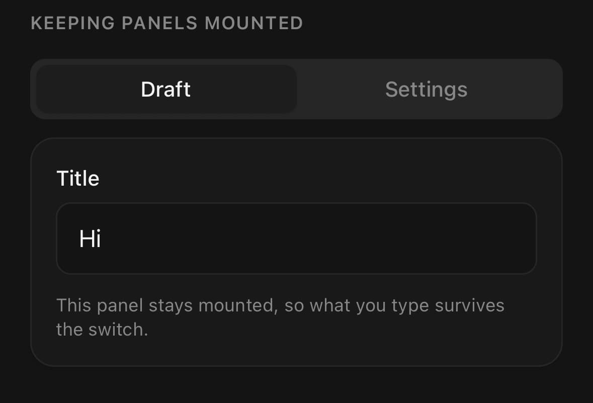
<Tabs keepMounted defaultValue="draft">
  <Tabs.List>
    <Tabs.Trigger value="draft">Draft</Tabs.Trigger>
    <Tabs.Trigger value="preview">Preview</Tabs.Trigger>
  </Tabs.List>

  <Tabs.Content value="draft">
    <Input label="Title" value={title} onChangeText={setTitle} />
  </Tabs.Content>
  <Tabs.Content value="preview">…</Tabs.Content>
</Tabs>
Swiping between panels
With swipeable, the panels sit side by side in a strip and dragging sideways moves it. The neighbouring panels are built before you reach them, which is what keeps a heavy panel from stalling on the frame it appears. The gesture takes over after 12pt of sideways travel and gives up on any real vertical travel, so a panel that scrolls still scrolls.
A swipeable tab set needs a height to lay its strip out in — flex-1 here, or a fixed height. It is off by default because a panel may already contain something that wants a horizontal drag, and the two cannot both have it.
<Tabs swipeable defaultValue="mon" className="flex-1">
  <Tabs.List scrollable>
    {days.map((day) => (
      <Tabs.Trigger key={day.value} value={day.value}>
        {day.label}
      </Tabs.Trigger>
    ))}
  </Tabs.List>
  {days.map((day) => (
    <Tabs.Content key={day.value} value={day.value}>
      <FlashList data={day.entries} renderItem={renderEntry} />
    </Tabs.Content>
  ))}
</Tabs>
Variants
variant
segmented(default)underlinepillexpanding
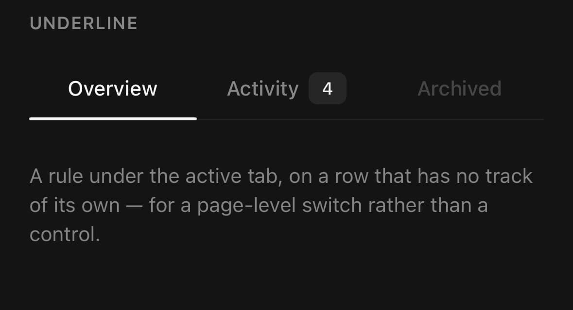
{/* A chip travelling inside a recessed track — the default. */}
<Tabs variant="segmented" defaultValue="a">…</Tabs>

{/* A rule under the active tab, for a page-level switch. */}
<Tabs variant="underline" defaultValue="a">…</Tabs>

{/* A filled chip on the page, active label inverted against it. */}
<Tabs variant="pill" defaultValue="a">…</Tabs>

{/* Icon pills, only the selected one open. Every trigger needs an icon. */}
<Tabs variant="expanding" defaultValue="chats">
  <Tabs.List>
    <Tabs.Trigger value="home" icon={<PackageIcon size={18} />}>Home</Tabs.Trigger>
    <Tabs.Trigger value="chats" icon={<MessageCircleIcon size={18} />}>Chats</Tabs.Trigger>
    <Tabs.Trigger value="calendar" icon={<CalendarIcon size={18} />}>Calendar</Tabs.Trigger>
  </Tabs.List>
</Tabs>
size
xssmmd(default)lgxl
{/* Inside a card or a toolbar. */}
<Tabs size="sm" defaultValue="day">
  <Tabs.List>
    <Tabs.Trigger value="day">Day</Tabs.Trigger>
    <Tabs.Trigger value="week">Week</Tabs.Trigger>
    <Tabs.Trigger value="month">Month</Tabs.Trigger>
  </Tabs.List>
</Tabs>

{/* The main navigation of a screen. */}
<Tabs size="lg" defaultValue="day">
  <Tabs.List>
    <Tabs.Trigger value="day">Day</Tabs.Trigger>
    <Tabs.Trigger value="week">Week</Tabs.Trigger>
    <Tabs.Trigger value="month">Month</Tabs.Trigger>
  </Tabs.List>
</Tabs>
API Reference
Tabs
| Prop | Type | Default | Description |
|---|---|---|---|
className | string | — | |
value | string | — | |
onValueChange | (value: string) => void | — | |
defaultValue | string | — | |
variant | TabsVariant | 'segmented' | segmented is a chip travelling inside a recessed track, underline is a rule under the active tab, pill is a filled chip on the page. expanding is a row of icon pills where only the selected one is open: it widens to let its label out and closes again behind it. For a short row of destinations that are recognisable by their icons, where the labels would otherwise take the whole width to say things nobody rereads. Give every trigger an icon — a closed tab has nothing else. |
size | TabsSize | 'md' | How big the triggers and their labels are. xs and sm are for a tab set inside something else, such as a card or a toolbar; lg and xl are for one that is the main navigation of a screen. Icons and badges you pass are not resized. |
keepMounted | TabsKeepMounted | false | Mount every panel up front instead of only the ones that have been reached, so a scroll position or a half-filled form is there from the start rather than from the first visit. Usually unnecessary. A panel that has been shown once stays mounted for the life of the tab set either way, and with swipeable the panels on each side of the active one are mounted before you get to them. What this adds is the panels you have not been near — the fourth tab of four — which costs their render at startup and buys nothing until somebody opens them. Turn it on when a panel has to be live while it is off screen: a form that must validate as another tab is edited, a chart that has to be ready to print, a subscription that must not miss a message. |
swipeable | boolean | false | Move between tabs by dragging sideways on the panels, as well as by pressing the triggers. Off by default, because a panel is allowed to contain something that already wants a horizontal drag — a carousel, a slider, a row that swipes open — and the two cannot both have it. Turn it on for panels of ordinary scrolling content, where it is the gesture people try first. It changes how the panels are laid out. They go side by side in a strip that is as wide as all of them, and the tab set shows one panel of it at a time. So the panel on each side of the active one is built and sized before you swipe to it, which is what stops a heavy panel — a virtualised list, a chart — from stalling on the frame it becomes visible. It needs a height to fill, the same as any pager: flex-1 on the tab set, or a fixed height. Without one the strip has no room to lay its panels out in, and a list inside a panel of no height renders no rows. In development the tab set says so rather than rendering nothing. |
animation | TabsAnimation | — | Turn the tab set's animations off — the indicator, the strip, and an expanding tab's reveal. For a screen that is already animating something more important, and as a blunt instrument on a device that cannot afford them. The system's own reduce-motion setting is honoured without this. |
Tabs.List
| Prop | Type | Default | Description |
|---|---|---|---|
className | string | — | |
scrollable | boolean | false | Lay the triggers out at their natural widths inside a horizontal scroller instead of splitting the row between them. For more tabs than fit — which a fixed row answers by crushing every label. |
Tabs.Trigger
| Prop | Type | Default | Description |
|---|---|---|---|
className | string | — | |
value | string | — | |
icon | ReactNode | — | Rendered before the label. Required by variant="expanding", where it is the only thing a closed tab has left to identify it by. |
badge | ReactNode | — | Rendered after the label — a count, a dot, a status. |
disabled | boolean | false | Unselectable, dimmed, and announced as disabled. |
Tabs.Content
| Prop | Type | Default | Description |
|---|---|---|---|
className | string | — | |
value | string | — |
Every part also accepts the underlying React Native props (ViewProps or TextProps) and a className for Tailwind utilities.
Notes
Swiping puts the panels in a row
With swipeable, the panels are laid out side by side in a strip as wide as all of them, and the tab set is a window showing one panel of it at a time. Moving between tabs is that strip sliding. A press and a drag do the same thing to it, so they produce the same movement.
The panel on each side of the active one is built before you get to it. That is the point of the arrangement: a panel that is only created when it becomes visible is a panel that stalls at the moment it becomes visible, for as long as it takes to build — and for a virtualised list or a chart, that is long enough to see.
Without swipeable, one panel is shown at a time in place, and the panels are neither laid out together nor built ahead.
A swipeable tab set needs a height
Give it one, the same as any pager:
<Tabs swipeable defaultValue="users" className="flex-1">The strip lays its panels out inside the height it is given. Without one there is nothing to lay them out in, and a virtualised list inside a panel of no height renders no rows — the failure looks like the tab set being empty rather than like a missing style. In development the tab set warns when this happens.
If you do not give it a height, the strip is as tall as its tallest panel and every panel stretches to match. That works for panels of ordinary content, and it means switching tabs does not change the tab set's height.
What a swipe commits on
A drag changes tab on release, not while the finger is down. It commits once the drag has passed a quarter of a panel's width, or once it is moving faster than 500pt/s however short it was. Distance and speed can disagree — a flick back the way it came reads as a cancel — and speed decides.
The gesture takes over after 12pt of sideways travel and gives up on any real vertical travel, so a panel that scrolls still scrolls.
The order swiped through is the order the Tabs.Content panels are written in. Under RTL the first tab is the rightmost, and a swipe towards the start of the reading direction goes to the previous tab either way.
At the first and last tab the strip still moves, but a sixth as far. A gesture that produces nothing at all is indistinguishable from one that was not received.
What keepMounted is for
A panel that has been shown once stays mounted for the life of the tab set, whether or not this is set. So state that has to survive a visit — a scroll position, a half-filled form — survives without it.
keepMounted mounts the panels you have not been near, at startup instead of on arrival. Turn it on when a panel has to be live while it is off screen: a form that validates as another tab is edited, a subscription that must not miss a message. It costs those panels' render up front and buys nothing until somebody opens them.
keepMounted="measured" was the way to keep a hidden panel's size, back when a kept panel was hidden with display: none and so had none. In a swipeable tab set every panel in the strip has a real size already. It still works and means the same as true.
The expanding variant
A row of icon pills where only the selected one is open: it widens to let its label out and closes again behind it. For a short row of destinations recognisable by their icons, where writing every label out spends the whole width on words nobody rereads.
Give every trigger an icon. A closed tab has nothing else, and one without an icon closes to an empty pill.
There is no travelling indicator here. Every tab draws its own pill, so a shape sliding underneath them would be invisible; the shape that moves is the open tab itself. The open pill sits one step further from the page than the closed ones — lighter in a dark theme, darker in a light one.
The label is never unmounted, only closed over: a row of unlabelled icons gives a screen reader nothing to read, and a label that mounted on selection would have no width to animate from, so the pill would jump to its open size with the text fading in inside it.
Turning the animations off
animation="disable-all" stops the indicator, the strip and the expanding reveal. For a screen already animating something more important, or a device that cannot afford them.
The system's own reduce-motion setting is honoured without it.
Public exports
Values: Tabs
Types: TabsProps, TabsListProps, TabsTriggerProps, TabsContentProps, TabsVariant, TabsSize, TabsKeepMounted, TabsAnimation